Poll results
Save to favorites
Add this poll to your saved list for easy reference.
Which logo do you prefer?
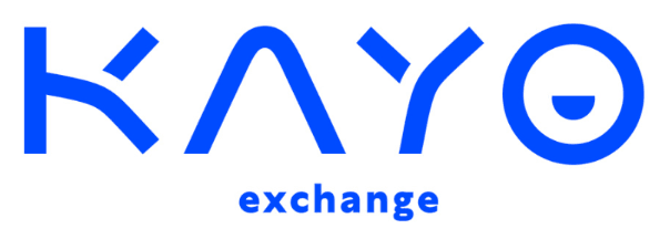
28 Responses to Option A
The letter O looks like it is smiling, which gives a lot of life to the logo.
This option looked less like a nipple to me. It seemed more sleek and modern.
option A i like the one that looks like a smiley face inside of the O
i prefer the logo in option A because it looks more innovative and advanced to me
Option A seems more unique visually when compared to option B where the O reminds me of the target logo
It looks like the logo was smiling.
I like the smile face of the letter O. I find it friendly and inviting.
I like option A better than the other option. I like it because it has a sort of a smile at the end with the o I like how it makes that look because I think that one stands out in this logo the best instead of just the bullseye Target. This option looks more friendlier memorable and I think you could do much more and how much more retention with the logo in the backing of decorating the app would this look. The other one looks like a bullseye Target at the end and doesn't match the theme of what the company is supposed to be doesn't come off as an exchange but it comes off as more of another type of app I think the other look looks much better going by what the theme of the logo is for.
I like choice A because it looks like a cute little smile in the O.
I like that the half circle kind of looks like a smiling face
I like option A the best because I like how the little graphic in the middle of the letter O looks like a smiling mouth. I think this would catch the attention of people who look at the logo and as a result they would remember the logo associate it with the brand name.
I LIKE OPTION A BECAUSE IT LOOKS LIKE A SMILE. IT IS INVITING AND HAPPY
I like the smiley face in this O. It has a good look.
I really liked the option A. Reason behind it was that the semicircle or bowl shape looks better than a small circle in the middle of the "O". Make one notice the logo once more. Circle shape is too common but the semicircle looks a bit unique.
I prefer this, the other feel kind of plain and like it has been done before (Target) but option A is just different enough to make it stand out and feel unique
Looks like a smile which goes well with the font, has a kawaii type feel which is cute and the bullseye look could look like target, a nipple, distracting etc...
Option A looks classy yet jovial. The half dot in the O at the end seems a bit of a smile. It seems friendly and relatable.
the logo in option A is quite interesting, I like it better
This one conveys more positive emotions with the smile. Be careful though as it looks a little too similar to thr smile I se fumigation uses
I like the cute little smile in the O of this one. Make it just a little more fun and memorable in my opinion.
It looks more authentic for the name.
Why not spread happiness? The smile is great in the O at the end.
A i think this one fits more thematically and visually as it sort of stands out and looks better in my opinion and just looks nice in general
Option A, the center of the circle is appealing because it looks like a smiling face.
Option A has a unique font. Keeping with this uniqueness, I haven't seen a logo with a half circle inside the O. The Option B looks reminiscent of Target and may serve to confuse people.
I like A that does not have a target for the O. I feel like it is more in keeping with the rest of the letter styling and doesn't draw association with another major brand's logo.
I like the O more in A, it looks friendlier versus the bulls eye
The two designs are very similar. The difference is the design of the letter "O". I prefer the design in A. The letter "O" looks like a smiling face and it is consistent with other letter designs in the logo.
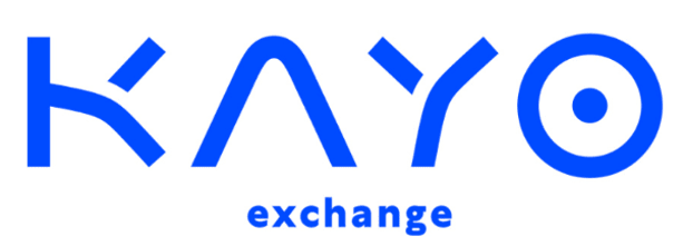
22 Responses to Option B
Since the "O" in Kayo is a circle, it feels a bit more "complete" and fitting for the dot inside to be a full circle as well, rather than a semi-circle.
A financial institution should convey strength and security in the logo.
I love the color of the name and the font of the letters are more attractive to me as compared to choice A.
The half circle dot in the circle looks odd. I prefer the full circle dot.
I like the target looking O at the end as it reminds of shopping due to the chain store with that name.
I prefer Option B to Option A. I think the O in Kayo stands out much better with the full dot in the middle of it.
I would have to say I prefer Choice B, even if the difference is slight. I'm not fond of the pseudo-smiley face in the last letter of A. Not sure if that was the intent or not, but it's what I think of immediately and I don't care for it when it comes to a professional business. Especially one in finance, it'd work for something like food or hospitality.
I feel that the dot in the O makes this design much more congruent overall.
Choice B is basic and standard that I would go with this logo to find out more information about this brand. Choice A the O in Kayo looks like it's sleeping which is weird that I would think this company might be boring and I would pass on it.
The logo in B looks better. I find the stylized "O" to fit the overall vibe of the logo well, and it looks very professional also.
This would be my choice.
I much rather prefer the option B financial business logo because the dot in the middle of the circle in the last letter looks much more comforting than the half dot used in the option A logo image.
It looks like an eyeball! It kinda adds some personality that makes it attractive
I like Option A best here out of the two. The half moon part of the O looks more modern and a little more techy. Option B looks a little too elementary and obvious.
Considering that it is a financial institution, I think the whole circle seems more appropriate, at least it gives more seriousness.
There is very little difference. I chose B as I like the circle in the "o" better than the half moon.
I feel like the smiley face in A is missing something so just go with what works in B.
Solid, complete geometric shapes promote a solid financial company
I choose B because I like that the trailing O looks like a bullseye.
B looks more normal and I can read the logo
I like option B logo best of the two illustrated, the reason being the full dot placed in the letter O at the end of the word. The half dot looks out of place and throws the entire image off, it does not look complete.
The other one looks like a "lazy eye" more so than a wink.
Explore who answered your poll
Analyze your results with demographic reports.
Demographics
Sorry, AI highlights are currently only available for polls created after February 28th.
We're working hard to bring AI to more polls, please check back soon.

