Poll results
Save to favorites
Add this poll to your saved list for easy reference.
which design do you like more? its an energy supplement drink for gamers.
Age range
Education level
Gender identity
Mobile gaming habits
Options
Personal income range
Racial or ethnic identity
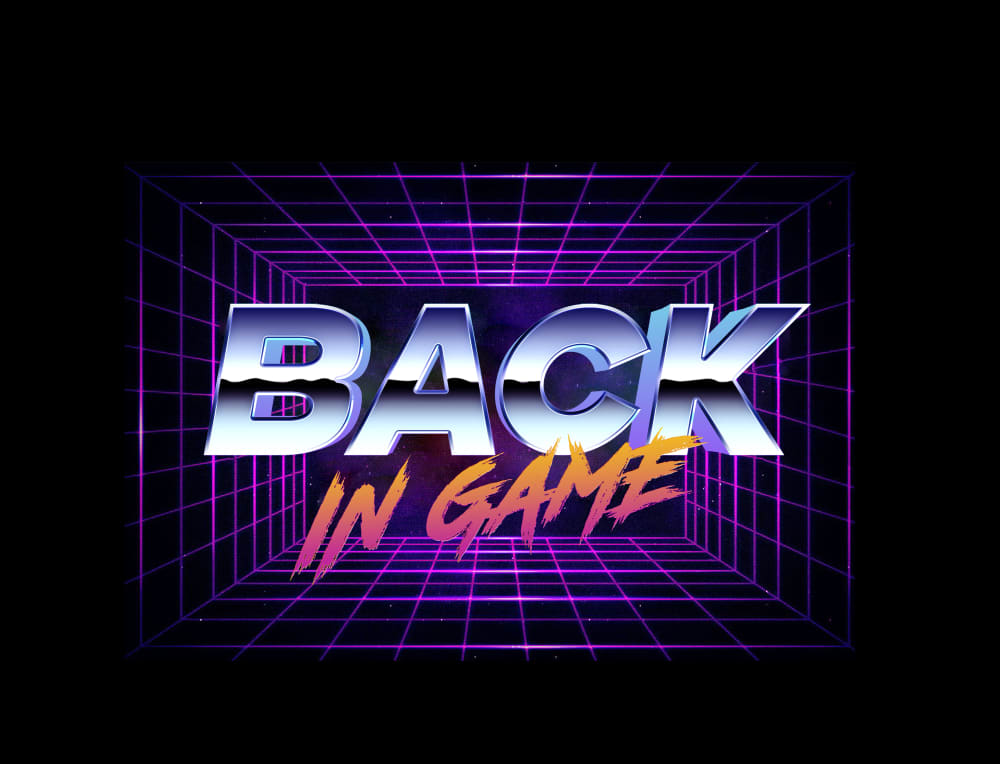
37 Responses to Option A
I like this design much better because it's very retro and reminds me of an old 80s arcade, which is quite nostalgic for me.
I like the retro 1980's feel of the logo - it takes me back to my childhood of playing video games and drinking energy drinks.
The retro feel and design looks fantastic and more appealing fr choice A. Choice B is interesting but a bit too much for a drink.
This design reminds me of retro gaming with the 80s design and colors
The retro arcade feel looks very cool, and is very appropriate for a product targeted at gamers. Nice design for sure!
I love the retro feel to the logo, it definitely makes it like you're going back and gathering more energy
I picked A as my top choice as I like the 1980's retro design of the logo than the snake design.
The retro design of this one looks much cooler and reminds me more of gaming
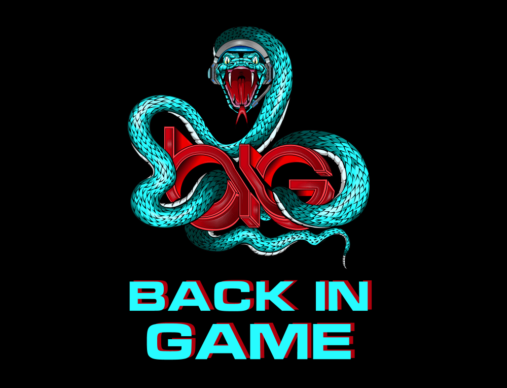
Honestly I don't really like either. I'm not sure what the brand is, potentially something with gaming. But I don't like the vaperwave style and I don't like how the snake looks. Neither of them seem intuitively connected to the brand name.
I prefer A over B for a few reasons. One being I don't really understand the snake in B, and I also don't like the text in B. B looks a lot less appealing and really just less professional. A looks nice. It's crisp and clear and looks much more gaming like.
I like the retro 80's style look of option A.
A looks cool and slick while B looks like its over doing it and to much. A has cool text and the colors are nice and clean. B makes me feel like i gotta look more at the snake then the text.
This looks the part for a gamer energy drink with the retro styling shown here
I like the vintage look of it. It looks really neat
I chose A because it seems to call back to old retro games. I felt it was the only one of the two that really indicated it was related to gaming.
I like option A the best because the graphics have a very 80's retro gaming look to them.
The concept of “BACK IN GAME” indicates a return of something from the past, which therefore makes the “retro” feel of Option A more fitting. The design of option A is immediately appealing, with nice typography and colors. Comparison to Option B, where the “BIG” text is not readable, and the snake design is generic and doesn’t seem to relate to the name of the drink.Therefore, Option A seemed like the better (and more appropriate) graphic choice for the Back in Game brand.
I love the retro feel of A. B has a nice design but I feel A is more in tune with the demographic they want to reach
I love A for an energy supplement for games. As someone who is a big fan of the 'outrun' aesthetic, I think it is a great logo. Also, this is a very popular presentation style with gamers, and works well with that industry. It is retro and modern, futuristic and vintage.
I like the retro feel of Choice A. It also fits the digital/gaming theme well. I think it looks professional and attracts attention.
I like the retrofuturisic look of option A
I like this one much more, has a real 80's type feel to it, I love the old 80's arcade type games. I think choosing this one, gamers would associate it with the feel good 80's arcade games.
I like the color of A, its a tough choice but I think choice A would look more appealing.
I absolutely love the retro throwback design!
I choose A because it highlight the message itself instead of using a distracting image. For B, I'm not quite sure if the snake is appealing to the average consumers. It's also a little distracting too.
I like A way more. I think that the design is so futuristic yet retro at the same time. It’s a great design, I would definitely buy A.
The 3d grid box that the name is written in just really looks like it would fit in with gamers and is technical looking like a computer.
Option A is fantastic. I love the 80s or synthwave feel. It feels modern but also nostalgic. I love this aesthetic!!!
I like the 80's retro feel of option A. If the target audience is gamers I would go with that option.
The snake might be cool but the techno theme of A just fits gaming better.
I like A because it looks like a gaming logo more than B
I'm going with A here because I like the retro style designs that you see from other types of media probably most notably now Dr Disrespect. He uses this same kind of style, font, and I think it just looks cooler to be honest with you. I would much prefer A over B. B seems more generic and trying to be cool.
I really like the retro tone of option A. It looks more welcoming than option B's design.
I like A better as I really dislike snakes and think option B is hideous. I think option A has a nice futuristic color scheme to it that looks cool too.
I am always a fan of the retro style, and I think it fits perfectly for gaming. It reminds me of the art of the 80's and the back looks like the back to the future font. Overall its much more appealing and I also don't like snakes in particular.
I really don't like snakes, and I like the retro gamer feel of option A.
I love the retro video game art style. Hackerman!
13 Responses to Option B
the teal on the black makes it stand out to me. the other option looks like it was from the 80s
A seems kind of old school and not very new or innovative. B works for me and has a nice look to it as it is creative with good colors and also the log as well
I chose B because snakes represents strength, power, endurance and intelligence. Fitting for gamer online.
I chose B because of the animal that is associated with the energy drink.
While the other design looks like it was made in the 80's, the image i chose looks much more modern and the use of the snake is really well done.
i think this option is more attractive it puts you in a competive mind state and is very encouraging
both logos look really cool, i like the retro aspect of A. But overall, B is nicer
Choice A is my pick because I like the retro vibe that it has to it. I feel like it would do well with older gamers has it would remind them of the games and other entertainment from back in the 80s or 90s. It has a look that would appeal to more people then just gamers as well based on the design as well. Having that on the bottle I feel would intrigue people.
This image is very strong and action pack, it says gamer a lot more than the other option. This option is also cool looking, I like the snake wearing the headset which just screams gamer. I would change up the font for the "Back in Game" though make it so it matches how cool the image is.
I really love A with the retro look but modern take. It just pops for me and appeals way more than B. B just seems way to overthe top. I would not touch B at all. A can appeal to all types of gamers old and young.
the snake icon looks very fierce and exciting
I like the color choices and look of option B and I feel like the whole retro sythwave aesthetic presented on option A is getting a bit played out. Though I'd personally lose the little wireless headset on the snake, unless it's tongue and cheek and that's part of the joke.
both options are really cool and on point but the option B reminds me of classic arcade games when I was younger so thats my pick
Explore who answered your poll
Analyze your results with demographic reports.
Demographics
Sorry, AI highlights are currently only available for polls created after February 28th.
We're working hard to bring AI to more polls, please check back soon.

