Poll results
Save to favorites
Add this poll to your saved list for easy reference.
Which design do you like for my podcast graphic?
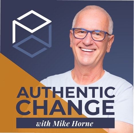
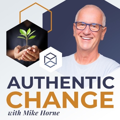
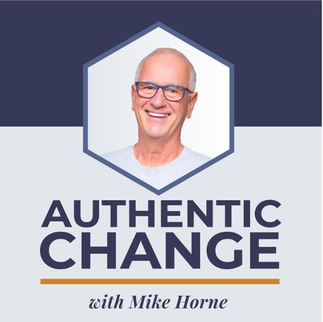

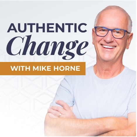
Option B won this Ranked poll with a final tally of 54 votes after 4 rounds of votes counting.
In a Ranked poll, respondents rank every option in order of preference. For example, when you test 6 options, each respondent orders their choices from first to sixth place.
PickFu requires a majority to win a Ranked poll. A majority winner differs from a plurality winner. A majority winner earns over 50% of the votes, whereas a plurality winner earns the most votes, regardless of winning percentage.
If an option does not earn a majority of votes, PickFu eliminates the option with the lowest number of votes. The votes from the eliminated option are reassigned based on each respondent’s next choice. This process continues in rounds until a majority winner emerges.
Scores reflect the percentage of total votes an option receives during the vote counting and indicate the relative preference of the respondents. If there is no majority winner, look to the scores to see how the options fared relative to one another.
| Option | Round 1 | Round 2 | Round 3 | Round 4 |
|---|---|---|---|---|
| B | 29% 29 votes | 29% 29 votes | 44% 44 votes +15 | 54% 54 votes +10 |
| E | 25% 25 votes | 27% 27 votes +2 | 31% 31 votes +4 | 46% 46 votes +15 |
| A | 20% 20 votes | 23% 23 votes +3 | 25% 25 votes +2 | Eliminated 25 votes reassigned |
| D | 21% 21 votes | 21% 21 votes | Eliminated 21 votes reassigned | |
| C | 5% 5 votes | Eliminated 5 votes reassigned |
Age range
Education level
Gender identity
Household income range
Options
Personal income range
Podcast listener
Racial or ethnic identity
20 Responses to Option A
I like the darker colors in choice A along with the picture of the host because I think it paints a friendly tone to the show and it paints the show as being helpful as well.
It's the most authentic version of yourself.
I want to see his face so D is the worst pick, A and E are the best but E is more modern
I think that people identify more with a podcast or book when they see the author/creator.
Option C is to cliche and simplistic. Option B is too busy. The other three are good. All would work.
I am interested in the person not the title to be honest. A gets the person across to me better.
I don't see the connection with your podcast and newly planted flowers, so those two are last. I chose E third because compared to A and C, it looks quite bland. I selected A since I dug that logo design and the color combination more than anything present in C.
I like the square hollow object that option A and B have. They look professional and like a product i would want to buy.
Choice A is nice as it allows me to see what you look like and it has fonts that's easy to read even if the picture is small. Option E comes in second in that the contrast with the background makes the title easier to read however it looks more plain. Option C comes in third in that the usage of geometric shape makes the podcast stand out however it looks pretty generic. Option B is in fourth because it looks too cluttered, there's too many things going on. Option D is pretty generic and doesn't make you the center of the podcast.
A is my favorite because I like the color plat and symmetry of the over all design. The words of the title and the name are easy to read. I don't understand the plant.
I generally like the more simple designs shown in Option A and E better than the designs with the plant that are more complicated (Options D and B), C is somewhere in the middle.
I like the color contrast of the dark colors in the ones I ranked higher. I also think seeing more of the person makes it more personable and relatable of an ad.
I chose the one with the best colors. Choice A stood out among all five and the best color scheme of any of them. Not too bland or simple, but it had a nice look to it. I liked it the best.
Option A is the most visually engaging. Option E is the cleanest and most memorable. Option B comes next becasue it is also very easy to visualize.
I feel that the photograph of the artist is ideal for properly showcasing the podcast. The arrangement of graphics is suitable in most of these designs and I like the darker color in the background as opposed to a lighter one.
A and E are the best because they look the best and don't use any kind of cheap clip art pictures like B and D do. C is just ok but a little boring.
I like my first option because it's neat, easy to read, clean and understandable. The second choice is just as neat, clean and understandable but not quite as easy to read. The third and fourth choices seemed too bland and needed more color, however the fifth was too distracting and needed more simplification.
I feel this one is most distinct and will cause someone to stop and want to learn more.
I like the mix of dark blue and orange colors, which makes for a nice combination and caught my eye. So my top four choices are really nice, but my top pick is definitely the best among them. Looks really cool for sure!
Option A is very professional yet welcoming at the same time. This picture makes me feel i can relate to what the podcast is about.
29 Responses to Option B
I like option B the best because I lie how it shows both the hands holding the seedling and the picture of who I assume is Mike Horne.
Looks catchy and modern and one that makes you seem more authentic and an expert on the subject. It also is very visually appealing.
I like choice B the best. I like all the graphics.
I like the sprout as it is close to starting anew which is a good message for a podcast
Options B and E are great designs, I like the font and the color scheme. Options C and A could use some reworking, but they're not terrible.
I like the options that have a good balance between the persons face an the image of the plant. Looks much more appealing to me.
I like seeing the plant imagery, makes me think of rebirth and growth
If this were on my podcast player, I would like Option B. I has his picture larger, which lets me identify with him more. I like the blue background as it feels trusting. Then I enjoy the graphics along side of his picture.
I liked B the most because it had the best balance of uniqueness and style without seeming too busy. I also liked C and A for similar reasons. I didn’t like D as much because it felt too busy and complex. I also didn’t like E because it seemed too bland and plain.
I like the design that includes both the author of the podcast, and what his mission is. Some of the posters, such as the one presented a plant in the background, seem a little " busy", theres alot going on. it would be good to narrow down, or lighten the background.
I like the design and seeing the guy's face up close. He seems really friendly.
B is the most pleasant image because it highlights the idea of nature or growing a plant which gives me a better idea of what the idea of the podcast is.
Voted in order of simplicity and something that is easy for me to see and read while scrolling through podcasts.
He seems like a nice guy but the ones with just his face don't really do it for me. I like B and D especially because of the seedling. I think that image goes well with the podcast that he is trying to foster about growing yourself.
I wasn’t a fan of D or E. I didn’t like the small photo or the crossed arms (too typical). B, A, and C were all nice. I liked the seedling in the hands in B. That one was my favorite.
The design I like for my podcast graphic first is option B because it looks very well planned out and professional looking.Second choice is A because it not clutter but simple and to the fact but I admire option B more.Third choice is D because I like it but I cannot tell what is behind the wording on the display.Fourth choice is E because it is really nice but I like the little plant on the display on option B and D.Fifth choice is C because it gives less information through details.
I think you should include the plant/flower as an inset to your face/profile, like in B. I think B is the best most attention grabbing. D is also good but your face is kind of small.
My favorite one Is because it incorporates the picture of the man and the little picture of the plant. Beyond that I just Picked based on the color scheme and which one stood out more. The one with the huge picture of the plant is easily my least favorite though.
I like B best because there is a nice-sized picture of you, and the plant to symbolize growth. I n D, the writing over the image makes it hard to see. I/m not sure what the 3D cube image had to do with your podcast unless it is already associated with you as a logo. Otherwise it doesn't seem to add much. I'm also not sure about the hexagon, but it isn't distracting. Good luck with your podcast!
I like the image of the man. Plus I like the insert of the other items. I get a better sense of what the podcast is about. Also i just like the overall design the best.
the text sizing along with the self portrait being relative to the framing is why i would go with choice B
The first looks the most professional and least clunky of them all.
These were really close and I loved all of them. I really had to go with my gut to order them but I feel all of them are easy to read and clearly communicate the idea. None of these are bad choices
I think since it is your podcast, your face should be the biggest focus of the ad for it. I like the idea of the plant growing because change equals growth, so that is nice. I think C and D do not feature your face enough and therefore are bad choices.
B has a good amount of things and it doesn’t seem so cluttered compared to some of the other graphic design. C is a bit on the simple side, but it is still not as bad compared to E, A and D. I do not like D’s design at all, it seems to cluttered and muddy. It just seems too full.
I like option B is my top choice because it is a good blend of colour a good blend of head shot and related item.
I ranked the design for a podcast ad for Mike Horne that I liked the most. I think the design of option B gives me the best idea about what the podcast is like. It is clearly a self-help/growth podcast. I then liked the design of the advertisement for option A followed by option E. I found the design of option C more appealing than option D.
I actually really like the headshot so having a larger more prominent one like the first couple of choices is pretty good. The last two choices are strange looking with the headshot framed with a strange hexagon shape.
I picked B, A and D as my top choices as the hexagons make it look like it's a very smart book.I picked E as my least favorite as the design of the cover looks a bit bland.
5 Responses to Option C
I think that the less busy the icon is the better. I like the simple layout with a nice image of the podcast lead and with the purple background it's not completely boring. D and B are far too busy in design for me.
Looks the most appealing as book cover.
i believe simpler is more effective. i like option c and e because of the plain and simple graphic and font. they are clean and not cluttered.
I like something that is simplistic but still pleasing to see. C I feel does the best job at that and would be the best. A, D, and E are okay but does not stand out as much. B has too much going on for it to be pleasing.
Don't need the plant
21 Responses to Option D
All look great but most enticing formatting
I choose d it is the good design and i like it.
The plant is very appealing to look at and I like it as a way to describe the feeling of the podcast. The images that minimize the face of the person are much more appealing as well.
i particularly like the one with the tree on it. I think having the tree / seedling larger brings it to light as well as having the darker background for it exemplifies it. Putting the headshot in a hexagonal border and a lighter background plays a nice contrast to that too.
The growing plant pictures look dynamic and carry the idea of growing and thriving. The rest are more static and thus less "energetic," and the picture with the cursive/ fancy writing is downright ugly.
i like the design of option D the most here
lighter colros look more prof. like his smile. would like to see more whites on lighter colors
i would want to keep the focus off of you, so i went with the graphics that make the images of you smaller
I like on my first choice how the plant represents how authentic change can be.
E is just him and I dont think he should be so prevalent. I like the ones with more design and a smaller head profile
I like all of these, even my bottom choice. Option D is the tidiest and the graphic design looks the most professional so I would trust that the podcast is made by an expert. Option C is also centered really well so it caught my eye first out of any of them. Option E is a bit too simple, though the image of the person is very approachable and even that podcast graphic I would be compelled to read more about.
I like option D the best because the main image featured on the cover is a tree.
I prefer the large plant picture in D first as it is the most attractive. B is second as it would help the people whole already know who the personality is. the additional choices are all pretty similar in my view in terms of the authors picture just with different graphics
I like the plant as it makes me think of a natural growth
I definitely prefer the one with the plant! That is the most eye catching; the others all kinda look the same and I don't know who the guy is or if I should care.
I like a little color. I voted the most colorful ones.
The originality is in the first choice.
I put these in order by which was more natural looking.
D: Like the green plant in the artwork. Adds pleasant thoughts when thinking.B: Same as option D, but slightly less impactful.A: Darker color splits look nice and focus goes to the author.E: Full size image of the author looks attractive.C: Don't like the hexagon frame around the author.
I like D the best because it looks mysterious but also symbolic of growth and help and change-- the black with the plant growth showing through with your picture below just shows enough to capture attention but also keeps a mystique. There's something special about that one. I like E because you look trustworthy, credible, and compassionate. That's a great pose which makes people let their guard down. You look approachable and welcoming. I would use one of those first two for those reasons. THe other are nice, but I don't like B and A as much because of the random shapes and patterns blocking too much of the photo and overlapping. The first three look much more natural and the two first ones (D and E) are the best in my opinion because they just have both qualities of warmth and approachability but also professionalism and credibility. Good luck on your new business endeavor!
I liked the design of option D, it really highlights the 'authentic change' aspect which is the most important. Option B, seems more like a middle ground of highlighting the speaker and the podcast topic. Not bad but I prefer focusing more on what the podcast is about. Option A, design is okay, not a fan of the darker text for the podcast name because it blends in with the bg. Option E, looked a bit basic. Option C, looked boring and lacking. It doesn't grab your attention, it just looks to minimal.
25 Responses to Option E
I like that choice E looks to be the most authentic and engaging.
I think that option E looks the cleanest and most professional as the image to be used for a podcast.
I ranked them in the order from best to worst, assuming the tile would be this size. I'm not sure how well they will scale down, but I wasn't able to infer that information.
These designs are fairly weak. The elements really don't add a whole lot to the table. That's why I went with E: It is the simplest of the bunch but is most effective. In a way, simple IS authentic. So I feel that represents the meaning behind the title as well.
I think its best with the half body, larger size photo of the actuall podcast host with the name of the podcast.
My preference is E because it is colorful and attractive, it has a very nice content of design while C is cool and attractive and i like the image displayed on the design also B Is cool and I belief it has a good idea of design and the pleasant color of the image, also A looks cool and simple but I don't really like the design but nice content, D is cool and simple but the color and content used is not really attractive to me.
Options A, D and B are too busy, especially Option B. There's too much going on that it is distracting. I like Option E the best since it is simple and not complicated.
E was great. I enjoyed the look of C as well. I thought E had the best look and design and looked the most professional.
I like to think of it in a similar way to being in a bookstore. Based on the cover, of the book, it's gotta be E for me. It's a good display for the podcast. I'm certainly curious.
I think the design of Option E looks the most casual, which would make me want to tune in to his podcast. I don't care for the plant images. It just doesn't seem to fit with the overall feel of the design. I understand the thought process behind it, but I feel like it's not needed. Honestly, Option E is hands-down THE BEST. Sometimes, simplicity is the key! All of the extra graphic and stuff is just unnecessary fluff.
C and especially D with the way the face pic is framed don't look professional so C 4 and D 5. E is the best and is professional and visually appealing so E 1. I prefer B to A so B 2 and A 3
I like seeing the picture of him and simple font choices
i prefer the ones i chose because the were relatively simpler. some of them were too busy and had too much going on in them
I liked choice E for your podcast graphic because it is the biggest picture of you and the graphics are not segmented, it is a smooth looking flowing naturally image. Choice A is not bad as it has a big picture of you but the colors are too distracting. In choice B there are too many things going on and your picture is too small. Choice C has too small of a picture and same with choice D
I liked E - it highlighted you as a person with a simple white background
I preferred the one with more of the photo shown, and I preferred the ones that were a little less busy.
The first one I chose is a more clean design
Simple looks best. Too many graphics on one page looks messy.
color scheme and wording I like better in order selected
I like A because it is simple and to the point without looking unprofessional. I chose A next because the added color and graphic were not distracting. I didn't think it added to it, but I didn't think it did anything for it. The others, with the plants growing was a bit confusing. I thought gardening podcast or like a meditation podcast.
I like the larger image without to many graphics.... It looks crisp and bold.
I went with my gut and what catches my eye for a podcast. I like to see the person I think.
I like the simplicity and clean approach of E. A is also good as it has a nice color scheme and the graphics add a nice touch. B is a little cluttered but the plant is ok - seems a little unnecessary though. C is pretty boring and just looks like a guys face, lacks personality. D looks like a design that should go on a granola box or something.
I like E, C, and A more than D and B because I don't think the plant image adds much beyond more clutter; it's nice to focus on the title and the image of the person. I like E most because I think it would be easier to recognize as a small icon than C. I like A least of those three because I think the diagonal orange/brown background makes the title harder to read. I like D more than B because B has even more elements that clutter the image (the cube shape, a background hexagon, AND the plant image).
I prefer Option E the most because it's simple and relies on the great smile of the host... it feels more warm. Option A is okay but the graphic is a little distracting and unnecessary. Option B is nice but there are way too many graphics that detract from the host and his smile. Option C is simple again but the picture is too small with the text too large. Option D is the worst because it's obvious the graphics and text are overpowering the host's picture.
Explore who answered your poll
Analyze your results with demographic reports.
Demographics
Sorry, AI highlights are currently only available for polls created after February 28th.
We're working hard to bring AI to more polls, please check back soon.

