Poll results
Save to favorites
Add this poll to your saved list for easy reference.
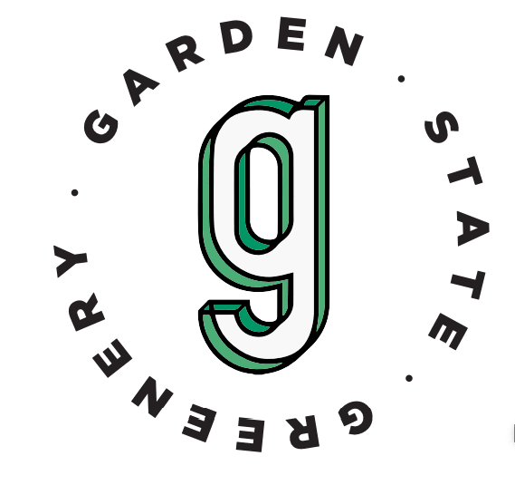
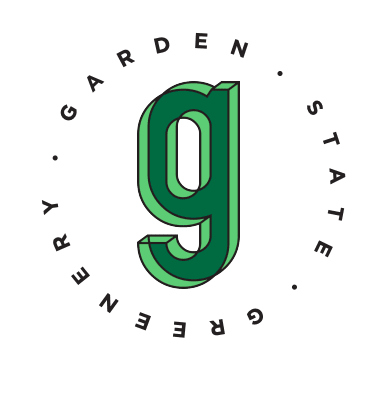
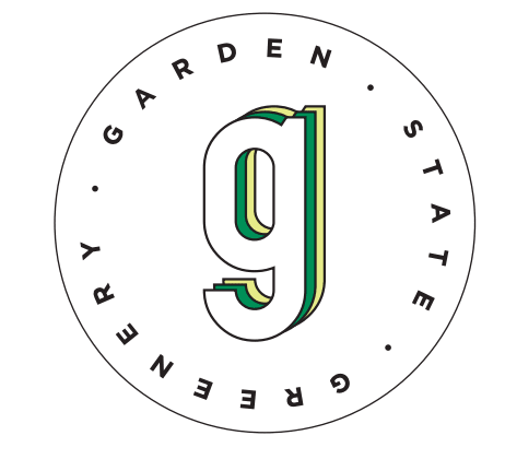
Which design do you like?
Option B won this Ranked poll with a final tally of 26 votes after 1 round of vote counting.
In a Ranked poll, respondents rank every option in order of preference. For example, when you test 6 options, each respondent orders their choices from first to sixth place.
PickFu requires a majority to win a Ranked poll. A majority winner differs from a plurality winner. A majority winner earns over 50% of the votes, whereas a plurality winner earns the most votes, regardless of winning percentage.
If an option does not earn a majority of votes, PickFu eliminates the option with the lowest number of votes. The votes from the eliminated option are reassigned based on each respondent’s next choice. This process continues in rounds until a majority winner emerges.
Scores reflect the percentage of total votes an option receives during the vote counting and indicate the relative preference of the respondents. If there is no majority winner, look to the scores to see how the options fared relative to one another.
| Option | Round 1 |
|---|---|
| B | 52% 26 votes |
| C | 26% 13 votes |
| A | 22% 11 votes |
11 Responses to Option A
I found them all equally pleasing
I think A and B are the easiest to read. I like the design of A the most and the font was the best, but I liked the colors in C more than B.
the first i chose was really nice
I really thought Option A was the most original, interesting and eye catching logo. I love the depth of the large g, but with minimal color.
I like the green around the 9 in A the best. I really didn't like the full on green 9 so that left the green and yellow in the middle.
In option A the lettering is bigger and eye catching. The design on the G helps it pop. With option B it is still get size lettering and the coloring in the G makes it better to see. The logo in C just looks smaller then the other choices.
I like A the color and the size of the lettering, B I like the green shading, C the lettering is too small.
I like the look best in this order.
the hollow "g" looks best to me, and I like it to be transparent as well
This logo is easy to see and stands out
my first choice is much better two
26 Responses to Option B
B is easiest to read.
I like b best since it is bright green and really pops then asince is gree to but like it filled in then c since it has yellow it is my least f vorit
I like B because the "g" is filled in with color so it stands out more. I like A because I like how dark the shading is.
I like the 3d colors of B the most
I love B, the color and fade is great. C is good and attractive, but I do not like A at all. It almost looks like it is blurry.
I like B because I think the green G in the middle stands out and the font size of the name around it in the circle is just the right size. I like C alright, but the G doesn't stand out as much for me as B. C is also just okay, but a distant 3rd from B.
The shade of green really makes it stand out. It fits really well too since gardens of course mostly green.
B is bold and cool.
The colored in g stands out the most so that it would be easy to remember it.
Option B is bold and eye catching. The green G is very fitting for the company name.
B i like the solid color green better. A the green outline looks better than the yellow. C I don't like the yellow in it.
I think that Option B is the most eye-catching and colorful.
Green indenties with garden well so that one that is more green is fitting
B just stood out the most visually to me, probably because of the very green G. C was my second choice for the same reason, he stood out more than choice A
Be stands out more. You can see the G better in it. The different colors of green make it prettier.
First choice has better use of color green.
Option B has the solid green 9 which pops from the logo and immediately grabs attention pulling me in to read the verbiage in the circle. Option A uses bold font that is easy to see and attracts my eyes to the verbiage. Option C uses a thin lettering font and is too generic.
I liked option B the best because the bold, green logo immediately catches my eye. I also liked option A because although it's not as bold as option B, it still is quite eyecatching. I liked option C the least because the logo gets a bit washed out and as a result does not catch my eye as much as option B or option A.
I chose option B first because the color scheme was simple and the font looked good. I chose option C second because I liked the circle in the logo, the font, and the colors chosen but it was a little too simple. I chose option A last because the font was too blocky and the g in the middle had an odd look to it and the logo was not very vibrant or colorful.
I think the solid green letter really stands out much more
I chose B because i like the all green and the font of the lettering it pops out more
B is the best for me and it is because of the green g. I like the contrasting colors. It is eye catching and modern.
I chose B because it was the one I liked the best. The logo should have as much green as possible.
I like option B. The green g looks great in the logo.
easy to read from a distance
Option B is definitely the best design with the bold color g.
13 Responses to Option C
I will probably be visiting this store. I would much rather see C it is the most well put together. A is a little hard to focus on. B hurts to look at.
I like how the font of C and A appears lighter. It makes those options more modern.
The font size could be a little bigger on this one, but the logo is the most readable and distinguished of the three choices. The other two begin to look blurry. The yellow in the logo makes it pop a little better, too.
this is the best one by far
I'm honestly not a fan of any of them but I like the C the best because it seems the cleanest and easies to understand. I don't like A because the g looks like it is blurry.
To be honest, I'm not a huge fan of the design. That being said, here are my reasons for the choices I made:C- I feel like this is the most professional looking of the three. The circle around the text, the font used, and the three layers of the "g" all combine to make the most attractive logo.A- Although I'm not a fan of the font used in the circular text (I prefer the one used in C), the "g" looks pretty good.B- I do like the font used in the circular text (it is similar to C) but the two colors of green look a little off. Probably because I tend to think of shadows as darker, but it is reversed here.
The first logo looks the sleekest to me, because it reminds of the old Sonics logo.
I prefer the first two logos that I chose because they both have an uncluttered look to them. I like the fact that the G is not filled in with color as it keeps the inside of the G white. That makes the G more noticeable and it stands out more. The outlining of the lettering makes it pop off the page. My first choice has a green and yellow outline and that makes it really stand out even more.
I love the clean look of C with the plain G in the center. It is classy but not so much that it would be overlooked by common people.
The three color combo is my favorite.
option C has the best appearance because the circle around the text makes it easier to follow and read and the G has a clearer and more even-look. the other ones look too cartoonish.
I like option c the best because it seems to be more clean. I prefer a over b because I don't like the green g
C is easiest to make out the lettering, A is too dull
Explore who answered your poll
Analyze your results with demographic reports.
Demographics
Sorry, AI highlights are currently only available for polls created after February 28th.
We're working hard to bring AI to more polls, please check back soon.

