Poll results
Save to favorites
Add this poll to your saved list for easy reference.
Which of these designs do you prefer and why?
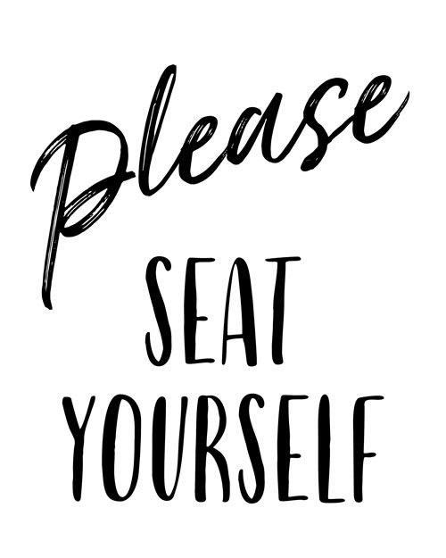
Option D won this Ranked poll with a final tally of 31 votes after 3 rounds of votes counting.
In a Ranked poll, respondents rank every option in order of preference. For example, when you test 6 options, each respondent orders their choices from first to sixth place.
PickFu requires a majority to win a Ranked poll. A majority winner differs from a plurality winner. A majority winner earns over 50% of the votes, whereas a plurality winner earns the most votes, regardless of winning percentage.
If an option does not earn a majority of votes, PickFu eliminates the option with the lowest number of votes. The votes from the eliminated option are reassigned based on each respondent’s next choice. This process continues in rounds until a majority winner emerges.
Scores reflect the percentage of total votes an option receives during the vote counting and indicate the relative preference of the respondents. If there is no majority winner, look to the scores to see how the options fared relative to one another.
| Option | Round 1 | Round 2 | Round 3 |
|---|---|---|---|
| D | 40% 20 votes | 42% 21 votes +1 | 62% 31 votes +10 |
| C | 24% 12 votes | 32% 16 votes +4 | 38% 19 votes +3 |
| A | 24% 12 votes | 26% 13 votes +1 | Eliminated 13 votes reassigned |
| B | 12% 6 votes | Eliminated 6 votes reassigned |
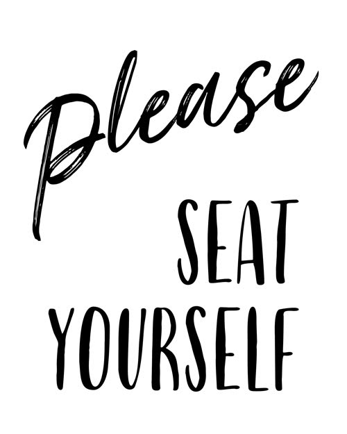
12 Responses to Option A
These designs are the strongest in terms of style and presentation
I think it looks best with "please" being in the fancy font and then the centering and alignment of A just looks the most natural.
I would rank them in this order with choice A as my preference. I like choice A because the writing is plain and legible. Doesn't mess with cursive or a font that makes any of the words harder to make out.
A has a more engaging and less intrusive display.
I think having "seat yourself" together makes sense - it's a lot easier to get the intention at a glance. It also looks better, visually, to have the two fonts separate.
Like brush stroke font in A and D. Seat biased towards right looks slightly better in A.C and B looks identical. All options look great. I just personally like the white peaking out of black fonts a little better.
I like the variants that have the please in cursive to emphasize that the guest is welcome and we are pleased to have them in choices A and D
Emphasis on the please makes it most polite in its inflection. And the centering of it just looks most aesthetically pleasing
"please" is the nicest word so should be nicest font.
Don't interrupt block print with a word in cursive - options C and B are out! I think Option A works best. You've got the cursive PLEASE at the top, grabbing one's attention, and the block SEAT YOURSELF pushed to the right side, working to balance the image.
Option A is my favorite because it is balanced in that Please is centered and seat yourself is pleasantly right-aligned. I think the options where Seat is the biggest part of the image is helpful but maybe a little too forward. Option A does it in a sweet and comforting manner.
I like all of them but A is my favorite
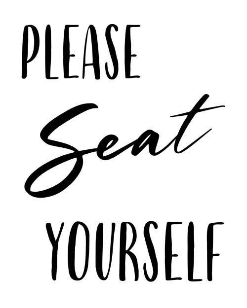
6 Responses to Option B
the font in option B stands out more in my opinion
i think the bottom two options are more readable
Options B and C font style is clear and nice to look at. Options A and D are ok, but the font could use some work.
B is my top choice because it is clear, has a good font, and has a good structure to it.
I prefer option "B". The design looks unique and creative. The font looks great overall.
I like how “please” and “seat” are in larger font
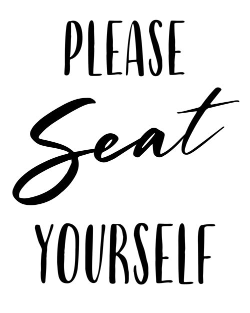
12 Responses to Option C
compare to best font style choose this option
Best looking option overall and choice for image
i ranked the product and company logo by how well they fit for advert purpose and how enticing it look.
This design is preferable because it is more riveting. The design will be follow through by the readership.
I like C and B because the word seat is italicized rather than the the word please. I like the size of the word in choice C. Choice D and A, the word please is italicized and it seems like it has an attitude or something.
I like how it goes normal font to italic and back to normal font, and I like how it goes from left to right the best like in my first choice.
C looks best to me, the sizing of the text has a nice balanced look and the font has a more cohesive look to me.
I thought it was important for "seat" to be the word that was handwritten in feminine lowercase since "SEAT YOURSELF" in all capital letters felt too aggressive. C had a more feminine looking font than B.
I selected C because it is the easiest to read because the fonts are better and they are darker. Selections A and D are harder to read becasue the letters aren't solid but broken.
based on what looks better and is easier to read
I like Option C because the font was easier to read. I like the focus on seat.
it looks better when the cursive font is in the middle so C and B are better
20 Responses to Option D
I like option D the best because the layout looks the most organized.
I think having "please" in the different font makes more sense, and the layout in Option D works best in my opinion.
I think the please rather than the seat should be emphasized here. I preferred the font and layout of B
Options D and A of "please" in cursive makes it more of kindly request and being courteous.
I prefer D Because the fonts used in this design was very attractive and good looking.
I like the ones that have "please" italicized best. The other options are a bit more difficult to read clearly.
I ranked D and A as higher because I believe that the thought of Seat Yourself should be in the same font for both words. B and C are lower because the fonts are separated. D is higher than A, and B is higher than C because I believe the words should be centered on the sign.
I ranked these in order of what is easiest to read at first glance.
I like D the best, I like it being centered. Next is A with the off center. B and C I do not like either way. In my brain it emphasis's the wrong word and kinda makes it sound like a command.
Option D is spaced out best and I like how the word please is in script.
In my view, the 'Please' here should be in a different typeface than 'seat yourself'. I also like it to be centered. So D is my first choice, followed by A. B shares the centered 'Please', so I like that one better than C.
I like D because I think having the word please in cursive looks the best. I like A too but I think D looks better with the words centered. The last 2 for me are just okay but they don't look as good as D.
I much prefer the "Please" being the interesting font because it adds more flow to the text. I like it more.
first options are more polite and less command-like
I chose the order in which I felt the signs felt most pleasant to look at and easy to read in my opinion.
I like this design. It is easier to read. I like the font and I like that sit yourself is in block letters. I know a lot of people who cannot read cursive.
I like that the 1st word is script. It stresses the PLEASE.
I prefer this option. It is easier on the eyes with consistent font use. The use of cursive could confuse some customers.
This option is the most aesthetically appealing
The word "please" being hand drawn evokes a feeling of sincerity; thus, options A and D are ranked highest.
Explore who answered your poll
Analyze your results with demographic reports.
Demographics
Sorry, AI highlights are currently only available for polls created after February 28th.
We're working hard to bring AI to more polls, please check back soon.

