Poll results
Save to favorites
Add this poll to your saved list for easy reference.
Which podcast cover art do you prefer?
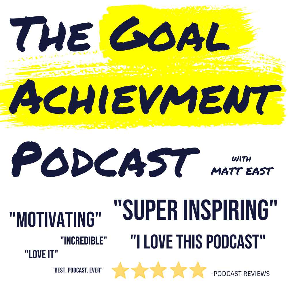

25 Responses to Option A
I don't think a podcaster picture is necessary on a podcast icon.
The profile picture looks out of place in the graphic. Without it the logo looks much cleaner.
The image without his face seems more appealing, it just clutters the image here
I think the option without the guys face looks cleaner.
I like A more. I think the picture in B is a bit creepy. On A, the information and ratings of the podcast are better spelled out and look really good. I like A far more than B. A is very professional looking and I would be interested in learning more about it.
I like just the words. That is a stupid looking photo on the other one.
I think the one without the picture is better because it focuses much more on just the podcast than on the podcaster. Also, it leaves the comments towards the podcast to be much more highlighted and present in the image.
i prefer the ad without the human figure
this one looks more motivating to me
It feels less cluttered/obnoxious without the caster's face on it. I know some people like that, but I'm okay with just the title and testimonials.
I don't want to be not nice, but Matt looks like Curley from the three stooges. I would rather take a chance on the podcast if I didn't know what he looked like. Probably a very nice guy. But all I could think of was 'would I want to listen to a podcast given by this guy?' Probably not.
i think the self portrait is not necessary
The picture on the podcast while some might like that I am partial to keeping it as uncluttered as possible. I know that I enjoy podcasts that look professional and clean and I think just having the font would intrigue me more then the picture does.
It's a podcast. I don't really need to see his face.
Having him on the podcast thumbnail is too jarring.
The image of the man is distracting. I prefer text.
It's laid out neater and much easier to read than option B. Adding the guy's face to option B crowds everything together and makes it seem like an afterthought. Sometimes, less is more.
I like option A without the image of a person because with the portrait of a person it's harder to imagine myself listneing/enoying it
I pay attention to the words more on the one I chose. Both are good though. I like the font, the highlighter, and the simplicity of the design.
I like this cover slightly more because the larger writing makes me read more of the positive reviews.
I chose A because the best reviews stand out and they're all positive.
A because it is not as aggressive and seems like it would be more informative versus just trying to sell you something.
I like the larger words that stick out more.
I like seeing multiple quotes.
Your face is definitely not going to sell this podcast
25 Responses to Option B
i think the photo makes this option for sure better people want to put a face with the voice
I definitely prefer seeing a person associated with the podcast. It seems a tad bit more real and honest.
Its much more interesting with the face attached.
I like putting a face to the name which is why I went with cover art choice B. I know many people who do podcasts or radio shows, you might only hear their face that you don't know what they look like so I like seeing Matt East's face in choice B. There are more words written on choice A which can be overwhelming that I think his face help to break up the art cover as well.
I prefer this option with the photo because it humanizes the content rather than just having text.
I like to see who will be talking on a podcast because I find it more personal and interesting. People who don't know who Matt East was would find it more eye catching too.
I feel more trusting when I can see the host.
I like the picture with the actual podcaster on it; it puts a face to the voice and makes you feel closer to the content of the podcast and who is running it.
SUPER inspiring sounds like a California surfer dude, and I don't like that it's the first thing I notice. It should be smaller font.
Choice B with the person's face along with the bold strong print makes its cover art the most appealing.
I chose option B because I like that I can see the face of the podcast host.
Having someone's photo on the design makes it more personable and easier to relate to. Very helpful for sure!
Option B gives us a sense of who is behind the mic while we're listening. It's also not over crowded with text like A is, making it easier to know the names of the podcast and speaker.
I think it's better to see the podcaster and associate a face with the name and the voice.
P refer it with the picture of Matt because if I'm looking for this content I need to feel a connection with him.
I picked B as I like how it shows the guy in charge of the podcast.
It looks better with the person's head there.
A face behind a product is more trustworthy.
I think seeing the host is interesting. I like it.
I like the options with less and smaller quotes. I think this makes the message come across more clear.
I choose option B because it has the face of the podcaster.
It's nice to see the face of the human behind the podcast, so I strong prefer B!
I like seeing the face to the voice.
I chose option B because I think it makes more sense to have the host of the podcast pictured.
B because I think it is important to have his face on the cover.
Explore who answered your poll
Analyze your results with demographic reports.
Demographics
Sorry, AI highlights are currently only available for polls created after February 28th.
We're working hard to bring AI to more polls, please check back soon.

