Poll results
Save to favorites
Add this poll to your saved list for easy reference.
Which would you pick? (for a bookkeeping software for Youtubers)
Option B won this Ranked poll with a final tally of 31 votes after 3 rounds of votes counting.
In a Ranked poll, respondents rank every option in order of preference. For example, when you test 6 options, each respondent orders their choices from first to sixth place.
PickFu requires a majority to win a Ranked poll. A majority winner differs from a plurality winner. A majority winner earns over 50% of the votes, whereas a plurality winner earns the most votes, regardless of winning percentage.
If an option does not earn a majority of votes, PickFu eliminates the option with the lowest number of votes. The votes from the eliminated option are reassigned based on each respondent’s next choice. This process continues in rounds until a majority winner emerges.
Scores reflect the percentage of total votes an option receives during the vote counting and indicate the relative preference of the respondents. If there is no majority winner, look to the scores to see how the options fared relative to one another.
| Option | Round 1 | Round 2 | Round 3 |
|---|---|---|---|
| B | 44% 22 votes | 44% 22 votes | 62% 31 votes +9 |
| C | 26% 13 votes | 30% 15 votes +2 | 38% 19 votes +4 |
| A | 16% 8 votes | 26% 13 votes +5 | Eliminated 13 votes reassigned |
| D | 14% 7 votes | Eliminated 7 votes reassigned |
Age range
Console gamer
Education level
Gender identity
Options
Personal income range
Racial or ethnic identity
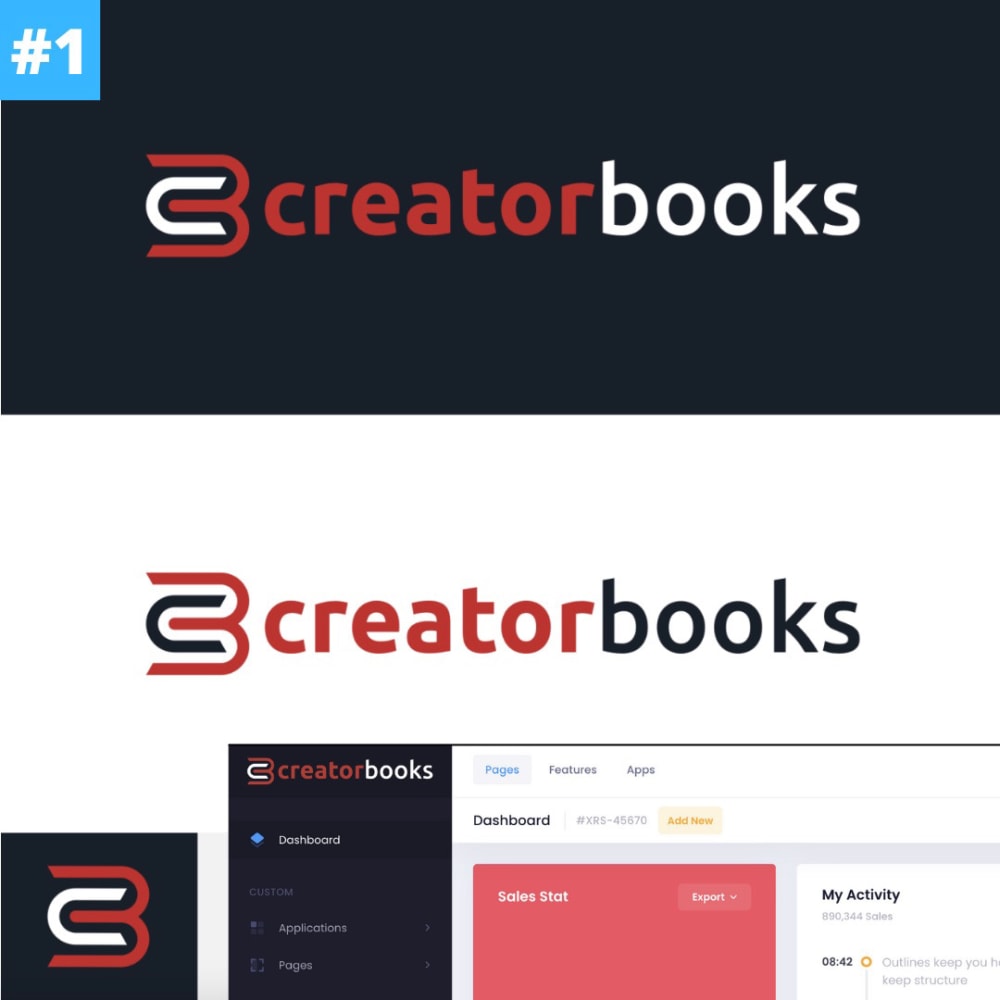
8 Responses to Option A
A and D look creative, clever, memorable, and professional. B and C look very standard.
I like the logo the colors and the bigger black box around the name makes it stand out good over all design>> like logo not a eye catcher>>Don't care for last two
I like the font in A. It's a bit hard to tell because their is comparison of the two colors but I think A and B stick out nicely.
I would choose option A because the logo and overall layout looks the most put together. It looks professional yet user friendly.
a is 1st because i like the way the c and b merge into each other, d is 2nd because it is big and bold, b is 3rd because it looks dull and darker then the other options, c is last because the logo looks like a battery charging and nothing like what you would think for the website
I think all the designs stand on equal footing. I don't really prefer one design over another. I would choose any of these designs positively if presented individually.
The C and B together, integrated as they are in this option, gives you a closer sense of partnering with this company. That is why I would pick this option
Choices A and B look more professional overall as compared to the other choices
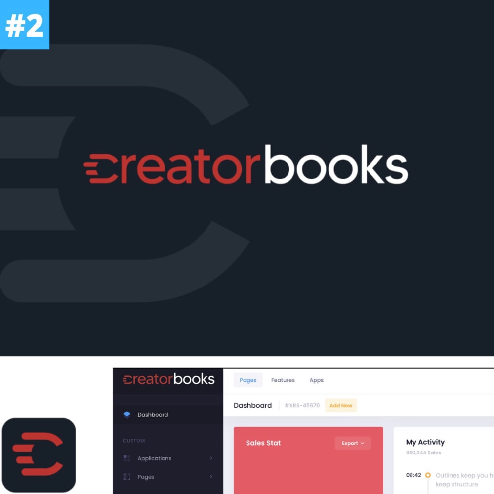
22 Responses to Option B
I like option B, because it provides the biggest logo, with the most overall design attraction.The ad is bold, and the size alone makes it the most attention grabbing.
I like the more square and linear looking logos. I think they are more clean and simple in design while being a modern twist. They are more modern than the bold and curvier designs.
I like option B because the color scheme is easier on the eyes and makes it better to focus on the information.
I really like the logo and the futuristic look of choice B. Seeing this logo makes the product jump out at me. The other options did not give me a similar reaction as choice B did.
I would pick option b because the design catches my eye more than the other designs. I like the layout at the top and bottom.
Option B/Option 2 is by far the best because it is just the big black logo which is my favorite and it draws my attention and it makes me want to learn more about, and try, your product.
I liked choice B since the logo looks confident and engaging. The other logos were not as appealing and didn't grab my interest as much as choice B.
I would choose B. The larger dark background is more enticing to me personally.
those were the layouts i liked from best to worst
The more simpler and minimalistic options looked the best to me as it’s more modern and clean looking.
I picked the ones that most fit the company and dont look too cheap
B had a more professional look. I liked the shape of it more.
I dislike option A the most, it looks like something recycled from a 70's TV set. Option C just looks like copy that was inappropriately taken from an old cell phone company logo. Option D looks like I would expect once knowing what to look for. Option B is surprisingly good, I like that one the best.
I like the background on this the best. The designs in the black box make it look the coolest. C is my second favorite because I like having the white box on top of the black
Option B is the best choice because the logo is the simplest and cleanest. Options A and D are overly complicated and are not as good looking because of this.
I chose what was the most attractive and less busy to look at
I thought B offered the most uniform and coherent layout with the least redundancy, so I liked it best. Next, I thought that C and A were both okay. I didn't like the logo component of D as it seemed too difficult to understand and it took me a while to realize it was a "c" and "b" letter next to each other.
I love the black background. It is a good contrast with the colors. That is why I chose this one. It is attractive. Thank you.
I like option B as the large black label/background looks very nice. I don't see the need for a background that is also white in the same size. I think the large black one is attractive and eye catchy. It also looks more modern.
I really liked the solid background color of option B and the color was a nice choice and look. Option C and D is a good mix of colors, the size is nice also. Option A is good and is on par with option D.
Choice B is my top pick because I like how it only has the black background option, which is the one that I like a lot better then the others which have the worse looking white alternative. I also like the way that the C in Choice B is designed. It has a nice aerodynamic look to it. Choice C is second because I like the little stat box logo next to the wording. I also like how the E was designed to mimic that. Choice D is third because I like the two lines between the C and B but I do not like how the letters themselves are lowercase. Choice A is last because I do not like the logo at all. It just looks weird.
i like the graphics in B, i think the size of the fonts and the colors look professional and attention grabbing
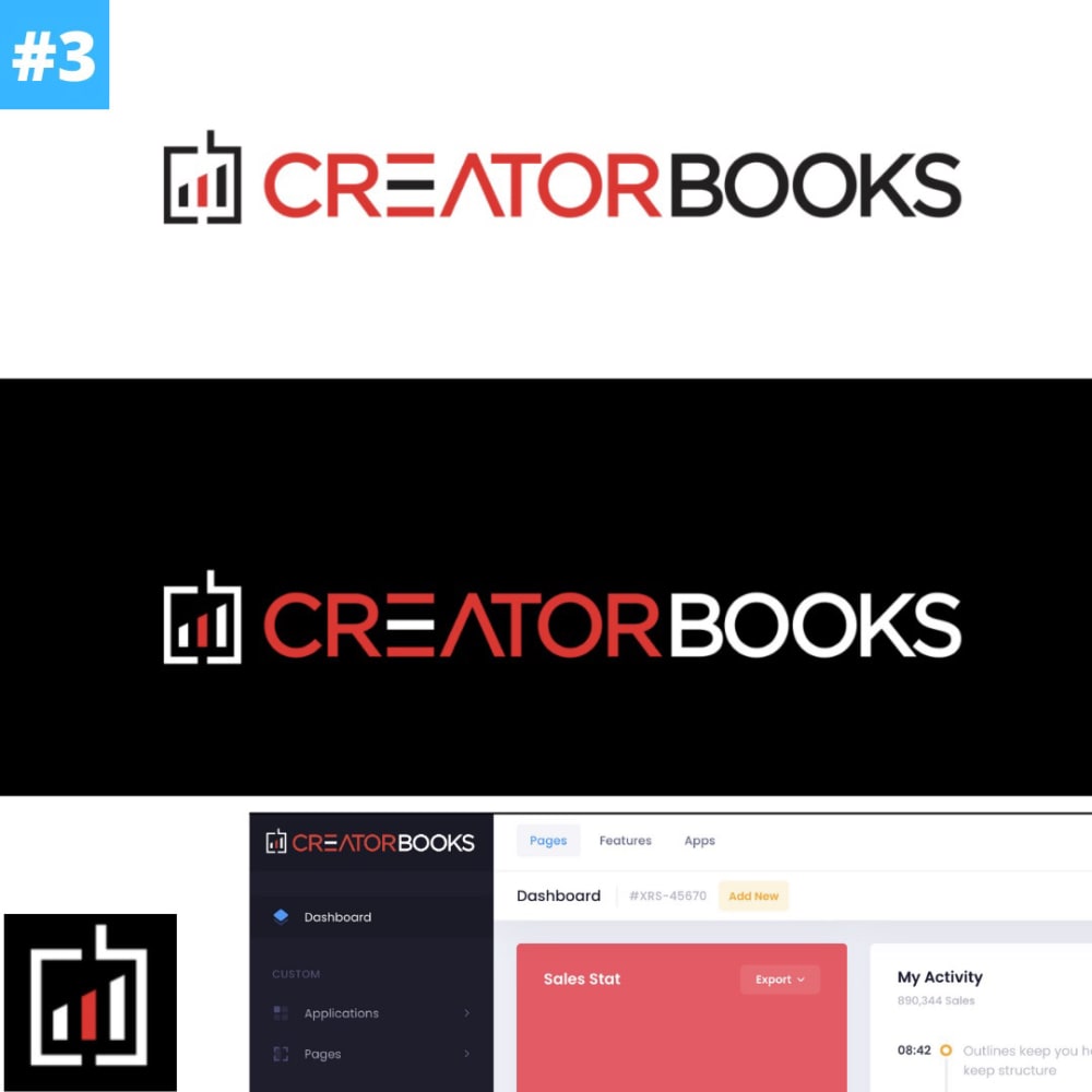
13 Responses to Option C
I liked the little bar graph in C. I thought it was a cool logo. I didn’t like option A. It looks like C3, which is not the name of your product. Choice D reminded me of the old WB network that was on television a few years back. I think it’s the CW now. Option B was just meh for me
I chose based on the uniqueness of the design and which one looked like it was more associated with bookkeeping
I like C because it is unique, professional, and trustworthy. A is eye catching. D and B are boring.
C is an interesting looking logo, I think this one looks professional and communicates the idea of the brand well. B is also pretty good, but a little too dull and not exciting enough. D would be better but the B looks like a ripoff of the Beats By Dre logo.
The first one looks the most professional and stands out. The 2nd one is okay, as is the third. The fourth one looks amature.
The designs for options C and A are vastly superior to options B and D. Options C and A appear to represent progress and advancement, as well as signifying the product well. Options B and D are not nearly as alluring.
The aesthetics are really nice for option c. I just love the font and the color palette. I think it is really nice and I would be drawn to this particular product.
Options C and B are my preferred choices for this type of product because these images clearly convey the concept of bookkeeping software for you tubers, who are creative content developers.
I prefer the options that give larger images of the thumb nails at the bottom. I feel like I am more engaged if I can more readily access that information.
I like choice C because it appears that it has a dark theme and light theme. I also like the bar graph that is in the logo which relates nicely to the bookkeeping nature of the software
I think having the graphs in the logo helps communicate the idea better, and I think youtubers are always interested in alaytics and data, so it would attract them more.
I think C seems like the most appropriate logo for a creator of audio content.
A is last because I don't like how the logo looks.C is first because the logo looks like a productivity software logo.I like B slightly more than D because B is more unique.
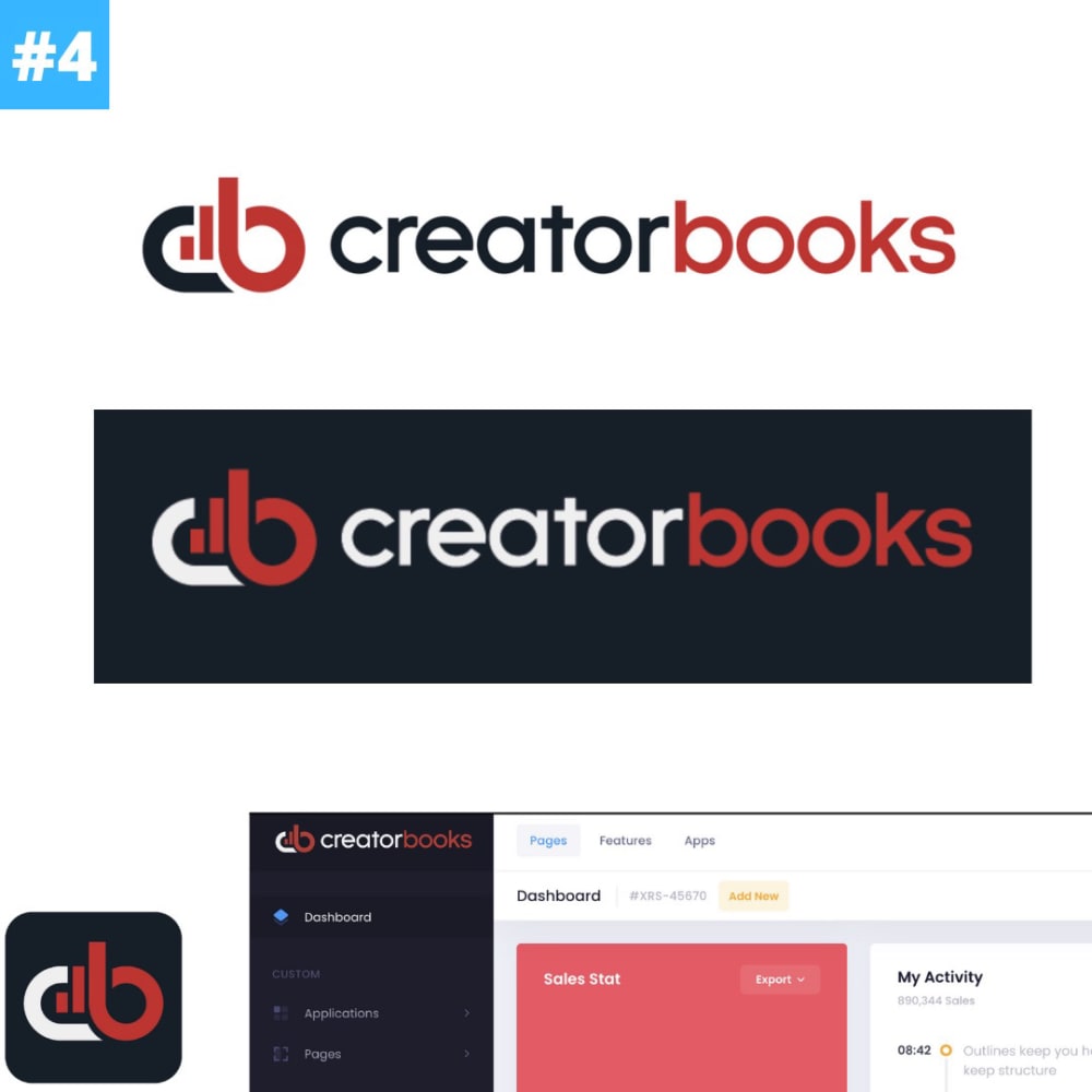
7 Responses to Option D
I enjoyed this the most because it was easy on my eyes and attractive.
I find the black background with white/red lettering impossible to read
Okay the last one I chose last because the big blue Horizontal banner wasn't their best work, and it was a bit unappealing to my eyes.The good ones had the Creator Books top and bottom, but the #1 had THE BEST logo. I like the #2 as well, but the logo in #1 is just gold. The way the C and the B works together, the bar graph tucked together. AMAZING. Same with the backwards B and C in the 2nd ranked option, but I honestly fell in love with the #1 ranked option SO much. LOVE IT!
Option D is my first choice. It looks smart, clean and sleek. Option A also looks modern and interesting. Option B has too much black in the logo portion. It looks awkward and not balanced. Option C has the letters extended on the logo and I find it hard to read and not attractive.
The logo design looks best in option D. I like that logo the most. Next best was C.
The first two are better because the black space and the name of the logo are smaller. It doesn't overwhelm you.
If I was a youtuber and needed a bookkeeping software, I would pick choice D because I like how the font is bold and assertive and the color scheme shows that the software is authoratiative.
Explore who answered your poll
Analyze your results with demographic reports.
Demographics
Sorry, AI highlights are currently only available for polls created after February 28th.
We're working hard to bring AI to more polls, please check back soon.

