Poll results
Save to favorites
Add this poll to your saved list for easy reference.
Which of these podcast cover art logos do you prefer?
Age range
Education level
Gender identity
Options
Personal income range
Podcast listener
Racial or ethnic identity
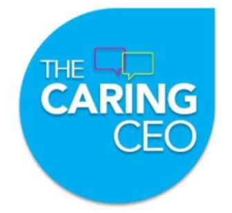
23 Responses to Option A
I like the bold blue background color.
I think the more colorful of A is better to stand out and it's a lot bolder and in your face.
The blue is easier to remember. The White one looks least professional.
I think Option A is more pleasing to the eye than B. B is a little jarring.
Blue is my favorite color so I prefer the more blue in the logo
Blue is my favorite color and I like that it's mostly blue and white which I strongly prefer over the reddish pink color and a lot of white empty space is the logo design.
I prefer higher contrast and fewer colors overall, so my vote goes for Option A which I consider to be more pleasing to the eye. Option B just has too many colors on a white background, and it looks too buys and unfocussed to me.
The white background with bright pink and light blue colors is very child-like. It reminds me of a logo for a children's toy or TV show, not one based on business. The blue background reminds me of technology, which seems more fitting for the company.
I like option A the best because the blue background stands out more to me and grabs my attention.
B has more of a color differential, but to me it doesn’t look good. A looks nice and is easy to read.
This stands out more due to the blue background. I think this looks more complete than the other choice.
I picked A as my top choice as the design and colors make me think of being calm and helpful.
The blue is much more appealing to me over the white background. The blue is the option that seems more vibrant and interesting to me.
I like Option A because the white text stand out best and makes it easy to read.
The shade of blue used in this logo is nice to my eyes and I find the solid background more appealing. While the pink and yellow variations on the alternative may be a bit more compelling, I think the overall design is a bit too glaring on a solid white background.
the white on a blue background is nicer and easier to read than the multiple colors on a white background
Choice a is easier to read
I like the filled in logo. On a white background the logo pops out better.
I like the blue background better. It seems to be more professional. The white background seems empty.
I like that the color bubble is filled in and bright. It is more eye catching and interesting.
Like the bolder color in A. It just looks better overall and is more noticeable to me. I would pick this one
I'm not a fan of the pink with the white. Blue tends to look better with white.
The blue has a more soothing look to it
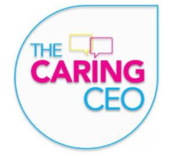
27 Responses to Option B
I like the white background and the way it makes the logo blend in to the website it will be displayed on; it's a more natural look and something about it looks more professional. The deep blue reminds me too much of the Salesforce logo.
The logo that has a white background has better visibility and makes it easily recognizable for me that why I like it more thats why I prefer choice B over A.
The blue fill in I feel is a little too much. The whole white background looks much more pleasing.
I like that this option features colors that stand out more since the hot pink, neon yellow and blue are more prominent against a white background than a blue one.
I like B more. The white background of the logo just looks cleaner and more professional. While A is ok, I think that the overall look of B and the color scheme makes it the stronger out of the two.
I like B because the colors pop and stand out.
The text stands out better.
B has a nice logo and elegant design
Text is easier to read in option B.
I think the color pops more off the white then off the blue. I find the font that is colored to be easiest to read than the white font on the blue in choice a. I think that I am more drawn in on choice b.
The podcast cover art logos I prefer is option B because it is more brilliant and friendly looking which is very inviting.
i like this one because it's more colorful
I dig the whiter brighter one better.
I think B has a prettier color scheme and the colors work well with each other. Option A looks strange with the pink and yellow against the blue background. It's too much blue.
I like the one with the white background because it stands out more.
I find this particular logo more artistic, captivating and riveting.
This looks much nicer and it is much cleaner, too which makes it easier to read quickly.
I am really split on this one. I like the purplish coloring the letter of CARING in option B but I like the blue background of Option A. My ideal would be combining the two designs.
I think the colored letters pop more. And I like the white background.
The pink text of the word "caring" stands out more.
I like the more colorful option, it is very eye catching and appealing
The different colors with white background looks nice. The blue is overwhelming in choice A.
The white background looks professional and easy to read
I light the pink color. It is very attractive and makes your logo stand out more. The other one has too much blue for my taste. Thank you.
Sounds the most appealing and ravishing to me.
Not a huge fan of the pink color on the primary text but overall this version looks better than the other which is just too difficult to see with the blue background and white text.
The white seems a little more promising re: care and I like the pink and the blue combo. It's just a little more inviting than Option A.
Explore who answered your poll
Analyze your results with demographic reports.
Demographics
Sorry, AI highlights are currently only available for polls created after February 28th.
We're working hard to bring AI to more polls, please check back soon.

