Poll results
Save to favorites
Add this poll to your saved list for easy reference.
Which name do you prefer for a business that creates clothing and apparel designed to be tough and durable in daily life.


40 Responses to Option A
I prefer choice A simply because the word forged sounds stronger than tempered.
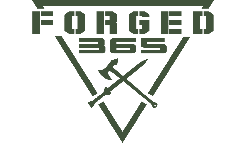
I like the logo better for Option A. I like the sword and axe in that option.
I think that option A is a more interesting company name. I also think that it has a more eye-catching and visually appealing logo design.
I like the sword in the axe in the logo. I think it stands out definitely get people to look at it
I like the colors in the other one more, but the name of this one and the logo sticks out and better fit the brand.
I like the logo with the tools incorporated in them. It makes the logo look more tough and macho.
I like forged 365. I think of metallurgy, which is going to lead to something strong and durable. I think it hits in the right ideas for what you are trying to sell
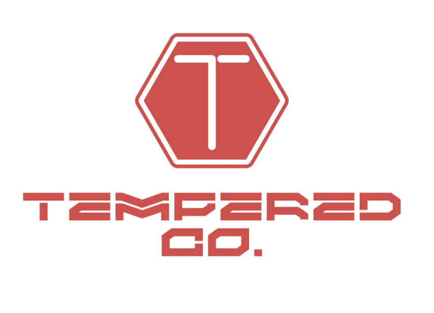
I can’t even read what the other option is the font is so bad.
I think A would be more eye catching and attention grabbing. I also think A has a name that sounds more powerful and modern in which can help attract more potential consumers.
I think this font is a little easier to read and the logo also seems more unique and memorable, the sword and axe are way more notable than anything in B.
The color is outdoorsy, the logo looks tough, and the font is easy to read.
Option A is not obvious that it's for a clothing brand but does convey an idea of toughness. Option B is hard to read and the stop sign symbol is confusing.
I think it screams tough and rugged vs. the other option. I see this immediately as more of a clothing line of outdoors, quality, long-lasting items. More manly in my opinion.
I like this a lot better. I like the name a lot better. I like the green color because it makes it seem like it is made for the military. I also like the axe and sword in the middle
B is more colorful, but A reminds me of the military and nothing is tougher than the military
This seems like a more rugged and reputable brand with the tool shown in A
I like Option A better because I feel that it embodies the description the best. When I think of Forged, I think of Forged in Metal, which is strong. And the 365 could be interpreted as daily.
has better colors, the green is associated with the military so it's tougher
I like option A the best because it stands out the most and grabs my attention with the green color.
I like the logo more.
I prefer option A for a business that creates clothing and apparel designed to be tough because the axe and the sword indicates toughness especially with the crossing of for the X symbol.
I like the logo that goes along with this name. It’s way better than the other logo.
I chose option A because the logo best reflects the brand's direction.
I like the idea of an item being super tough every day. I have a hard time actually reading B. It seems a little too cybertruck.
I like Option A. It's really easy to read. I feel it's fun to look at and would be cool on the clothes.
This rolls off the tongue better. The axe and sword are pretty effective. The logo is all around easier to look at and read than the one in B. The green color suggests a rugged outdoorsy-ness.
I love the look of A it makes it seem rugged and tough and would be high quality.
I picked A as my top choice as the green tells me that it's a very bold and green brand.
This name sounds more rugged and durable.
I liked option A better because of how the logo and the text is part of one element. I thought this was really creative and I liked it. I liked the colors and liked the logo better overall.
Both are pretty good. I like the 365 because it implies all of the time. I like red better. The green reminds me of military, which I actually like but red has power to it and it stands out a little more
I like option A best because I think the title is catchy and I also think the design for the logo is easily read and represents the products well.
The axe and sword immediately give off the vibe of strength and toughness.
I like option A the best because I think more people would understand the meaning of Forged than they would Tempered (shown in option B) when it comes to associated both words with something that is tough and durable.
I think that "forged" creates a more clear mental image of something that is made well and made to last.
I like choice A because it looks more bold and strong compared to choice B. In addition choice A is also more readible.
FORGED works best. It's strong, formidable, and I love the sword and sickle!
I chose "Forged 365" because it inspires thoughts that are in line with toughness and durability. When I hear forged, I think metal and strength. The 365 tells me every single day out of the year. Combined to "Forged 365" makes me think these clothes are items that I can wear every single day and they will last, they are strong and durable and of high-quality.
After carefully studying and comparing both proposed names for a business that creates clothing and apparel designed to be tough and durable, I selected Option A over Option B as my first preference and the one that I would more likely click on to learn more about. There is a certain ring to FORGED 365 that leads me to believe that the products would be tough. I also preferred the logo for the name.
I like the design of the logo
10 Responses to Option B
I like Option B because of the visible Red and White color and design.
I liked option B better because option A looked more like a logo for a video game. Option B had a more rugged look to it as well.
B feels more confident and assured of itself to me. A feels a little insecure.
I feel that B's name and logo meshes much better with what the brand is about.
I feel like Option B will have more wide-ranging appeal since Option A having the sword and battle axe will inevitably conjure to mind images of violence (which may appeal to some, but be a strong turn off for many others).
I like the name in option B because it sounds more innovative and creative. Option A does not resonate as much with me!
Sounds more authentic and sticks out.
Tempered makes perfect sense to me because tempering chocolate or metal makes it more stable and durable, which is exactly what the company is looking to portray. Also the choice of using red fits perfectly with the tempering metal reference.
I would rather B because I think that the logo is much sleeker and looks more forward thinking. A is ok but it’s almost a little too detailed and distracting.
B is more unusual.
Explore who answered your poll
Analyze your results with demographic reports.
Demographics
Sorry, AI highlights are currently only available for polls created after February 28th.
We're working hard to bring AI to more polls, please check back soon.

