Poll results
Save to favorites
Add this poll to your saved list for easy reference.
Which logo is more appealing?
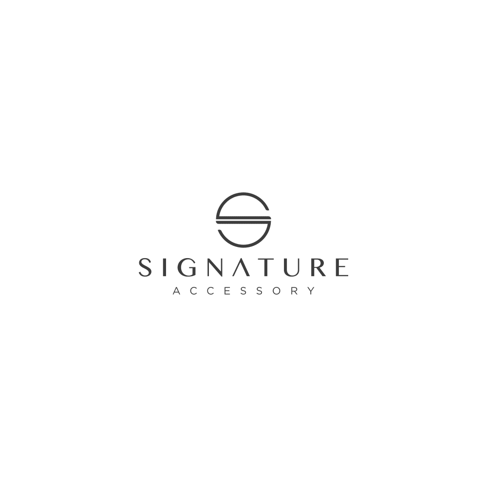
11 Responses to Option A
They both look good but A seems more high tech and modern
Option A has a clearer image. I think the circle has a more prestigious feel. I like the idea of this company, and I would be happy to trust it.
I like the simplicity of this logo
it looks a bit cleaner, more sophisticated.
It has a more modern look to it and looks less like a hotel logo. It reminds me of another higher end brand of accessories as well
The S on Option A is really classy looking. Can't tell that's a S on Option B.
A seems more upscale and classier, although it also seems more familar. Is it too close to something else that I can't quite put my finger on? Either would work fine, but option A puts off a higher-end image.
A's logo is more elegant, although I like both
i like the clean s for signature
I like this one better. It looks more sophisticated and more high-quality.
This S looks so sleek and modern. Reminds me of a chic hotel brand!
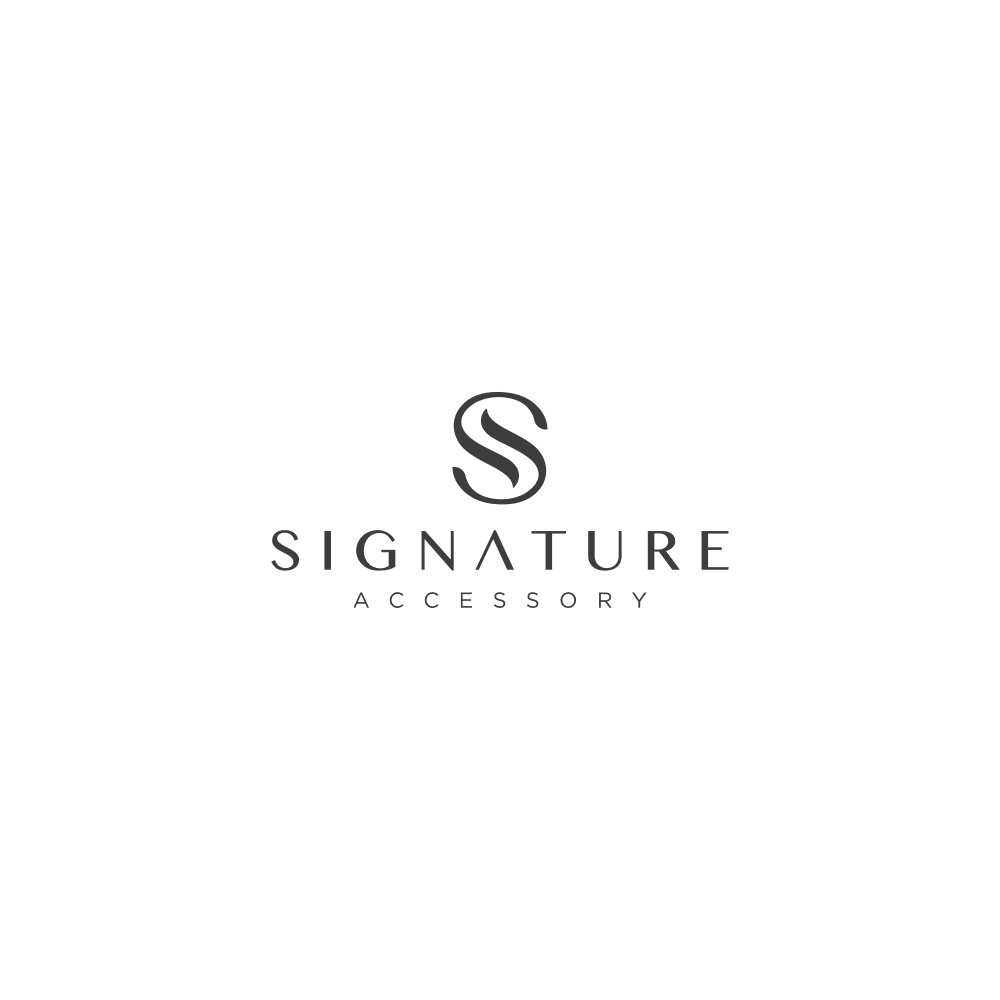
39 Responses to Option B
It looks cleaner and more elegant than choice A
The logo S is more fancy and seems high class.
THe S is more professional and makes me want to learn more versus the least professional looking one
The 'S' doesn't stick out as well in the other one. This one looks more prestigious and nicer in my opinion anyway.
the s looks more elegant that the other logo. Someone with refined taste would perfer B
I prefer the logo in option B because it is great design on the S. I think option A might get taken for something other than the letter S.
This clearly looks like an S whereas the other one looks more circular
The logo seems a bit more symmetrical.
It's a more elegant "S" for signature, it looks a lot more classy.
The s for the name is better.
I think the curvy lines of the s logo is really pretty and eye catching on B. I looks elegant A's S is not appealing to me. Can't really tell that the logo is a S and it's too block like
i am definitely saying choice b is more appealing! I like the fancy S and how it is written with 2 lines. I have never seen that before and just think it is amazing! I have seen option A before and find it boring. It looks like the local Macaroon shop logo. I had a hard time seeing that was an S and not one of those EOS round lip balm containers that are like $5 bucks and my kids always want, and always lose first time they take to school. Option B, all the way!
B because the logo on A does not look like an S.
this logo looks more expensive and high end
The letter S is more appropriate to the label and more clear that it is a letter S, and it is just a more beautiful logo.
I think the "S" in this choice is more elegant looking. In the other choice, you wouldn't even know it's supposed to be an S. I'm not crazy about the "A" in Signature in either option though.
Prefer the S on the logo. It looks more elegant and professional than the circle one. Also like that it's slightly darker.
I think these are both pretty great but I really love B. When I first saw it I immediately thought of Luxury!
more elegant and classy, looks nice and stands out
A looks very familiar. I can't place it, but it looks like something I've seen before. To make your brand stand out, I think B is the better option. I've seen similar to B, but there's still some uniqueness to it.
The curves and roundedness are much more inviting.
I think the fancy s in the choice b looks more elegant. It make me feel like it is a high class product.
B definitely catches my attention and makes pay attention to the rest of the logo.
Option B has more of a high-end, "luxury" look to it.
it's definitely more classic and therefore classier.
The design displays the S in a more straight forward way,
I like the look of B much more than A. B's logo looks much like a fancy S, which is appropriate since the company's name is Signature. A's logo is boring.
The way the letter is formed looks classier
B is thicker so it stands out better than A.
THE DETAILS ARE MORE APPEALING
I like the font in B a little better.
It's easier to make out the S logo above the words in B.
The logo still easily comes across as an "S", while being much more elegant.
I think option B is more appealing, it definitely is to me personally. This logo I think would be one to easily remember and recognize if you saw them in a store or on an ad.
I like B. It's a little more fancy. Kind of classy, A seems typical, everyday, boring
The S is much more artistic and creative. It inspires.
This has a more classic, sophisticated look. It actually took a second, when looking at the other choice, to determine that the logo was an 'S'.
I chose option B because the logo looks more like cursive writing.
I like this one the best. It reminds me a little of the Hilton logo. I think it is classy looking.
Explore who answered your poll
Analyze your results with demographic reports.
Demographics
Sorry, AI highlights are currently only available for polls created after February 28th.
We're working hard to bring AI to more polls, please check back soon.

