Poll results
Save to favorites
Add this poll to your saved list for easy reference.
Which logo is more appealing?


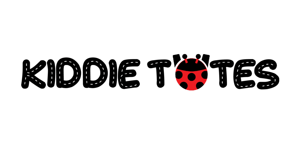
23 Responses to Option A
Appeals more to kids for the product.
looks more appropriate for a child's brand
It's more fun and bubbly
this is more aimed for kids which is what they are going for.
I LIKE BOTH BUT I THINK CHOICE A IS MORE APPROPIATE
I like the font with the design in it.
I prefer the A picture. I really like the lettering in black. It just seems to be much more bold to me.
The bigger writing is what caught my eye. I guess being older, bigger writing is always going to jump out at me.
I think the thicker font is cute and stands out more.
I like the quilted thread pattern on the letters for choice A. It reminds me of the kind of stitching that might be a on a cloth tote. The bold, black, capitalized letters also stand out more than on the red and black letters.
i think this is cuter
This one is cute and is appealing to little ones
Just seems a nicer design and easier to read. More engaging somehow.
It's nicer looking and easier to read. The font is a lot more unique looking.
It looks more like it represents a product for kids. Just that simple.
This logo seems more noticeable and relates better to children, I feel.
I like A better as I like keeping the lettering in all black form. I think A is easier to read as I immediately saw Kiddie Totes but B sort of looked like the ladybug was doing a V shape with its arms. A looks more like the logo for a children;s brand to me also. Besides the ladybug, B looks doesn't immediately show itself as a children's product to me. I think A looks better, is clearer, and fits the targeted demographic better.
The logo in option A really stounds out. The font is fun and youthful. I also think that it is very unique and memorable.
I like the logo more as it is more kid-oriented. The bubbly letters accentuates that feeling.
The wider letters with the stitch-like centers are easier for me to read, they are more visually appealing, and the color of the text is easier on my eyesight than the other option/
I have two younger kids, Kindergarten and Second grade. Based on my experience with them I think they would like A much more than B. I also like it as well but I am very positive in their choice and if they saw this they would want to look at A more than B.
Kid friendly font and eye catching pattern in the letters.
The black text is easier to see than the red and black text. The lady bug is easier to see on the all uniform black text of A.
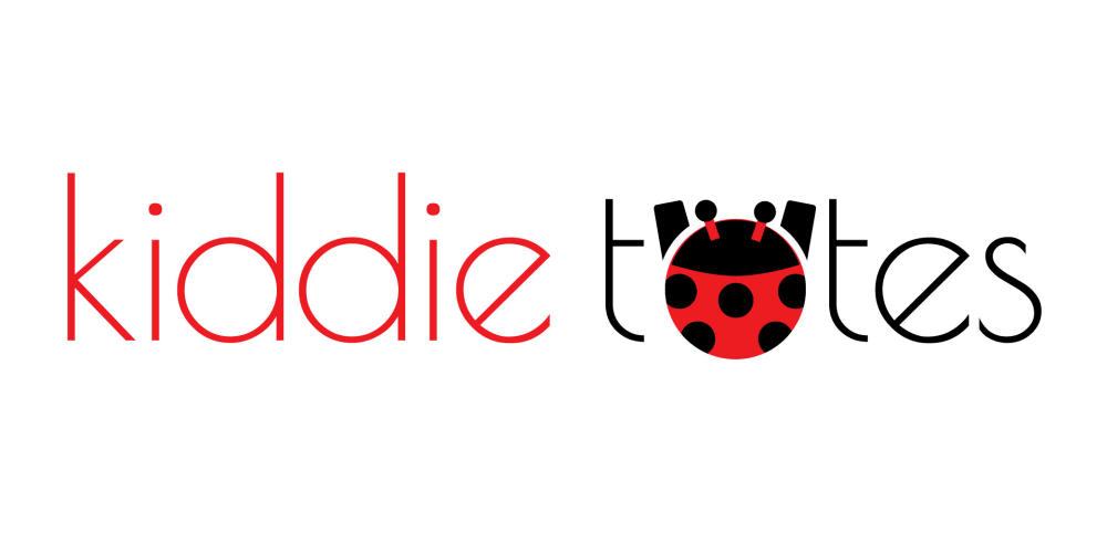
27 Responses to Option B
this looks much cooler
The other font looks like a road
I don't like the white lines in option A.
I like the contrast of the two words with different colors
this one looks very clean and easy to read at a glance, very modern too
i like the modern artistic feel of B
A looks like a road, the font of the letters, and that is incongruous with what the product seems to be
I like the solid font in B and that they are lower case letters, it draws me in more whereas A looks too serious and turns me away
Really, really hate the "road" font. It's so dumb and juvenile
I like the font better on Choice B. It has a "kiddie" feel but is not cheesy, like Choice A. It also looks cleaner.
It's not as 'childish' and I feel would be more appealing for a longer time. It's 'timeless' if you will.
The layout is cleaner and seems more expensive.
Sometimes simple is better.I like this logo more because it is less congested. I like font because it is much less obnoxious than the former. I like the placement of the ladybug and how it makes the logo really stick out.
Its easier to read and the font is even more kidish
this option looks more professional the line srae cleaner and has alot more detail while being simpler
The style is much clearer than the white dashed lines in black letters font.
It looks more professional, it gives the sense of being of better quality, but is still fun,with the bi-color and ladybug. Is easier to read and less busy than Option A .
I prefer this option because it is easier to read. The different fonts of the two words cause a contrast and make it more readable.
I like the use of the red and black together--these are my school colors, and they will always get my attention first.
The text is cleaner and easier to read. I would remove the arms of the lady bug but it is a very cute touch and eye catching.
The lighter color of the font makes this more easy on the eyes
It looks fun, clean, and interesting. I love the font and also that the adorable ladybug is larger in this option. I also like that both words are in different colors; very well done in that it doesn't look messy or confusing.
The other logo is more kid-friendly, but the kids aren't paying for this. The adults are. The logo is more adult friendly.
This one is more modern looking I think.
more streamlined design
I find the lowercase lettering more readable and more child-themed or simplistic which makes this logo better suited for a children-focused product.
It's cleaner and less busy.
Explore who answered your poll
Analyze your results with demographic reports.
Demographics
Sorry, AI highlights are currently only available for polls created after February 28th.
We're working hard to bring AI to more polls, please check back soon.

