Poll results
Save to favorites
Add this poll to your saved list for easy reference.
Which logo do you prefer for kitchen appliances/products?
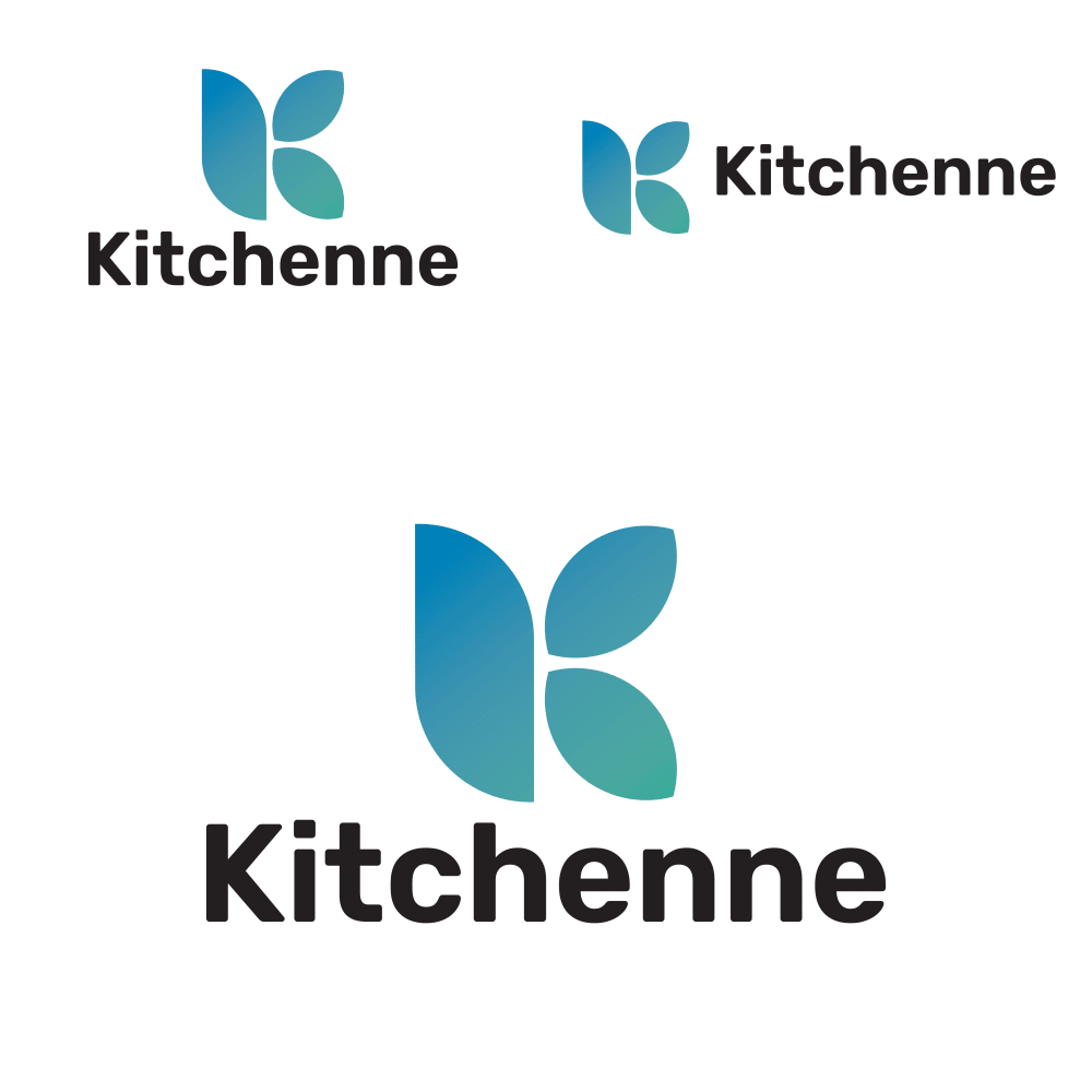
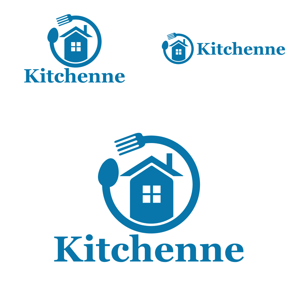
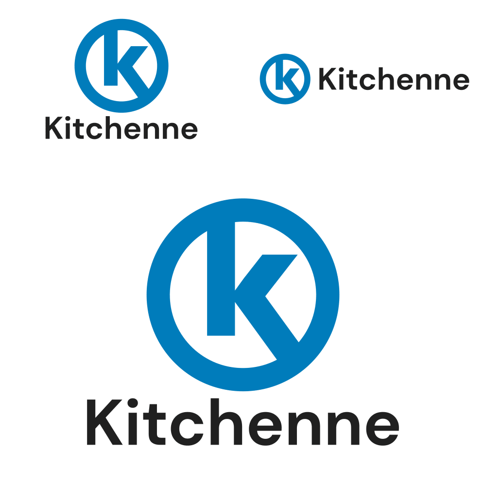
Option A won this Ranked poll with a final tally of 28 votes after 2 rounds of votes counting.
In a Ranked poll, respondents rank every option in order of preference. For example, when you test 6 options, each respondent orders their choices from first to sixth place.
PickFu requires a majority to win a Ranked poll. A majority winner differs from a plurality winner. A majority winner earns over 50% of the votes, whereas a plurality winner earns the most votes, regardless of winning percentage.
If an option does not earn a majority of votes, PickFu eliminates the option with the lowest number of votes. The votes from the eliminated option are reassigned based on each respondent’s next choice. This process continues in rounds until a majority winner emerges.
Scores reflect the percentage of total votes an option receives during the vote counting and indicate the relative preference of the respondents. If there is no majority winner, look to the scores to see how the options fared relative to one another.
| Option | Round 1 | Round 2 |
|---|---|---|
| A | 42% 21 votes | 56% 28 votes +7 |
| B | 42% 21 votes | 44% 22 votes +1 |
| C | 16% 8 votes | Eliminated 8 votes reassigned |
21 Responses to Option A
I like A the most because the logos are simple and minimalistic. I also like the transition of colors. B is my second favorite because the logo is really creative I like the circle of a fork and spoon around the house. C is ordinary but I did like it as well I just think the other choices are better.
I prefer option "A". The logo looks unique and appealing.
I like A because I like the design the best
A is my favorite because of the elegantly colored logo. B is my least favorite because the spoon and fork circular portion looks a little awkward.
I really didn't like any of the choices because they all felt either too ugly and/or did not say anything about the brand. Option A and Option C's logo does not communicate anything about kitchen appliances or products. Option B's logo feels way too generic and it feels more fitting for a discount brand of kitchen products.
It's cute and original!
Option A is the most stylized and appealing to me. Option C is basic, but looks more modern and sophisticated compared to B.
I feel like this logo is memorable and definitely unique.
I liked a because it was unique and b because it was relatable. C was boring and I did not really like it.
Option C looks too much like Circle K gas station's logo. I like the K in the Option K graphic.
Bold and eye catching. Comes off as friendly with the smooth edges
The softer logo looks more friendly and inviting than the other harsher logos. This one is more like a leaf or water drops.
A: Modern graphics look, like the curved edges.C: classic.B: don't like the shape of spoon.
My first choice was the best looking logo because
I picked A and B as my top choices as I like how the design of the logo makes it look like it's made for homing.
A is BY FAR the best. Easy to remember and modern and stylish. Doesn't look cheap like C or old fashioned like B
Option A looked the most new and different to me, and also still fit an appliance company
I really appreciate the simplicity of A and how the blue shifts to green. C bores me. B bugs, as I live in an apartment -- and truly it doesn't bug, but it assumes things at a glance and might be a turn off.
A is the best looking to me because it looks sleek and modern. It is also memorable
A seems the most modern and sleek, it gives the feel of high quality products. B seems cheaply designed and would make me think it's a knock off brand.
A's symbolism in the logo has the least bad connotation. B looks nice, but the house is so vague and the ouroboros style logo has earned a bad reputation with a lot of people. C's circle and k logo is too similar to the circle K gas station logo and a circle and the letter K have bad connotations, and connections to the things like the KKK or slurs used against groups like Jewish people, if the designer wasn't aware.
21 Responses to Option B
B's logo stands out to me the most as it has the most detail to it and looks the most pleasing.
They all look nice, so I just decided based on what felt the most unique and interesting.
I like the kitchen and the house. The K is not unique for me.
Not only does this logo stick out well, I like the fact that it is all one color. It's the most memorable too.
I chose option B logo first because the circle with the spoon and fork and the home clearly communicates that this business makes kitchen appliances and products. I chose option A logo second because I do not like the the option C logo looks like the popular circle K logo.
B is the more unique looking logo, this stands out the most to me and I think it gives a better idea of what products it represents.
The fork and knife element around the name is very interesting and unique so it's my top choice
I chose my top rank based on the kitchen related items in the logo, it's visually appealing and matches the theme of their brand. The other two were less appealing to me.
I like the blue color of my top choice, and the image of the house evokes a feeling of warmth and comfort. Very nice logo design for sure!
I think B is adorable! I love the spoon and fork forming the logo, the little house in the middle and all of it! I think it's so cute and a classy design that looks down to earth and just perfect.
C's logo felt a bit too generic. I liked how informative the logo was for B; it felt very homey.
B is much more creative and fits the company very well
I prefer Option B because the logo makes use of different imagery that you would find in a home and kitchen. Option C is the worst because it makes me think of the convenience store chain Circle K. That leaves Option A in the middle by default.
The logo is designed to impress. The product logo is uber likeable and easy to induce practice.
I selected the logos for kitchen appliances based on my personal preference.
I think option B looks more homey and inviting. I chose C last because it looks too corporate.
i love the utility cord around the logo.
I would be a fan of choice B because the logo is a house and the logo is welcoming.
B is perfect it sums up what you are doing in the entire logo. I would not go with option C it looks like the Circle K store.
Option B most closely resembles a home and the items that would be included in a kitchen like the fork and spoon.
Option B is so cool, and with the fork meeting the spoon, it indicates KITCHEN much more than do the other two options.
8 Responses to Option C
These logos stood out the most in terms of color and design
C has a stronger design and a brighter template that is more enthrallin.
I ranked in order of what stood out the most.
I like the simplicity of the logo. I like the dark blue color with the K inside. I think it is simple , but it looks very professional and intriguing overall. I am not a huge fan of choice B , but choice A is a decent option overall. However, I like choice C more.
C is simple and straightforward which is admirable. A is too cutesy and childish. B is too convoluted.
I like the simplicity of the K logo shown in C with the alternative in the leaf design being neat in A here
I ranked these based on what I consider simplicity and ease of recognition.
i ranked the kitchen product logo design by how well they look meaningful and fit for package advert purpose.
Explore who answered your poll
Analyze your results with demographic reports.
Demographics
Sorry, AI highlights are currently only available for polls created after February 28th.
We're working hard to bring AI to more polls, please check back soon.

