Poll results
Save to favorites
Add this poll to your saved list for easy reference.
Which logo do you prefer for a curly hair product line?
Age range
Education level
Gender identity
Number of kids
Options
Personal income range
Racial or ethnic identity
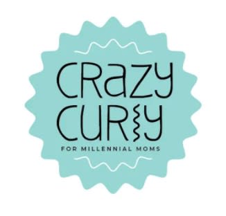
29 Responses to Option A
The logo design of curly shape circle coordinates with the text-"Crazy Curly ".
I like the funkier design, it is more fun and unique.
I choose option A for the flashy logo.
A has a more robust and genuine feel to it.
Option A is appealing. I like the over look and the wavy look to it
I prefer the blue color of A to the pink and clashing red in B. I also like how the logo in A shows curly shapes in the font and design.
I think design looks easy to read and that the extra color makes the words pop more then the other option.
I chose option A because of the shape of the logo and the squiggly line for the letter "L". It is eye catching. Also it includes the words " For millennial moms".
A It’s very fun and I love the play on that letter L with the curly look to it. The font is fine the color is fun and it looks great. High-quality and clear design
it just looks more crazy and there are also more waves to make you think about curly hair
I like option A the best because the font is unique but easy to read against the turquoise background and turquoise is my favorite color. Option B is harder to read by comparison.
Both are cute but B shouts curly hair much more for me!
The curly l makes it fun and unique
This logo is creative and inclusive. The use of drawings to complement text is modern.
I like the design of this label. The extra words at the bottom aren't necessary because it makes it seem like this product is only For Millennial Moms. That's not cool.
To me, this logo evokes both curly and crazy. It's fun and cute.
This conveys curly better
I like this design because all curls are not ringlets. I pointy edges and different shapes looks more inclusive of the different type of curls out there.
I like option A better because I think the curly l in "curly" is clever and cute.
The curly L makes this one stand out as the most attractive option.
The first one looks generic, but not as much as the second one.
I love the font and background color of Option A! The "L" in curly is especially cute and reminds me of a curly strand of hair! I think this would be the PERFECT logo for a line of products for curly hair. I think Option B is cute, too! I just like Option A more and I really like that it says, "For Millennial Moms" at the bottom!
Option A seems a little more original and fun. I like how the L is shaped like curls, it’s a fun play on the shapes. Also the black lettering stands out better on the background color.
Option A is definitely more original, transforming the L into a curl. Option B is quite boring, nothing special about it. Could be for any product, not related to curls.
Option A, the design looks like a curl and the color is different to other brands
This looks awesome I wonder what this could be for
I think the logo looks more striking. I also like the color scheme better. The curl in place of the "l" is clever.
Option a has a better color scheme and more modern font.
It's a little much, more it's more unique than option B
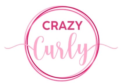
21 Responses to Option B
This logo is more eye catching and aesthetically pleasing in my personal opinion.
I loved how curly, fun and feminine the font was for this option and loved the splashy boldness of the pink color.
I like the pink. It is very attractive and catches your eye. I would chose this one for sure. I think the shade of pink is perfect. Thank you.
Image option B logo looks nice and eye catching then option A
If you have a product that states "for millennial moms" you are excluding gen x, z, boomers, and everyone else. It's just not smart business, especially where millennial is a dirty word to some of these other generations.
I like this logo better because I feel like the other has too much of a limited target audience.
I like logo B more because the outline circle and the ends of the word curly as well as the font make it more appealing.
B looks more proffessional for adults.
Choice B appears more as a clean image and because of that it is much more appealing
option B: looks clean, simplistic, without being overly done and wasteful in design. Makes me think of a prestigious brand, salon brand. easy to read and follow along. option A: reminds me of a kids shampoo, specially the 3 in 1 shower/shampoo watermelon smell from the brand Suave.
Ummmm...first of all, why is Option A only being marketed to Millennial Moms? Older and younger people have curly hair. So that's one reason I don't like that logo. I also don't like the "l" in the word Curly. Option B is my favorite by a mile!
The words themselves are curly...
I love the font of this, but they both look really nice.
I love the color pink and this font is perfect for curls!
B is feminine, girly, fun, and memorable.
I don't think the for millenial moms is necessary, it sounds like that would mean it's only for younger moms
B looks cuter. I prefer the color pink. The other one seems too pigeonholed.
This one is definitely much more readable when compared side by side with the other one. The other one looks like "Crazy Cury" which confuses me.
The pink logo in combination with the font looks best.
I do love the color of B. I also like A because it is a little easier to read but I don't like the text of it being for millennial moms.
I like it better than A.
Explore who answered your poll
Analyze your results with demographic reports.
Demographics
Sorry, AI highlights are currently only available for polls created after February 28th.
We're working hard to bring AI to more polls, please check back soon.

