Poll results
Save to favorites
Add this poll to your saved list for easy reference.
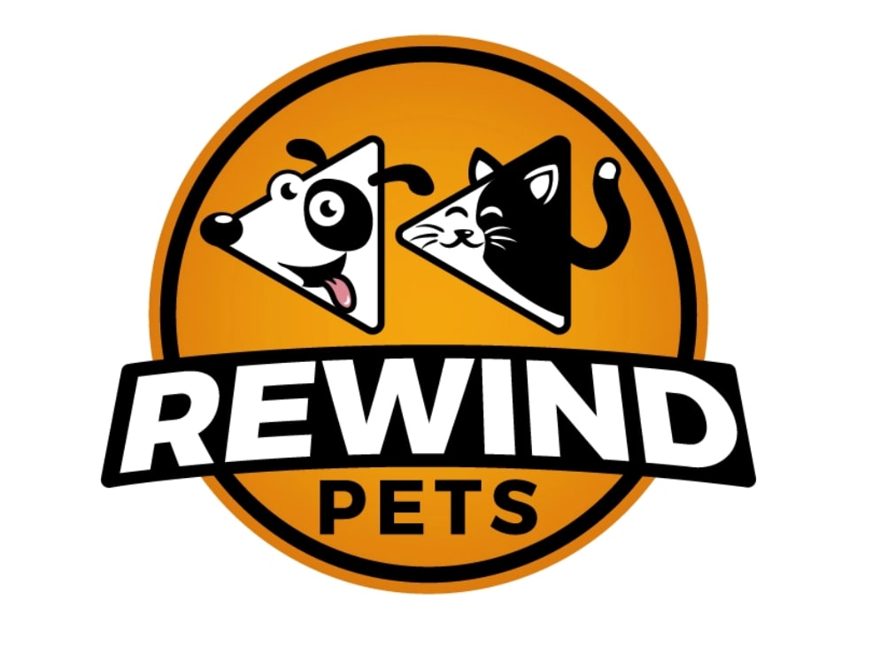
Which logo design do you like better for a premium pet supplement company?
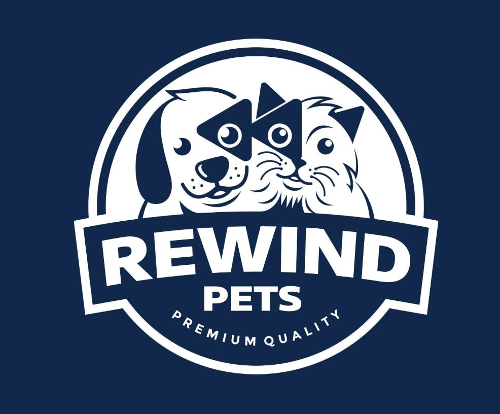

Option A won this Ranked poll with a final tally of 27 votes after 2 rounds of votes counting.
In a Ranked poll, respondents rank every option in order of preference. For example, when you test 6 options, each respondent orders their choices from first to sixth place.
PickFu requires a majority to win a Ranked poll. A majority winner differs from a plurality winner. A majority winner earns over 50% of the votes, whereas a plurality winner earns the most votes, regardless of winning percentage.
If an option does not earn a majority of votes, PickFu eliminates the option with the lowest number of votes. The votes from the eliminated option are reassigned based on each respondent’s next choice. This process continues in rounds until a majority winner emerges.
Scores reflect the percentage of total votes an option receives during the vote counting and indicate the relative preference of the respondents. If there is no majority winner, look to the scores to see how the options fared relative to one another.
| Option | Round 1 | Round 2 |
|---|---|---|
| A | 36% 18 votes | 54% 27 votes +9 |
| C | 36% 18 votes | 46% 23 votes +5 |
| B | 28% 14 votes | Eliminated 14 votes reassigned |
18 Responses to Option A
I like how this one incorporates the remind triangles as spots around their eyes. It's different and makes it more memorable.
I chose them in this order because this is the order that stood out to me the most.
A is cute and the triangles don't look strange or out of place. I chose C second merely because it looks better than B. B looks like a pizza place logo.
I like choice A for my top choice of pet supplement company! I love that it says premium quality right on the logo. Choice B is fun!Choice C I am not fond of at all.
A is the most creative and the cutest
A and b are cuter than C and A is the most cute.
Colorful is a good approach when addressing pets.
A is the most eye-catching to me. I then like the simplicity of C.
this pairs the animals with the rewind symbol in a way that is cute, and feels very natural
I like the rewind button idea, but hate the orange. I think it's a good marketing/graphic design look.
Blue is the best color for the logo and I don't like the triangle looking animals of B.
The first one is more classic style. The second is cool, but I guess only young audience will appreciate it. The third one is just boring.
Option A is my first choice because the pets are so cute, faces are visible, color contrast is good and it says Premium Quality. It is creative to have the rewind sign on pets' eyes. The second choice is B because it looks attractive, but the pets are do not look that great. The third choice is C because it shows the back of pets.
I like A because it states the obvious premium quality claim. I like the graphic on C but I don't like the graphic on B.
Although I think the orange will catch a lot of eyes, the dark blue design is professional and very aesthetically pleasing. I love the cat and dog illustrations, and it is incredibly inviting to the consumer. I like how the rewind symbol is secretly embedded into the spots on the animal's faces too. Really cool logo overal that encompasses the name of the company.
I choose option B because adding premium quality on the logo made it sounds more appealing to the customers.
Choice A is the most appealing because the cat and dog are well illustrated and the use of the rewind icon helps integrate the concept. Choice B is a close second for the same reasons, but the illustration isn't as nice. Choice C is kind of generic and less appealing as a result.
I like Option A best because the dog and cat are really cute and look happy; I also like the blue color. I chose B next because the dog and cat are cute in this one too and I like the orange. I chose C last because you can't see the face of the dog and cat and the black background is not eye-catching.
14 Responses to Option B
These cats changed into triangle shapes is quite cute and I prefer it over the more complex and less popular looking logos.
I chose Option B over the other two because I like that it is obviously a rewind symbol in the logo as well as a dog and cat. The rewind symbol in Option A is a little harder to see in the animal faces. As for Option C, although I like the aesthetics of the logo, I don't see how it is relative to the word rewind.
I would choose B first because it is cartoony and super friendly looking. Nice colors, smiling pets. I would choose Option A second because it is less colorful and more on the serious side. Finally, I would choose C last because it is way too somber. Option C reminds me of something to do with a pet dying, not a supplement.
Chosen in order of how professional they look
If the consecutive triangles signifying "rewind" could be a little more prominent somehow in Option A, I would pick that one. As is, it looks busy and gets lost.
I like B best - the colors and the graphics are unique and stand out, C is okay and A is last because I really think it could be jazzed up a little more (C too for the matter)
I like option B. The color of the sign really stands out and is noticeable.
Option B has the most color in orange and is fun as a cartoon. It looks the most memorable of the three. The black and white logo is also a fun and memorable one. I would go with the orange logo here as it seems to be the most unique and memorable one.
This is a simple design that best highlights the rewind button.
Choice B has nice color to it. The pets are cute. And typography is strong. Choice A is also good. But too blue.
The ones that show the animal faces seem friendlier and happier
Option B is so unique with the triangle shaped pets that you would notice it because it's something you don't see anywhere else. I love it. The orange color also makes it stand out.
I like the color in the picture. I think it also sticks out and easy to understand.
B was my favorite because it was fun and whimsical. The illustrations of the pets look fun and warm. C was my second choice because it's a very clean design and the silhouettes of the cat and dog are cute. A was my last chiice because the cat illustration looks creepy. Don't like it at all.
18 Responses to Option C
I like the picture of the cat and dog sitting, with their backs turned.
I just like the simple design and the overall look of it. Plus it looks more classy than the other ones.
The image "C" of the black and white silhouetted doggie and kittie facing backwards was the most appealing to me. I liked the image of the doggies and kittie too in "A", but it didn't appeal to me as much as the one in "C".
I like C because it is bold and Clear . would also make a great car window sticker
Option C is my first choice because and gets to the point. The other options I had to look at for a couple seconds to understand what I was looking at. Option C also reminds me of the search pictures they have on animal shelter sites so it is kind of familiar when looking at it. Option A is my second choice because it states premium quality and it easier to make out what the picture is. Last would be option B because I has to take the longest looking at it to figure out what it was trying to portray.
Choice C is by far the best as the silhouettes will appeal to a broader audience
C seems to be the most clean and straightforward. A is pretty appropriate. B looks a little to much like a cartoon
The logos with traditional looking pets appealed more to me. They make the product feel more serious and dedicated to all pets.
The options ,in order, convey class and quality which works best for premium label.
Option C looks like two best friends, growing up together. I also like the black and white simplicity as opposed to the manic, cartoony options
I like choice C best because the minimalist black and white design is appealing. There are only a couple of lines in the drawing and I believe this makes the logo immediately recognizable. Choice A has a better color scheme than choice B.
The black and white logo has a much more polished and smooth look to it which looks professional but also has some style to it.
I like the pets looking like they should not as a cartoon triangle.
i love my first two choices overall..I like the design and the black and white color combo..I dont like how the dog and cat looks in the orange logo
I think choice C does the best job. There is something about the triangles in the other two choices that I don't like . Option B looks like a pizza shop and too cartoon-ish. Also, with a name like 'rewind' in the title, I like the idea of having the animals facing backwards. The option A isn't too bad, but the triangle, especially on the cat's eye, looks weird.
The black and white contrast of C is my favorite. It's bold. It's also sweet and there is a kindness to it. I like that it's not trying to be cute or funny.
C was si.e and clear. It took me a minute to equate the triangles in the other options with the rewind symbol. It doesn't seem to go along with a pet ad.
In order of the best looking designs
Explore who answered your poll
Analyze your results with demographic reports.
Demographics
Sorry, AI highlights are currently only available for polls created after February 28th.
We're working hard to bring AI to more polls, please check back soon.

