Poll results
Save to favorites
Add this poll to your saved list for easy reference.
Which Logo Concept (Design & Style) Do You Like?
Option D won this Ranked poll with a final tally of 27 votes after 3 rounds of votes counting.
In a Ranked poll, respondents rank every option in order of preference. For example, when you test 6 options, each respondent orders their choices from first to sixth place.
PickFu requires a majority to win a Ranked poll. A majority winner differs from a plurality winner. A majority winner earns over 50% of the votes, whereas a plurality winner earns the most votes, regardless of winning percentage.
If an option does not earn a majority of votes, PickFu eliminates the option with the lowest number of votes. The votes from the eliminated option are reassigned based on each respondent’s next choice. This process continues in rounds until a majority winner emerges.
Scores reflect the percentage of total votes an option receives during the vote counting and indicate the relative preference of the respondents. If there is no majority winner, look to the scores to see how the options fared relative to one another.
| Option | Round 1 | Round 2 | Round 3 |
|---|---|---|---|
| D | 30% 15 votes | 36% 18 votes +3 | 54% 27 votes +9 |
| C | 24% 12 votes | 34% 17 votes +5 | 46% 23 votes +6 |
| B | 26% 13 votes | 30% 15 votes +2 | Eliminated 15 votes reassigned |
| A | 20% 10 votes | Eliminated 10 votes reassigned |
10 Responses to Option A
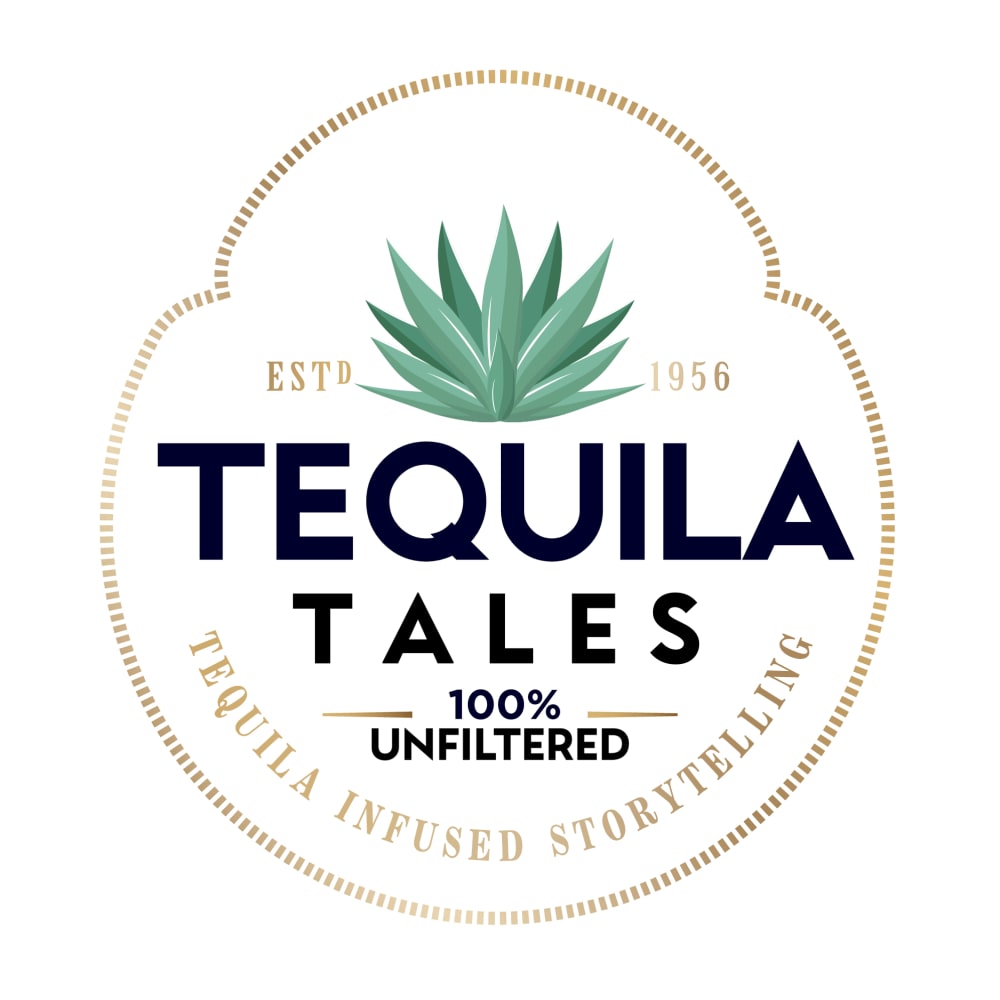
Option A is more professional looking, better for marketing, and easy to read and understand. Much preferable.
I like A and don't like any of the others. A is classy and clean
I like the more simple and understated logo. I like that it isn't chaotic and is very pleasing to look at. I am really not fond of the skull or "day of the dead" graphics.
First and foremost the skull makes it feel less serious which is why I picked A first. I like the Banner and color balance in C if we must have the skull. I do not like the blue text in B or D.
I picked A because I really think the skulls are creepy.
I prefer option A because it looks more professional without the skull. The font is nice and the color scheme works well.
I prefer the less cartoony version best but If we have to choose a second best I like the banner on the bottom and the yellow vs the blue
I am more biased towards a modern design, that's why A wins for me by a long shot, it is modern and appealing. The rest were pretty much the same for me.
I like the less whimsical version of option A. The others look child like and not really appropriate for tequilla. The others are colorful and pretty, but I am not really in my test.
Not really feeling the skull look, then ranked by which actually match the most with regards to color scheme
13 Responses to Option B
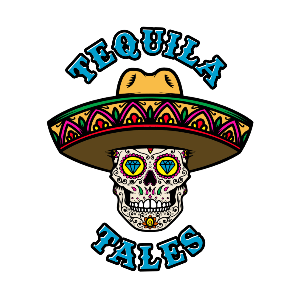
I definitely like the skull design better than option A. I like B the best because I think it looks the best having the words separated on the top and bottom. It doesn't look too cluttered. I like D better than C because the blue color looks better
I like the overall balance of my top choice. I like how the name is split into the top and bottom. Plus the blue lettering stands out more. I find this one more attractive to me.
I like the blue lettering with the skull best, and I think it's probably a little better without using the tagline. I think the name kind of speaks for itself.
I like the logo design in option B the best. I like having the brand name on the top and bottom of the skull. The blue font creates a nice contrast with the colors of the skull.
i chose B forst because i like how the nont color matches the bottom font color. It also has a sugar skull which is really nice and fitting to the mexican culture.
the skeleton logo gives it way more personality and something the end user can associate it with.
the cool skeleton gives it a vibe so make sure that is there. from there, a simple logo with just the name is fine or just a small blurb about what it is.
I like the colors used in this one. Very eye catching
I like Option B the best because I like that the name is split between the top and bottom of the skull. I like Option C as well because I like the font used for Tequila Tales and the fact that it has the subtitle underneath.
Both B and C are the most colorful, bright, engaging, and eye catching. D mixes colors and they do not compliment each other. A is boring and lacks the creativity of the others.
I chose option B because of the logo and simplistic design, this very appealing and attractive. Choice A is a close second because the only text logo is appealing due to the color scheme. Option D and C are alright because the logo has too much going on.
I like the scull with the name tequila tales. It has a nice fit with the name. This is why I like B and D. I do not like the gold lettering so I picked A over C.
B has the best look. I like the design a little bit better. I like how it is mostly about the logo and there are no words on it.
12 Responses to Option C
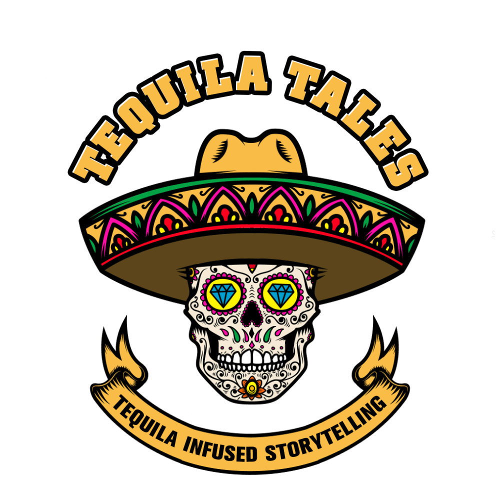
First option with blue font not yellow would be good since the blue font is kind of hard to read. I like the layout and styling. I think the 3rd option (no sugar skull) is clean and simple but doesn't stand out and hard to remeber.
i like the logo in option C the most out of these
C is very similar with font, and the colors. It's very noticeable.D the font is too different, but not the worst.B the font isn't bad, but needs a logo.A is way too modern. There's need to be something that separates this product from something else if I saw this in an aisle I'd walk past it. It's not fun at all.
I prefer the skulls for tequila than anything else.
I chose logos that most quickly caught my eye. I like the colorful skull.
I liked the overall design of C, D, and B more than A as I thought it was creative, unique and memorable. Then, of these options, I thought the yellow color was most appealing, so I favored C first and D second.
Option c is the best logo for branding because it has a tagline in the ribbon and bold readable letters. It instantly reads what the logo is about with a whimsical dark twist of the day of the dead skull face. The logo looks authentic and original.
I like the skull with the tag line because I feel it stands out more. I like the warmer colors because it screams what I think with this type of product. Option A isn't bad but it's bland. I would strongly prefer option C or D.
I definitely associate the skull with tequila, so I think the images that include that fit well.
The infused storytelling banner adds personality, hype, intrigue and excitement. The bold colors match the tone of the image. A lacks the detail and omits the helpful banner. A is not memorable.
I thought the font was clearer Option C than in D. I picked A third because it has the pertinent info, but it reminds me of a tequila company label and seems unoriginal. I picked B last because it doesn't mention storytelling and that seems important
Options B and D were my least favorites because I thought blue font was hard to read. C and A were very different styles but I liked them both, it depends on what image the brand wants to project. C is more fun, but A is more refined and seems like a luxury product.
15 Responses to Option D
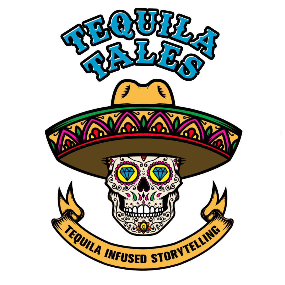
D has a fantastic design logo and is very festive and energetic too.
I THINK OPTIONS D, B AND C ARE THE MOST FUN AND CREATIVE OPTIONS THAT WILL GET ATTENTION AND LOOK THE BEST
D and C are both very nice. The skull fits thematically and gives the logo some visual "pop." Also, they both include the tagline, which is really important for understanding the nature of the project, which is why I ranked those two above B. A is perhaps a little more modern in design, but doesn't really stand out.
I like option D the most because I like the blue "Tequila Tales" and like the tag line too, so you know what Tequila Tales is.
although i like all of these, the first one really stands out because it shows what its actually doing the best. also i love the day of the dead reference and pictuer.
The skull illustration looks incredible and D is my favorite among them.
I really like D with the Mexican Day of the Dead skull. I also like the font and color choice. It stands out and looks interesting.
I liked the sugar skull ones the best. I also liked the ones that told me the most about the product. So I chose D because it was a sugar skull with the name and description. I chose C next again because it told the name and description. B was third. I like the font of the blue tequila tales but there was no description so that's why I chose C before B even though I like the font of B more. Lastly was A, nothing wrong with it, it's actually pretty nice, I just liked the other ones better.
The blue lettering makes it stand out in a fun way
I like the vibrant mix of colors in option D. They really standout while being very cohesive. The yellow really stands out as something that aligns with "tequila" in my mind. The mix with the blue is very appealing and is in-keeping with the overall theme of the logo.
D Really nice graphics,color and information.CA little brighter and shows up better and colors are great. B Blue stands out nice but not quite as much information about product.A Gives all the information but does not stand out as much with color and graphics.
Loving the image and colors and font
The first three really stand out to me. They all look great and the logo screams that their is a story to tell and that story is very interesting. I do not think the color and designs make that big of difference between those three.
I like having the subtitle on the logo for clarity, so ranked B lower. A last because it is not as attractive and eye-catching as the skull. I put D first because I the blue makes me think of blue agave and thus tequila. I would prefer the banner in the bottom to also be blue.
I picked option D because the blue font looks edgy The placement makes the label unified. The skull is festive. The yellow banner fits the logo and blue font. The whole design has cohesion and catches the consumers eye. I picked C next because I like the yellow banner and picture of the skull. I don't like the yellow font above skull because it is washed out an doesn't catch the consumers attention. I picked A next because it has a modern sophisticated design but I don't like it because it doesn't stand out. I picked B last because the placement of the blue font makes the label look off and there is not cohesion.
Explore who answered your poll
Analyze your results with demographic reports.
Demographics
Sorry, AI highlights are currently only available for polls created after February 28th.
We're working hard to bring AI to more polls, please check back soon.

