Poll results
Save to favorites
Add this poll to your saved list for easy reference.
Which logo better suits a brand selling quality wooden household decor items (serving platters, small furnishings)?
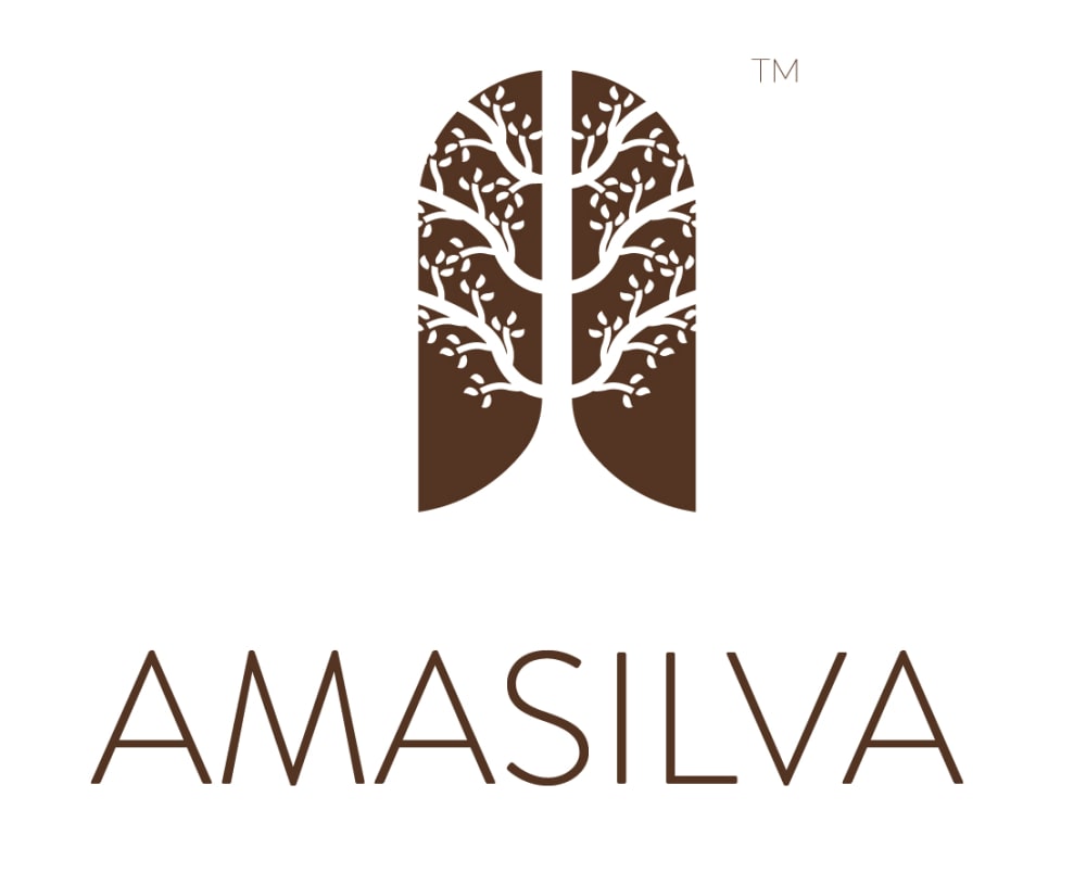
33 Responses to Option A
This logo has nice design and is delicate and eye catching
Would like like to pick A is the best logo design, excellent name, interesting one
I prefer Option A because I recognize it as a tree and that product is made out of wood.
A is just a little more softer and easy to look at. I like the logo it is cute and draws your attention and I also like the thin letters.
I think the logo in option A looks much more pretty and decorative than the other, so more appropriate for decor items.
This one looks more modern and sleek and it would intrique me.
The silhouette of a tree elicits more imagery involving wood and woodworking than in A, which doesn't have that.
More appealing graphics
I chose because it simply is pretty. To me it represents decor.
I like A a lot better than B. I think the tree with the leaves is a really attractive logo that makes it stand out. B looks kind of boring and plain to me.
A is more indicative, visually appealing, and memorable.
A homey feel to the icon with the tree and lande.
It is good looking. I feel great just looking at it. I will purchase.
I chose option A because it looks much more natural and flowy. It looks like a brand I would go for if I wanted an upscale natural decor.
I think Option A better represents wooden home decor items because the picture is very decorative and attractive - the name and the picture align very well with a home decor company. Even the font used for the verbiage is more attractive and will better align with a home decor type of company. Option B looks more like a stick figure drawing and not much of a decoration - I would think twice before using that company for home decor.
B looks very generic and can be anything. The Amasilva brand suggests living, vital wood. It implies quality wood products.
I like the art design of this image. It is neat and clean and displays the name well.
I prefer option A. It reminds me a lot more of the product they are selling. It looks modern and trustworthy.
I don't love A but I at least get that there's a plant design. Not sure what the logo shape in B is.
Chose A because of it's unique logo and the font used in the text, what's used in B appears very common and will be hard to stand out .
Option A is more identifiable. B is too abstract.
A stands out to me with the tree design. It seems like it portrays a tree of life and a free flowing design. A seems like the best design to me because of aesthetics, but it also has the better name. The name of B almost reminds me of 'placenta' and that isn't an image I really want when focusing on my products. All around, A has the best name and design from a female perspective.
I feel like the more intricate logo is more luxurious
the tree is pretty cool it signifies life and growth i think this would be a great logo for a company, also with the whole recycle safe earth stuff that is going on now this logo would draw in more customers
I like this logo better. Even though it's a tree, it looks more delicate and kind of lacey.
i think this design is easire to understand
really like the tree type image
I like A better than B because the logo is more interesting. It grabs my attention more and makes me wonder what the company is.
i like this logo. I like the tree included in the logo itself. To me, it shows its wood used in their products so thats why I think this one fits the company and what its for
This is way more attractive.
I would certainly choose Option A because it's more elegant and I'd rather go with something more artistic than Option B for decor.
I like the use of a tree symbol here because it ties in with the wood products
It's beautiful and has a tree.
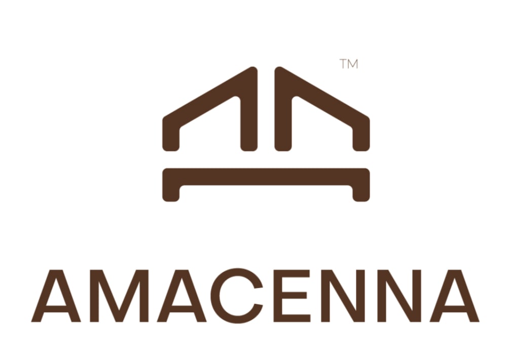
17 Responses to Option B
I like B the best because it is blocky and wooden looking, which works as a logo.
The linear look with the sharp angles are reminiscent of a home, looking at the design on "B" makes me think of household items. The other design on "A" honestly reminds me of lungs.
I chose option B because it feels like a decor company more than option A.
Choice B is a better fitting logo for this company. It is more appealing and fits for what they are selling.
The logo and name better reflect the product lines. I do like the other logo, but that would work better for a garden related company.
This design reminds you of wooden pieces.
This logo reminds me more of a wooden home goods company versus the other one which I might see on the side of some yoga mats. I really enjoy this and think it's on brand and to the point.
The bolder print and the letter cemma cam be compared to cienna a color that can be matched to wood.
Option B is better because it is not limiting and can mean a full range of things
I'm curious about this company but I think I like logo B better, in fact I strongly prefer logo B. I like the fact that the logo brings to mind a house but isn't crazy obvious about it. I like the thicker text, more cozy and easier to read. I like the brown coloring in both, makes me think of a natural product and like a more high end brand. Overall, I think option B is more hygge and more of a cozy feel to it which seems to fit the brand best. Yet the logo is still modern which I think is best.
Something about B fits with the products this brand is selling more in my mind. It's not totally as literal as A but it still works and I like that its a little more creative and interesting.
I like both actually. But B makes me think more of wood and trees.
The logo in B is better for this type of product since it looks more like architecture or furnishings. I also like the bold typeface for a furnishing brand.
This logo looks like a house to me so I would assume the company sells items related to homes, which it does in fact do.
The logo looks more related to the items
Option B is easier to pronounce and the symbol reminds me of a house
I like the simplicity of the picture while focusing on the future aspect that it could be a bed, or a couch, or a building.
Explore who answered your poll
Analyze your results with demographic reports.
Demographics
Sorry, AI highlights are currently only available for polls created after February 28th.
We're working hard to bring AI to more polls, please check back soon.

