Poll results
Save to favorites
Add this poll to your saved list for easy reference.
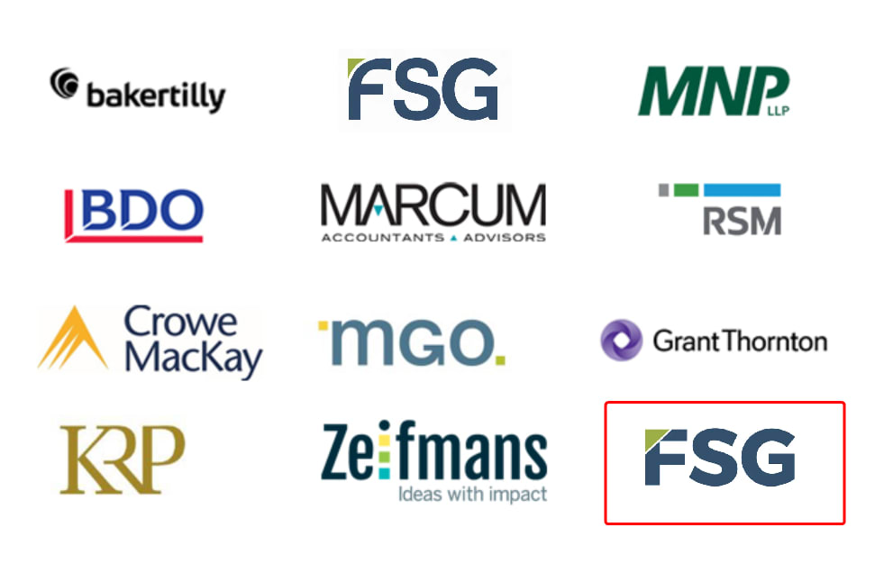
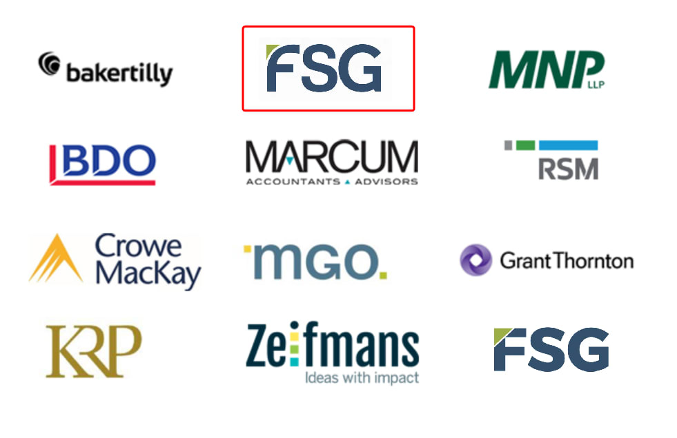
Which FSG logo best represents our brand in terms of professionalism, security, reliability, and accurately conveying our financial document printing services (primarily customizable cheques), compared to the other logos displayed?


32 Responses to Option A
I think the box around the FSG looks best off the the bottom side.
I think the size of this one looks more professional and mature. It also seems to radiate strength and trust as it is not too large and flashy.
I prefer A because the font looks solid, dependable and professional. Critical when printing financial documents such as checks etc.
I think the text in this version has a stronger look. The straight lines give off a feeling of strength compared to curved lines.
I like the font and it looks clean and professional.
This logo has a bolder style that looks stronger and stands out more to me
I thought option A looked the best. I liked the font style more. It looked more reliable.
It's easier to spot and looks the cleanest and most professional.
Option A is the better option because the font and the text looks more professional. The logo also looks cleaner than the other option. The other option looks low quality.
I like the bolder, thicker font. It just looks more professional and stands out. It looks stronger.
It's more square and solid looking.
While there is not a huge difference between the two, in my opinion, A stands out a bit more due to the F having a wider colored ban at the top designating strength.
I think sharper, more distinct lines make the logo more professional looking. So I like the straight line as opposed to the curved line.
I chose the logo of panel A. It is strong but not too pushy. I like it without the box around it as it is about the products and less about the logo even though, this one looks great.
Both are honestly really similar, but the color of this logo feels a bit darker which makes it stand out more.
I love this one more because the letters in this logo are capitalized, making it seem more professional and confident.
I would pick A because it is first....they are the same.
I think that Option A's bolder, wider lettering conveys an image of strength and professionalism, which would be appropriate for this industry. The bold letters give the impression that FSG is well established, with a long, stable future. On top of that, A's wider letters stand out more effectively against the other logos, whereas B tends to blend in due to the use of taller, thinner letters which are more similar to those of competing brands.
The bold font makes it look more secure and reliable and strong
I prefer option A because I like the way the "F" looks, compared to option B. For some reason, I feel like the full, strong "F" conveys more of the attributes listed above (professionalism, reliability, etc.), than the "F" that looks like it's drooping a little, due to the curved, light green corner area.
i like the bold sharp lettering way better, stands out and easier to read
The bolder letters seem way more secure. In Option B, the font is too light, which looks flimsy and like it would be less secure. I would like to see the bolder font with the circular green part design like in B. (I might not like it, but I would like to see it just to see if it looks better or worse.)
The block letters look more authorative.
I like the bold font a lot, it stands out.
I think A feels more modern and sophisticated, which gives it a sense of trust and reliability.
The G in this one looks more strong and assertive.
I feel like the slightly more golden trim of Option A looks more professional.
This one is bolder while the other one seems like it cuts corners
The thicker letter stands out better especially since there are only 3 letter
I would say Option A's logo is the best out of the two. I think the font of Option A's logo looks better and makes the logo appear more trustworthy.
The thicker font size embodies strength and makes it look more modern.
The choice I made is based on the fact that this logo is bolder and stands out more as a professional look whereas the other looks childish and like a fourth grader created it
18 Responses to Option B
I prefer the slender font. It's easy to read and just feels higher quality.
B is the option I think better represents the brand based on the qualifications listed above. It really resonates with me as a consumer!
B is more modern, innovative, unique and bold.
This logo looks like more thought and intention went into designing it. It gives the impression that the company is reputable and has a strong history.
The logo with B really stands out more and has a little something extra with it. With A, it seems more standard and not as special.
B has the FSG logo on top row with a red triangle which makes it highly visible. The logo has adequate size which makes it highly noticeable and eye-catching.
This set of logos were carefully created and they fit great with these brand's current values and will attract a lot of potential customers.
I think the thinner logo feels more like a secure financial company and less like a fun type of organization
Since S and G are both round letters, it makes more sense to have the "curve" in F to make it more aligned with the remaining letters. Option B helps with visual appeal in general. Neither option communicates your core services since they're just letters.
I prefer the larger font which seems a bit more professional.
I like this logo better because it is curved and not so rigid. It seems more flexible and like it better fits with the company's values.
I like the one not in a box because it has a more professional look
Choice B looks more clean and neat rather than blocky and fat.
Just my gut reaction. This option looks better to me.
I like the font better in A
They look the same and they all look professional and suitable
I like the logo being at the top middle better than being at the bottom right.
With B the logo seems to stand out more bcause it is on the top line.
Explore who answered your poll
Analyze your results with demographic reports.

