Poll results
Save to favorites
Add this poll to your saved list for easy reference.
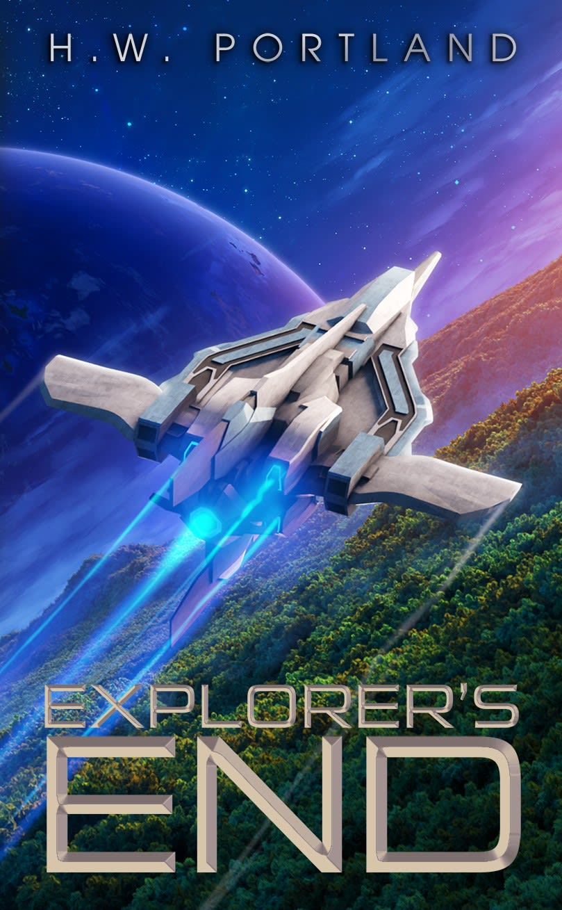
While browsing science-fiction books, you see two covers. Which cover is more likely to result in your purchase?
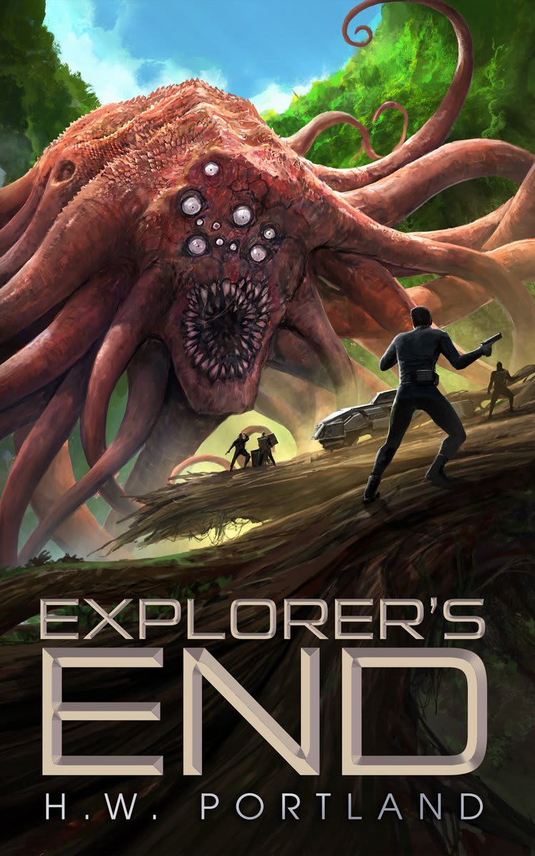
24 Responses to Option A
i think this one is the best by far
I chose A because the creature really mad me feel the thrill and excitement of the world and story.
Option B is just too generic for a science fiction book with a generic space ship flying along, so I'd go with A since it at least shows a relatively exciting looking action scene.
The cover that is more likely to result in a purchase is Option A. I think this cover is very exciting and scary at the same time with the monster. The scene lures me in and it makes me want to know what the story is about and if there are more monsters like this in the storyline.
This cover is alerting and prominent. The design is creative and catchy.
A is more interesting because I want to know more about the monster.
I love the huge creature in A, it stands out so much and is much more interesting than B.
Hey grabs your attention right away with the monster. Not only is the cover engaging, and exciting, but it’s also descriptive of the book
This one seems much more exciting.. I've seen many planes in the book idea itself for that 1 just doesn't interest me as much
The big monster on the cover of A is much more suspenseful.
Option B is a little generic, where Option A having a monster or alien immediately makes me think the book would have interesting action or drama, and actually explore unknown and unfamiliar elements.
I liked choice A since the monster grabs my interest right away and looks the most intimidating. Choice B looks more plain and simple with the aircraft in the cover.
Choice A looks way more exciting and original. I would much rather read about about a monster battle.
Option "A": A ripping good monster on the cover is a sure attention getter and this one is no exception; this is the more enticing of the two presented.
The monster in this option looks exciting and scary, which is appealing. Very cool design for sure!
This cover art makes it look more action based and like something that I would be more interested in and keep my attention better.
Space is cool but doesn't imply action the way that strange alien monsters do.
I like seeing the scary sc-fi monster and futuristic look. Just seeing a ship doesn't catch my attention as much as a crazy looking deadly monster.
A looks like a much cooler alien themed plot that follows a much greater sense of storyline
The other option is so plain and generic like a thousand other covers, A is interesting and makes it feel like it will have a lot of action as well as sci fi
The space thing is overdone and this creature looks really cool and I’m interested
Choice A really is awesome and sets the tone for the book being this unique alien world
the monster in A is very eye catching and looks really cool to me
I like the cover in option A better as the monster's design looks interesting and makes me curious.
26 Responses to Option B
The theme and color choice is very intriguining, as well as being eye catching. Also, by adding the authors name to the top and the title at the bottom, it adds a balance to the cover.
Book A reminds me of pulp fiction books from the 50's. I outgrew those types of books years ago.
The scenery in the background of choice B is stunning, looks like worlds I would enjoy reading about
I prefer the author's name on top of B with title below as well as the spaceship imagery.
The monster on Option A looks gross and I don’t like looking at all the eyes.
I think they are both cool but I like the vibe of B, which looks to be classic sci-fi. A is good too but gives a different vibe. And it's a bit creepy.
I am always fascinated as to what happens in space so a space themed cover gets my attention very quickly.
The cover of the ship flying gives a more exploration focused feel and I feel that kind of lets your imagination run wild.
I really like the monster/animal in A and noticed it before B. That said, I deal with this industry and usually B is what attracts people and usually what I would buy. I would only buy A if the description is amazing and fits with the A cover. But "Explorer's End" sends like it's more specific to the journey and exploring than to one creature. B is much better at representing that theme.
B's cover is able to draw my interest more to it as it more pleasing to look at.
I prefer this cover just because it's less disturbing looking. The other one is more unique, but it's not pleasant to look at.
Option B is the best because the bookcover is well designed and simple to understand
Seeing a space ship and the background of both planet surface and planet in the background looks like an explorer's dream adventure. Thus I like choice B better.
I'd be more inclined to purchase a book that didn't give away a creature in the book on the cover.
B says science fiction where A says terror. I think the book is meant to be sci-fi so I picked B.
I think this picture does a better job of creating a sense of excitement and action
I'd rather highlight the sci-fi element over the monster.
I like the Sci-Fi design of this one. Plus I never like the idea or concept of the Kraken as depicted in the other one.
I like this because it looks like you would be able to go more places. I like the idea of exploring the galaxy and seeing different planets. The color scheme of the cover also looks a lot better and I like seeing futuristic space ships
B makes me think of exploration, and possibly harder sci-fi. A looks a little more like fantasy.
I like B, the cover seems more exploratory and fun and not as dangerous.
I liked the greater mystique and sense of grandness conveyed in B.
B seems more adventurous and like there is more exploration. The picture on A is pretty comic book looking to I would skip over it.
It's looks interesting, but not scarey.
I'm a sucker for a cool space ship with sharp lines and angles.
Choice B would make me more likely to purchase because I like how it has the spaceship on it as that makes it come off as being sci-fi to me. I like how it has the grass on the planet below and then space and another planet in the background as it looks cool.
Explore who answered your poll
Analyze your results with demographic reports.
Demographics
Sorry, AI highlights are currently only available for polls created after February 28th.
We're working hard to bring AI to more polls, please check back soon.

