Poll results
Save to favorites
Add this poll to your saved list for easy reference.
Which graphic design is better for a Communication Skills book cover? Which looks more professional and attractive? Which would entice you to buy the book? Why?
Age range
Education level
Gender identity
Household income range
Options
Personal income range
Racial or ethnic identity
Self-help book reader
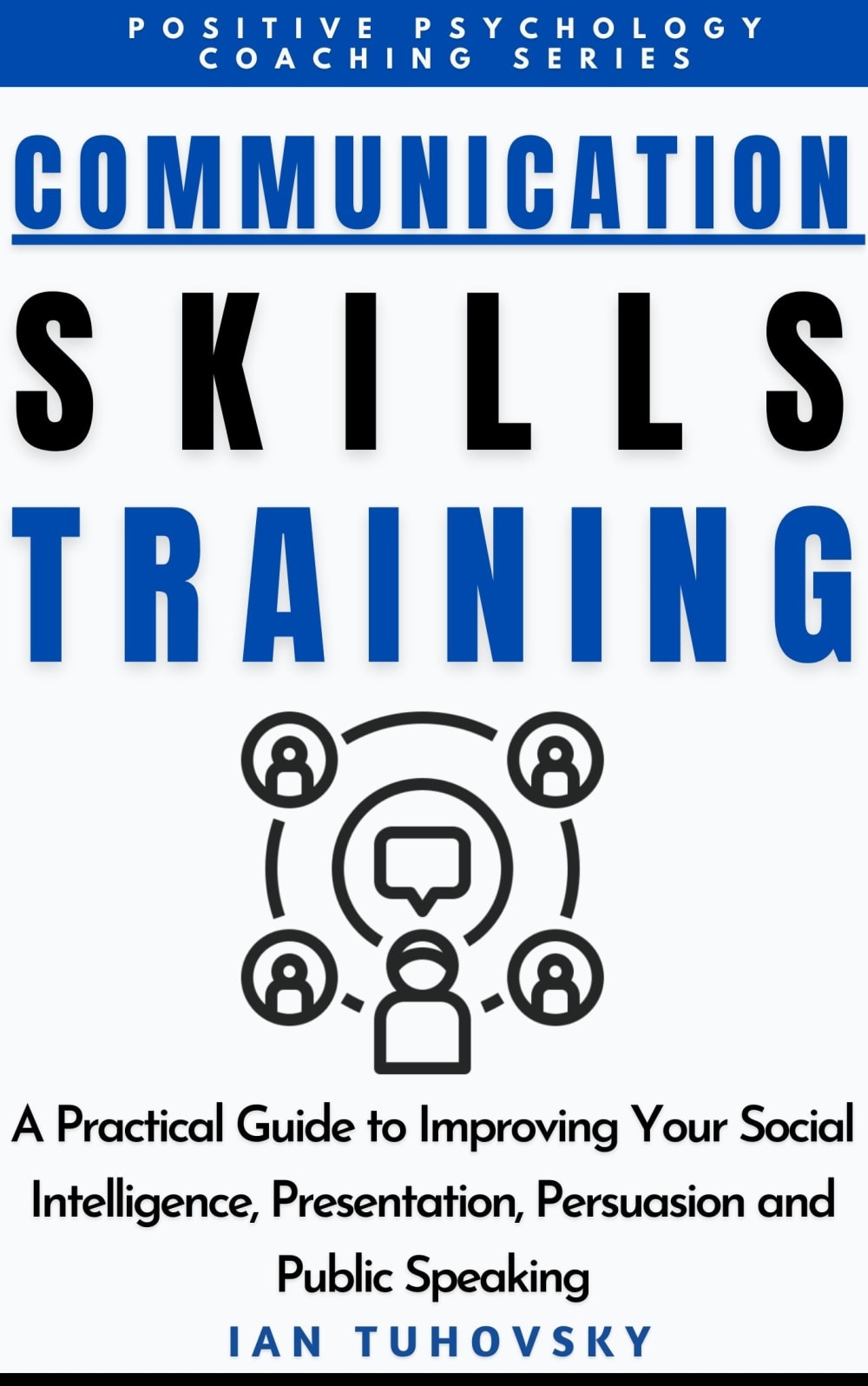
36 Responses to Option A
This option didn't look as dark and depressing since the graphic and icons associated with the cover were lighter.
I chose option A because the illustration is easier on the eyes.
I prefer A,with the "social circles" that you can picture yourself being a part of and communicating with. I'd be more engaged with that cover.
I like A better because it looks more professional. It looks like people are marketing to each other. Option B looks more social than professional.
I can better understand the graphic in A, the one in B seems like nonsense to me.
This is a more detailed and interesting image, it makes me more curious and looks more complex.
I think A looks better because the image of the people in the circle fits better with what the book is. I think it's more attractive and gets my attention first.
Option A looks more professional and business-like because the design in the middle of the page on the other example is far too distracting and doesn't really convey the theme of the book, which would be helpful to many people no matter their profession.
This one B has to much black.
i like the logo and symbol in A the most, i would go with that one based on design
I prefer A because the text is very clear and so is the picture it looks nice versus the solid block hi everyone happy new year
I like the image in Option A better. The reason is because the participants are working around an idea in the center. The image in Option B has one person in front with an idea and it looks like the people behind him or her as lesser important ideas.
I like option A the best because I like how the graphic shows the message going out to the peope in the four corners of the sound waves.
It liked the different types of people
I like option A. I find it more appealing because of the graphics being used. I think the black design is unappealing
I think my first choice best illustrates the networking and communication aspects about the book.
i really like the picture that is used more in choice a cause i like the way it looks. i think the other option is too bold and doesnt really make the book cover look professional at all, it just looks like a black blob at first.
I thought the communication image in Option A was really well done and it was easy to determine at a glance the meaning of the image. I liked that it quickly and clearly fit the theme of the book. Everything about this cover seemed professional to me, which would make me more likely to trust and purchase the book. I thought the image in Option B looked a little unclear and required more effort to discern. It looked kind of odd to me overall.
Option A definitely looks more professional and attractive due to the graphic elements. The graphic design on option B looks like it is taken from an app logo or something similar and is not nearly as appealing as option A.
I think "A" better shows the concept of people to people. "B" looks like people having thoughts.
I like the set up with the people - the dark one doesn't look as good.l
I think the logo best displays communication on this one.
The people in the other one are too bold and kind of distracting when reading the cover in my opinion.
Multi panel shows a lot more then the usual.
B looks a little like there's a person in front and they're most important. A still shows that there's likely a "you" in the picture but still looks more collaborative in nature ie less of a prioritization.
The networking that is used for this circle in A is the best suited for the cover
I think the graphic design is better for option A, both of them look professional and attractive, to me, and option A would entice me to buy the book; I think it looks better, overall.
I prefer this one it looks more clean cut and easier to glance over and notice everything.
A - My favorite because the picture shows "layers" of commnication represented by the circles, and reflects better the concepts listed, specially "public speaking". Other option I don't like because it's just a big black picture that can be anything.
I like the design of option A better because it looks more professional. The images of the people are easier to understand on the image.
I like option A, the graphic on option B is too dark in the middle of the page. Option A looks more creative and professional.
I prefer option A because is has more sophistication and detail in design, however, both covers seem to be incomplete.
i like choice a the best. the icon is clearer and easiest to view. its more welcoming
I think this graphic is a bit more descriptive of what the book is about.
The image on the bottom conveys a network of people versus people thinking. It matched the words better.
I think choice A has a better graphic in terms of marketing for networking individuals.
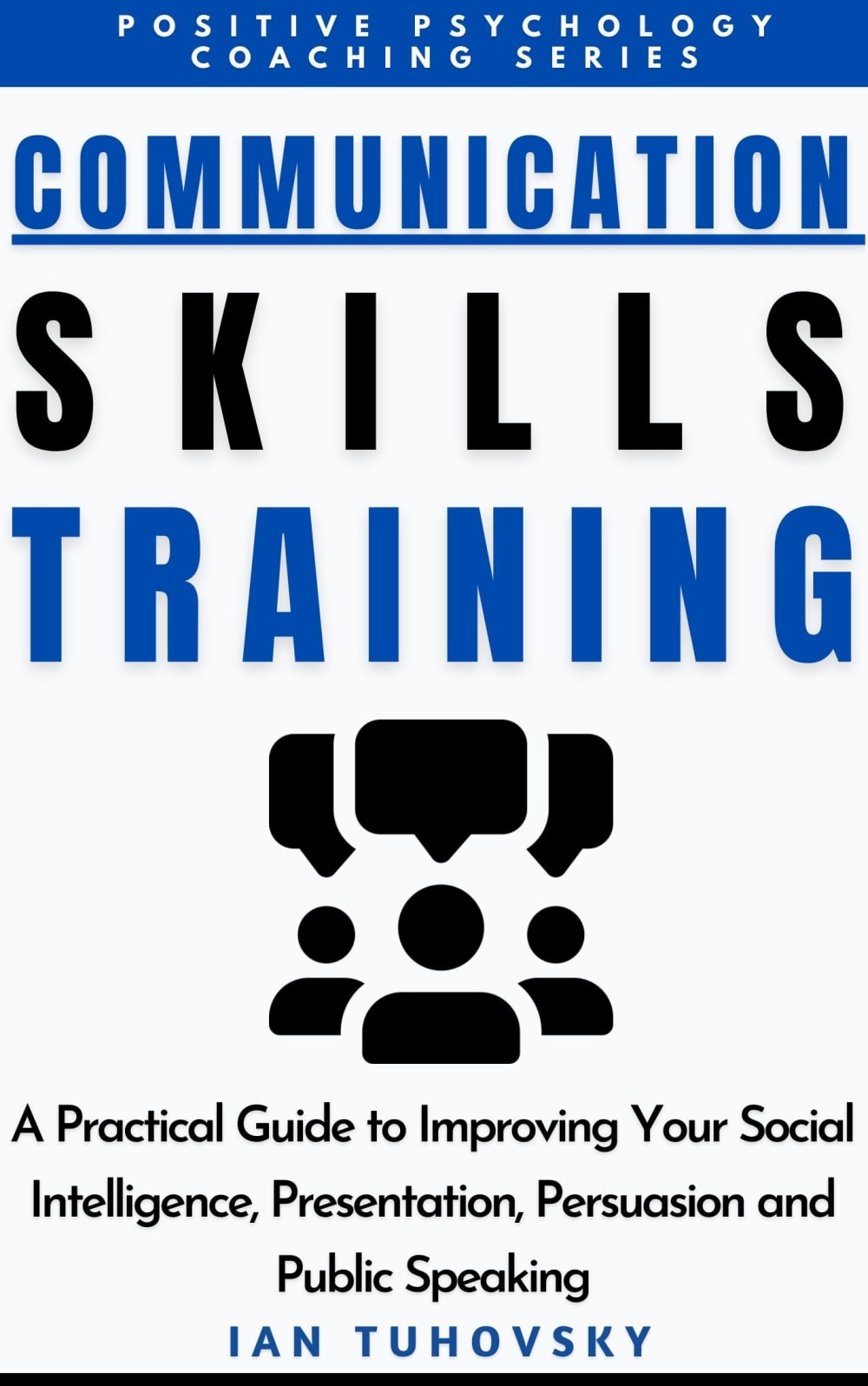
14 Responses to Option B
I like the middle image. To me it represents more about communication than the other one. Plus it makes the book stand out more.
I like that it shows all of the people talking.
I chose B because I like the boldness of the image.
I think that I like choice B a lot. I think that this one looks more professional and attractive. I really like the logo in the middle being in all black.
I think the 3 bold character icons grabbed my attention faster than the circle. It felt more impactful.
The graphic looked more aesthetically pleasing for option B. The color scheme also flowed well.
I like the presence of more black in B. It matches the word Skills in the headline.
I think option B looks the most professional, attractive, and entices me to buy because the image stands out more
The more solid and bold graphic elements convey strength
I like that b makes it seem like it focuses on talking not other communication
The text looks a little more bold, and the central image is more attractive and stands out more with its darker color. They both look professional, but the cover with a more distinctive central image is more eye catching.
Both images look very nice and I would consider buying either. I chose Option B because I liked how the black/dark image broke up the monotony of the white cover.
I specifically like the black graphic in the center instead of the white. It is bold and eye-catching.
This is more attractive for a book. The contrast of the all black graphic supports the title better than the 2nd choice. My eyes were forced to linger longer on the 2nd choice after I considered the picture and how it applied to the book I had lost interest.
Explore who answered your poll
Analyze your results with demographic reports.
Demographics
Sorry, AI highlights are currently only available for polls created after February 28th.
We're working hard to bring AI to more polls, please check back soon.

