Poll results
Save to favorites
Add this poll to your saved list for easy reference.
Which graphic design and color theme is better for True Crime themed book cover? Which would entice you to buy the book? Why?

Option C won this Ranked poll with a final tally of 51 votes after 1 round of vote counting.
In a Ranked poll, respondents rank every option in order of preference. For example, when you test 6 options, each respondent orders their choices from first to sixth place.
PickFu requires a majority to win a Ranked poll. A majority winner differs from a plurality winner. A majority winner earns over 50% of the votes, whereas a plurality winner earns the most votes, regardless of winning percentage.
If an option does not earn a majority of votes, PickFu eliminates the option with the lowest number of votes. The votes from the eliminated option are reassigned based on each respondent’s next choice. This process continues in rounds until a majority winner emerges.
Scores reflect the percentage of total votes an option receives during the vote counting and indicate the relative preference of the respondents. If there is no majority winner, look to the scores to see how the options fared relative to one another.
| Option | Round 1 |
|---|---|
| C | 51% 51 votes |
| A | 34% 34 votes |
| B | 15% 15 votes |
Age range
Audiobook listener
Education level
Gender identity
Household income range
Mystery and crime book reader
Options
Personal income range
Racial or ethnic identity
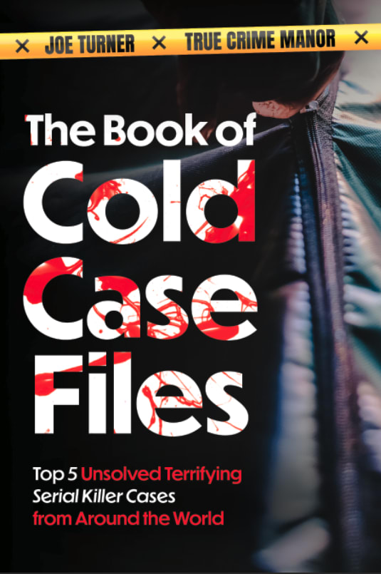
34 Responses to Option A
I put by how much each caught my eye - A is best then B then C
I like Option A the best. I like the blood Splatter on the title the best
A because it has a very strong mystery element to it. I find the unsolved wording and the blood stains on the FILES makes it extra creepy and special.
I prefer option A because it looks the most interesting and compelling to me. Option B looks quite enticing to me too! Option C looks too basic for my tastes.
I chose these options in this order according to which one has the best overall graphics and design on the cover I chose them based on which one seemed the most intriguing and really drew my attention and made me want to find out more
'A' and 'B' are both fantastic. They convey that you are about to read something bloody, moody and possibly terrifying. The splashes of red (blood, firer or just red paint) whatever the substance it conveys a mood. 'C' is not bad and I'm sure the title would give one pause to explore further.
Having the blood fill the letters in the title is eye-catching. Also, the "Top 5" shouldn't be in red--it should be the "Unsolved Terrifying" to emphasize the blood and horror.
OPTION A AND BOOK LOOK SPOOKING AND LIKE THEY WOULD DRAW YOU IN. I LOVE THE BLOOD LOOK ON THE LETTERS
I would choose "A" because it looks blood covered and adds mystery.
The blood in the letters in A look the coolest, then B's bold letters appeal more than C.
I picked A. The splash of red in the title is very appropriate and fitting considering the theme of the book. It helps complement the design.
I like the blood effect that A has the most its catchy and draws my attention right away. B is second because other than the blood i feel as if its rather plain. And C is last because its generic and i feel as if i have seen this cover before.
I voted for option A, I really like the body bag motif, I think that really sets up the mood for the book.
I associated my first choice with crime, the subject matter of the books. The design of the book cover immediately told me what to expect within the pages.
Option A. This option has the crime tape title on the top of the book cover and a body bag as the art for the cover. The blood through the lettering of The Book of Cold Case Files is intriguing and would make me want to pick the book up.
I like number 1 because of the blood spatter you know what type of book you're getting into. 2 is nice because the colors highlight the title by ha ung a mich darker background. 3 us nice too but a bit harder to read and doesn't light up the title as much
a looks most like a true crime cover, c is ok, b is ugly, type is too large
I selected the covers that I found to be the most visually pleasing, eye catching and stimulating.
Option A makes the best use of the white, and red colors. It has what appears to be a blood visual in the title, making it more eye catching, and something that would lure my interest in. It makes the book seem more suspenseful.
I like the way the letters look all creepy and scary with the blood. Choice B is also good, like an interesting read. Choice C looks too formal and boring.
Honestly they are all pretty good, but I like the ones with the blood look to them more. The blood in the white looks coolest imo
I like A because it looks like red blood was splashed on the white lettering on the cover
The blood spatter definitely makes the cover!
I like the fact that it has a body bag being zipped up. It makes this book more grim and mysterious. The blood on the letters also is attention grabbing.
I think option a and option b really make it clear that this is going to be a gory and gruesome book
Option A is the best choice out of the options given. The font and the blood within the lettering makes it stand out more. I also think the color theme fits it best.
I prefer Option A as my first choice. The choice of the blood stained lettering makes you know that there is a thriller inside the covers. Option C is a little macabre looking with the back of a hearse on the cover but it's also intriguing and exciting. Option B has the outline of a body but it's not very effective or clear.
I really like the designs of the covers but the one with the body bag and the blood in the font really stands out the most to me and would draw me in more than the other two choices would.
I think the blood splatter look is a really good fit for this kind of book, especially the one with the body bag zipper on it. It's a perfect vibe for the subject matter.
I like the writing and font in A the most, the blood splatter under it is a nice touch
I like option A the best because it looks mysterious and gives you an idea about what the book is about. I also like option C because it looks modern and has a nice design. I do not like the font size in option B. I think this is too large for the title.
The covers with blood are better than the one with a coffin.
Option A was the most interesting, because it has the nice embellishment of the blood in the background of the letters. My second choice was option C, because the words are easier to read than in option B and the front cover flows better.
I like A the most because I think the image of the body bag goes well with the content of the book and it is also intriguing. I then picked C because I like the table and board on the cover are reminscient of a police room and go well with the contents of the book as well. I then picked B because it is a bit boring and I wish it had an image of something other than what looks like blood splatter.
15 Responses to Option B
B- I like the look of this one the best, the way the blood looks kind of "pretty", C- I like the color choices used here, A- a little basic and similar to other books
The cover in choice B is the best looking cover of the three choices and the one I would pick up.
For a True Crime themed book cover, I think B is the best cover. I like how bold the font is, and how easy it is to read at a glance. I think A is also a good cover, and the blood spatter is a nice tough. I find C to not be as good as the other two, and is not as attention-grabbing.
I like seeing the blood but not too gorey.
I chose these in order of how quickly the title drew me in.
I prefer choice B for the more simple design.
The blood drops on the book title font looks terrible on option A. If you are going to use blood, use it like in option B
B and A allude to a crime scene. C is just a folding table and chair. I would pick B or A.
B and A look like it's going to be more violent so i prefer them
I picked B as #1 because the blood spatters remind the reader that these cold cases are, in fact, about serial killers still on the loose. But A's blood spatters seem like overkill. And C seems way too clinical and detached.
Since this is book about serial killers, seeing blood on the cover relates the most. Choice B seems the most eye appealing.
This cover draws in to the book more and makes you want to find out more
The fake blood on choice B looks clean and overall interesting for sure
I disliked A, the blood on the letters is a bit much. I liked that in B the words 'serial killer cases' were in red, it made them stand out.
I find option B the most eye-catching and appealing and would buy this book. I like the way the wording is colored too.
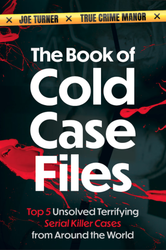
51 Responses to Option C
I think the darker red book looks the best. It has more of an adult feel. A and B are about the same with the blood splatter, but all cold case files aren't that way, so I would just rather see it like C presented it.
I prefer this design because there's a focus on the detective side of things and gathering clues. Seems like there would be a good mystery. Doesn't rely on shock value with blood and gore.
C has a more mysterious style that makes me more intrigued, I think it gives a better idea of the investigative aspect
I find the red to be very striking and draws me in. Plus the idea of seeing the crime board is a nice touch. I do also like the blood on the title in A.
I like the design of my top book cover. It has a sersounes that it brings to the book. Thus I find it more appealing.
The one I ranked 1st looks good, but the two others look like childrens books.
This is the most polished. The blood spatter is tacky.
I chose option C as it looked most appealing and I didn’t like the look of blood on the other options
I think the more serious and less gimmicky, the better. The blood splattered text looks awful. A looks the most sophisticated of the three.
I think the yellow crime scene tape and interrogation chair draws me into interest of what the book will contain
I get that the subject is serial killer cases, but for me, the less graphic the cover looks, the better.
I like the clean and modern cover in option C, option A is unique font/colors in the letters. Optoin B is okay but nothing different on it.
Option C is a great cover, I like the font and color schemes that look good. Options B and A are good also, the covers are well designed.
C looks the least cheesy. I wouldn’t be embarrassed to read this book in public as it looks the most like thriller novels I am used to reading. Both B and A look cheap. And cheesy. I’d be embarrassed to carry those around.
I like the room that looks like a room for cases best in C. Then the body bag in A.
Seems more intriguing and interesting, it captivates my attention and makes me want to find out more about this
The one with the chair is the best I think. I like B too with the splatter but it’s a little plain. A has some good splatter but I can’t tell what’s in the background
The blood thing is way overused in the genre so it’s best to stray away unless you want to be just a regular book on the shelf
I like that option C seems more like a mystery solving type book and makes me curious. A makes me feel unsettles with the blood splats.
Option C has a nice proportion of type face font in graphic image
The graphic design and color theme that is better for True Crime themed book cover is Option C. I think this book cover would entice me to select and buy this book. The cover among the three looks most professional and interesting in design.
I ranked my choices based on which covers had the least amount of blood.
I ranked the book cover designs that I liked the most. I found the book cover illustration of option C to be the most mysterious. I then liked the book cover design of option A and then finally option B’s book cover.
C seems the most professional which would lead me to believe it would be a better book. I also like B. A looks amatuerish.
Using dark red as the main color scheme for the book cover is a good choice for such crime-related topics. In addition, it is common to see book titles with all capitalized letters. Thus, C is my top pick. The two designs in A and B are similar in terms of fonts of letters and color of words. The letters of words in A have a special design with parts of letters are painted using red color. It gives me a feeling of horrors. It is a good match for the crime topic of the book.
My rankings are based on the book theme I like best and would choose to pickup if purchasing this book. My top choice is Option C. I think this book cover is enticing and interesting.
Option C gave me the clearest impression as to why I would buy this book.
I like C the most because I like the font layout the best. It is easy to read. A and C are more unique than B. B also looks less professional that the other two.
C SEEMS A LOT MORE INTERESTING.
These are the most striking and the options that would draw my attention if on a shelf or a webpage.
I chose C first because the words aren't as large on the cover which allows one to see the image behind the words. I like that the image include file folders. I chose B next because it is simpler than A. I don't are for A because it is very difficult to tell what the image is supposed to be - a boot? a zipper? a case of some kind?
I really don't have a definitive answer for my selections. After staring at them for longer than it deserved, I went with option C looking the most professional and option A just looking bloody.
Option C has the best design in my opinion. I really like the clean and professional look of the cover. The color scheme of the cover fits the genre of the book, and the title and lettering are nice and neat. They also perfectly align on the cover as opposed to the other two choices.
It looks the most realistic to me which I like. It’s mysterious and catches my attention.
I don't like the bloodstains, I understand what the book is about already and it seems like the cover is 'trying too hard.' C has no blood, and it actually manages to seem the most serious, and scary. A is much less scary, but the red and white letters are a bit attractive. B is my least favorite, all I see are the bloodstains and I can't make out the underlying design at all.
C, I find the imagery in the background interests me and makes me very interested in learning more, it makes me intrigued about the cases.B, I find the title and imagery makes my overall interest very high, the designs make it very interesting.A, I find the imagery in the background almost interesting, however I can't understand what it is showing.
I like C because it tells me everything I need to know and doesn't have the creepy blood like the other choices have.
Option C - The faded red in the background behind the white font really brings out the title. It's simple, and it's enough to catch my eye.Option A/B - I put these two together because I just don't care for either of them. I don't like the blood splattered look of either. I think the cover of (4) looks alright without the blood splatter. Both book covers remind me of a Goosebumps cover.
I chose C because the cover looks like somewhere where someone would be researching a case.
The text size and look on B doesn’t fit the genre. Feels like an upbeat or silly book vs crime book and the cover is ‘eh’. The one with the bloody letters at least that makes it look serious. C looks like mysterious and ominous which is what I want in the genre and it’s understated in a way that raised curiosity
C is my first choice because the font of the title is more expected and familiar to me than the font in the other two choices.B is my second choice, because the depiction of blood within an amateurish font in my last choice, C, is worse than B.
The description at the bottom looks better when it is centered and not left justified like A. Also prefer the white letters better than the blood splattered ones, because I was trying to figure out if the blood splatter was actually something else and got annoyed.
The bloody covers are graphic and unnecessary. C is intriguing without being morbid.
I like the clean easy to read title with a good contrast with the red background.
I think the "unbloody" covers make it look like a more legitimate book, one that appeals to smart fans rather than horror fans.
I prefer this design and color. It's more appealing and enticing. I find it interesting and it makes me want to know more
I'm not a fan of the covers with blood splatter, the blood looks very bright and paint like. I think the red glow of Option C is more dramatic and enticing.
I like my first choice best, just because the title isn't so bold and in your face. It seems a bit more professional.
I think C is the best option for a book cover to me because I really am interested in those boards detectives use to solve cases. It would make me feel like an I was reading an insiders view. My second choice would be A, because the body bag looks very dramatic. My last choice would be B, because I really couldn't even make out what was on the cover.
C is simple and too the point while the other 2 books looked like it tried to hard to seem intriguing.
reminds me of a john grisham book
Explore who answered your poll
Analyze your results with demographic reports.
Demographics
Sorry, AI highlights are currently only available for polls created after February 28th.
We're working hard to bring AI to more polls, please check back soon.

