Poll results
Save to favorites
Add this poll to your saved list for easy reference.
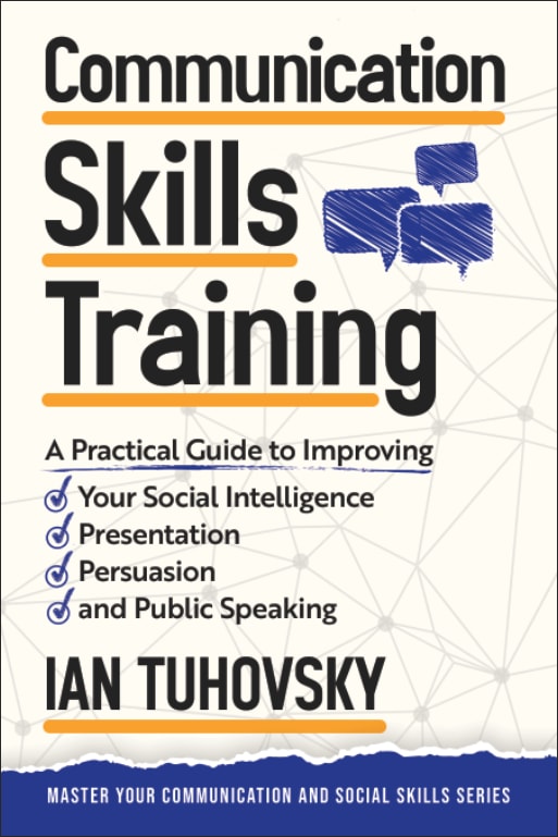
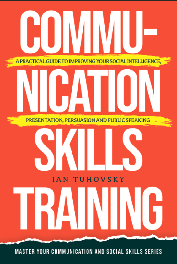
Which graphic design and color theme is better for a Communication Skills themed book cover? Which would entice you to buy the book? Why?
Age range
Education level
Gender identity
Household income range
Options
Personal income range
Racial or ethnic identity
Self-help book reader
74 Responses to Option A
This white color for the book with the text is better suited and easier to read and look at
The white background enables the text to stand out and be read easily.
The more palin vanilla looks not so bad and the deep red is a little too deep for board room.
This cover is a little more attractive to me because it highlights the key points of improvement.
I find the checklist to be more communicative than the text in between the lines, which is a bit difficult to read and didn't immediately capture my attention.
B tells me nothing, it's like shouting in my face. A tells me the info I want to know, looks professional, and the colors are nice.
A - fast and easy to read what is the book about and main objectives, I like the letter fonts and the "checks" for each goal. My only comment is about the color scheme, it's good but I think it's too common.
A is easier to read and comprehend. The other one could be confusing for some people. I like the color scheme of A better as well.
I prefer option A because to me, this book cover is easier to read.
I don't like the colors used on the other cover. Splitting the word 'communication' up into two lines also doesn't really fit the book's theme in my opinion.
I hate the word communication being split on B.
I choose option A simply because the image looks more like a training book that you would be given to read in a college class than the other which just looks like something sold at a book store for anybody to read.
I really am attracted to the bullet points in this book. It makes me want to read it more.
I choose option A for the graphic design and color theme for a Communication Skills themed book cover because it has a more serious theme whereas option B seems uninteresting in terms of skills which I would probably lose interest in the future for reading.
Option A is the best choice because it lists the skills on the cover so you know all the key topics covered.
I chose A because this book cover is clear, and easy to see and read the font.
The spacing between the word's communication skills is awful. It looks terrible and sends a bad message about the series. The option I chose looks nice and professional. Much more like something I would want to check out.
I like the color scheme of the other book a lot more, but the bulleted list on the cover I chose sold me.
The red is too in your face, communication hyphenated is odd and makes me stop reading to start on the next line, option A is cohesive and has good composition
I like option At the best because I like the information that is on the cover is very easy to read due to the white background and minimal blue colors on the cover.
The word being cut up like the choice b image book over is confusing. I would be able to read it at a quick glance and im likely to over look it completely. I think the the choice a is easier to read and look at with a quick glance. I think the font is a good size on the cover choice a too.
Option A is more clearly readable, which seems like something a communicator would want for their audience. Option B is visually stimulating but it is not readable and hard to discern what it is about, when I found out it was about communication training, it seems like a bad example and I wouldn't think the book would be very insightful.
To me, this one looks more professional. The color scheme is subtler and there's no hyphen in the middle of an important word.
I chose Cover A. The colors and images on the front cover made me interested to look at the book at further investigate if I want to read it. I think that having the bullet points on the cover also lets the reader know what to expect out of the book. I wasn't visually interested in Cover B at all.
I think having the bullet points helps to illustrate and summarize what skills you will be gaining if you read this book.
This book cover design looks more modern and more professional than the other one.
For this book I would be looking for all the words to be perfectly in line not scattered which I would then feel scattered brained
I prefer this one it is easier to read the information and I feel like the red of the other one is yelling at me.
"A" is cleaner, crisper and less "Blaring". It has a more traditional text book look to it. I greatly dislike the overbearingly bright colors on "B" and the way they hyphenated "Communication" did not flow for me.
I am put off by the harsh red in Option B. I think Option A seems more trustworthy.
This one was hard for me. I like the color and big letter of option B, but I don't like how the word is broken up. On option A I like that it looks a little more professional, but it's also a little busy and gives me too much info at once. I did go with A however because I think it looks a little more professional over all.
If you can't even put communication properly to be read as one word, I wouldn't even want to read the book because that isn't very good communication. I appreciate the red background more. But I, in good conscious, would not purchase that.
A seems more authoritative, trustworthy, and high quality. B seems like a joke or gag.
A gives a better description of what can be found in the book and what skills the book will help you develop.
option A is more professional
The layout is very easy to understand and well organized.
A looks far more professional, breaking the word communication on a poster looks absolutely awful and amateurish
I prefer the layout and colors or the one I chose. I love the check marks and list format.
I chose A because its interesting and professional. B is like it's yelling in my gave with the huge type and red color. It's a little too much.
Having the word "communication" broken up in Option B feels awkward to me, A seems to convey the message of the book much more.
I prefer words to be in one continuous line instead of being split up. I do like the orange color as it gets you eye attracted to the bright color but the blue touches does the job as well.
I like this option because I feel like the web in the background goes well with the rest of the graphics and text.
This color scheme was more appealing to me.
Straight and to the point. Not sure I am liking the way communication is written in option B
I like choice A cause I think it is easier to read and it doesn't hurt the eyes. The other option is a little too hard and makes me not want to see what the book even is.
While I love the red, I think option A is more eye catching, unique, and more informative about what the book includes which makes me more likely to read.
Choice b was abrasive and disturbing. Choice a was friendly and easy to see what’s in the book.
don't like how words are broken up in the other picture
The graphic design and color theme that is better for a Communication Skills themed book cover is Option A. Even though the color in Option B is more attractive and draws my eyes more, the broke word 'Communication' doesn't fit well with a book that suppose to improve communication skills. I think the layout of the text in Option A works better but I do prefer the background in Option B.
The layout of the cover is designed in an non intimidating way and easy to use
A works the best and lays down the bullet points of what it can help you with.
The graphic design and color theme I like better is A. For the Communication Skills themed book cover. The colors draw me to the book. It also makes me want to buy it. Whereas B doesn't. The colors throw me off.
The cover to book A looks more in line with my current library
I really like how it tells your right away what you will find in this book.
I prefer A because the cover and design is so much more straightforward when I look at it. I feel like this design in itself gets the point across easily and it feels like it makes the most sense given that the book is about making things clear.
option A is easier on the eyes than that bread color that I find the red highly distracting and I would pick up the first one option a before I would pick up the other one just because that second one is very distracting.
I don't like either of them. But the orange one is to orange, the color feels aggressive, and I don't like that communication is hyphenated. The break in the word makes it feel less communicative to me. I like the blue color better, I like the incorporation of the blue text boxes and the communication map. However I dislike all the fonts, the large font specifically feels like it wants to grow up and be comic sans.
I like this cover seems friendly and casual. It feels like an easy but informative read.
I like that there were bullet points on what I can get from this book. Just looking at the cover, it gives me more information about the book compared to the other cover.
I picked A because the cover show the topics that will be covered.
I prefer A as It is much easier to read the title. It quickly sums what the book will cover in a short checklist. The other choice is too messy, especially for a book with a topic of communication.
It is more descriptive of the content of the book. The check-marked bullet points clearly point out what the book is about
I chose A because it is clear, it helped me understand what this book is about with the bullet points and its not overwhelming like B.
I really don't like that "Communication" is across a line break and hyphenated in B
A looks more friendly. The red color brings me anxiety.
Option A seems friendlier, more accessible. It also has more information on the cover for the contents inside the book.
The book is about communication skills, so it is imperative that "communication" be one word on the cover.
Option A is much more eye-catching and exciting. Option B splits a word over two lines and this makes it feel very disjointed. I much prefer option A.
While B would grab my attention more, A has more of a professional design, and would integrate well into a business enviroment.
Option A is more straight forward. Option B's title is kind of confusing
A showcases a strategic point of view compared to B which looks more raw and refined.
This option is best for me. The title is concise. The design layout is easily readable and looks professional. I would buy this option for those two reasons.
I prefer option A because it seems more of a guidebook.
The other book captures my attention but its too hard to read - font is too big and separating the words on different lines makes it harder.
26 Responses to Option B
This cover is more eye-catching and colorful.
I feel B is more bold and really jumps out at the reader. A is too tame and boring.
I liked that this option featured a bright red color that was bold and confident.
The red color of my first choice seems more powerful and effective.
After carefully studying and comparing both proposed book covers displayed above, I selected Option B over Option A as my first preference and the one that I would definitely click on to learn more about before purchasing for my own reading enjoyment. I felt that this image jumped right out at me as having more eye catching appeal based on the bright coloring displayed on the cover.
I like the big print on the bold orange color - it draws me to the book right away.
I really like this cover in choice B a lot more than the one in choice A. I think that this one is more vibrant, more energetic. I really like the colors on this one more. It feels more in tune with the title of the book.
The book design in Option B is more dynamic and exciting
I like B because the red with the white font stands out and looks the best. A looks like it has too much going on with all the info and the design.
I think the orange red color is much more attention grabbing and visually appealing so for sure the book I'd pick up first
I prefer option B because this design is vey eye catching and attention grabbing, I love the red color.
Option B looks less like a boring textbook. I would expect to be a smoother read then the Option A
The title is bold and easy to read. There is too much going on with "A" and too distracting.
The colors of B are much more eye-catching and attention-getting -- it gets my attention immediately and I kind of trust it more because it seems less generically designed than A. It would also look better on my shelf or desk.
I chose option B because I like the orangish/red cover. It really stands out and it grabbed my attention and made me want to read the cover to see what it was about.
The blood orange color in Option B is definitely way more eye-catching, and it makes it seem more energetic.
I think B comes across as more appealing to the eye for their color scheme and stands out. Overall, B seems to be more striking and stands out.
I prefer choice B because the red background makes the words stand out.
Choice B is bold and in your face! You can't miss it on the shelf and will definitely be noticed (the red cover stands out). However, the way they broke up the word communication was odd.
I would for sure gravitate to the orange color book it catches my eye way more than the other.
I like choice B because I feel that the cover on the book is more eye catching
Option B has a bold color which makes this book stand out a lot better.
B is a better choice for me because it stands out more and the text is easier to read.
I prefer the red cover more than the other, I would go with B for this one
choice B because of the bolder style of text
The red color and bigger, bolder letters brought my attention to this much faster than the other option. Plus, the other option looks kind of bland with the boring background.
Explore who answered your poll
Analyze your results with demographic reports.
Demographics
Sorry, AI highlights are currently only available for polls created after February 28th.
We're working hard to bring AI to more polls, please check back soon.

