Poll results
Save to favorites
Add this poll to your saved list for easy reference.
Which graphic design and color theme is better for a Communication Skills themed book cover? Which would entice you to buy the book? Why?
Age range
Education level
Gender identity
Household income range
Options
Personal income range
Racial or ethnic identity
Self-help book reader
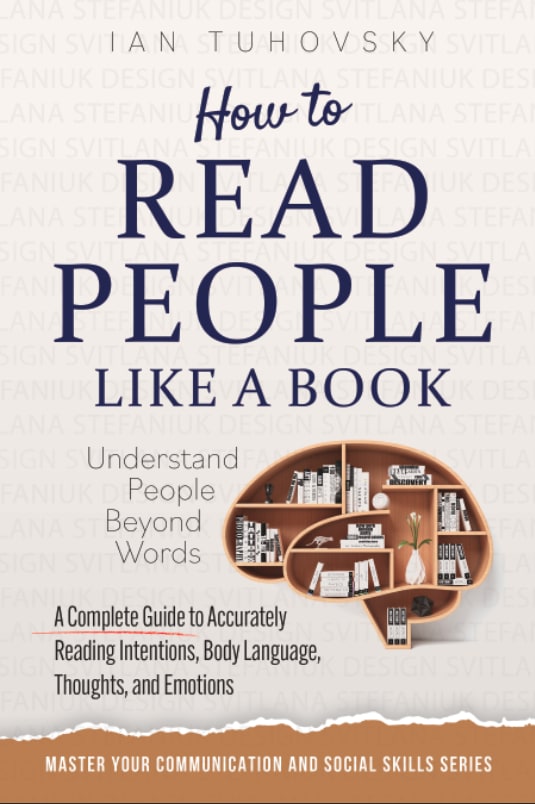
33 Responses to Option A
This is a slightly more pleasant and inviting cover that makes the book seem more casual and calm.
This is much more memorable, and I like the image on the cover. Honestly, I think there could be an even better image (with actual people), but this is a good start.
The brain bookshelf is a genius way to display this product in all its glory for the cover of the book
I think the cover is friendlier and more comforting. I think that is the kind of feeling that someone interested in a book like this would like to be feeling.
I like the rustic retro look better than the in your face red color.
I like option A because overall the cover looks more serious and gives the impression that it will be a helpful book. I like the picture of the bookcase shaped like a brain. It helps you imagine how the title of the book will be true to its purpose. Also the cover is very easy to read with it having neutral colors. In option A, the red color is overpowering and it makes the book appear cartoonish.
The clean look and design of the cover really communicates the feel of the subject. The white really shows of the steer and official cogitation the book seems to be going for.
I like this cover because it isn't too bright, where it actually hurts my eyes to look at. I think the design is simple and professional.
The clever use of colors makes your eye look at the title and the design is quite interesting as well. Due to the contrast of the colors the text is easy to read.
The red color used in the other version sticks out and catches my eye, but it doesn't look as professional to me. The image in this version also fits well.
I chose option A because the beige color is more relaxing.
The color in Option A looks more professional and trustworthy. The red in Option B is not good.
Tough. I like how B "highlights" the term "understand people beyond words" and it's bold and bright, but I think I like the actual books and the color scheme of A a bit more.
I like the concept and how the front covers is light and pulls you attention.
The pink is too harsh. The image of the brain and books makes more sense. People are not computers, which is what I think the lines on the pink book are trying to represent (???)
It's more gender neutral and I like that the graphic looks like a brain but it's a bookshelf which is related to the title of the book.
I like option A the best because I really lie the shelving unit that is shaped like a human brain.
This option looks more professional and smart.
I liked that the color on this cover was a lot more subtle since this felt more refreshing and elegant.
Red is such an aggressive color for a book like this. Psychologically it means stop. A is a lot more appealing because of the color
B is a bit too much red. Not to be morbid, but it looks like blood. A is a much more agreeable, amenable design.
I chose option A as the choice that is better for a Communication Skills themed book cover because it is much easier to read the titles on the front of the book and better communicates the idea of the book. Option A would entice me to buy the book in option A because it looks like it is more professional and presentable looking.
I like how the cover has an image of brain on allowing you to understand what is about by just looking at the cover and not reading anything
I thought that the brain image was very relevant to the purpose of the book and makes the cover much more memorable.
I prefer option A because this book cover looks higher in quality and well thought out, design communicates more trustworthy.
The cover for A is more compelling and I like the brain as a bookshelf.
The red color is a little too much in my face. Option A's use of the image with the bookshelf shaped like a brain is also effective in grabbing my attention.
The reason why I went with A over B is because B seems to be more technical and elec tronic compared to A which allueds to the tittle of the book better than B.
I like the look of the cover - it's more calm. I like the brown tones.
I love A because of the colors and the overall design. I love he brain with the books in it.
This cover looked more psychologically driven, which I preferred for this topic.
That graphic of the book shelf in the shape of a brain is brilliant and eye catching.
This cover is much more professional
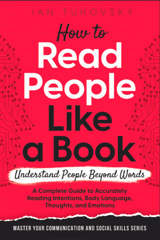
17 Responses to Option B
I prefer B because the red background really pops out at me immediately. It's highly vivid.
I chose Option B first because I think that color draws attention right away, while all te neutral colors of Option A just blend into any book shelf or web page
I think that this book cover is more vibrant. I like the read color. I also like the font on this one more, I think it feels more modern and cool.
I like B because I like the red with the black and white font. It gets my attention first. B is kind of boring in comparison.
The coloring is definitely eye grabbing although the background looks kind of childish like a coloring book. But I definitely would be more apt to pick up the red book.
This color is more eye-catching and makes the words 'pop' more.
The color of my first choice is powerful and it seems most interesting and dynamic.
I like the bold colors and it's easy to read and understand exactly what the book is about.
If I saw both products side by side Choice A would catch my attention the fastest.
This is a better cover for a book on this topic because the color and design are more engaging.
B is more compelling, but I do not like the fonts or the color scheme, it's too agressive. Overall I love A and the brain bookshelf design but I think B is a cleaner look.
B is bold, eye catching, intriguing and powerful.
I like the design and all the lines that infer that is how the brain is wired. I also like the red color as it stands out and gets my attention.
Definately the bright pink would entice me
I prefer the color scheme and design of B over A. A seems too bland and boring compared to B.
The graphic design and color theme for a Communication Skills themed book cover that would entice you to buy the book is Option B. I think the red color draws me immediately to this book and design. The "read people" in white also stands out a lot and immediately gives me a sense of what the book is about.
The red cover stands out while the beige one would not jump out to me. Also the background of the beige looks like a watermark.
Explore who answered your poll
Analyze your results with demographic reports.
Demographics
Sorry, AI highlights are currently only available for polls created after February 28th.
We're working hard to bring AI to more polls, please check back soon.

