Poll results
Save to favorites
Add this poll to your saved list for easy reference.
Which fun, non-fiction children's book cover, for ages 4-9, is most appealing and would sell better? Suggestions?
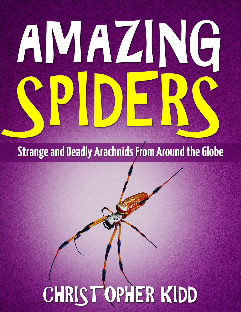
16 Responses to Option A
i think the purple cover is the one i would purchase. i like the font on that one it just stands out.
My children really like books that look like Option A. They're not scary or weird, just cool things to be observed.
I think choice A would sell better. The purple is unique and sort of brings home the fact that spiders are interesting and maybe a little scary. Not to mention Halloween is coming up.
i like this one best. it has big title and only one spider instead of crowding the page with a bunch of them. i also like that the author is on the front page that is important. they worked hard on the book and should be recognized.
I prefer option A because the cover looks more dynamic and interesting. Option B does not really intrigue me as much overall.
Tough choice, but I will go with A because of the purple scheme. Purple is often used to denote poison or venom, which fits the theme of deadly spiders. It's a toss up though because yellow is often used as a cautionary color, which also fits the theme.
An ironic name. However I also think this cover would sell better because one I like the coloring more number 2 it looks more like a kid's book and it looks more like a kid's book and it looks more tickets designed to teach as well as sticking out more on the shelf
I like option A the best because the purple background stands out more and grabs my attention.
I think that the book cover in option A would sell better because it is more eye-catching and visually appealing.
I prefer option A because it looks fun, looks more appealing.
A has the better color scheme and the overall design is cooler.
Option B is a little terrifying to me
I like the purple cover with this text that is used for the book here
I like the colors and text of option B better but its way more creepy with the spiders and lighting on said spiders.
I just happen to like the purple background more.
I like the purple background for the title more. That is a better draw and more visibly fun. I think that makes it awesome and we do want to know more about the arachnids. Perfect appeal to the kids aged 4-9 and a nice look in both. I prefer option A for the design.
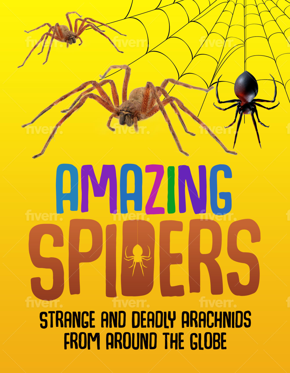
34 Responses to Option B
I think the book cover of option B is more eye-catching than the book cover of option A.
The lighter background is a little more inviting and I think it makes the spider look more friendly which would attract children better.
This option showed the spider web and also featured a brighter and sunnier cover.
I think this would sell better because the cover is brighter and more colorful. It also has more pictures of spiders which the kids would want to see
I like the multiple colors in the title in Option B.
I like B because the yellow makes it stand out more
The colors here are really cool, and the big pictures of multiple spiders. I do like the purple in A, but everything else about B is better.
B because it has more bugs and will capture their attention more.
I think looks more fun and intriguing especially for children . I like the bright orange and yellow as well.
I think the yellow will attract more kids. And there isn't as much of a focus on strange and deadly as there is on A. It's there but the font makes it less of a focus .
The yellow color of this option is bright and appealing, and caught my attention. The other option is also nice, but the yellow is really great for sure!
B has a strong layout and I like the visual much better.
I voted based on how appealing the images were to me compared to the others and which ones I would click on in the real world.
I prefer the option B book cover because I like the spider web and three spiders shown on this book cover. I would like it if the option B book cover also a had the author name somewhere on the book cover like on the bottom of the option A book cover.
I think the variety of spiders on the cover plus the larger and more colorful text on the book would be more appealing to children in that age range.
I think the yellow one with the multiple spiders is very eye catching. It gets your attention. I would buy this one. I think in the book store or online it would stand out. Thank you.
I think that B is a good combination of looking appealing and fun without being too scary.
For that age group, I think the more spiders the better. My son is 8 and he likes this option.
Choice B is more appealing to me for that age range because I like how the cover has different spiders on it and how the lettering has some coloring on top and then the spider logo inside of the letter d as well. Adds more variance to it.
They both are creepy with the real spiders, but I think the colorful words will draw kids attentions a little better.
I think kids would like seeing more than 1 spider on the cover. Also, kids like spider webs and I like how the word "amazing" is in different colors.
I prefer the book cover with more than one spider on it. I makes me think I going to see more.
I like pictures of different types of spiders as well as the colorful title.
The font choice here is much better, even though there is a water mark on it.
Choice B looks more fun and has a more diverse array of spiders. I feel like my kids would get more excited about it.
This is an honest book. It is best not to sugarcoat it. Maybe a fake toy spider of the deadliest sort should be sold with it. It should be native to your area. It will teach children not to go near them.
I picked B as my top choice as the yellow color makes the spiders stand out.
Four ages 4-9 I choose the first image as it is more vibrant and attention getting. For any older than that I think the second would be best as it has a more grown up look to it.
The imagery on this cover has more of a dynamic sort of look to it.
I think B would seem more fun and engaging. The vibrant colors and combinations along with the graphics also make the book seem more interesting and exciting, which would be more compelling for kids around that age group.
I like B as it has more than one spider on the picture. My son would have wanted this book when he was younger.
The enlarged real images of spiders gives an interesting realistic look with colorful texts to give focus on the kids with bright yellow background are appealing to the not just kids but to adult like us.
Both are very well done, but B with the web, multiple spiders and the spider inlayed into the D takes the prize
I feel B has a more fun vibe to the cover. Not crazy about the color scheme, however. Maybe try some different primary color combos?
Explore who answered your poll
Analyze your results with demographic reports.
Demographics
Sorry, AI highlights are currently only available for polls created after February 28th.
We're working hard to bring AI to more polls, please check back soon.

