Poll results
Save to favorites
Add this poll to your saved list for easy reference.
Which cover would you prefer for a Horror novel, and why?


Age range
Education level
Favorite book genres
Gender identity
Options
Personal income range
Preferred book format
Racial or ethnic identity
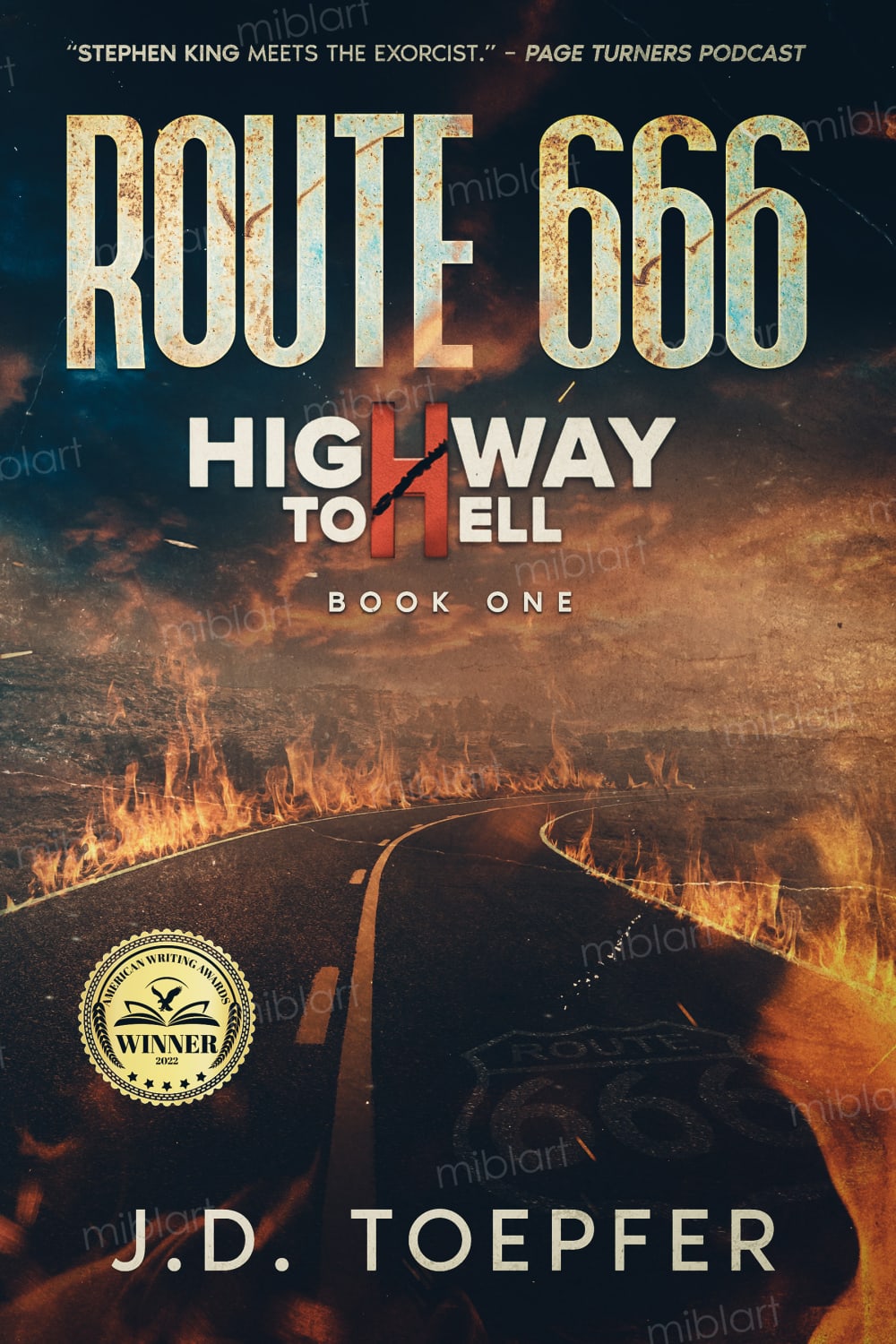
29 Responses to Option A
This one is easier to read and it's clearly the first book in a series. I got all this information quickly and I appreciate it.
I like the addition of highway to hell. It also makes it easier to tell the book is part of a series
I like the two uses of the letter "H" in this option.
The "Highway To Hell" information makes the entire book theme a lot scarier to me.
Looks better and makes it more clear it is part of a series and gives it sort of an epic feel to it
This seems like more of an adventure, and being book 1 intrigues me.
I like that it says, "Highway to hell".
Option A seems to speak more to the book it self, I like the endorsement at the top and then being able to read the description and author from top to bottom.
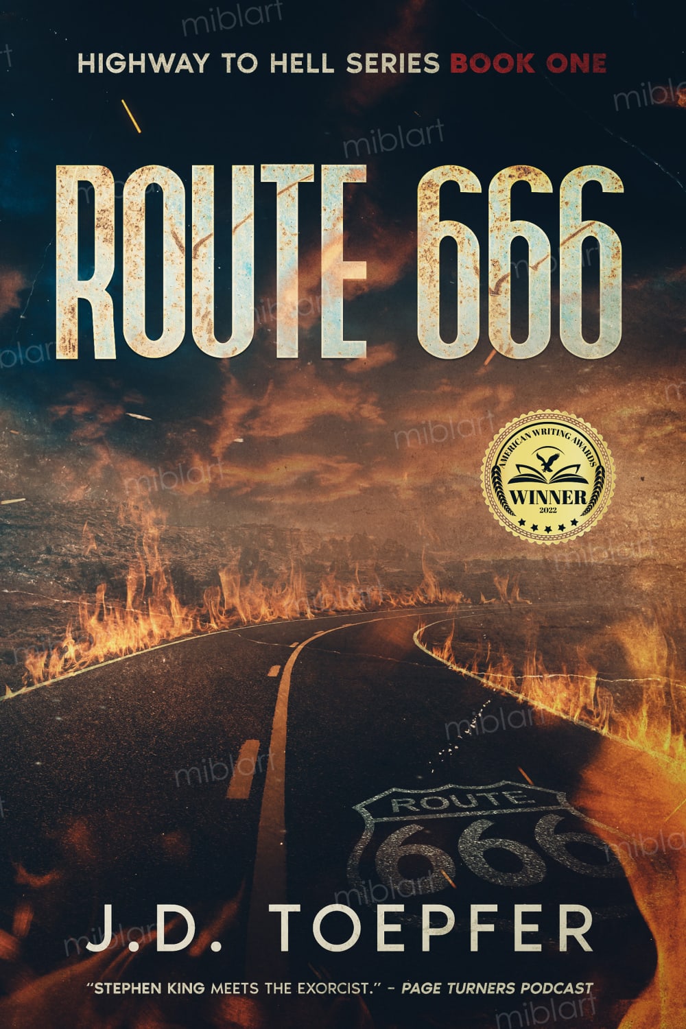
The subtext in option B gets lost or overlooked, and makes the cover look boring.
i would prefer the cover in option A because it looks like a more high quality book
The Stephen King blurb is far more important than the information that this is a series.The blurb makes me want to buy it, the realization that it's a series make me want to avoid it.
I think A with the flaming font looks scarier than in B which is just kind of plain in design.
I feel like A has a more compelling layout. It's much easier to see the American Writing Award Symbol on A, it took me a while to notice it was there on B.
The cover in Choice A catches my attention a lot more. Having the quip about King at the top makes it far more noticeable, and I noticed it a lot sooner, and that's very relevant to me since I'm a fan of King. A lot of people are. Opening with that is going to be a strong move in my opinion. I also think having the trilogy number horizontal, and written artistically, is also a more powerful look than how it is in Choice B.
A is better in my opinion for the additional text and the font design of it as well as the general arrangement and visual composition of the different graphical elements which i think make it look better
I chose option A, I think the Highway to Hell logo has a bit of a retro look, which I like.
Option A is much more striking design wise. It's more likely to grab the reader's interest because the seal for the award is more prominent and the "Highway to Hell" graphic with the big red H is eye-catching. The Highway to Hell title is lost on option B.
This one looks cooler with the giant red H on it.
Choice A is better display because of the location of the winner logo at the bottom section of the display which makes it easy to read another contents of the cover as compared to choice B which has the logo at the middle which makes it less attractive to me.
Choice A is the one I prefer because I like the layout better. I like how it has the endorsement quote at the top, followed by the name and the subtitle centered nicely below that. I also like the placement of the gold seal better as well.
The added Highway to hell part makes it look more ominous .
It’s good tjag it’s rhihjt in the open it’s part of an o going series
A is more standard format, its easier to see the important information.
A is the best because it is more exciting and tells you more about the book
I like franchises and series so promoting that it's part of one would be enticing to me.
The layout in A is more pleasing to me. The layout looks natural
Much more horror in this cover. The “Highway to Hell” graphic with the red H used in both Highway and hell was very eye catching.
I like this one more because the writing on the pavement is lighter. There is no need to have it written twice so clear to see in the othe one especialy if the title is rt 666.
The highway to hell idea makes it stand out much more and I like seeing that it's book one. Gives me something to look forward to when I finish the book! The layout looks much better.
21 Responses to Option B
THe smaller title is nice you can see more of the cover of the book which I like a lot
I like how the extra information (ie that is the first book) is on the top and bottom of the page in a way that it is easy to see but also does not distract from the cover art
the extra words make it appear a bit less horrific and mysterious.
I prefer B because the "Highway to Hell book one" is smaller and not as noticeable, and I am not used to seeing "book one" in large font on the cover.
I like the series title at the top. The title in big letters catches the eye
I like the cover design in option B better. The text "Highway to Hell Book One" in option A is too distracting. I like the formatting used in option B.
I prefer option B cover looks appealing. I find it easy on the eyes.
Option B's design looks cleaner and the placement of the award-winner stickers makes more visual sense because it's the first thing I see vs. the way Option A sticks it on the left hand side like an afterthought. Plus, I could do without the quote used in Option A.
I would prefer option B. Something about the minimalist design of just having the title strikes me as more appealing.
there is too much information overload on the other option A
Based on the design, the book is one of the series of "Highway to Hell". I think the phrase "Highway to Hell" in A may be misunderstood as the subtitle by many people based on the design. Making people be confused is definitely a bad idea in design. Thus, A is not my choice. The design in B does not cause any confusions.
I think I like the emphasis on the main title, but also including that it's a series in a smaller font towards the top. I think having it at this format makes me focus on the title more, but also makes me intrigued on what Route 666 is.
I like single title without the subtitle. It has more interpretations and meaning.
Option B looks less tacky than option A. I like the subtitle across the top.
Just the title is enough information to go off of for the cover.
I prefer the focus on the title rather than the series title.
While it may be tempting to put that it is book one of a series, I think B looks more clean and appealing.
I have a variety of reasons for why I like option B more than I like option A. My first impression after looking at both options was that I like option B more. As to the why, the first is the text placement for the title and the quote. The quote at the top of the cover for option A diminishes the strength of the title name being the first thing I look at when I look at a book cover, because when I look at a book cover I start at the top of the book cover and then my eyes read the rest of the words as I look at the cover and register what it is that I am reading. So, when I see the quote first instead of the name of the book I'm not as focused on the title of the book or thinking about the book as much as I am focused first on contemplating what the quote means. I like that option B has the quote at the bottom of the cover and that the title and series description are what I read first instead when I start reading from the top of the cover. Another thing that I liked between option A and B is that option B has the book title on the highway much brighter and easier to read compared to how option A presents the numbers and the word route. I think making it brighter and easier to read reinforces the clarity of what the title of the book is and makes it easier to remember the title if one were to read the book starting from the bottom of the cover or starting from the top of the cover. Essentially, I like option B more than option A because it's easier to read, the title is easier to remember, and I like the quote placement and the way the series is described better compared to option A. I also think the placement for the winner symbol is better for option B compared to option A because the location of the symbol for option A obscures the highway somewhat and option B does not obscure the highway as much which makes it easier to see that it is a highway. So those are the reasons I like option B more.
The series is Highway to Hell. It will be less confusing if the titles are different than the series.
"Highway to hell" text just looks cheap and tacked on.
I like b better. I don't need the extra text shown in A to sell me on the book. The picture does all of the work.
Explore who answered your poll
Analyze your results with demographic reports.
Demographics
Sorry, AI highlights are currently only available for polls created after February 28th.
We're working hard to bring AI to more polls, please check back soon.

