Poll results
Save to favorites
Add this poll to your saved list for easy reference.
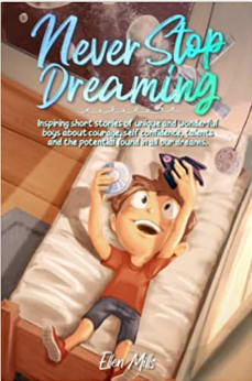
Which cover would you find more appealing for a book with inspiring stories for boys aged 7-8?
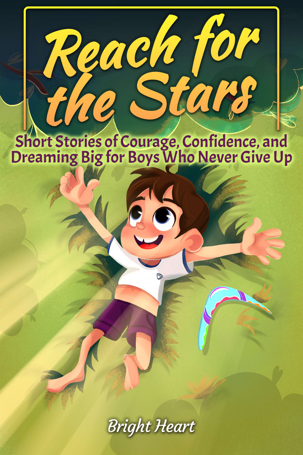
26 Responses to Option A
Just feels a bit more aspirational
I like this cover and title more, because it feels a bit more active. "Dreaming" is just fine, but dreams won't happen without action.
I prefer A because it’s more simple and straightforward.
I love this one because it shows them outside and it shows them exploring the world around them which I love
It has a more active and lively character on it. I think it is a more interesting cover.
I think A is more appealing. I like that the boy is out in nature and isn’t confined to his bed.
I like option A because its more colorful and fun looking.
I like the bold colours on choice A. The artwork is easier to see. The 'naturey' green is pleasant to look at.
The other book cover is a lot more complex and it's kind of hard to see the kid in the picture
The colors seem fun and the illustration looks fun for a young boy. This makes it seem like it would be a fun and interesting read.
i chose option a because reaching for the stars is something my parents used to motivate me when i was a kid to set goals
I think the color profile was more interesting and inviting in the option A cover. I also liked the cartoon of the child more.
I rather prefer the option A story book cover because I like the reach for the stars title text and how the subtitle text is much easier to read on the green grass background shown here.
The face on the other character looks a bit off and disturbing. This one looks more wholesome.
A-reach for the stars is more inspiring than never stop dreaming B, especially for a child
I like the colors more on option A. It looks more appealing.
I think kids would find the idea of reaching for the stars a better metaphor than not stopping dreaming. At that age dreaming = sleep = nightmares or bedtime.
its attractive and doesn't show any resemblance of lazing around
Better art and adventurous sounding title in option a
Option a has a title more appropriate for young boys.
a looks like a fun book, the child is happy and the titel means everything is possible and achievable.
it is more colorful and the picture shows a better happy face.
Option A seems more fun in its design and more geared towards kids.
The green background is more attention grabbing.
less text on the cover, gets the point across pretty well of what's in the book, not that people tend to read that kinda stuff but hey.
Reach for the stars sounds cuter for a small child because it makes me imagine a young child jumping and trying to reach the sky. Also I don’t like the photo in option B because the boy looks crazy.
24 Responses to Option B
I like the illustration of the kid laying on the bed playing with a space ship, as seen in option B. I really can't make sense of what is all around the illustration of the kid on the cover of option A.
B's cover has a lot more detail to it that makes it pop out a lot more to me.
The more realistic look to the cartoon is fitting for a fantasy setting.
I feel like the style in A is too generic and the title is a bit boring as well. I find the art in B to be better and the title is more unique and interesting to me.
I think the cover is more artistic and appealing overall, I think kids that age would appreciate the better details.
I chose B, because I feel that it is more realistic and makes me think of a child and his dreams to become something great when he grows up.
I think that this picture is better looking compared to the other one
I like B better; the graphics are cuter. I don't like A because it says "for boys who never give up", which sounds like it could exclude some boys.
In my opinion, option B looks really beautiful and appealing to my eye.
I like option B the best because I love the image of the little boy laying in his bed playing with the toys, which makes it look like he's inspired and dreaming about what his future will be like.
both are outstanding; the look on the kid's face in "B" is a little more appropriate.
I think the colors and the design stand out more, and would draw a kid in to the story.
Three green background that the color always to be lying on, appears un-natural
I choose B, I like the creativeness and idea of the example it's very suitable and attractive.
Definitely Option B because Option A looks like something more for a baby in my personal opinion. Thank you.
I feel this book would resonate with more children as they all have dreams.
I think it pictures things boys that age are interested in (i.e. rocket ships)
I think option B is better, it looks cool and the name with the picture makes a lot of sense. I think boys could picture themselves laying on their bed like that. Option A, the title with the picture is confusing because to me it looks more like the boy is falling and not reaching for the stars.
I think the drawing of the boy laying on the bed with the toys in his hands is more appealing than the drawing of the in the green blob in A. Both titles might be acceptable but it should be closer to a kid of that age understanding.
I picked B because the title seem more achieveable.
This one has a great look to it, and kids enjoy that bed metaphor in my opinion.
I just like this overall design and is more clear. I like seeing the kid in bed having fun and makes me think of bed time stories. I also like the color of the title a lot better
I really like that art style in choice b. I looks like a triple A video game animation. My kids would love it
I thought B seemed a little bit more new and different than A
Explore who answered your poll
Analyze your results with demographic reports.

