Poll results
Save to favorites
Add this poll to your saved list for easy reference.
Which cover would make you want to by this Urban Fantasy book about modern-day witches in Salem?
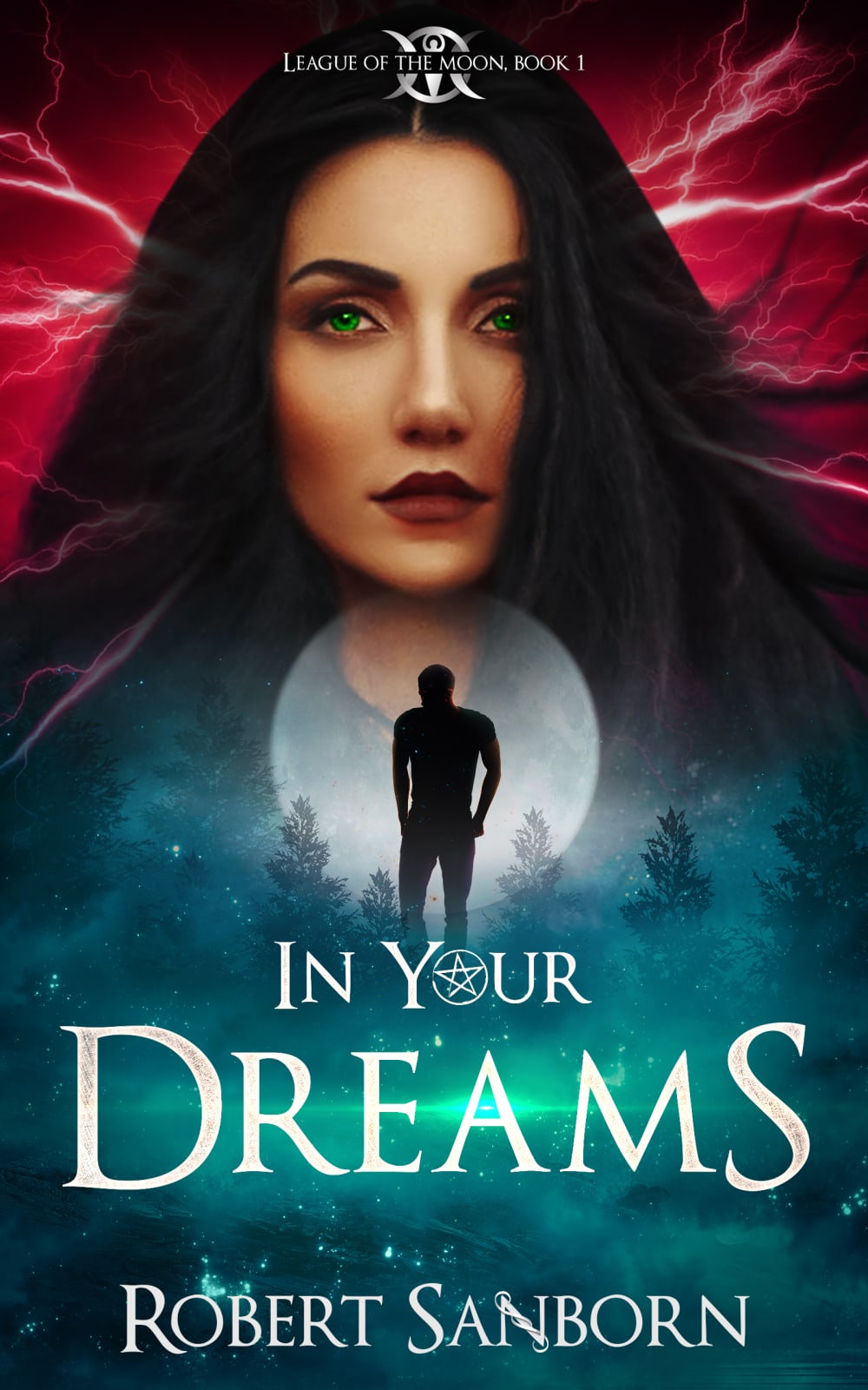
27 Responses to Option A
I think this cover draws the eye more as it includes people and contrasting colors.
I like seeing the woman on cover ?
The cover for choice A is more intriquing and makes me want to read the book.
I think that if i was looking for a book online or in the store that this options cover would grab my attention more and at least get me to look into what the book was about.
I chose A because being able to put a face with the stories and tales makes me feel more connected and that I can trust the book more.
I love the cool colors to this cover and the overall sort of dreamy feeling to this as it matches the title very well.
Probably choice A because it includes actual people on the cover which helps me understand the tone and the theme of the book a little more, so I like choice A.
I like the cover in a because it shows the face of a person, which makes me think more of a character and connects me to them. B is just very generic.
I think it's cool to kind of get a feel for the character by giving her a face, though that won't necessarily be how the reader pictures her, it makes an impression
I like option A better. I like that the cover gives me an idea of what the character might look like. i think it helps develop a personality for the character in my mind
Option A is more visually eye catching. The cover has a good color scheme transition, and puts focus on certain characters, which would help for visualizing the characters throughout.
Option A cover looks way more interesting. The cover fits what the book is about more than option B.
I think I like option A better because I feel like it tells me more about what the story is about, more of the plot and more about the characters. It makes me want to know who the lady is and who the person is in front of the moon. The other cover doesn't give me much to go on.
I selected Option A because of the fact that it ties to witches of Salem, I think it's a good idea to picture one on the cover. I think it could potentially be confused with werewolves due to male figure and full moon, but it was still clearer than Option B, which didn't really tie to the supernatural in the same way.
I like the color of the other one more but this one shows more what the book is about and exactly what it has to do with
I think given it is a witch book - having someone that depicts a witch is helpful.
This one fits the theme of the book better
her eyes really pull me in and makes me want to pick up the book
There are a couple of reasons I picked option A. First I love the "League of the Moon" logo kind of thing at the top - brilliant! Then the overall picture used here is more dreaming. In option B - what's going on there? I have no idea. There's a moon....that's it. At least there's a suggestion of a dreamlike world in option A. I honestly feel like it still could be better, but maybe this image makes more sense in the context of the book. That said it feels better than option B.
Option A has a more interesting cover, it is more bewitching and enticing.
Having a picture of a character is a good visual for me. The intrigue of the shadowy figure draws me in.
You get more of an idea about the book from this cover. The pentagram in the O of "your" gives you the sense that it is about witches.
I chose option A because the attractive woman makes the the design more appealing
Choice A would be more likely to make me want to purchase this book. It stands out much more than the other option.
a grabs my eye over b, good coloring and detail
I really love the colors in option B with the blues below and the shadow of a man. It is very alluring and enticing. I generally don't like people to be on covers but in this case it is a great juxtaposition with the female face on top and the moon with the silhouette below. Very well done, I even like the pentagram accent on the O of "Your". My only criticism is that I like the way "League of the Moon" is presented in Option B.
The cover has many things that makes me curious about what the story is about. Is this woman the main character? What does she do? Is she a witch? Is she good or bad?
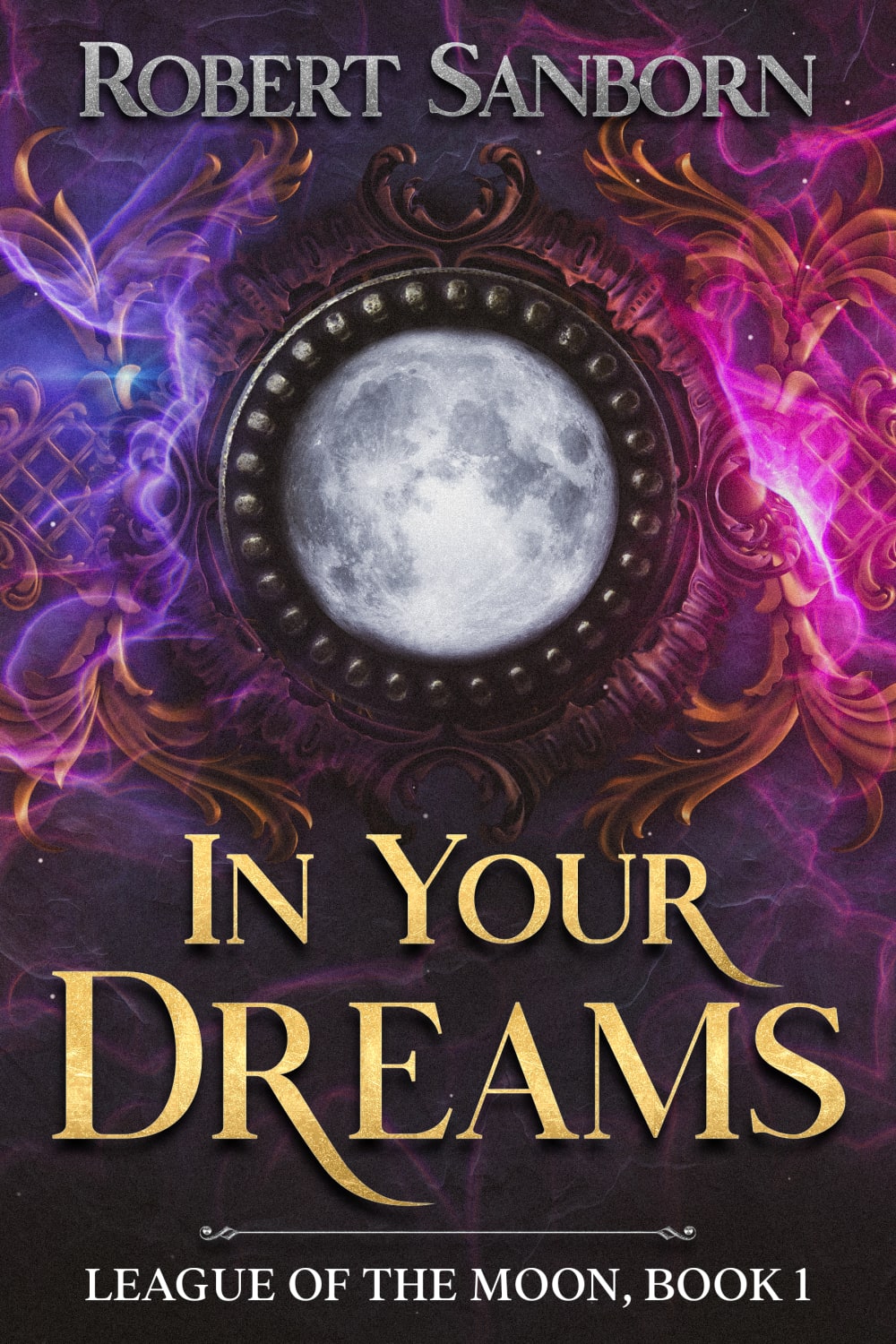
23 Responses to Option B
i prefer books without faces on them so i can imagine the characters how i want
B's cover stands out a lot more and is able to draw my interest to it.
I like that it looks like it's a series of books I can fall into. Looks more interesting.
I like the colors and the whole mystic feel of the cover, it's more appealing overall.
Since the book has moon in the series name, I think B is better. I also don't like the artwork in A.
the big face on the otherone looks too generic, it doesnt appeal to me, give me too thought about the characters
I always prefer weird drawings than pictures of characters
I choose B because it is a more symbolic representation of witches or supernaturals. The color purple is more inviting and the overall design is more intriguing.
I like the look on b. Just fits the dream thing.
B: I like the yellowish color for the title. The way the moon is central and how it has all this "gilding" around it makes me think think a lot about what this story could be about. it seems to have a lot potential.A: I dont like these sorts of covers because there's all this lore and info that i dont know so i have zero reason to be invested in it. I have no idea who this lady is or what the silhouette means. I think the other cover is more "enticing" it invites people to think about the world and this one just shows you people in it with no context.
This is much more magic focused for me
I like this option because it matches the title of the novel. It leaves some mystery behind and makes you want to know exactly what the book is about.
I don't like covers with faces on them very much.
has slightly more information "league of the moon" in the title
I like B for a cover. It's colorful, cool and fits the genre. A is ok but I am not fond of the images on the cover.
Option B looks more abstract, and thus more interesting. Based on the cover of Option B, I would really have no idea what the book was about, so I would not immediately get any preconceived notions about it, like I would with the picture in Option A. Thus, I would be less willing to automatically dismiss and more likely to take a look at it.
The woman's face in A is REALLY edited, like too much. So I would go with B.
I like this image a lot better. It has a lot of energy to it and makes it look more exciting
I feel like B is more typical of what sells and A is poorly designed. A has too many things going on whereas B is really focusing on story and not some cg model.
Image A would be very good without the two people on it, and without the pentagram, which is too obvious. The font for the name of the author is more attractive in B. The image in B is more mysterious and that makes me want to read the book more. The font in the title of the book is better in B because it is evenly sized and not distracting from the message.
B looks more mysterious and it's more prominent that this is book 1 (I almost missed that fact in A the first time I looked at it). Also, B has some air of strangeness around the mirror or object in the front of the book. A is just like "Here's a generic witch character" and doesn't feel as well thought out as it could have been.
I would want to know that this book was part of a series. I don't like to find that out after I have been reading the book for a while. I think this cover has much more of a fantasy look to it.
I like B over A because I overall like the placing and size of the text better for B.
Explore who answered your poll
Analyze your results with demographic reports.
Demographics
Sorry, AI highlights are currently only available for polls created after February 28th.
We're working hard to bring AI to more polls, please check back soon.

