Poll results
Save to favorites
Add this poll to your saved list for easy reference.
Which cover would entice you to read the full book description and/or buy the book?
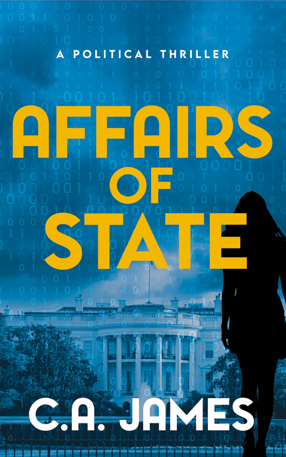
31 Responses to Option A
the silhouette of the woman adds an aura of mystery.
Option A's cover would entice me the most to the full book description since it has an air of mystery based on the figure in the forefront of the cover
Assuming that this is about a relationship going on in the whitehouse, I like the image on the left as it implies more about what the story will be about.
This cover design is quite beautiful and i cannot wait to read this.
The woman's figure is more morbid.
it appears to be a larger book. but actually they both look the same
The dark figure pf a women in the cover page in option A makes the cover design more mysterious and interesting to read.
The person on the cover in Option A adds some mystery to the image which makes the book more appealing and interesting to me.
The silhouette with the woman brings some mystery and makes me more curious.
Choice A has a brighter shade of blue. Choice B is murkier. At least that's what I initially thought. Choice A has an additional dark figure on it, which adds to the "affair" of the title.
I like A with the shadow of the person in it. It makes the book spooky.
A has the mysterious woman on the cover.
This is a lot more interesting and ties into the title more.
by adding the woman to the cover it hints that there is a love affair going on as well as the affairs of the white house. sounds intriguing!
Adding the female shadow did make me interested. The other one did not. The idea of the subject matter even changed.
The shadow of the woman is very mysterious, so that is the one I would choose.
The silhouette of a woman indicates an actual affair. A full blown scandal in the white house.
Having that siloutte of a person gives it an intrigueing sort of look and would make me pick it up to check the descriptions.
This one because you would think a lady is involved and someone in power is having an affair.
I chose A because of the shadowy figure on the cover. It signals that the book is a thriller.
I think Option A would be a bit more than Option B. I think Option A gives a better idea of what to expect with the woman on the cover.
The colors one the cover and the Font of the writing are complementing each other and thus easy to read the title and attracting the eyes
because the cover indicates that it not just politically that nit is also involves inner human connections.
if the book is about a marital affair then option A would be a better choice
Always a little more of a mystery when you see a person standing in the shadows.
A seems to be more mysterious with the lady shadow and the buildings seem to be a little more clear than B.
I chose option A because the silhouette of the woman makes the book cover more intriguing compared to the image without the woman of option B. Option A makes the consumer wonder, "Who is the woman, how is she involved, and how does she relate to the title of the book?"
I LIKE THE ADDITION OF THE SHADOWED WOMAN IN THIS BOOK COVER. IT GIVES IT AN ADDED ELEMENT OF MYSTERY AND SUSPENSE. THIS ONE WOULD ENTICE ME MORE TO READ THE BOOK.
There was a shadow figure on this one so it was more interesting than the other one.
It looks more intriguing and mysterious and kind of scarey with the shadow. It makes you wonder why the woman is in the title and what this book is all about
I would purchase choice A because of the female depiction on the cover out of curiousity of her part in the title.
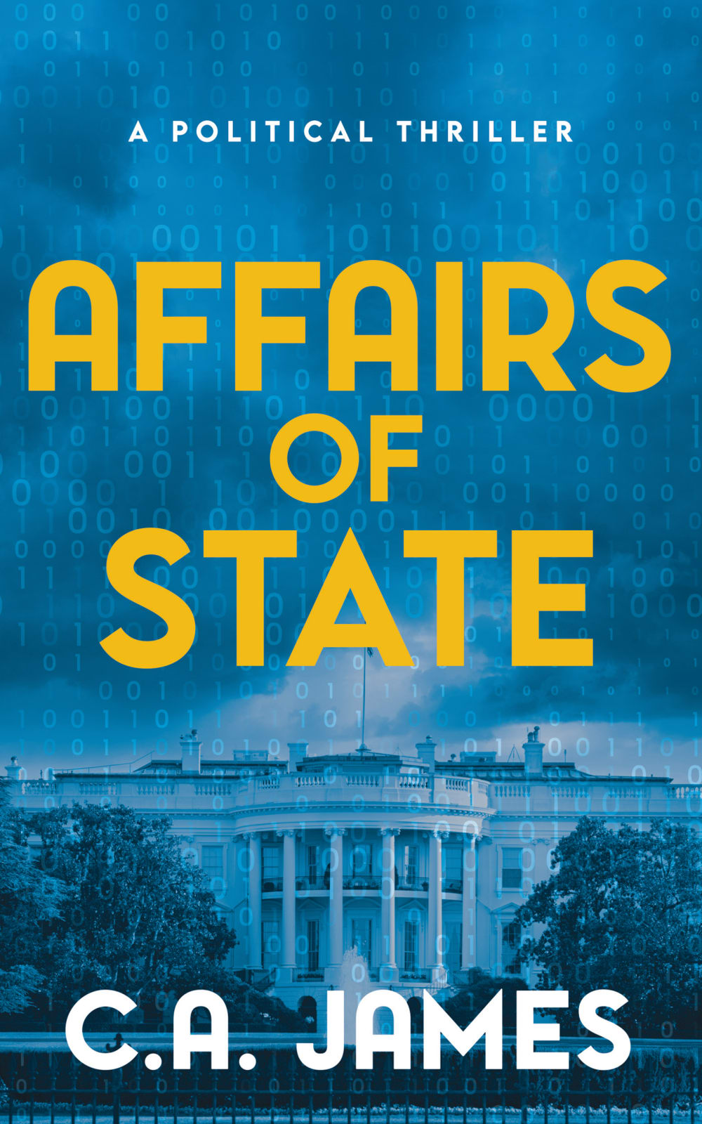
19 Responses to Option B
This cover has a stronger look. The silhouette of the woman in A isn't recognizable at first. Just looks like a black mass.
I prefer B's more simplistic design. It would intrigue me more and make me try to read its description. The other one with the silhouette of the lady looks pretty "cheap" and I'd think it's some kind of romance book for old ladies.
I really like this one , without the person in the image. I think that image, distracts from the beauty of the cover with just the white house. I love the bold yellow font, against the blue.
The silhouette in Option A is a bit distracting and I'm not sure it fits into the composition of the image very well. I think it should be excluded.
The shadow in the background of the other cover looks too fake and stereotypical.
This choice is easy to read. The photo on the cover helps yo explain what the book is about. The blue background with yellow title is acceptable to the eye. Choice A has a silhouette of a person which is distracting.
the background seems to be a bit more clear
more interest in political fiction, sexual is not main interest, blue is not best color to show off title
I would pick option B with the lighter blue and the white house. Option B would really strike my interest.
I think option B looks fine with its simplicity. Adding a shadowy figure makes it look a little weird.
It's hard to tell from cover A what it's showing at first glance. I don't think showing the woman on the cover really does much for my interest. I prefer B which shows the normal trees or bushes that aren't covering the building and no not showing a person.
I prefer it without the image of the woman as it makes it look sexual
I like this without the silhouette on the cover.
I like the B version better. It makes me more interested than the one with the shadow figure in the front. I am kind of scared of the shadowy figure and really, I don't want to read a scary book at the moment.
B The cover is alright. I would use a different color than yellow for the title. Make the title slightly smaller. I would use a different color for the author name and use a different font style and size across the bottom. Then, I would be more interested in reading about the book.
I like Option B the best because it doesn't have the image of a woman on the cover because it doesn't make any sense to have that on there.
I think that the silhouette on A is very distracting. I think that without it, the moodiness, and the color scheme does a good job at emphasizing the vibe of the book.
This cover looks less cluttered and more appealing.
I think it has a cleaner look than choice A.
Explore who answered your poll
Analyze your results with demographic reports.

