Poll results
Save to favorites
Add this poll to your saved list for easy reference.
Which cover do you prefer for a sci-fi book?


8 Responses to Option A
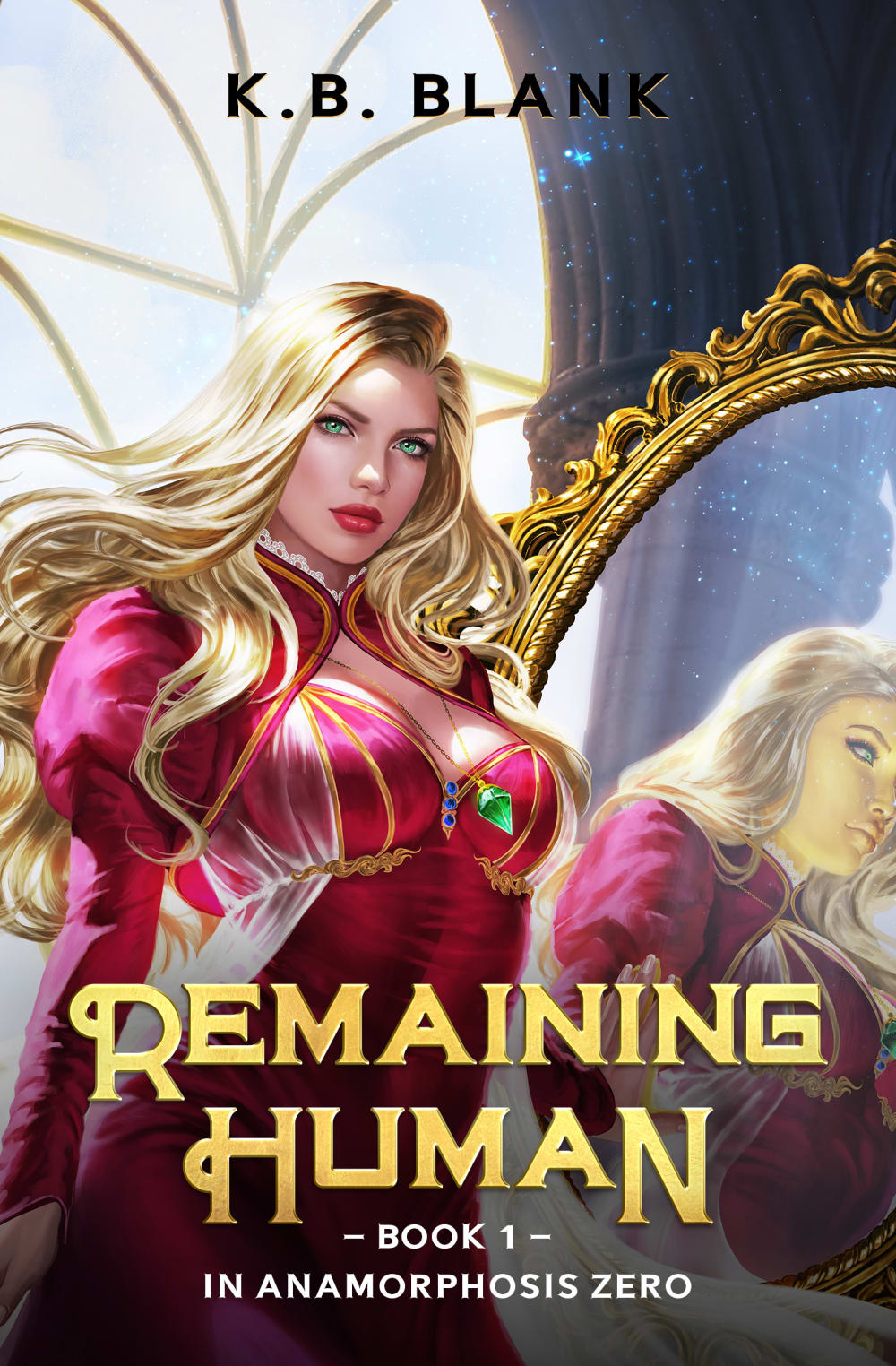
I like seeing the sci-fi mega hottie. It's definitely got my attention more and I want to see what happens to her.
I definitely prefer this cover. I like the sex appeal that it has. The woman has a great outfit and I like how it shows off her features. It is much more interesting
The character seems to have more of a mysterious look and triggers ideas of what the story might be about. I also like knowing that this is Book 1 in a series because I really enjoy world building and knowing there would be more books coming should I enjoy this one, would make me more interested in getting involved with it.
fancier more color
The women in A is sexy and catches my attention faster
Not gonna lie, I'd buy A just on the looks of the cover, it's pretty hot. The artist did a great job of capturing a humanoid look that looks just a little robotic but still human. great job! Do not like the author's name at the top. They're not Issac Asimov.
I like option A because I like the mirror showing someone slightly different. It makes me more curious about the book.
They're both good in different ways, B feels more serious, but also suffers from a resemblance to a lot of other dystopian books with young female protagonists. It's very competent, but doesn't stand out. A on the other hand instantly grabs my attention with the high quality, vibrant and colorful art. The only downside is the style seems to imply it is for a somewhat younger audience than A. Without knowing the intended audience for the book, I can't make a judgement on the differences. Overall though A intrigues me and catches my attention, which is vital for cover art.
42 Responses to Option B
This is the book cove I prefer. This is the book cover I find to be the most fitting for a sci Fi book.
the other one is too sexualized
Option B of course. A is just repulsive. Unless you're male and I'm not.
it's a much more interesting design, A looks rather generic
option B looks like someone with a brain wrote it. Option A looks like a horny dude who likes cartoons and Sailor Moon wrote it, and therefore I have no interest in reading it. Option B looks like it might have a lexile reading score of maybe 3.5...not worth my time, money and effort. Option B looks like Hunger Games or something a little more interesting and that the girl on the cover has a brain that will help her survive. I would not look at A, but would pick up option B to see if myself or one of my daughters would want to read it.
Choice B is definitely more evocative of a sci-fi (post-apocalyptic, dystopian) atmosphere. Choice A is more cartoonish and fantasy, harder to take seriously.
the other is nicer in colors, but the chest is too big and showing that much cleavage really doesn't say much for it. it almost makes it feel like a trashy romance novel set in the future. this one shows more a scifi type book.
this one is more sci fi not the other one looks to cartoony
The face brings about more mysterious to their purpose and the story of B
The darker themed cover seems more fitting for a sci fi novel. Option A looks like some kind of erotic fantasy.
This fits the style of sci fi a little better so I find that to be more appealing
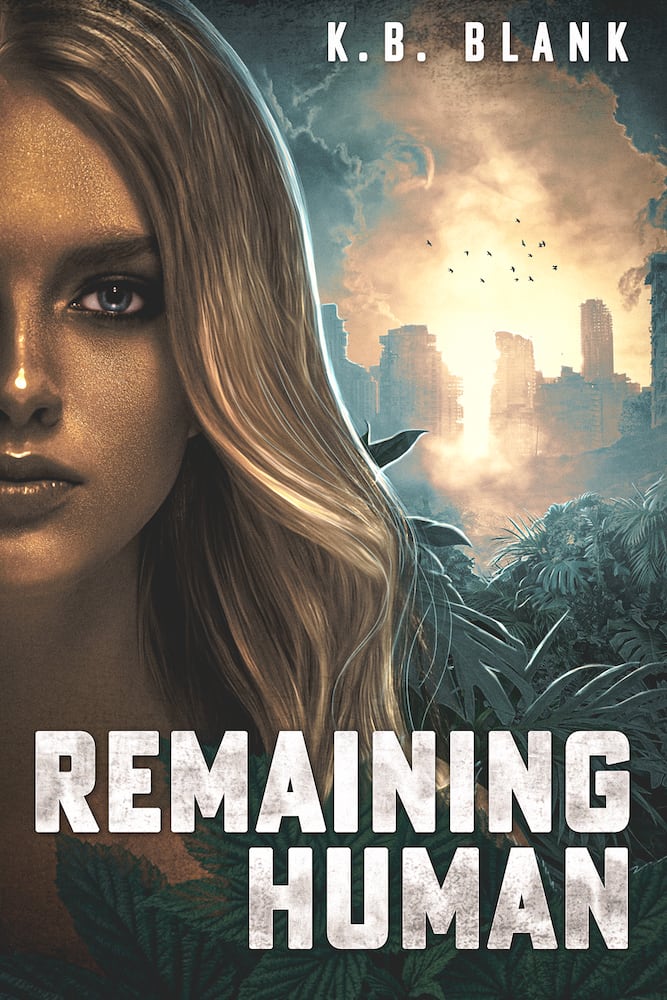
I like option B because it has more environment for the background to give a better idea of the setting. Option A looks more like a fantasy genre cover than science fiction. Optio B looks more like what a world of the future might look like especially with the background of the buildings. I also like the color scheme of option B more. Option A is too bright and the colors seem somewhat unrealistic and happy. Option B has much more natural looking colors, the shading is more realistic with respect to lighting, and the color scheme has better contrasts. The plants, the flock of birds, the building, the realistic face with the look of seriousness are all more persuasive that this is science fiction than the cover for option A. Option A doesn't quite convey the title of remaining human as much because the character looks too happy with the slight smile. Option B does convey the title somewhat better because the character doesn't appear to have a smile and the overall situation appears more serious which appears to be more relevant to the title of a remaining human. So I chose option B because it seems like a better cover overall with respect to the title of the book.
I definitely prefer B. A looks more like a soft core porn cover
B is more realistic and less cartoony. A makes me think it’s a less legitimate book.
I think that option B looks more realistic and interesting. The design is intriguing and makes me want to learn more.
B looks more interesting and appealing to me, the tone it sets.
I like b better. Gives you a feel of things that have gone wrong.
Option B looks more sci fi with the darker palette as well as the font chosen I also like how the woman's face is shown half only. It just reads sci fi and has more appeal as opposed to the woman being in pink.
Option B gives a slightly better idea of what it might be about. A just makes it look like a generic romance novel.
I like the post apocalyptic feeling of this one. The other one looks like a pulp romance.
The princess one looks cheap and trashy.
I like how the cover has half of her face cut off from view since it really feels like it focuses on the character. I like her outfit in option A but I feel like it is too similar to a fantasy game and it feels a bit too glamorized for a sci-fi genre. It feels more suitable for a fantasy genre rather than sci-fi as well. I like the overall moody color scheme shown in option B and I think it is much more fitting for a sci-fi theme too!
The other one looks way too close to a very popular video game, and doesn't scream scifi to me.
Both are good but A is too unbelieavable to be any good
B is much more realistic and I like the post-apocalyptic city in the background. A is too cartoony for me personally, buxom tho
I liked choice B since it shows half of the characters face which looks more intriguing and grabs my interest right away. Choice A looks more generic is only appealing with the scantily clad woman on the cover.
Option A feel less sci-fi, and more egirl
I really feel like the cover for B would find a much wider audience than the cover for A. A looks like the cover of a romance novel.
I like the girl in B better, I think it is a cool cover how her face is half of it. A looks more cartoony.
she's still hot, but looks like a realistic human, which is important in a book titled, remaining human.
B looks more realistic to me. I think that A looks too animated.
The cover for B has a modern, gritty, dystopic look that conveys a feeling of struggling to "remain human" that I really like (even the font choice echoes that feeling). The cover for A looks too much like a romance novel, which I have no interest.
I think option B is a better choice for a sci fi book as the elements do a better job making it look like a sci fi book. The darker colors, the apocalyptic background, the stern look on the woman's face, all work.
A looks trashy. Like it would be some cheesy, poorly written, drugstore romance novel.
easier on eyes over A
I like option be for a few reasons. First, and most importantly, the woman doesn't look as cartoonish and seem overtly sexual like in option A. Second, I like the background, which makes me think post-apocolypse.
B's cover is a lot more fitting with the title of the book than A's.
This book cover is graphic and compelling. The design is bold and conversant.
I think i that this cover makes me more interesting in finding out more about what this world is than the other cover though the other cover is more visually interesting.
I prefer B because of the scenery and the colors used. A is too sexualized and looks like an icon for a mobile game (one of those pay-to-win ones about making choices as a king, or sultan, etc).
I like the darker look of Option B, and I think it is more consistent with a sci-fi book than Option A, which looks more a fantasy book.
The other option doesn't look like a science fiction book at all.
Explore who answered your poll
Analyze your results with demographic reports.
Demographics
Sorry, AI highlights are currently only available for polls created after February 28th.
We're working hard to bring AI to more polls, please check back soon.

