Poll results
Save to favorites
Add this poll to your saved list for easy reference.
Which cover do you prefer for a Korean Short Stories for Beginners book?
Option A won this Ranked poll with a final tally of 33 votes after 3 rounds of votes counting.
In a Ranked poll, respondents rank every option in order of preference. For example, when you test 6 options, each respondent orders their choices from first to sixth place.
PickFu requires a majority to win a Ranked poll. A majority winner differs from a plurality winner. A majority winner earns over 50% of the votes, whereas a plurality winner earns the most votes, regardless of winning percentage.
If an option does not earn a majority of votes, PickFu eliminates the option with the lowest number of votes. The votes from the eliminated option are reassigned based on each respondent’s next choice. This process continues in rounds until a majority winner emerges.
Scores reflect the percentage of total votes an option receives during the vote counting and indicate the relative preference of the respondents. If there is no majority winner, look to the scores to see how the options fared relative to one another.
| Option | Round 1 | Round 2 | Round 3 |
|---|---|---|---|
| A | 40% 20 votes | 48% 24 votes +4 | 66% 33 votes +9 |
| B | 30% 15 votes | 32% 16 votes +1 | 34% 17 votes +1 |
| D | 16% 8 votes | 20% 10 votes +2 | Eliminated 10 votes reassigned |
| C | 14% 7 votes | Eliminated 7 votes reassigned |
20 Responses to Option A
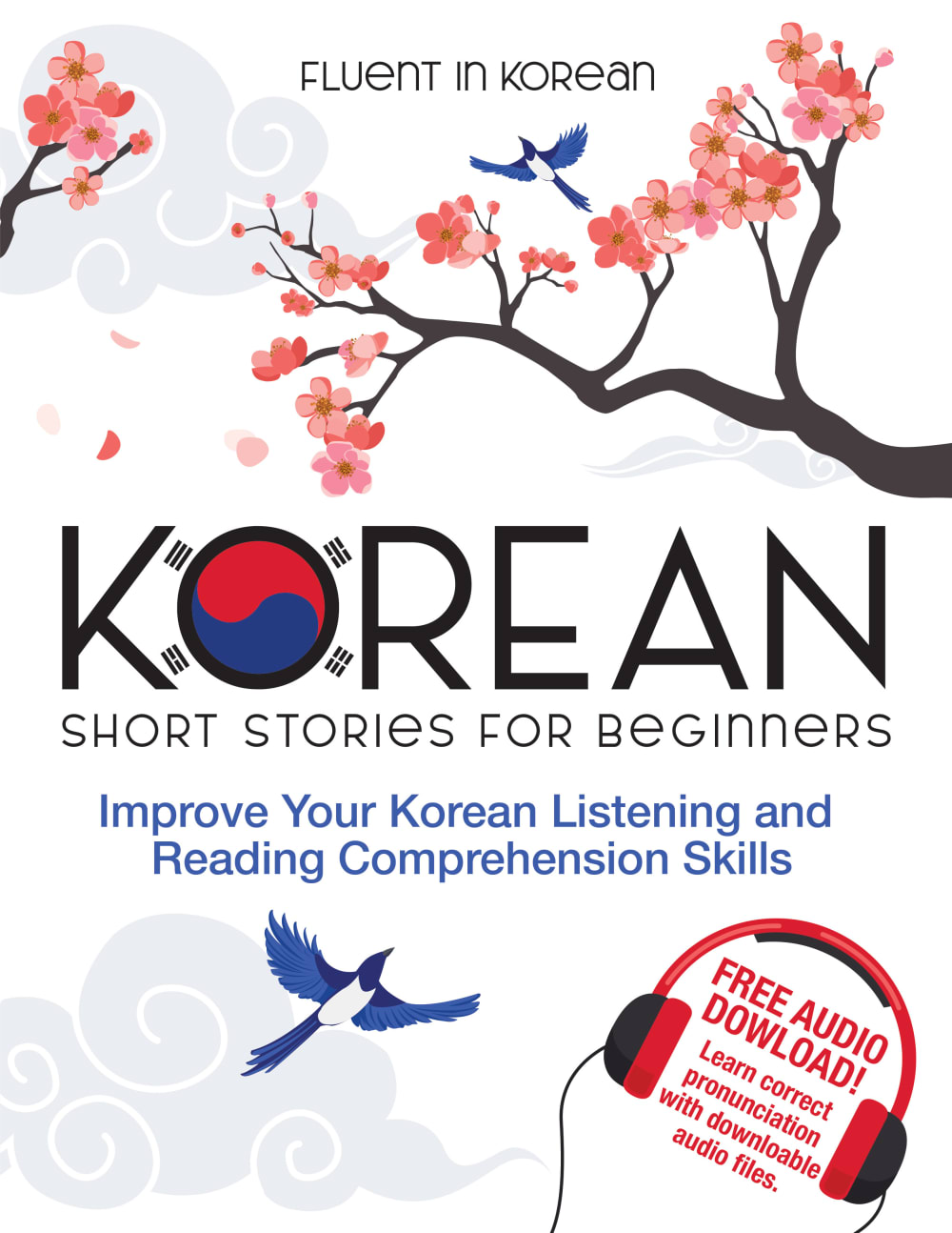
A has the most personality and really stands out, making it the most interesting.
A - I just love the art style. The Korean imagery is also the most fitting. C - a bit bland and uncreative in comparison.
I like the artwork of A very much, plus the notation about the free audio download is attractive. B just looks cool - I am a sucker for cats, even Korean ones. D has a nice traditional look, while C looks like a grade school textbook.
I chose option A because I like the landscape illustration of this book cover.
A looks simple and pleasant, like it's easy to read. The others seem more complicated or serious.
The white covers look more professional to me. I also like how my top 3 choices all show the Korean flag. That sticks out to me and fits the book well.
Option A has beautiful cultural elements on the cover without being too childish or cartoonish.
I like a. Nice inviting cover to easily read the text.
I like A and B for symbolism and layout. I like the traditional artwork of B.
The cherry blossoms, along with parts of the Korean flag make the cover fun and eye-catching.
I really dislike Option B, it feels more stereotypical. I think that the designs on Options A and D are the most clean and attractive.
option A and then option B are my top two choices. I like option A because the cherry blossom flowers that are on the cover. The color is a perfect added touch to the cover. I like option B because the artwork on the front is unique and creative and colorful
A seems that it would be the most fun to pick up and read.
I like option A. It is simple and the images look nice.
Choice A looks best as it has a nice modern looking cover design with some cute but clean looking graphics. B is also nice but the tiger looks a bit outdated for a language learning book. Choice D looks a little too mechanical and stiff. All three choices but choice C make an obvious mention to book audio which is why choice C comes in last.
The cover with the animal is engaging and I also really like the beautiful tree with the bird design because it is calming and peaceful
Option A looks the most inviting for a beginner book due to the birds and foliage. Option B has cool art, but the tiger beast makes the book look less approachable. Option D is ok and has calm art, but it's not as enticing as the others. Option C is a little too simple and doesn't even mention the free audio.
Option A has audio downloads for the stories. So it sounds good to learn a language.
Option A looks more korean
A. Bright and easy to read. C. Text stands out well over background. D. Text too cluttered. B. Looks too boring.
15 Responses to Option B
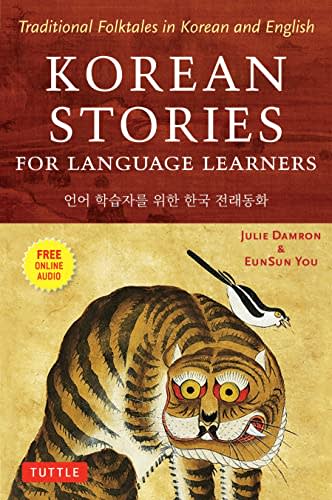
I like B the most. I think the art in a traditional style speaks to the unusual nature of some of the stories that might be in the book.
B's cover stands out the most to me as it looks like it would have the better stories.
I definitely like this the best. I like the color scheme the best. The darker background looks good. I also like seeing the tiger on the cover
I prefer B because I like the illustration and color scheme the most, followed by D. I thought A was kind of bland and C was too busy.
The tiger looks interesting, I feel like I would like that book
I like the allover colour on cover B. There's no white space, which instantly makes it look more thoughtful as if more work went into making it. The tiger is interesting.
I like the imagery used in the first two covers the best
I like the cover art of B as it includes a tiger on the front
These look more fun and less boring in this order.
I really like the artwork on the tiger. It illustrates and gives me a beautiful visual idea of some of the amazing stories I might encounter in this book. It’s an authentic Korean vibe which I would expect from a book like this.
I chose B as my choice because I like the graphics, color, and text.
I like that option B is more colorful and would stand out more.
My favorite cover here features this iconic creature and it's very much done in the style of Korean culture and I like that. The other covers here felt very basic and stereotypical to me and I didn't really prefer any of them
After carefully studying and comparing all four images of book covers for a Korean Short Stories for Beginners Book, I selected Option B as my first preference and the one that I would definitely click on to purchase for myself. I felt that that this image just jumped right out at me as having the most eye catching appeal based on the attractive design and bright colors. Option D was my second choice followed by Option C and finally Option A with all four rankings based on my own personal opinion of the relative attractiveness of each book cover image.
The less school like the book looks the better, the more I would want to learn from it.
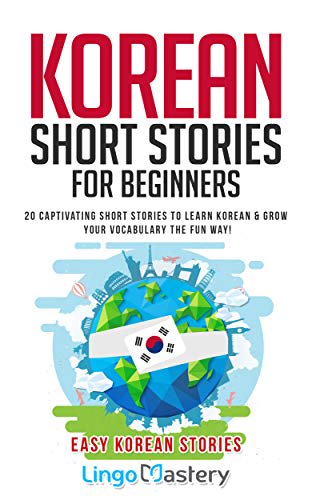
7 Responses to Option C
The globe is a nice touch
The barrier to entry for beginners looks really low for options C and A. The covers make the subject of short stories seem more approachable with the simple illustrations.
I think my top pick grabbed my attention and is overall more appealing.
This cover is the most appealing, the details and illustrations are clear and draw me in more.
This is a more modern book cover for Korea. My second choice was the more traditional look.
I think option C is the easiest to read and I like the colors and graphics which makes me the most likely to buy
I think C is the most visually interesting, while A and D appear somewhat plain by comparison. B looks like it might be a bit too focused on classics and thus be boring.
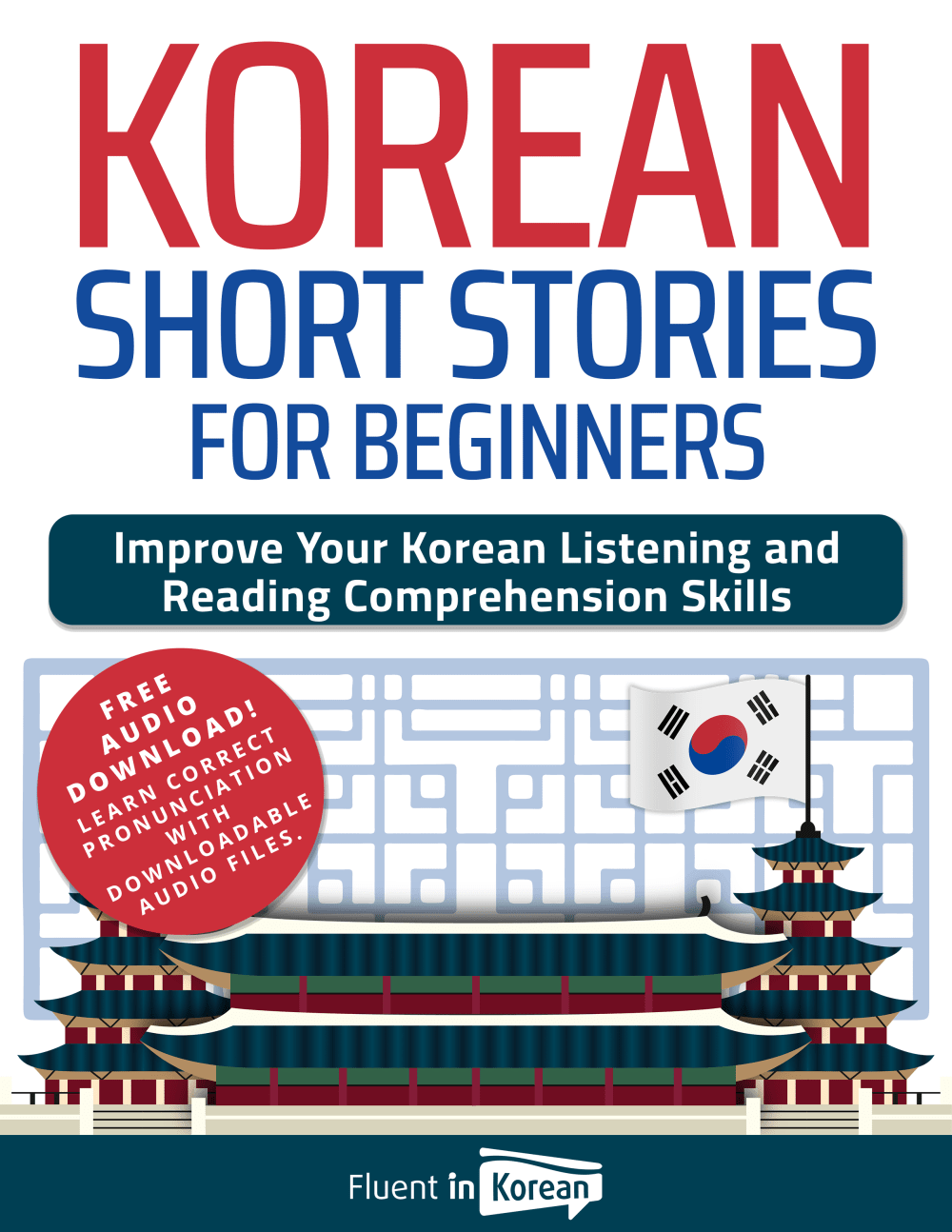
8 Responses to Option D
Option D look simple and not so intimidating. I think I would be less nervous using option D.
Options D and A looked more like a language book and also noted there was an audio download, so they were the top choices. I did not care much for the other options, as they did not grab my attention.
Option d with its oversized red fonted Korean geabs your attention immediately. The cover was,very clear and easy to read.
I rather prefer the option D language book cover design because I like the large easy to read font and building illustration with the free audio download sticker the most. I chose options A and C second and third because I like the cute bird and tree and cloud illustrations with the flag incorporated into the title text more than the more generic world globe illustration. I chose option B last because I do not really like this strange looking cat illustration nor style of this option B book cover design as much here.
I prefer D; it looks high quality, is informative and is easy to read. A and C are next. B is last.
I don't find B or C inviting at all, but I do like the spring sprigs in Option A and the pagodas even more in Option D.
I like option D because overall the cover looks the nicest. I like that the title is top centered. I like the drawing of a Korean palace on the bottom also.
I prefer this option. I liked the way the audio download was presented. I think this will sell better than the others.
Explore who answered your poll
Analyze your results with demographic reports.

