Poll results
Save to favorites
Add this poll to your saved list for easy reference.
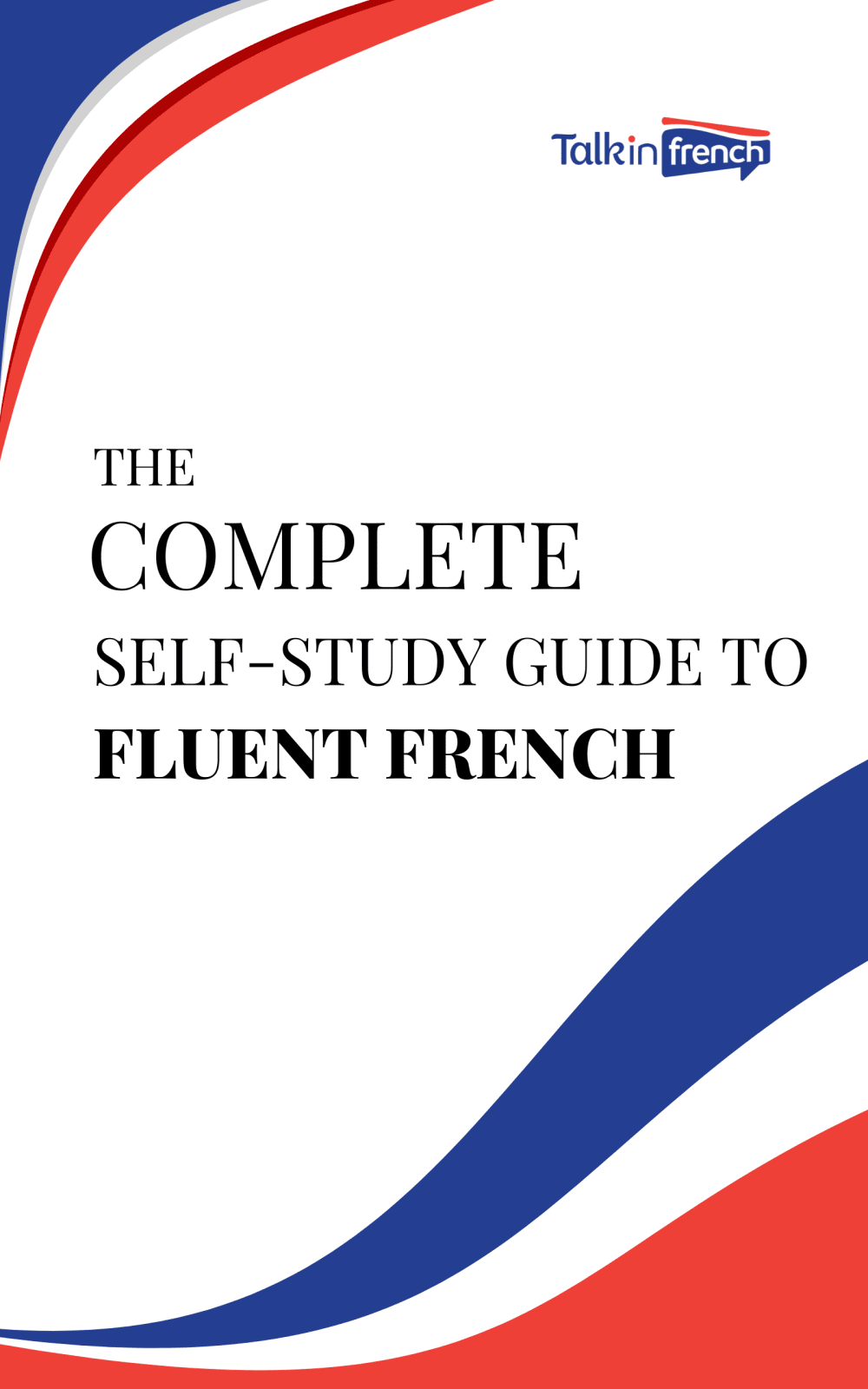
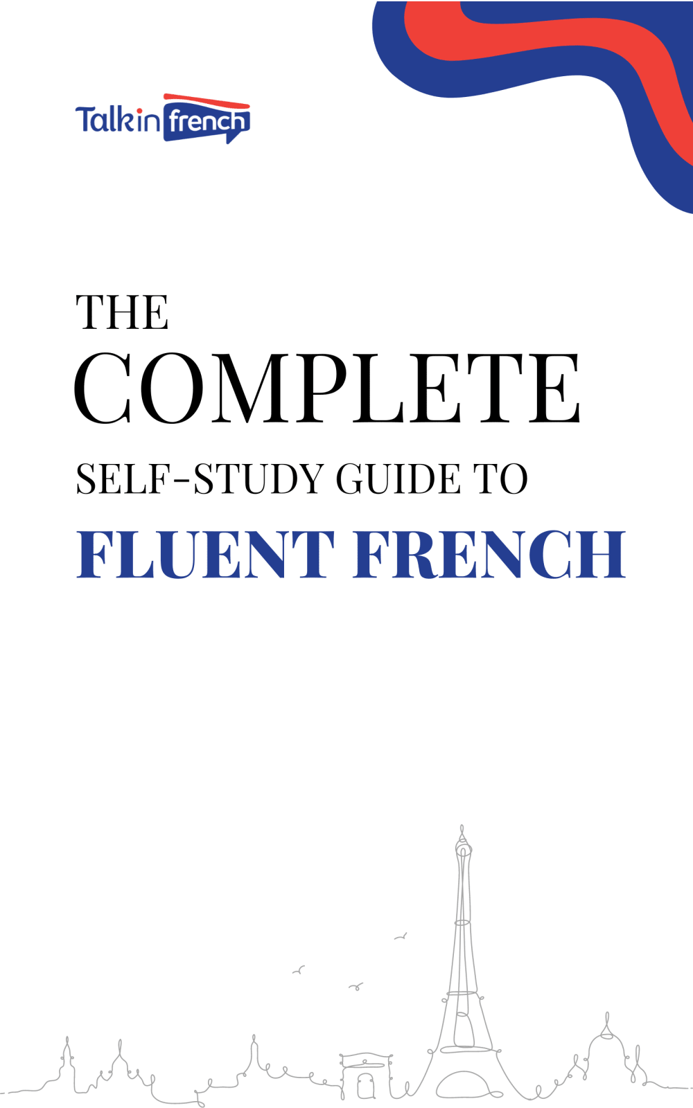
Which cover do you prefer for a complete self-study guide to learning French?
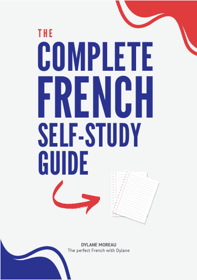
Option C won this Ranked poll with a final tally of 32 votes after 1 round of vote counting.
In a Ranked poll, respondents rank every option in order of preference. For example, when you test 6 options, each respondent orders their choices from first to sixth place.
PickFu requires a majority to win a Ranked poll. A majority winner differs from a plurality winner. A majority winner earns over 50% of the votes, whereas a plurality winner earns the most votes, regardless of winning percentage.
If an option does not earn a majority of votes, PickFu eliminates the option with the lowest number of votes. The votes from the eliminated option are reassigned based on each respondent’s next choice. This process continues in rounds until a majority winner emerges.
Scores reflect the percentage of total votes an option receives during the vote counting and indicate the relative preference of the respondents. If there is no majority winner, look to the scores to see how the options fared relative to one another.
| Option | Round 1 |
|---|---|
| C | 64% 32 votes |
| A | 18% 9 votes |
| B | 18% 9 votes |
9 Responses to Option A
A... I really like the corners of this one, the red white and blue with a slight wave in it Is the same color as the French flag.
I think number one is a little bit more interesting than the rest but I really honestly don't like any of these covers I don't really think the title is that obvious and I think there's not even really a good use of negative space. Number one at least you can kind of recognize the French colors whereas in number two and number three they're there but they don't have any meaning they're just like the Russian colors too or The American or any other country with these colors on their flag
I like Option A because first it uses the colors of the French Flag, then it uses the wording I like best. Option B is good because I like the wording "fluent french".
I chose A as my choice because I like the design and look.
The color combination of all three covers are same. But I choose option A as my first choice because of the design of the cover. I next choose option B because of the art of the Eifel tower. The over of option C, I do not like it.
The design of the book cover in A looks most likee the french flag and makes me able to pick thes book out at a glance
I think a looks the most official and the one I'd enjoy looking at the most.
I strongly prefer A. I think the cover looks very professional and like a source I can trust.
A has an attractive design and easily gets the attention of a consumer. The cover basically speaks for itself.
9 Responses to Option B
Goodness, get that Eiffel Tower in there! Option B is easily the best cover here.
I like option B's font style, design, and color; it is more elegant than other options.
B I feel is able to stand out the most to me as it has the best design to its cover.
I like seeing the Eiffel Tower on there, it really gets me excited
I chose B because I like the skyline on the book and it suggests I can become fluent in french. I chose A next because it also suggests I'll learn a lot from the book. I chose C last because the red arrow is pointing to blank piece of paper and looks gimmicky.
i like the subtle skyline b, there could probably be a bit more pop of color like the others but still the cleanest design
Love the balanced look and design of option b
Having the silhouette of the Paris skyline along the bottom makes B a bit more enticing and interesting.
Besides France's flag colors, I like the Eifel tower on the cover.
32 Responses to Option C
I really like the playfulness of the cover shown in option C. I think what makes Duolingo so successful is its playfulness because learning a new language can be daunting. Options C and B take look too serious and option C looks like the cover of an airline pamphlet.
C looks the most dynamic and exciting, whereas A and B are both kind of bland.
I like books that have larger font as they look more bold and also less straining to use and read.
"C" is definitely the best; it drew my attention immediately. the words really stand out. "A" is better than "B" because of the size of the book.
Option b is the easiest title to read way to much white in the back ground product does not stand out.
I prefer the designs of C and A with the colors in two corners. I think C's text is the most attractive, but the design of A is better. B's illustration on the bottom is too small.
Definitely Option C because it looks more fun and easy with that design. Thank you.
I like the bolder lettering
I think Option C did the best job of drawing my eye.
I like the positioning of the red and blue in C. It looks like the tricolor flags. The other options have the wrong order
C this has bigger letters were it's easier to read and the colors look great. B has bigger words were it counts A doesn't look very good.
a has the best wording in the title and bold print in the most important part complete.
All 3 covers are fine, but option C is just more eye catching. A is also very nice. B is somewhat bland. Perhaps if the drawing of the Eiffel Tower was a bit darker it would be more attractive.
C - I like the bold font and the red white and blue (flag colors), A - less bold, B - even less.
I think option C the cover is easy to read and understand the best. Option A was next, I think the words are a little less easy to read than C. Option B was last, it is hard to read and the light drawing on the bottom it is too light and not bold enough.
I like the book covers that are modern, trendy, and clean. It makes me feel like the text will take a more modernized approach to the content, so that's something I look for, and that's the metric I used to rank the options.
The font is more bold, attention grabbing and makes the book feel more exciting.
By far C was the best cover for the book.
I like option C the best because the cover showing the smaller graphics in the opposite corners with the large text grabs my attention the most.
I favor option C' since it has a really appealing and intriguing design that is easy to catch anyone's attention. Additionally, I think the book title's design piques my desire to find more about it.
This one seems more fun and approachable.
The larger text on C definitely fills out the cover much better and focuses on the goal of the guide. There is also enough color to give the cover some style and pop.
I like how bright and easy to read the name is. It is a really nice shade of blue that looks good in the middle. It looks nice having the blue and red in the corners. Everything flows and matches well
I like the one that looks more professionally designed
C good text easy to read and seeB text second best terms of ease to readA text harder to see from a distance so is last
It is so easy to read the title of C from afar. I know what it is, don't have to squint like I would in choice A. Choice B is clearly in the middle of that.
C gives a friendlier vibe, would make me feel less intimidated to trying to learn french. A is more decorative and I appreciate that.
I large the large font on Option C. It is easy to read.
I picked option C because its larger sized blue text on the cover stands out the most.
Option C is good. I like how the title of the product is very easy to read and someone looking at the title would know immediately what the product purpose is.
The larger font is easier to read, plus the contrast of the blue text on the slightly grey background is easier on the eyes.
I prefer option C. The size of the font made it really easy to read, especially if I'm scanning shelves or online stores.
Explore who answered your poll
Analyze your results with demographic reports.

