Poll results
Save to favorites
Add this poll to your saved list for easy reference.
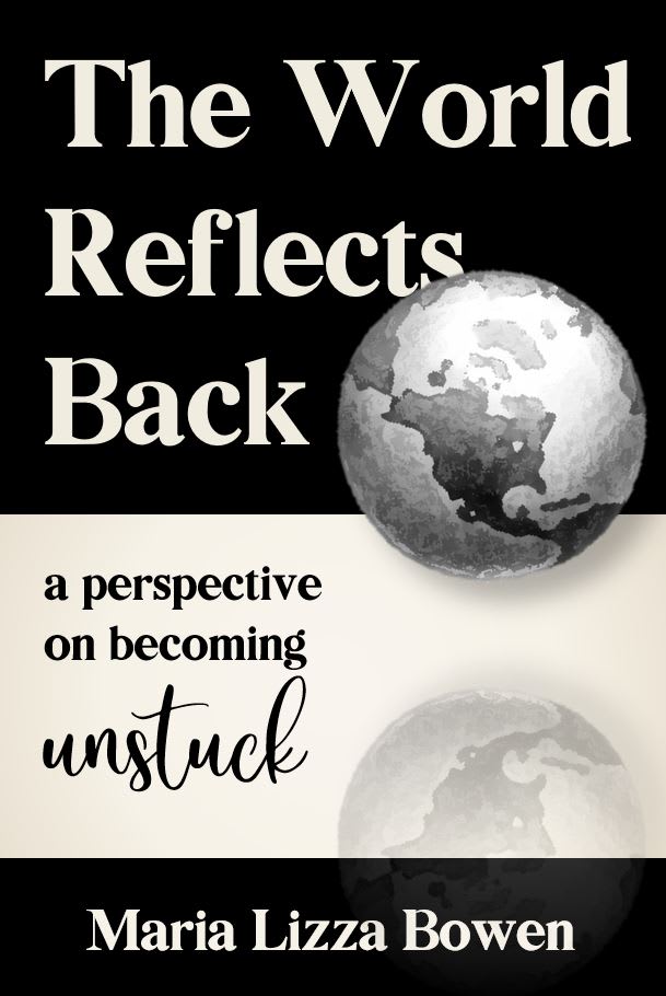
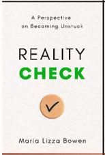
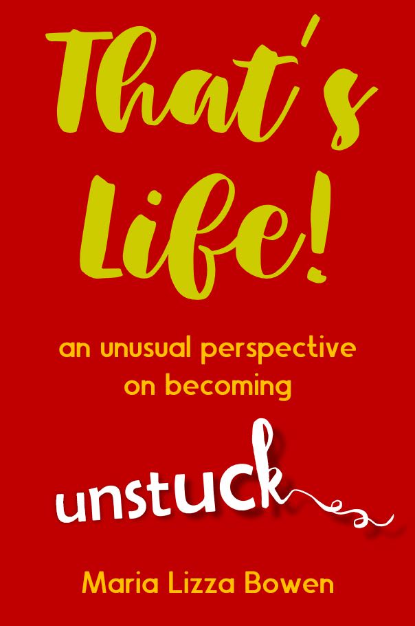
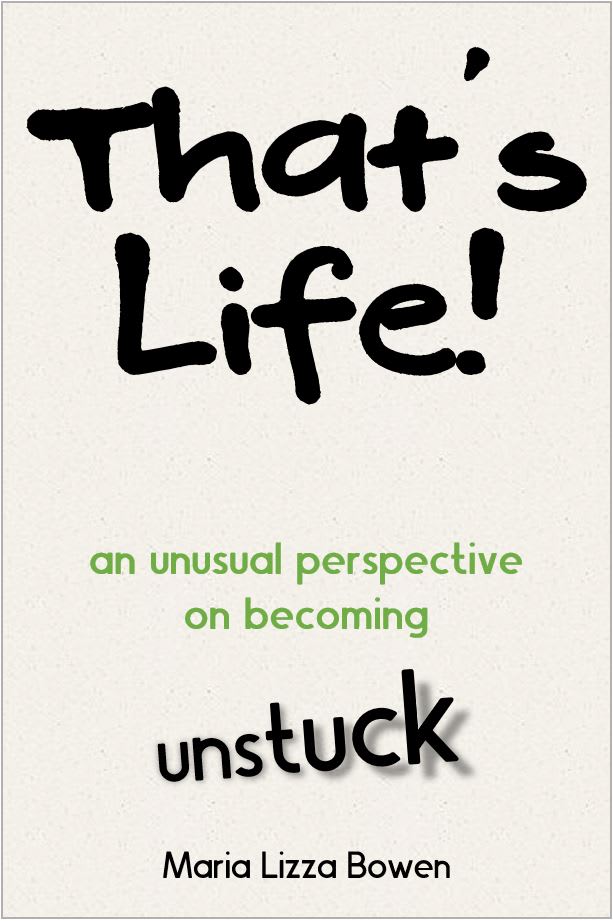
Which cover do you prefer for a book about becoming unstuck?

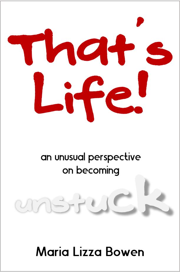
Option B won this Ranked poll with a final tally of 34 votes after 6 rounds of votes counting.
In a Ranked poll, respondents rank every option in order of preference. For example, when you test 6 options, each respondent orders their choices from first to sixth place.
PickFu requires a majority to win a Ranked poll. A majority winner differs from a plurality winner. A majority winner earns over 50% of the votes, whereas a plurality winner earns the most votes, regardless of winning percentage.
If an option does not earn a majority of votes, PickFu eliminates the option with the lowest number of votes. The votes from the eliminated option are reassigned based on each respondent’s next choice. This process continues in rounds until a majority winner emerges.
Scores reflect the percentage of total votes an option receives during the vote counting and indicate the relative preference of the respondents. If there is no majority winner, look to the scores to see how the options fared relative to one another.
| Option | Round 1 | Round 2 | Round 3 | Round 4 | Round 5 | Round 6 |
|---|---|---|---|---|---|---|
| B | 24% 12 votes | 24% 12 votes | 24% 12 votes | 28% 14 votes +2 | 42% 21 votes +7 | 68% 34 votes +13 |
| D | 18% 9 votes | 20% 10 votes +1 | 22% 11 votes +1 | 30% 15 votes +4 | 30% 15 votes | 32% 16 votes +1 |
| E | 12% 6 votes | 14% 7 votes +1 | 18% 9 votes +2 | 22% 11 votes +2 | 28% 14 votes +3 | Eliminated 14 votes reassigned |
| C | 20% 10 votes | 20% 10 votes | 20% 10 votes | 20% 10 votes | Eliminated 10 votes reassigned | |
| G | 16% 8 votes | 16% 8 votes | 16% 8 votes | Eliminated 8 votes reassigned | ||
| F | 6% 3 votes | 6% 3 votes | Eliminated 3 votes reassigned | |||
| A | 4% 2 votes | Eliminated 2 votes reassigned |
Age range
Education level
Gender identity
Options
Personal income range
Racial or ethnic identity
Self-help book reader
2 Responses to Option A
People that feel stuck in their lives are looking for options to change, not criticism. Option A seems to be the most motivating and uplifting cover. Option D is alright, but very generic. The title of the other options is very critical and unsupportive. I sorted them by most engaging color and cover design to least.
A is the most appealing to me. E and B are not bad. F, G, D, and C are average
12 Responses to Option B
I like the green/teal one since it stands out the most to me and I love the colors. The red also pops, but I rated it lower since I don't like the yellow text.
I prefer this cover the most as the font is easy to read while it's still whimsical and not overly bright.
I chose B because I like its text and colors the best. It's a good look to me.
I picked B first because the turquoise coloring in the background with the yellow lettering had the most "pop."
I voted on the presentation and the colors as well played a important role in my judgement and my vote.
I chose option B as my favorite because I like the title, and most of all I like the blue background and yellow lettering. This color combo makes the title pop when you look at it.
Option B because the color and title of the cover doesn't look harsh. I don't want to be told about reality-checking, if I am stuck, because it sounds unpleasant. That's Life, instead, is a better term to show more compassion.
The color of the cover is the most appealing of all of them. And coupled with the font type and size, it's the least unattractive and would offend the least number of readers/consumers. The exclamation point has the potential to be off-putting to some, but the font is a little more "cartoonish" and has a lighthearted feel. My least favorite cover (Option A) is because of the title, it doesn't flow smoothly.
I like D even though I ranked it low, I think it looks the most "professional" and much like similar self-help titles. That said, I chose B #1 bc I like the combination of the bold color and the fonts, I especially like the "unraveling" of the word unstuck, very clever. A is my absolute least favorite, the design is dated and reminds me of graphic design class projects I made in the mid-90s.
I like option B the best because I like the design of the words for the main title and how "unstuck" is unraveled at the end. What makes this my favorite cover though is the green and yellow colors used that when combined with the words creates a visually relaxing cover for me to look at. It's not too vibrant like options E and C. But it's also not as bland as the black, red, and white colors used for G and F.
I really like the design of the books in options B, G, C, F, and E, but the color scheme that looks the best is option B. The colors fit together so well and are very aesthetically pleasing and attention grabbing.
I picked B and E as my first two because they use the same font for thats life and out of all of these options look the most professional. Not to be rude or anything but none of these look that professional at all and could use some work, but if I had to pick I would go with B or E depending on your color preference between the two.
10 Responses to Option C
I like the design and color scheme of this book. The orange makes the book really stand out. I find it appealing and fits with my personality.
C stood out to me right away
C stood out the most to me, it's very eye catching, the colors go well together and I like that "unstuck" is very clear to read on this cover
My first 3 C,B,E were all chosen as the top due to the cover having some nice color too it making it eye catching. From this point the other covers were graded from most appealing to least. Some of them have writing that is difficult to read (F) While others have a text book like cover that makes them unapealing (A,D)
Option C is the most eye catching due to the bright colors and is the easiest to read the tittle due to the color combination
I like my first two choices as they are bold colors and they are also easy to read. The red is bold but not as original as the first two choices. I like the titles in my last two choices the least. My mother used to say "reality check" haha, a lot, so it is not as fresh of a cover in my opinion.
I like the color and wording of C best. B and E are very close, but the others don't appeal to me very much.
That's Life is definitely the best title for the book, and the bold but somewhat subdued cover of C is the best one to me. E also has it, but the fiery brick red can be somewhat overpowering. D and A at the far end of the spectrum just does not work. Nothing catchy about either at all.
I like the brightness of the cover and the unravelling of the text on the bottom.
The font on my top pick reminds me of Money magazine, so it looks like it's worth buying. The next pick has a bright red cover to make it stand out better. Number 3 has the same font but not as strong a color scheme. Number 4 - with the different title - has a calm approach but makes me think of Wikipedia. My bottom 3 are almost not worth picking up, especially the bottom two. The font for those two is too far off the mark and appears unprofessional.
9 Responses to Option D
I went with Option D first because the cover looks minimalist yet something I would find in a bookstore. The title of the book "Reality Check" also is the least aggressive title. Option A's cover feels painfully generic and something I would find on Amazon for .99 cents and be filled with generic advise I've been told before. The remaining choices all just feel like the same ugly cover with different variations. The title "That's Life!" feels overly judgemental and needlessly mean to the point where I would avoid the book outright.
I like Reality Check, sounds straight and to the point. Like keeping it real.
I like D the best because I like the title "Reality Check". It gets my attention first and it's a phrase a lot of people are familiar with. I think the rest are okay and I ranked them by which colors look the best. The only one I don't care for is A. It doesn't really get my attention at all.
I like a calm, subtle approach. The color, font, and placement of "unstuck" is credible most in this order.
Option D is my preferred choice for a book cover because it peaks my interest and it also calls out the consumer to examine their own life if they feel stuck. The design is pleasant and professional as well. Option B is unique, vibrant, and catches my eye. All parts of Option B are easy to read. Option E is also vibrant and easy to read, but not as much as Option B. Option A is professional, but a little bland to the eyes. I feel like I have seen book covers like this before and that makes this cover generic. Option C is difficult to read. Some of the colors on the cover are too similar and I feel like I have to struggle in order to read it correctly. Option G is too simple and gives the impression that this book is for someone in elementary school based on some of the fonts and effects. Option F is awful. I would never consider putting white text on a white background because it goes unnoticed way too easily.
the way some covers are designed and the colors used, makes them more appealing than others. Thats how I ranked them as the covers and colors appeal to me the most
I chose options D and A first and second because I love the titles equally. I really like the cover design for option D the most, so that was first. I feel indifferent between options B, C, and E, as I like the cover art equally. I really like the cursive in which "unstuck" is written. Finally, I chose G and F last. It's not that I dislike those covers. They're just my least favorite.
D looks the most like a professionally published book. I like the title of "that's Life" but don't like any of the font options.
D and A look authoritative, helpful, insightful and trustworthy. The others all look like gag gifts are jokes.
6 Responses to Option E
Options E and C and G, in that order, are my preferred covers for a book about this particular topic because the colors and fonts have more impact which is engaging and the word "unstuck" jumps off the page.
I like the colored covers, the premise of the book stands out quickly and easily. Option E was my favorite followed closely by b and C. Option G is good, i like the shadow on unstuck, option F is tough to read with the white font on unstuck. Option D and A seem to get lost for the reason for the book
I liked that E and B featured brighter and bolder colors on their covers that were really eye catching. Orange felt a little tacky to me but the other covers just got a bit too dull and generic with their plain white covers.
I select the order in which I felt that I like the design of the book the most.
E,F,C,B looks like a book cover professionally made. Those are equally good, but I prefer the red color cover better.G: Don't like the cream color background.A: the other title is much better.D: too simple.
I chose E first because the red cover caught my own the most with the yellow text color. I thought it was easy to read and appealing. Options C and B were close but I didnt like the cover colors. G and F were unappealing. And D and A were too wordy of titles and the cover design was not appealing.
3 Responses to Option F
I like "that's life," but I like the idea of being "unstuck" better. The white book looked good. Third, I liked "Reality check" - there is something that grips me about that. I least liked the orange "that's life" book - too bright.
option A is more eye catching because of the colors and font
i chose option f as my first choice because the use of a white background with the red lettering really makes the book cover really stand out and grab your attention immediately and want to find out more
8 Responses to Option G
I like this text font that is used on this book option in G, the reality check one is also a neat one for this case. It looks like a book that has a clear message in D
I like G and F the best, the white space makes the title stand out. I prefer G as it seems almost calming in relation to the brightly colored ones.
I think Option A looks a little too serious. I like the fun and loud font on the cover of most of them. I also like the term 'reality check' but I feel like that cover is a little too bland. I think the white backgrounds are more appealing, because of the simple design. After that, I ranked based on which colors I think worked the best.
I chose by the way the tiles seem appealing to me.
I like the more simple and elegant titles, they are more catchy. Options G and B's color is more attractive.
The most eye-catching ones to me were the ones that were bold in color and font, but also the simpler designs. I think a book about becoming "unstuck" and gaining control over your life and motivation should have a cover with a design that is clean-looking and very readable.
I think I like choice G because I feel that the message looks almost comical to me and looks almost in a light hearted, but serious way.
I picked the way I did was because the white with the black lettering stuck out at me.
Explore who answered your poll
Analyze your results with demographic reports.
Demographics
Sorry, AI highlights are currently only available for polls created after February 28th.
We're working hard to bring AI to more polls, please check back soon.

