Poll results
Save to favorites
Add this poll to your saved list for easy reference.
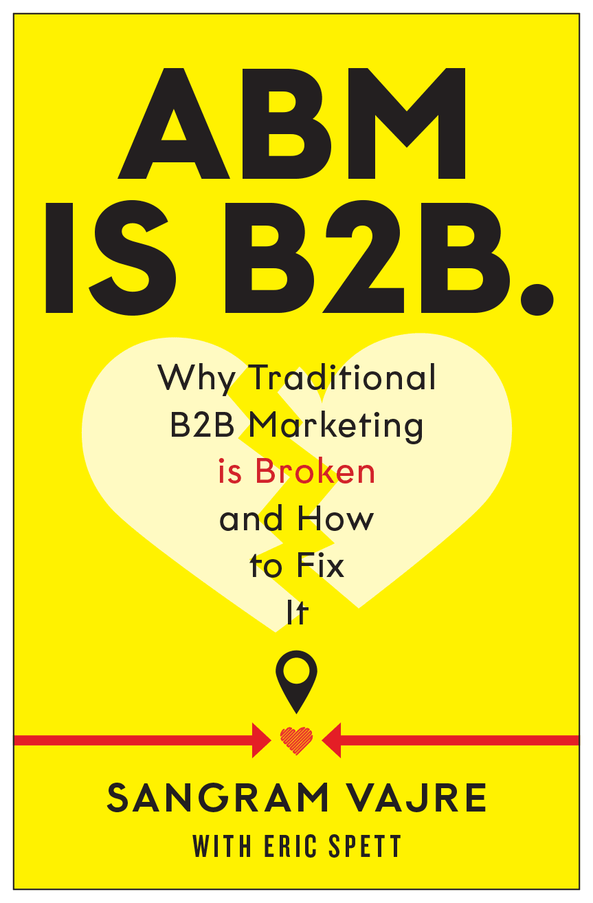
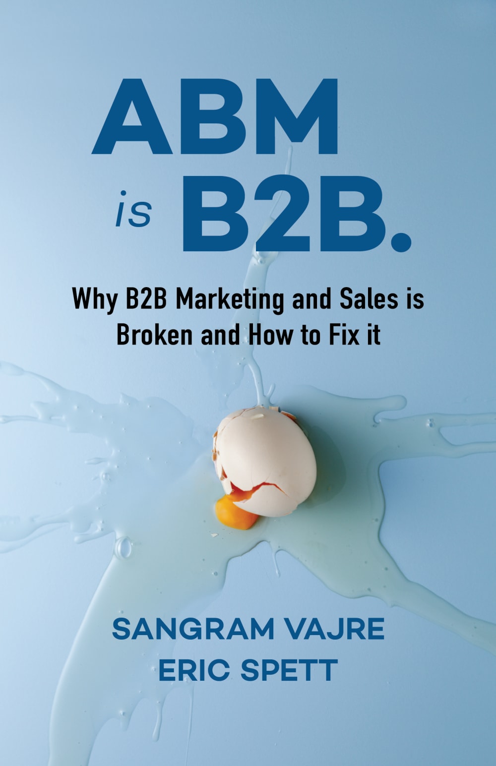
Which cover do you prefer for a book about Account-Based Marketing?


14 Responses to Option A
It's brighter. Both covers are good but I don't think everyone would like to see a broken egg.
The egg on the front looks gross and distracting.
I like option A better & I think other people would too because it is brighter and more eye catching
This one has a simpler design and is easier to read.
I prefer option A because the yellow color automatically makes this book stand out more. The colors and the overall design of this book are more appealing and make it seem like it would be more interesting to read than option B.
The bright yellow made me click.
I think Option A is more visually stimulating. It catches your eye more right off the bat as well. I think the design and spacing of the wording makes you focus more on that and get a fuller grasp of what the book is about and what it has to offer. I think Option A would get a wider audience of people interested and willing to pick the book up to see what it has to offer.
i like choice a better because it looks more professional
I like the bright color more and I think the egg cover is a bit silly.
The yellow one stands out much more
The broken heart is a better symbol, but I prefer the blue background and blue lettering.
I think the color of this works well to get customers attention
This cover really catches the eye. The black bold letters, and a key phrase "is broken" written in red, really stand out against the yellow background. This phrase encouraged me to read the full title a second time. I know what this book is about. The broken heart, the read arrows, and the full heart are an interesting and memorable set of icons to reflect upon this subject.
Choice A has extra text of what the book is about and it is actually much clearer and legible, compared to Option B.
36 Responses to Option B
The broken egg catches my attention more
having a real photograph on the cover makes an immediate strong visual impact
it is easy on the eyes but eye catching
The broken egg is immediately eye-catching.
It has MUCH more visual appeal and better colors. It makes me want to pick up the book.
The egg image is really unique and eye-catching. The blue is also a more appealing color than the bright yellow.
The egg is dramatic and engaging, I like it a lot.
The Option B cover has nice colors and an interesting picture. The Option A cover looks very generic.
It looks very original and I like the color blue
I like the background, the font, the food mess, and the overall look is best.
I have to say that I prefer B. I like the picture of the broken egg. It just catches my attention was more than the other one.
I like the background color better(its easirt on the eyess), and the broken heart in B seems an odd choice for this topic.
blue is my favorite color, so that will usually catch my eye first
LOVE THIS COVER
Blue reminds me more of business and I think a broken egg is more fitting than a broken heart.
B creates a stronger picture in my mind and makes more sense for the topic over a heart
The other one is too bright
I like the egg on the cover
I like the blue background better, and the broken egg is a nice touch. Broken hearts are very cliched and overdone.
This color isn't as blinding in my opinion and it sticks out to me as well.
The broken egg on the cover is more eye catching and appealing.
I like the actual broken egg on the cover of Choice B. Honestly though, they both look really busy to me.
the blue background feels more fitting calming in the view of chaos
I think the heart gives the impression that the book is about relationships.
While design "A" is more eye-catching, I think B is more aesthetically pleasing and still makes sense given the subject matter.
Not really found of either, but the yellow is terrible. B at least has a warmer friendlier feel to it.
B all the way. The yellow is way too bright for me.
I chose option B, because I feel that it is a lot more appealing to the eyes. I do not like the red and bright yellow of the other option because it seems to be too much together. The broken egg on the cover of option B is a very fun touch to the idea of the book!
The color isn't overly distracting like the yellow version is. I also prefer a realistic cover and this one I selected seems appropriate.
First of all, Option B has an incredibly powerful visual (graphic) to go along with the title. Secondly, the title and subtitle has been streamlined, making it easier to read and remember.
I really like the call blue, and the egg really pops.
I definitely prefer Choice B because of the coloring (the subtle shades of blue are easier to look at than the blaring yellow) and the egg graphic catches my attention more than the broken heart.
I find the bright yellow to be too loud. The blue-based advertisement is much for pleasant to read. I also like having an actual egg in the photograph.
The type on the other option is actually too large.
The color scheme looks a lot less jarring
This one seems more appropriate it's more eye-catching and more professional
Explore who answered your poll
Analyze your results with demographic reports.
Demographics
Sorry, AI highlights are currently only available for polls created after February 28th.
We're working hard to bring AI to more polls, please check back soon.

