Poll results
Save to favorites
Add this poll to your saved list for easy reference.
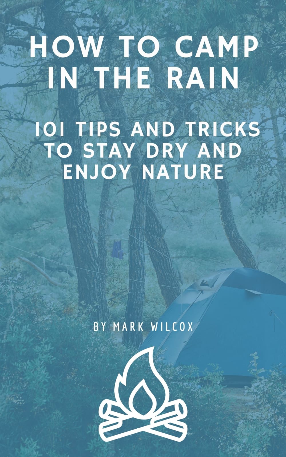
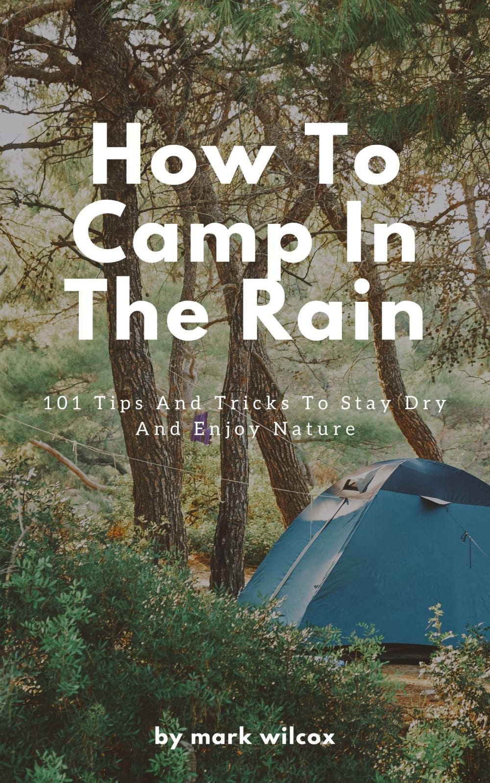
Which cover do you prefer about tips for camping in the rain


11 Responses to Option A
I think the tinted option looks fine it really gets the point across about rain
The color makes this cover stand out. The text is also easier to read. I just don't like the giant clipart campfire under the authors name.
I love this one more because I love the blue hue over it making it more aestheticically pleasing to me.
I like cover for A as it infers that there is rain in the air.
Looks like a more modern design
I like the blue on a better. Allows you to see the forest and see the text.
The blue hue in A as well as the added campfire logo really helps this stand out. These two things will draw reader attention better and get that initial look over.
A because the sound is very warm to it and presents a color that I associate with comfort.
I like the camp fire design at the bottom of the page and the sub-title is easier to read.
I pick A because I feel the rain part comes off better with the blue screen in front of it. I feel the clear image of B looks like a nice day and not so much with rain.
I like Option A because the blue accentuates how it would feel to be sad while camping in the rain.
39 Responses to Option B
I think it looks best with the natural colors, rather than having everything washed blue.
That blue filter on option A does nothing for me, let me see real actual nature without filters.
I do like option A but it is a bit to filtered so by default choosing option B
This image shows the natural environment in a way that makes the title more poignant for me
I choose "B" it looks more relaxing even if it is raining.
B because it doesn't have the distracting filter that A does. A's design looks like it's trying to hard to get noticed because the book isn't that great.
I choose B because B has better illustration, more appealing and attractive than A. The theme color of B goes well with the theme of the book.
A is too "blue" and "misty", I cannot see the background image very well. I think we need to emphasize the camping theme, instead of using a grey-ish blue covering everything. Too much blue make my eyes feel tired.
I prefer option B because I think that it is a much more interesting and visually appealing cover design.
I like seeing the trees and tent better in B.
I prefer this cover. I think a photo of a campsite in actual rainfall would be a better choice than this.
When thinking about camping I would rather look at the clear image of nature itself rather than a blue film over the nature photo.
I like the more real cover of this one. The cover pulls you in and you get a better sense of what it is about.
I like the picture quality and general clean look of option B more
I like option B the best because I like that I can see a photo of the tent and surrounding landscape that is not filtered like how the cover in option A is shown.
I like the more vibrant image, it also looks like it might be raining
I prefer the design of the book cover of option B more than option A. I don't like the blue color of the book cover of option A.
I prefer the choice with the natural looking colors.
Between the two different options, I decided that I preferred option b. I thought that the photograph looked extremely realistic and that this would be extremely helpful if I were in a situation when I would need to know how to camp in the rain. I thought that the photograph, covered with the exterior blue, was very interesting, but I also thought that it did take away a little bit from the experience of reading the book. Therefore, I decided to choose option b because I thought that this cover looked much more realistic.
This one reminds me more of nature because of the colors on the cover.
The blue filter in option A really hides the graphic and the typography. I think the filter is distracting.
I like the clarity afforded by the unfiltered colorful photo on B best. The obscured "blue" filtered cover is poor, it even lessens the readability of the text on the cover, NOT what you probably want.
I like that the image of the forest can be easily seen. With option A, it is shaded over. I also think the fonts used for the title and subtitle look professional and interesting. I do like the fire image of option a though
i like this one better because its more realistic and showcases the real outdoors better.
I chose B because I like the natural, original photo. It looks a lot better than A with the blue over it.
easier to read and seems less like rain
I dislike the blue filter, especially since the cover shows such a nice campsite thay it's a shame to obscure it.
I prefer option B because I think it looks more interesting and natural. Option A feels too basic for my tastes.
This cover looks great to me. I like the greenery, and tent, which makes me feel like getting out and camping right now. The other is too obscured, and gives me an overall unpleasant sensation.
I like the colors of nature in option B. They make the cover stand out better for sure.
I don't like the blue filter that they put on the whole picture
I much prefer the bold white font on the plain picture over the faded filter over the book cover.
B - because this cover image "scream" camping :)
This one is easier to see and I instantly knew what I was about to read based off of the green forest color versus blue.
B- I prefer the more colorful and detailed image. It's more classic for a cover.
I like the full color cover better
I like B better here but I think if you would increase the opacity of the blue on A and put a borderline around the title font that matches the blue and maybe a border around the fire design it may pop out and look better.
Definitely option B as you can see the words the other image is completely obscured with that tint of color and it is not pleasant to look at.
I would choose B because although at times when it rains it is dreary the image shown here makes one feel upbeat and bright and this makes it easier to camp when it rains
Explore who answered your poll
Analyze your results with demographic reports.
Demographics
Sorry, AI highlights are currently only available for polls created after February 28th.
We're working hard to bring AI to more polls, please check back soon.

