Poll results
Save to favorites
Add this poll to your saved list for easy reference.
Which cover do you like more? Which looks more professional? Which would entice you to buy the book?
Age range
Education level
Gender identity
Household income range
Options
Personal income range
Racial or ethnic identity
Self-help book reader
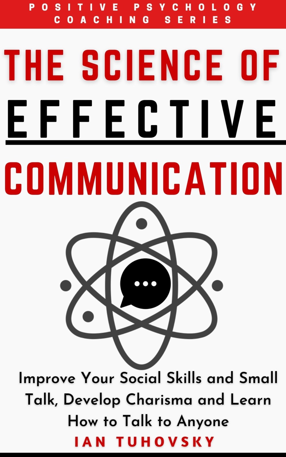
19 Responses to Option A
I like choice a because it has more of the color black in it which I think makes the cover of the book pop more. I also like the picture on the book better than the other one with the people on it.
A has a more professional and serious looking cover design. I think it looks more professional because it has more text. B is a little more intriguing though, the image is curious.
I think this one is more professional looking and I like it the best.
Overall what caught my attention and deciding factor has to do with the fact that the smaller sub text was much bigger in Option A. This convey the message clearly and across to me. It also makes the cover seem more scientific and it looks more effective.
I chose option A because the image is very creative.
I like A because I like the darker red color and I think the chat bubble inside the scientific symbol fits well with what the book is. It gets my attention first. I think the image on B looks odd and I don't like the orangy red color as well as the red in A. Overall I think A looks more professional.
My Choice B shows in the drawing what the book consists of and describes the title of the book.
Option A looks more professional and informative.
I like this cover because it’s easy to read (the other option is too “busy”) and color patter is nice. I’m not so sure about the picture.
I like Option A more. The layout looks more even and pleasing to the eye. Option A also looks more professional. I think it's because the font in the title is more rigid and pronounced than Option B. It conveys a sense of authority and dominance. I am more enticed to buy Option A. I also prefer the underlining in the title. It emphasizes that I will not only learn how to communicate, but how to effectively communicate. I also prefer the logo on Option A as the chat bubble makes the book more modern. I know I am getting up-to-date information. The bullseye logo in Option B is not pleasing to the eye in my opinion. I don't like the harsh contrast between the colors in the bullseye.
A is my answer for all 3 questions (which I like more, which would entice me to buy the book more, and which looks more professional). Actually, they both look professional and both are good covers overall. However, A includes everything that B does (graphic, title, etc.) but the text is larger and stands out more and ultimately is simply more noticeable and thus slightly more appelaing.
I did not care for the graphic in the other option. The two figures and the common thought balloon turned me off.
This is a much better overall design and it utilizes the space the best, I would however make that chat bubble a different color or maybe put 2 chat bubbles in on each side and connect them through the symbol
I prefer this picture better than the people.
I prefer this one because it says much more clearly and in larger letters what reading this book can help the reader obtain in forms of communication.
I think the large logo in option a coupled with the font and colors looks more professional, option b almost has a cartoon flair to the characters.
The visuals on option A are more pleasant to look at and seem to represent the title graphically. I would definitely be more inclined to choose option A. Option B's interwoven speech bubbles create a target, and while it's easy to see how that relates to the book, it's not especially enticing to the viewer.
I prefer this cover design because of the size of the font and the graphics, which combine to make it look more professional than the other choice.
i like the cover of A with the atomic type symbol, i would go with this
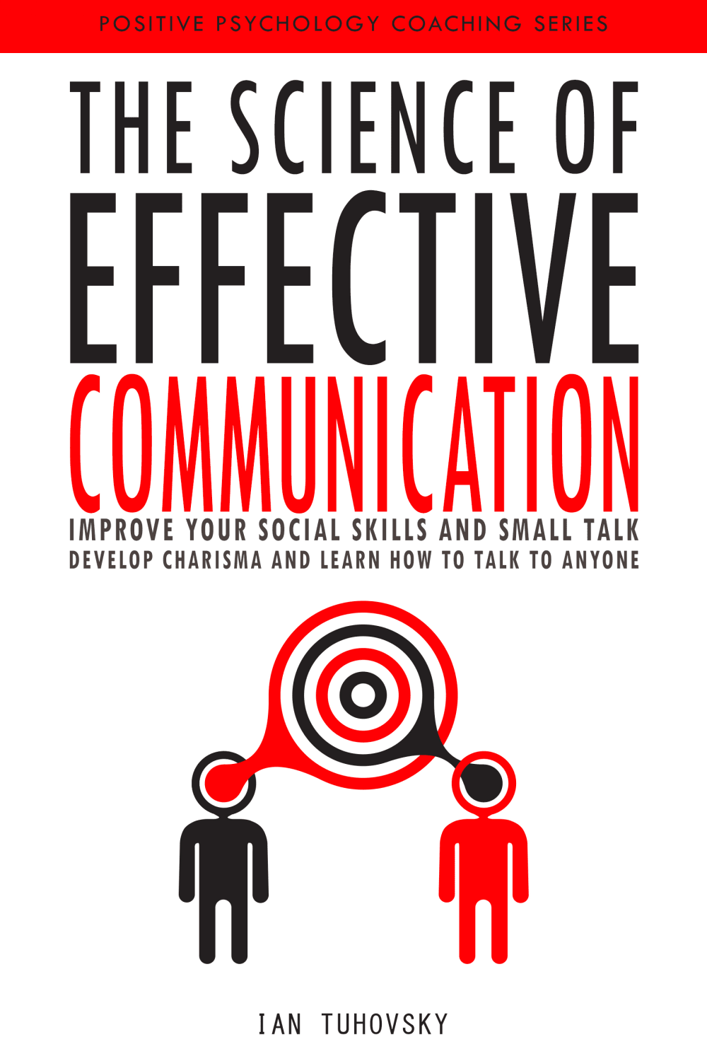
31 Responses to Option B
This option actually showed two people in active conversation with each other.
I like option B the best because I like the graphic image showing the two people engaged in conversation and the lines go from their heads and meet to form the circles between them.
The image that is used on this cover better fits the book's theme. The colors in this version also stick out more to me.
I feel like this this image is a little more eye catching; however, I feel the other option could be as well, if there were brighter reds and more vibrant colors included in the text / imagery.
I like that the title and text are all on the top half of the cover and leaves the graphic and author name at the bottom.
I like the illustration for this cover and it makes me very interested in the book.
I picked B because the two people icons display communication more.
having the two people really instills communication to me. And I prefer the lettering
I think B better shows the communication point of the book and looks more thought out than A. A would be good for a general science or chemistry book, but doesn't look good for this topic.
The font was better for me and the picture looked more realistic.
I really like the picture in this one, as it shows two brains and two thoughts coming together. But I wish it was with the lettering and font of the other book
I prefer A because I like how it has a graphic of people on the front since it talks about communication. Option A seems too analytical and the graphic doesn't match the title as well.
"B" is better. The design is more roomy. The text is crisp and easier to read. The people appear to be communicating.
This cover looks the most appealing and catches my attention the best.
I chose B because I like the illustration of the two people thinking as one. Also keeping all the text together makes the cover look less bulky.
I like option B more...Option B also looks more professional. It also entices me to buy the book because it's titled communication and there's two people on the front connected through brain waves..
My first choice has color that is more bold and the image on it most gets my attention I also think the image represents the book well.
I prefer the cover of B, it seems to sum up the point of the book quite well.
Option B is more effective at enticing me to purchase the book. The cover includes an image of two people which is a good fit for the title. Option A shows an image of what appears to be of an atom which I don't think of when thinking about communication.
I like the vivid colors more and the graphic of the two silhouettes at the bottom. It looks much more professional and eye-catching to me.
I think there's a sense of command in choice B because the colors and design makes it more eye catching.
I like the "beaming" effect. Reminds me of Star Trek and their communication devices.
I like the more simple cover of B. The graphics also depict communication better. A looks like a representation of an atom. That just throws me off a little.
I think having the word communication bigger really draws me to the book and I know what it is about easier than the other cover.
I chose B because it was descriptive and looks professional
The image of the people with the talk bubble was effective for me.
I really liked both options and would consider buying either. I selected Option B because it appeared slightly brighter and more modern so it would be slightly more enticing.
I like a B because of the image that is linked between the two people. It is very interesting it would make me read the title and the subheader. It’s just different
I really like both of these a lot and would be into either cover but the image in choice B just speaks to me more. If you want to talk to people you need to talk to people and this one conveys that more.
I like the coloring and design of this one. Also you can just look at the logo and see it’s about communication.
I chose B because I like the layout of the cover, but also I like the 2 people "communicating" on the cover which is the point of this book.
Explore who answered your poll
Analyze your results with demographic reports.
Demographics
Sorry, AI highlights are currently only available for polls created after February 28th.
We're working hard to bring AI to more polls, please check back soon.

