Poll results
Save to favorites
Add this poll to your saved list for easy reference.
Which cover (and why) do you prefer for "Dead Center" the first book in the Gritty, Pulse-Pounding, Female Police Suspense Series set in San Francisco?

10 Responses to Option A
I think A seems less cluttered, so the title catches my attention better.
People's faces ruins book covers
It's not a busy cover , easy to comprehend but yet still mysterious.
I like A because I don't like the big picture of the person on B
Elements of the design of A work well together.
I just prefer artwork to more generic photos.
much simpler and better graphics
it seams good so that i vote for it
A looks more gritty and mysterious. It fits the suspense genre better than B. B looks too clean and too polished.
I really like A. It's colorful and it really sets a mysterious mood. B is a bit too busy and has too much going on.
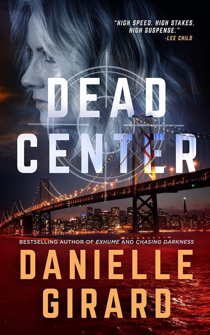
40 Responses to Option B
Much more interesting to look at and nicely laid out
I like knowing the lead is a female plus A doesn't give off a cop vibe
I like having a face for the main character on the cover. It helps me picture her. I also like the view of the city the story takes place in.
I like B because it's more unique. I feel like I've seen covers like the one in A before.
This is more appealing. The image is intense but not overly negative.
I love the scared looking face and the realistic looking bridge.
very cool and seems like an action packed story
The visuals on Option B look much better.
Much bigger so it stands out more.
I pick B because the cover drew me in. It made me want to find out more about the book. I also enjoy Lee Child's books and seeing an endorsement from him is a huge plus. A"s cover is extremely boring.
I choose option B because the book cover is very detailed and I would read it.
The gloomy picture of a city catches my eye more.
Female police, so pictorial of a female on cover is fitting and attractive.
B looks more professional.
I greatly prefer the cover of B because it shows a depiction of the main character. It also looks like more of a mainstream book and less like an indie novel. I also like the clean, modern font and how the title and author color contrast and match the color behind. I also like how there's a snippet of a review and a little bit more about the author included on the cover, again, makes it seem more professional.
This one looks more professional the other seems amuterish
This book cover looks more riveting.
Option B's cover looks very inviting and the illustrations are excellent. It would make for a perfect cover for a suspense mystery book like "Dead Center" and it feels like a great, thrilling read. Definitely well created design on the cover for option B.
The cover is more detailed. the photo draws me in
I like that B shows one of the characters on the front. I also like the inclusion of the quote from a review.
I really like the cover of the book, the image and the colors used are very appealing.
I think that B is more engaging. The picture of the women makes B more exciting.
option A is 360p . option B is 1080hd looks better
Choice B, the font has less distraction. The font is clear and bold and draws my attention immediately to it.
More detail, better color, and cleaner imagery
If the female leads is to be emphasized, then B helps it stand out more.
I like choice B because it's easily identifiable that it takes place in San Francisco with the picture of the bridge, and I also like the recommendation by the other author, Lee Child.
I prefer the cover with the woman and the city skyline, because it immediately allows you to make inferences about the setting and main character.
prefer the graphics of b, the picture of the woman in the cross hairs
It wasn't an easy choice as I liked both. But option B is brighter and more eye catching whereas A is kind of typical for mystery books.
I choose B because I like that there is a picture of a lady on there, the nice bridge, and the water looks like blood.
The lights and the character face make the book look more exciting and interesting, like a movie.
It looks more suspenseful than the cover without the person. It will give you a visual of what a character looks like. the scope target looks cool too!
can see the bridge
It's a much more interesting book cover. I like having a real-world photograph included. It's much more eye-catching.
this is brighter and more eye catching
I like Option B because I love the background and the shot of city makes the whole cover look really appealing. Option A's cover seems a little too plain and as a result, I think that Option B is the better option.
I think the expression on the face is very intriguing and I like it a lot
B has more color that attracts attention to the book. The difference in the design of the words allows the viewer to quickly see what the title is and who the author is. The bridge is easier to see in B and the target focused on the person highlights the title of the book.
I like the human element choice B has. It helps your imagination know what the character looks like.
Explore who answered your poll
Analyze your results with demographic reports.
Demographics
Sorry, AI highlights are currently only available for polls created after February 28th.
We're working hard to bring AI to more polls, please check back soon.

