Poll results
Save to favorites
Add this poll to your saved list for easy reference.
Which book would you buy?


41 Responses to Option A
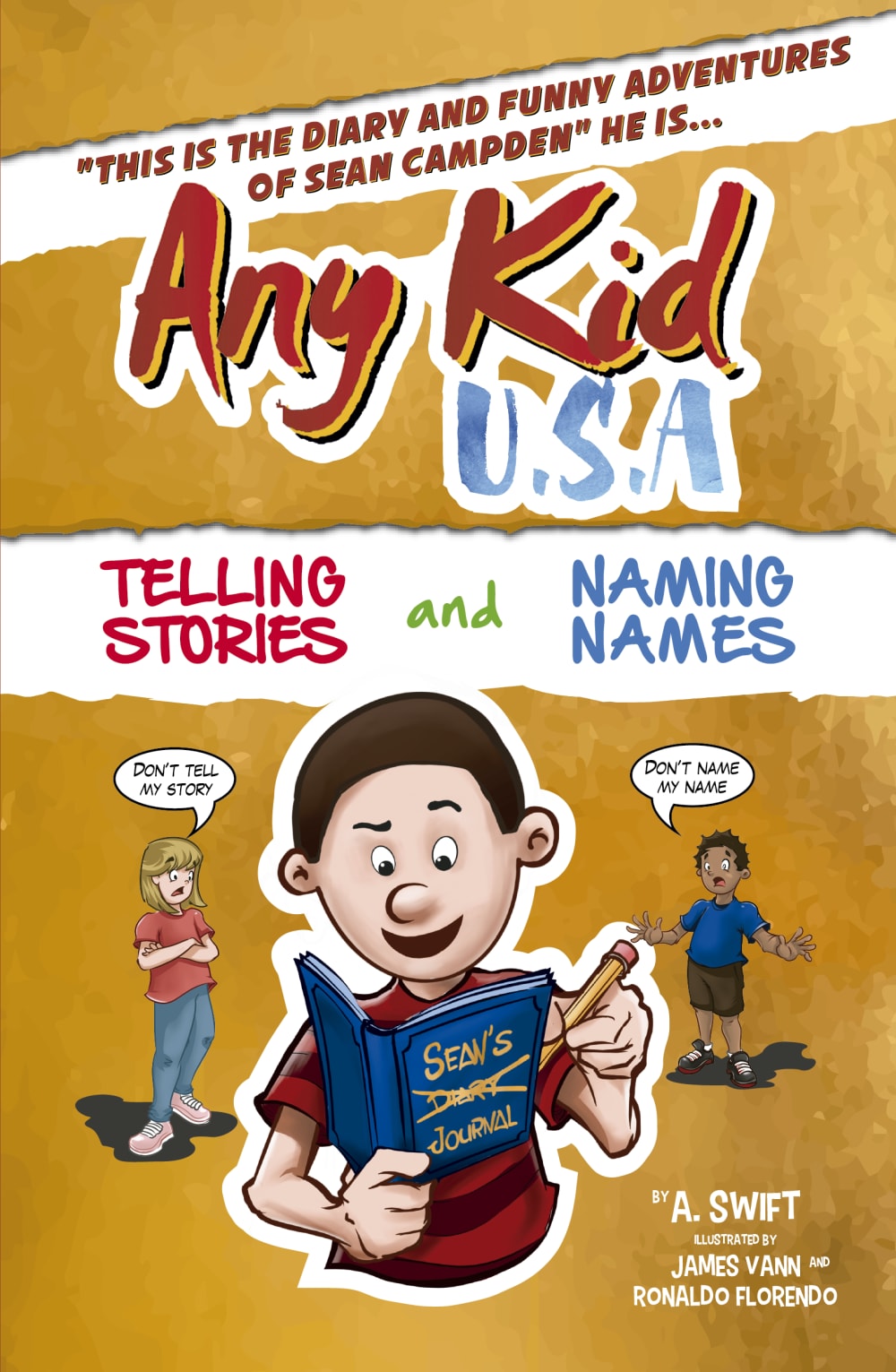
the white banner helps focus attention to different areas of the cover
I find it more appealing
ITS MORE LIGHT
i like the poster with the white line in the middle
The colors pop more and make it more noticeable.
the white strip in the middle of the book makes you read the text first
I think that I chose option A solely for the face that the naming names part is a different color so it attracts more people and makes them look there more.
The white around the words makes them stand out.
It looks a little more finished and put together.
I love how we can see the "telling stories" part separated from the top. I think it looks more professional but I think the kid doesn't need an outline around him
The white bar helps emphasize the words that are written in between them
I like how it breaks up the subtitle
the white makes it stand out more against the background
The white outline makes the rest of the colors pop up more and gives less of a bland look.
I think A is better. The white strip across the front really helps the overall appeal of the book
I like the way the white border highlights those areas. It helps break up the cover a bit.
The visual break in the middle looks nicer and cleaner.
Both graphics are so similar other than the white strip that highlights the description. For that reason I would choose option A as it stands out just a bit more and make the content easier to read. It draws my attention to that specific area on the page
Like the white box in the middle. More color and action the better!
I like how the white strip in A breaks up the page
nice break and adds something to make it not all the same
The white thing stands out better. Less plain very good.
They're very similar, but the extra white on A add some balance.
i like this book cover best as it shows more lighter colors
I chose option A because I really like the white banner to break up the background.
I honestly didnt see any difference between the two. If there was one it was very subtle.
This one is easier to see
I chose option A because the white outline of the character definitely brings the character to life, and showcases the main purpose. He is writing the story by telling it to his book! It just sticks out and helps individuals imagination grasp the concept
The white makes the images and text stand out more. It makes your eyes draw towards that info specifically. It also looks better and bolder
I think pulling the subtitle into its own whitespace like in Option A is necessary to draw attention to it. It helps draw the eyes to the whole picture. As an aside, I'm not sure why you've got that first part of the blurb inside quotation marks. It seems unnecessary and weird.
this one is brighter and brings it to life better
This cover looks better. The white helps the title to stick out better.
The white stripe makes it easier to read
Having the white border behind the tag logo is much easier to see.
I like that the color is broken up a bit and it's not all monotone.
I liked the white torn out section for the subtitle. I thought it was very eye catching and added depth to the design.
i like the white banner in the middle
I like the white outline. It really accentuates the main character of the book and the subtitle.
The graphic layout looks better.
This design is remarking important facts about this book and they are: Telling stories and Naming Names. I think this would be very helpful for me to decide in favor of this book and purchase it and I think everyone in the family would be reading it
I like how the white breaks up the text a little bit and makes it easier to read.
9 Responses to Option B
I think this one looks a bit better overall.
i like more this colors look better
Option A looks odd with the whited out "torn" area in the middle of the graphic.Both this and the white outlining around the main character are distracting.
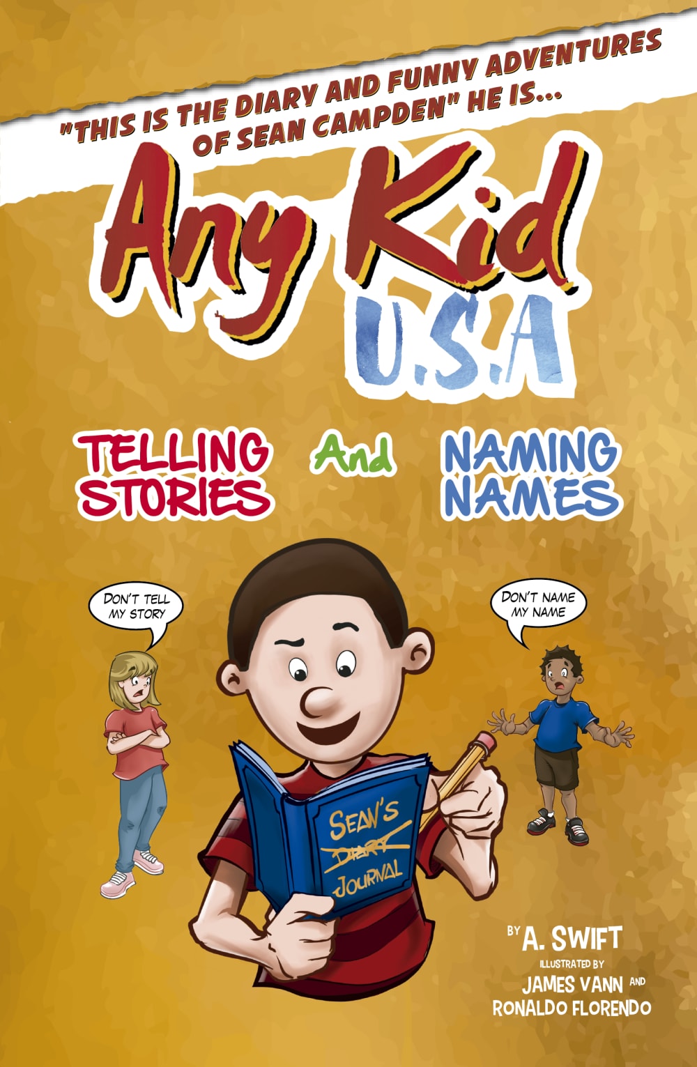
I like B the best because it is more fluent without the white banner accented the "telling stories and naming names" So probably more of a vote against A
Don't need the extra white in the background. Looks fine without it.
I don't think you need the white "tears" on the background.
The secondary white banner is too much and chops the book cover up too much.
I really can not tell much difference in either of the pictures.
I think that the white background on option A. doesn't have the same pop as the good background with white accents for option B.
Explore who answered your poll
Analyze your results with demographic reports.
Demographics
Sorry, AI highlights are currently only available for polls created after February 28th.
We're working hard to bring AI to more polls, please check back soon.

