Poll results
Save to favorites
Add this poll to your saved list for easy reference.
Which book cover is more likely to entice you to pick up the book?
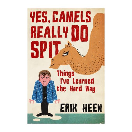
40 Responses to Option A
I would choose A because of the design looks to be a better story.
I like the colors in the second one best. I like the look of the camel more. The cartoony style is more interesting.
Option A visually personifies the title much better than option B. I love that the camel looks like it has attitude. The color scheme of option A's cover is very pleasing to the eye.
I chose A because the colors really make this book cover pop out. There is too much blank space and lack of color on B. Plus the black text also makes for a pretty boring appearance.
I think this book cover is much better as it has an element of humor to it. It would interest me more and make me want to atleast pick up the book and read the back
I like A because I like the look on the camel's face and then the man's. It gets my attention right away.
I like the cartoon nature of the cover for option A. It really appeals to me and would definitely make me likely to check the book out.
I am more likely to buy the product if it looks like Option A over Option B. This design makes the book feel lighter and therefore an easier read.
I like both of these covers, but I like option A better because the artwork reminds me of older-styled cartoons which are more colorful.
I like that the guy is being spit on. The colors also draw my attention more to choice A.
This looks more fun and interesting because of the cartoon text. I like the style of the camel a lot more. However, I'm not a fan of the man drawing.
The person in A looks pissed because they were spit on so A grabs the attention a lot quicker.
I like this book cover more - it just seems more friendly and inviting.
Choice A is a lot more fun and appealing to me. I like the art style of the cover more and it depicts a book that looks more fun to read.
It is humorous yet interesting.
I like option A because it looks more engaging and humorous. Option B doesn't look as compelling.
I think the cartoon version of the camel and man are more comical.
The title is clever, humorous, and the image in Option A is in line with that title and will get folks to pick up the book immediately - that won't happen with Option B.
The situation as described is a little ridiculous, so the picture on the cover of A is more appropriate. It's funnier and catches the eye like a cartoon. B is more realistic, but A is more fun.
The brown camel looks more relatable and real than the white one, and I like the inclusion of the human in my top choice, which makes the book easier to relate to. Very interesting for sure!
A is more comical and would catch my eye more.
This one has a fun color scheme and I'd be attracted by the surly look of the guy on the front. There isn't enough color on B
The cover of option A is so amusing! I would absolutely have to pick it up and read a bit of this book if I saw it in a store.
I like option A better. It is more funny, more colorful, more exciting. It has more humorous alphabets. Cover picture of option A is much more successful than option B has. So I vote for option A.
This cover is more colorful and I love the cartoons. The eyes of the camel is quite funny.
This image seems funnier. I like the humor and how it relays the message.
I think A is much more visually appealing overall. Moreover, the graphics are also more attention grabbing and the colors used are more eye catching.
like hte green gackgrond and road. the cover is more appelaing. would not change a thing
Cover relates more to what the book is about
The picture of the grumpy guy is great. It grabs my attention and makes me want to check out the book.
I think the mischievous looks on the camels face is perfect
I like Option A because it is humorous and I feel I would enjoy this book the most.
I like the style that this is drawn in better than the other one. It feels a little more messy and fun than the other one. With a title like this I'm not looking for a clean and simple book, I want a messy and fun one. I also really like the way the camel is giving side eye to the reader. And the guy on the cover is fun too.
I like the man on the cover, it makes more interested in what he’s learned the hard way.
The art style and color choice of A is more visually appealing to me. I prefer the non-realistic camel drawing.
This cover is more animated and interesting to me.
haha the guy looks so angry it makes it comical
The guy brings the point home that these are things that happened to him which makes the book funnier and more relatable
Option A looks great and a it of a throwback to the 90s. Interesting and charming.
A looks more creative and seems more interesting
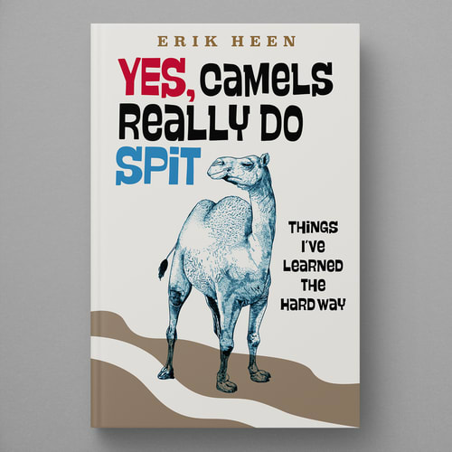
10 Responses to Option B
Option B book cover is more likely to entice to pick up the book.
I like the look and the art style of B a little more. A has more of a kids book design to it which I don't think this book is trying to go for.
The book cover that I think is more enticing is option B because I do not want to image the camel spitting on the man although it is a cartoon. Option B reminds me of Hump Day of the camel on the TV ad which has a lot of fans..
The other options looks odd and not appealing.
I think this is more attention grabbing.
I like the plain photo of the camel better than the angry guy. I liked the colors more.
Looks much more interesting than the other.
i do not like the cartoon look in choice a, it looks cheap and childish.
Best to just showcase the camel as it can reach a broader audience that way
This one is more intriguing, not as angry.
Explore who answered your poll
Analyze your results with demographic reports.
Demographics
Sorry, AI highlights are currently only available for polls created after February 28th.
We're working hard to bring AI to more polls, please check back soon.

