Poll results
Save to favorites
Add this poll to your saved list for easy reference.
Which book cover is more appealing
Age range
Amazon Prime member
Education level
Gender identity
Mystery and crime book reader
Options
Personal income range
Racial or ethnic identity
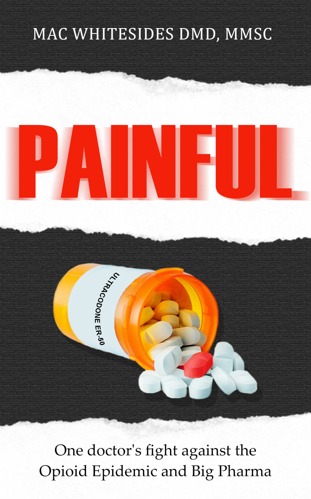
41 Responses to Option A
Seeing the pills coming out of the bottle sideways is more of an effective book cover.
I like seeing the bottle of pills tipped over. I think it is more impactful and powerful.
Feel as if the cover that depicts the prescription bottle spilled over and spewing out these pills better conveys just how bad the epidemic is.
I think the spilled bottle of pills work better with the title and tone of the book. I also like the little detail of the 'red pill'.
Just looks better
I think the image of A makes the topic more relevant and intriguing so A
The tipped bottle makes it look more dire and invokes a response of "chaos". Works very well.
I THINK THIS OPTION IS BECAUSE OF THE BOTTLE SPILLED OVER IT GRABS ATTENTION
I think A is a more vivid image than B.
I prefer the less detailed drug label because it's succinct and better gets the point across instead of the overly or unnecessarily detailed Rx label on the other option.
Looking inside the bottle just has a better look to it and looks like there is more action. The other option is just boring
A really emphasizes the pills and give great context.
This book cover is the most appealing.
the added effect of them being poured out makes the difference
I prefer A due to the red pill shown spilling out of the bottle. It makes me curious why it's there. I don't think the directions shown on the label in B aren't very informative. So the mystery of choice A is more appealing.
It feels more well-rounded with this image.
The pills spilling out looks more dramatic. Also, you don't need all the info on the bottle.
The picture with the pills pouring out of the bottle as if out of control with the central bright orange pill really appeals to me for this book. It really shows how out of control things are and is perfect for the cover.
I like A with the pill bottle spilled because I think it is more dramatic looking.
I think the open bottle is more dramatic and tells more of the story than the closed bottle. But the text on the bottle needs to be fixed to match the curve more correctly.
The tipped bottle with the one red pill is way more visually appealing and arresting than the upright bottle with just plain white pills. The tipped image gives a visual shorthand for the 'epidemic'. Aside from the bad photoshopping, it's also better to have less text on the pill bottle - not so much competition for the title and tagline. The upright option also has way too much info on the label - no need to have the dispensing instructions included.
I really like the symbolism of the fallen bottle and spilled pills in Option A. Taken together with the title and subtitle, it really produces its own imagery of an evil pharmaceutical company, and even invokes images of a toxic waste barrel spilling over. The colors on the bottle and pills itself are just a bit too cheery and could do with some dulling and/or shadow, but other than that, I think the picture is perfect.
Option A is more appealing because the picture is more emotional and makes me feel more convinced to buy the the book. Option B doesn't evoke as much emotions.
I think seeing the pill bottle tipped over with the pills spilling out is a more interesting image and has a more exciting look to it.
I chose panel A. I think the symbolism is there with the lid off of the pills and them partially out of the bottle.
I prefer choice A because the pills pop out, especially with one of them being a completely different color.
Choice A was more appealing to me because it was more eye catching to me. Having a red pill surrounded by white pills was more attention grabbing to me as was the fallen pill bottle.
I think A is the better cover overall. However, I do think that the text on the label could use some more work, though I presume that will be touched up in the final product. I do like the single 'red pill' in the bunch, as this can represent a doctor's push against an entire industry.
the spilled meds seems like they were out of control
Option A has me very interested, I wonder what it could be about. And that red pill in there makes it unique and creative. It looks like it would be a really good book.
Option A is better although both look pretty rough/fake. I like that it shows "action" as opposed to option B where the pill bottle is just sitting there. Option B has too much medical information on the pill holder.
I like the red pill. It means that there is something different about these pills.
The spilling pills is a bit more interesting because it seems to imply more chaos and a more interesting fight whereas the upright bottle seems too serious.
I like A because I think the pills spilling out of the bottle is more attention getting than just having the bottle sitting there like it is in B.
This lays out the subject matter well.
The red pill gives it more of a negative view perhaps leading the reader to think it is more painful.
Cover A is a lot better in my opinion.
I like this one because of the bottle tipped over. I does not seem as cold and medicinal like the other one. It is more inviting.
This cover shows the pills in greater detail and I like the aspect of the different colors of the medicine. The entire cover seems more realistic overall.
I think the image of the pill bottle looks better.
I think the pills look more vibrant and interesting on choice A.
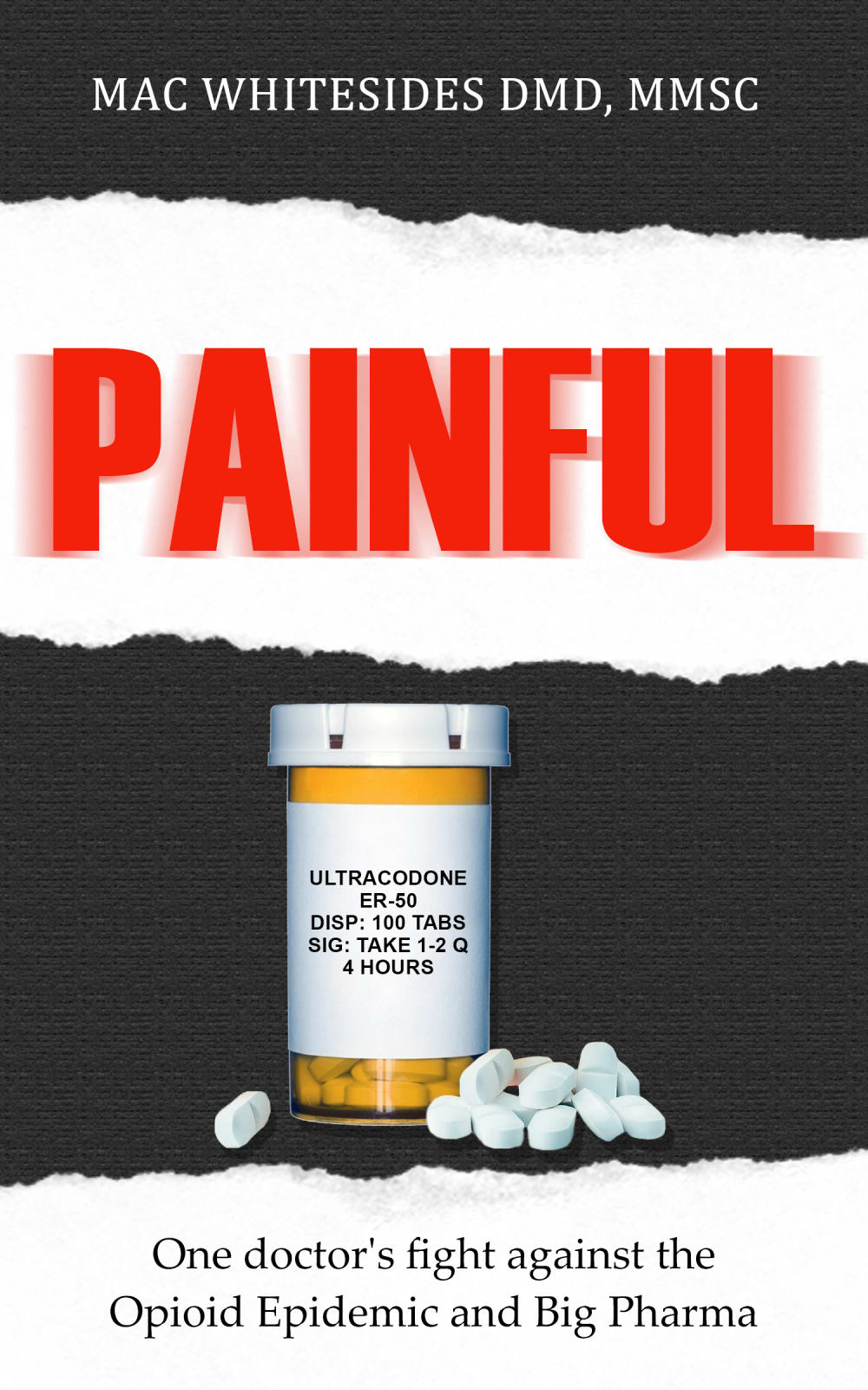
9 Responses to Option B
I selected B because it looks much more professional, and the label on the sideways pill bottle was very difficult to read.
I like this one, with the label and instructions on it. For some reason, it just adds something to it-- the other one is nice being spilled over, but this one looks like it's more "serious"-- it just looks like a serious issue, which it is, when you see the label with instructions on it.
I like being able to read the upright bottle like that.
A looks cheaper than B because it is more obvious that the text is photoshopped onto the bottle.
I really prefer the bottle laying down but the poor attachment of the text on the bottle was a complete dealbreaker to me. It looks like extremely poor photoshop and needs work. If it were better done I would have voted for A.
I feel like the pill bottle is more realistic and easier to read in Option B. The realness of it makes me more interested in the book.
This cover looks so cheap and boring to me. I think you need a person on the front who has drastically gone through the opioid addiction. I think you need to show the effects it takes on a persons body.
No huge difference between the two. They are both powerful images that give the same message. I have no preference
The extra information on the bottle looks more realistic. Also, I'm not so sure what the red pill signifies.
Explore who answered your poll
Analyze your results with demographic reports.
Demographics
Sorry, AI highlights are currently only available for polls created after February 28th.
We're working hard to bring AI to more polls, please check back soon.

