Poll results
Save to favorites
Add this poll to your saved list for easy reference.
Which book cover for a book about discovering greater meaning in travel is more appealing?
Option C won this Ranked poll with a final tally of 26 votes after 3 rounds of votes counting.
In a Ranked poll, respondents rank every option in order of preference. For example, when you test 6 options, each respondent orders their choices from first to sixth place.
PickFu requires a majority to win a Ranked poll. A majority winner differs from a plurality winner. A majority winner earns over 50% of the votes, whereas a plurality winner earns the most votes, regardless of winning percentage.
If an option does not earn a majority of votes, PickFu eliminates the option with the lowest number of votes. The votes from the eliminated option are reassigned based on each respondent’s next choice. This process continues in rounds until a majority winner emerges.
Scores reflect the percentage of total votes an option receives during the vote counting and indicate the relative preference of the respondents. If there is no majority winner, look to the scores to see how the options fared relative to one another.
| Option | Round 1 | Round 2 | Round 3 |
|---|---|---|---|
| C | 22% 11 votes | 38% 19 votes +8 | 52% 26 votes +7 |
| D | 36% 18 votes | 36% 18 votes | 48% 24 votes +6 |
| A | 26% 13 votes | 26% 13 votes | Eliminated 13 votes reassigned |
| B | 16% 8 votes | Eliminated 8 votes reassigned |
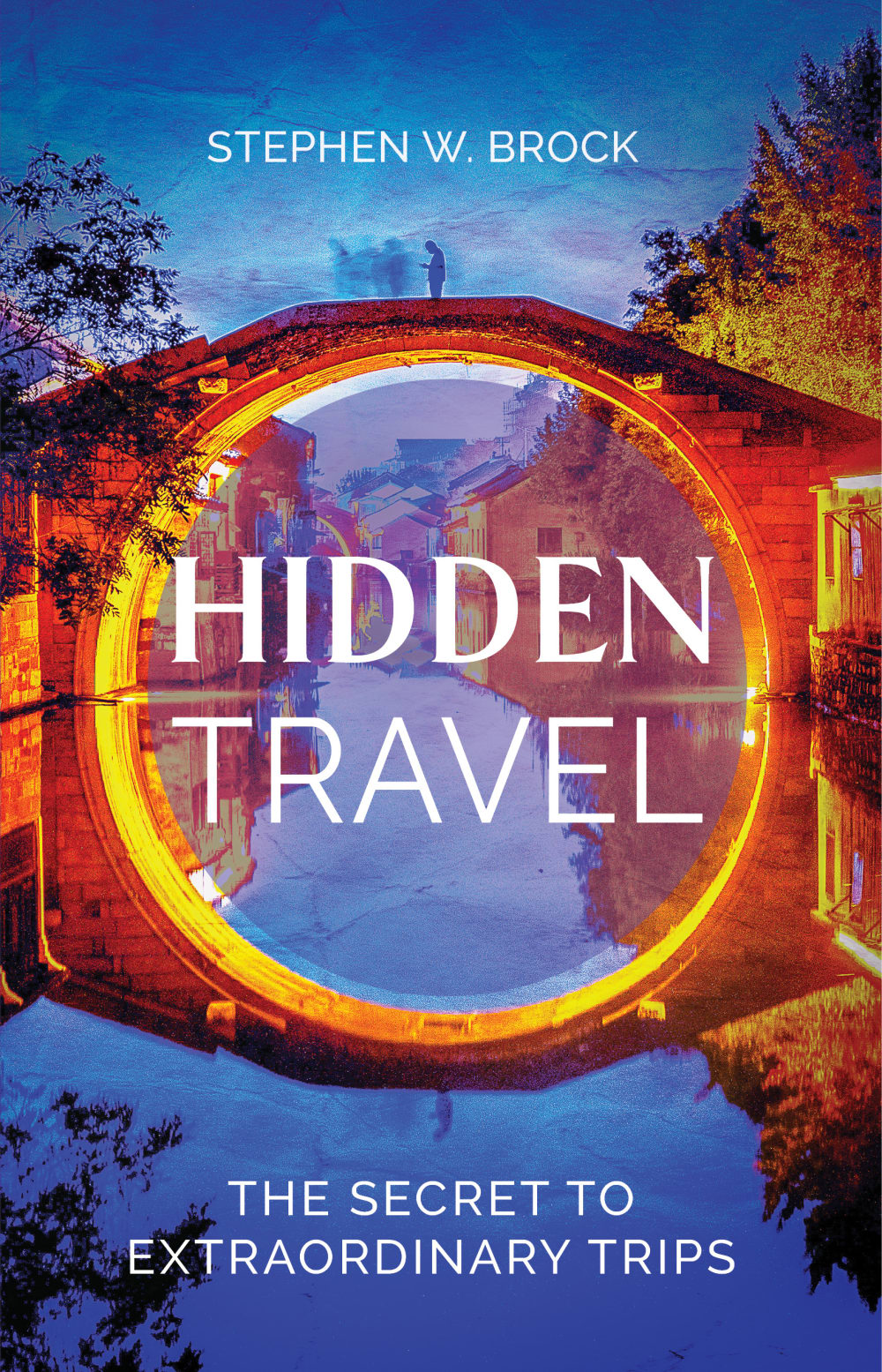
13 Responses to Option A
I prefer choice A because it is brighter in color. Also it is easier to remember.
I chose, in order the ones that felt a bit more mysterious to me, quite frankly.
A's cover really stands out to me and draws my interest the most. D is pretty beautiful and looks nice, but does not stand out as much. B and C are pretty much the same and do not really fare well compared to the others.
I think this picture is very beautiful with the bridge and water and perfectly conveys traveling or travel
Option "A" looks more appealing for a book cover. The colors in this image looks bright and colorful. The overall book cover looks appealing and attractive.
I chose these in the order of their overall impact on me
I like A because the bridge and the blue sky reflected on the water looks the most attractive and it gets my attention right away. I like all the rest somewhat but A just grabs my attention first.
The coloring on the cover in option a is more eye catching
I like A the most because the colors look great and I like the reflection. Option D is second because I like the outdoor scenery with the mountains. C is third because you can see some nature. B is last because it is just a city which is the least interesting.
I chose A as my first choice because I like the scenery and how the bridge makes a full circle with the reflection of the water. I chose C as my second choice because I like the scenery and how it looks like you are traveling down a peaceful place from somewhere else. I chose B as my third choice because I like how it looks as if you are entering a new place to explore. I chose D as my fourth choice because I like the scene and how the natural world is displayed. It looks quiet, peaceful, and tranquil.
I liked choice A the best since the cover looks enchanting and grabs my interest right away. Choice A reminds me of a portal being opened which relates to the title of the book.
I like option A the best because it uses unique forms of photography to really draw my attention in. The contrast is beautiful and makes it better than choice D. Choice D looks really nice too in that it's has really nice perspective as if I was on vacation. Option C and B are generic but option C looks more exotic compared to choice B which makes it stand out more to me.
I ranked them in order of what I like, the thing I like the most is the circle.
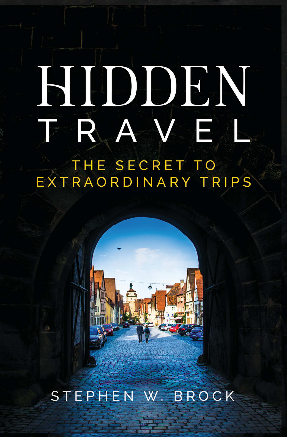
8 Responses to Option B
for a book called hidden travel, I like the first 2 since it looks like an entryway to a secret place
My preferred choices are B and C because those book covers have the most visual impact and are the most compelling
I'd say they reflect the nature of the book the most. The image shows a mysterious atmosphere along with a foreign area portraying travel.
The black background fits the title of the book better. I also like the artwork of the cityscape better.
I like the one with the blue archway the best and then the other one with the green archway. I also like the trees on the other one. I do not like the red and blue one.
I chose B first because I like the image of the tunnel and being able to see the people and the town on the other side, as if I am finding the hidden trip. I chose C second because it is similar to B, but I don't care for the sunshine that blocks part of the image, as if the hidden trip is still hiding on the other side of the tunnel. I chose D next, mostly because I don't care for A as it is too brightly colored and I don't think the circle in the image goes with the title.
i like the title against the dark background better than the lighter ones
The tunnel that emerges into something wonderful in both Options B and C would work very well here. I tend to love old world villages, so put B in first place.
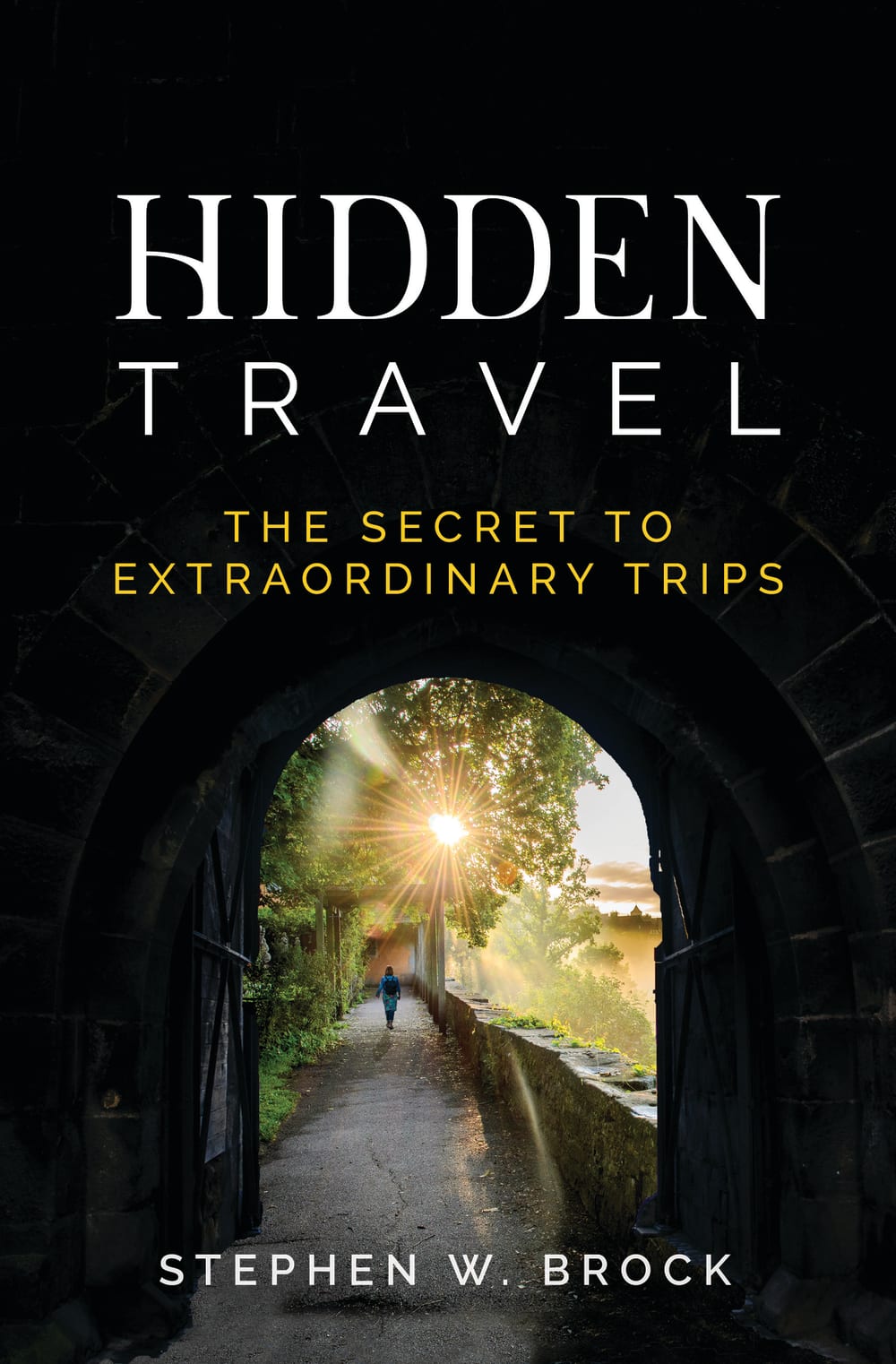
11 Responses to Option C
I like the darkness right before you come out to the sunlight.
C and B both look great, the tunnel and the view at the end makes them very interesting. They are saying "hidden". D is too colorful and messy.
I really like the look of a dark tunnel in C and B. A is one of those photos that looks cool as a plain photo or painting but is too much as a book cover with text over it.
None are bad but I think C and B have a more appealing look because the text stands out the most over the backgrounds. I worry A and D might have a bit too much going on that it could be off-putting.
I think all the covers are very attractive. I really like C and B because I think they really emphasize finding something hidden, unique, and special about travelling, C slightly more than B. While A and D are both attractive, I don't think the images quite fit the book title as well as C and B do, though I think A seems somewhat more unique and thus fits it a little better than D.
I like C and B the best, the view of coming out of the tunnel is inspiring. D's scenery is also very impressive and looks like an awesome place to visit.
I like that choice C is very relaxing and also travel centered, which is a passion of mine.
With the black background, you notice the title and subtitle much better than the other titles. The scenery is also more beautiful
Option C is more appealing as the dark cover and that leads into a tunnel of lots of other possibilities is definitely eye catching. This represent s what the book is all about in so many ways and speaks the image 'adventure' out loud with its cover.
All of them are very good but Option C has a aura of mystery to it; it makes the greater meaning aspect more mysterious and intriguing. The image for Option D is also very attractive, with it's mountain range image.
This was an extremely difficult choice for me between C and A. Can I just say first that ALL of these are GORGEOUS! I've never had such a hard time choosing-- normally one jumps out at me, but this time I really loved C, A and B. It was hard to narrow it down to C and A and impossible to choose between C and A. Ultimately, I chose A because of the colors and the way the book cover pulled me in, it looked both spiritual and mysterious, interesting and beautiful. The black color highlighted the mystery of it, and made it seem like the book held mystery and mystique. The other one A, just GLOWED with energy! I loved this one because of the beautiful colors-- also very spiritual, magical and pretty. But, when I looked at both and wondered which I'd be compelled to buy, it was C. B is very similar in the way it makes me feel, but that bright sunlight beam wasn't shining in that one, so I still liked A more. D is pretty, but I don't think it looks as intriguing and mysterious as the others. This is going to be beautiful whichever way you go, and the book looks fantastic, but I think C and A are one of the ones you should choose! they really just grab you and pull you in.
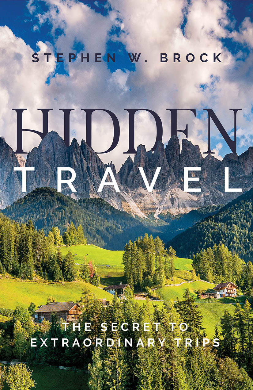
18 Responses to Option D
Option A is my least favorite. If I didn't know it was a travel novel, I would think it's a fantasy novel. Option D is my favorite. I think the picture is really beautiful.
This book has a lot of great imagery. It has a little of everything: roads, grass, beautiful skies, and mountains. It has everything for travel.
I like the cover with the full picture instead of looking through a bridge opening.
I love option D. I love how the word "Hidden" is hidden in the background behind the mountaints
I chose Option A first because I think the picture is really attractive, and I especially like how the word "Hidden" is behind the mountains. I chose Option A last because I think it's the least attractive photo, and the colors are a little overwhelming.
I feel that B is the best cover since it conveys the idea of the world being big and wide. I feel that is the best book cover for what the book is about. C and A are also nice but they just don't give me the same feel. I feel that B doesn't really fit what the book is trying to show and I think that it doesn't look that nice either.
The expanse of land in option d makes it look like a wider land of opportunities
I love the beautiful landscape in option D the best because I love nature and there are more possibilities with it. A is my second choice because the brighter colors make the picture look the most beautiful. I prefer B next because it looks like an old city that I would like to visit
Option D book cover for a book about discovering greater meaning in travel is more appealing.
i picked them from prettiest and places i would most like to visit to places i would least like to visit.
The lush cover on Option D is just so inviting and makes me want to open this book so I can learn everything about traveling to this place. The tunnel entrances in Options C and B are cool because it's almost like an entrance into the text. Option A is fine, but fairly unremarkable.
The gorgeous scenery in choice D definitely sticks out to me the most. It really inspires me to learn more about traveling because I want to go to locations similar to that in the future.
D has the most scenic and eye catching book cover.
These book covers are all pretty cool but I ranked them from best to worst.
Option D is by far my favorite. I love the nature and open format. Option A is a little too abstract for me.
D: When comes to travelling i like close to nature and D gives that vibes to me.B: The end of the tunnel with totally different town looks appealing and great feeling to explore.C:I like the light to the end of the tunnel but less depict look of travel.A:I really love the looks of time travel fictional looks but as per questions image of A doesn't look realistic.
I chose panel D. I really love the valley and makes me want to hit the road to adventure.
Option D, I like the green rolling hills and the rocky Mountains in the background. 2nd choice is option A, the bright orange color grabs my attention. I don't like option B or C, the dark shadow under the bridge is spooky.
Explore who answered your poll
Analyze your results with demographic reports.
Demographics
Sorry, AI highlights are currently only available for polls created after February 28th.
We're working hard to bring AI to more polls, please check back soon.

