Poll results
Save to favorites
Add this poll to your saved list for easy reference.
Which book cover do you prefer for this historical novel, and why?

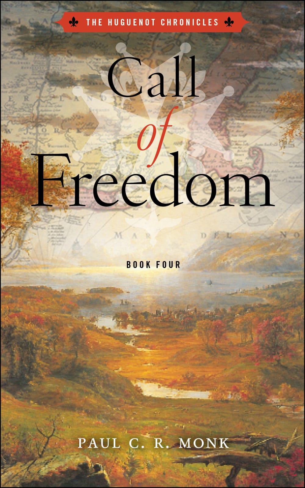
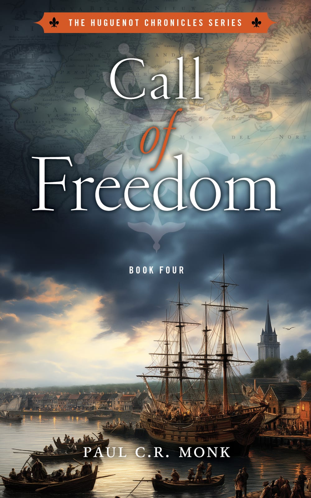
Option C won this Ranked poll with a final tally of 30 votes after 1 round of vote counting.
In a Ranked poll, respondents rank every option in order of preference. For example, when you test 6 options, each respondent orders their choices from first to sixth place.
PickFu requires a majority to win a Ranked poll. A majority winner differs from a plurality winner. A majority winner earns over 50% of the votes, whereas a plurality winner earns the most votes, regardless of winning percentage.
If an option does not earn a majority of votes, PickFu eliminates the option with the lowest number of votes. The votes from the eliminated option are reassigned based on each respondent’s next choice. This process continues in rounds until a majority winner emerges.
Scores reflect the percentage of total votes an option receives during the vote counting and indicate the relative preference of the respondents. If there is no majority winner, look to the scores to see how the options fared relative to one another.
| Option | Round 1 |
|---|---|
| C | 60% 30 votes |
| A | 32% 16 votes |
| B | 8% 4 votes |
Age range
Audiobook listener
Average monthly book spend
Favorite book genres
Gender identity
Literary preference
Options
Pet owner
Preferred book format
Reading frequency
16 Responses to Option A
When thinking of a quest for survival and freedom, one would think of wide-open spaces symbolizing being free. I think the illustration of A followed by B depicts this best. The cover of A is lighter which makes the text easier to read which is why I chose A over B. C is too dark of a cover for freedom, which I associate with light rather than dark.
I think the title gets washed out in all but C. In C, it is more visible and easier to read.
Picture A seems clearer and more pleasant.
I like the openness of the land and the title is easier to read on Choice A. The title is least easy to read on Choice B, but again open land for a family that will be exploring and settling America is good. Choice C looks closed in and busy being of a sea port, unless it is directly tied to the story.
option A has visible text and a clear image. both of the others are hard to read and the images are unclear.
C is a bit cluttered and busy to me and looks a little more military oriented. I like the vast plain symbolizing the "freedom" in the "new" country. I think A has text that is a little easier to read due to the lighting and bit more subdued landscape. It makes the map more up top and the winding river also makes me think of exploration during that time.
They're all good, but cover "A" with the wide river valley and mountains strongly suggests opportunity and the "call" of the journey. Cover "B" looks like an ideal place, perhaps the arrival. "C" suggests the start of the journey.
Option A suggests the wide open lands and the room for a person to be free with their beliefs.
I like the look of A the best - this cover gives a feeling of hope and persistence.
I chose Option A as my #1, because the landscape looks like the early US and the map in the background is light enough that it is easier to read the title of the book. Option C is my second choice because the boats look like early America and the white font on the dark clouds is readable. Option B is my last choice because the title is the hardest to read. I don't like the cross symbol on any of them--it gives a Nazi vibe.
I think C is way too dark for the things that should be happening in this book. There should be a lot of positive things along the way. I like the symbolism of a river flowing in A and the green land, both feeling positive. C doesn't feel quite as much growth, though it has a lot more light.
After carefully studying and comparing all three book cover images displayed above, I selected Option A as my first preference and the one that I would most likely click on to purchase for my own reading enjoyment. I felt that this image jumped right out at me as having the most eye catching appeal based on the attractive design and coloring and bold lettering on the cover. Option C was my second choice followed finally by Option B with all three rankings based on my own personal opinion of the relative attractiveness of each book cover image.
Other than the name, I'm not familiar with this series. Keeping that in mind, I ranked the covers strictly on their aesthetic appeal, and A's serene, green backdrop with a lazy river running through it won my #1 spot. C gets honorable mention, though, for its dark, foreboding sky and the beautiful tall ship.
It depicts the title. The colors blend well together.
The first choice makes me think of a more "wild west" time and intrigues me to learn more about the book. The second is appealing due to the image of the old timey ship, I love history and old stuff. The third selection is a nature inspired scene that is also interesting but came in 3rd, because one of them had too
I find the cover that I chose representative of early Americans... Raw and bold
4 Responses to Option B
I like b. Has more of the unexplored feel to it. Fitting if that timeframe.
The fall scene and colors would grab my attention the most, because that is my favorite season, so it would be nice to read a book set in fall. Second, I like the other one that is a peaceful painting or scene. My least favorite is the shipyard, since I'm not really into books based at sea or on ships. That's just personal preference, but it's common that people read a book by its cover, and I personally wouldn't seek out a book based at sea.
B has a wide open image while ships in C seem consrictive
I would choose this one first because the scenery view but also the very top of the cover with the map and the cross
30 Responses to Option C
I chose C because I thing the image on the over is impactful.
Option C is my first choice because I like the image on the cover page and also I like the style of the text.
I prefer C; it looks most relevant. A is next. B is last.
I like option C because I am a fan of tall ships and that is what is on the cover. I think that and the colors make the book look very interesting.
There is a slight problem with the font thickness. On all backgrounds, the text is hard to read. With that being said, I like C the most because it depicts coming to new world. A would be my next choice as I do not like B very much.
I really like option C. I love the ship and the high detail of option C. I don't have a strong opinion between A and B but maybe prefer A a bit better.
I like those ships and the seaside locale and the cover is perfect for the novel.
Nice contrast with easy to read text. Vibrant colors really stand out and is eye-catching next to the other two covers.
I like option C the best, because it has the most interesting and compelling cover. The ship really offers a focal point and point of interest that the other two covers don't have. It gives the cover more life and energy.
I prefer option C. I think this one looks more romantic and cool.
C was my first choice because it stands out best and caught my eye right away. A was second because I also like the look. B was third because it makes the title a little hard to read.
I like this one the best because of the old ships.
i chose option c because the pioneers had many cloudy days like the cover
I chose C as it shows the Americans in a depiction on the cover in boats that I envision being the Boston Harbor and the Boston Tea Party that helped ignite the American Revolution. I choose C.
Option c the picture fits more with the title and description to what the book is about especially with the boat.
The image of the sailing ship under a stormy sky looks appealing. Nautical themes are always intriguing.
C makes me think of the time the book is set in, B and A are both very nice but do not bring to mind the time the book is set.
I would choose C first because this is what I envision at this time of the noel setting.
C because the ships and people make this book look interesting. A bcause the lack pf people or buildings bring to mind rh ruggedness of the area, and B just looks like a nice fall day.
Option C has the best contrast. For the 17th century book, that looks the most apt. I feel it is a great historical read and option C captures the moment the best. Nice titles and book art for both.
The cover on option C is intriguing. The looming clouds suggest a struggle to obtain freedom. The winding river in option A is my second choice, but it doesn't hook my curiosity nearly as much.
I like option C. Out of these three the one I would pick up off the shelf would be this one. The port with the old ship and the conflict, the setting, it is the one that looks the most like old America and speaks to adventure.
This one really sets the tone of the time period.
I haven't read this series so I'm picking Option C because of the boats however if the family has already arrived in the States and have pushed west then I think Option B would be better and definitely connect with readers of the series. Option A just seems too "cultivated"...almost as if the people already have some nice John Deere tractors that they use to keep everything mowed and looking good, which is not congruent with what I read in the intro here.
I ranked as to what felt like a quest. I feel the ships convey that theme best. Then I felt the option A did next best then B.
The blue sky and the ship catch your eye better. The two landscape type book covers looked faded and boring.
"C" is by far my favorite. first of all my favorite color Is blue and I see a couple of shades of blue on the cover including one that is almost black. also it is the most dramatic of the three options.
I like that time period and also the subject. Just do not see enough of historical works done on pre America colonial times.
It looked like it matches the story best and was very old heritage
Religious freedom stands as an important part of the history of the United States. Those who fled came here seeking the freedom to worship without government interference. Surely the new land presented many opportunities that served to provide hope to these individuals. The dangers they faced in fleeing and then crossing the ocean were worth the price in obtaining a new start. The cover in m my first choice has a ship, which was the means of transport to get to the new land. The second and third choices reflect the land itself. While belonging to others, they were an opportunity to find a place where they could live and worship in peace.
Explore who answered your poll
Analyze your results with demographic reports.

