Poll results
Save to favorites
Add this poll to your saved list for easy reference.
Which book cover do you prefer for a historical romance?
21 Responses to Option A
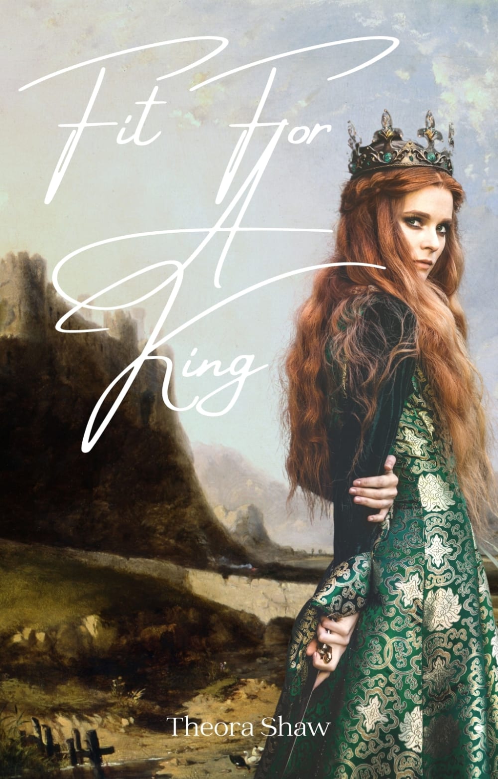
A is my pick because it's very beautiful and alluring.
I like cover A more because of the expression on the woman's face.
A's cover looks more interesting between the two. I also like the female character on it with her outfit.
The heroine wearing a crown and on a cliff edge lends intrigue and suspense to the book.
I loved the shimmery green dress on the woman on the cover here since this caught my attention right away.
Option A, the cover is more romantic and intriguing
I'm into the more realistic looking picture/image better, and I like seeing the face as eye contact is very powerful for me.
I love the colors on the book covers.
I believe the model on this book speaks old historical however I don't think the font used for the title is old enough
I really like how much more colorful option A is and I really like that you can see the details of the dress. The crown she's wearing also seems to fit with the royalty mentioned in the book title. I wish the sword was a little more prominent (it's a bit lost in her dress) but it's still a really nice tough. Option B is too faded looking and the background just makes me think barren desert (not super appealing).
Neither are great. They need more color. The name on A needs to be bigger. The title needs to be bolder and with a shadow so that it doesn't fade into the background so much. A different font might also make it easier to read.
The look on the woman's face sells the book for me. She looks innocent and like she wouldn't do anything wrong, but you see the knife/sword on the back. It's perfect.
I like option A better because the colors are more vibrant to look at. The model makes it very intriguing and mysterious looking and she does a good job drawing you in and making me want to read the book in order to learn about her story. The other option comes off as very aloof and doesn't fit the narrative of a romance more like a fantasy/mystery novel.
I like the character looking at me. It's intriguing and inviting.
i choose A because the book cover look more historical , appealing and enticing also fitting for advert purpose.
Both cover photos are great! That said, I think that the font style and coloring doesn't really work on either cover. I chose A over B because the font coloring and style doesn't wash out the image as much.
I like Option A because the image on the cover is brighter and it gets my attention more quickly. I don't like Option B as much because the image doesn't get my attention.
I prefer option A because the other option seems more mysterious.
I like choice A the best. I love the artwork on the cover.
Option A has a richer look with the deeper colors. The placement and font of the title looks better in Option A.
I think her gaze is engaging and holds my attention. The font of the author name is better too
29 Responses to Option B
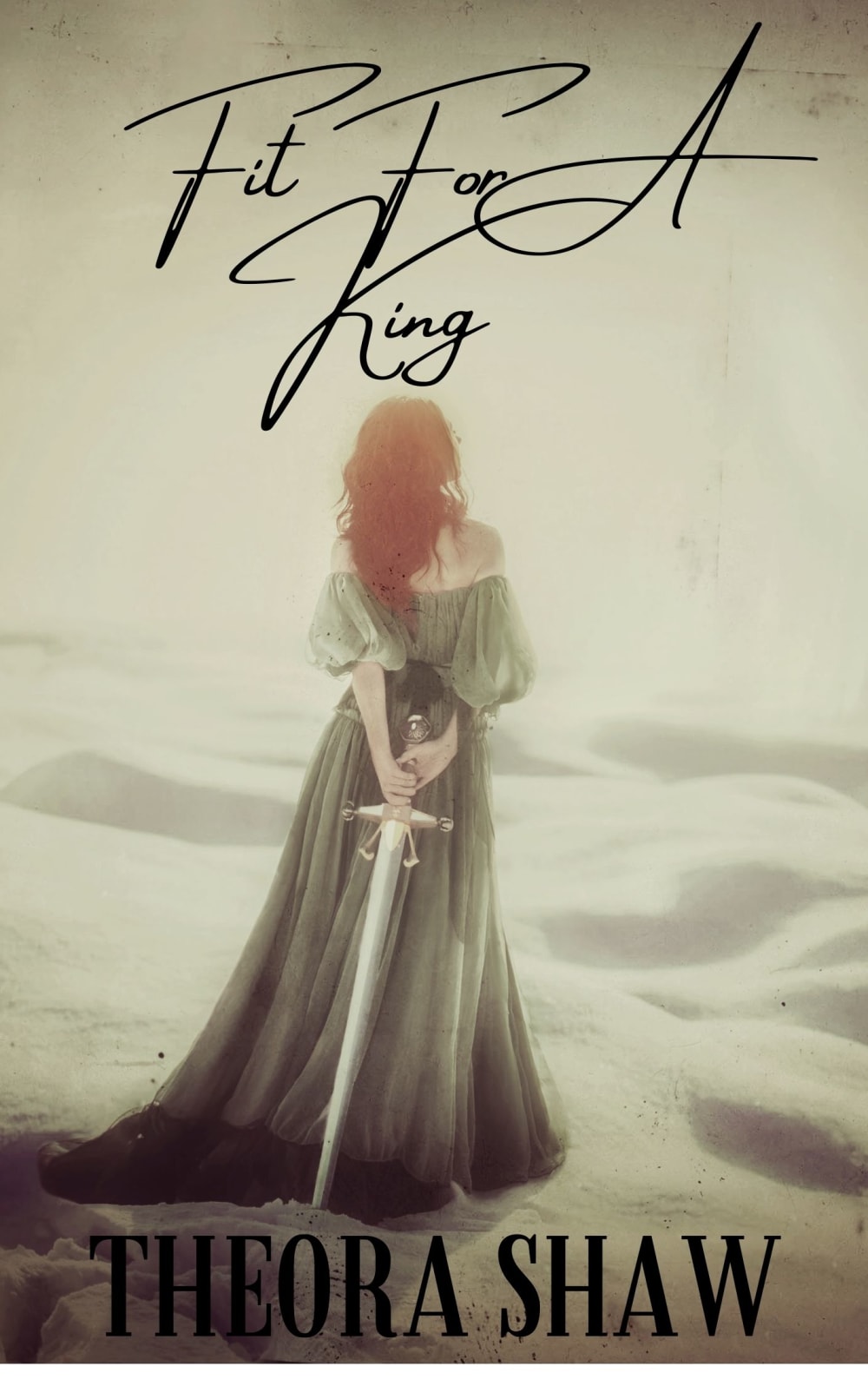
I like this cover better because it has a very ethereal and mysterious beauty. The other cover doesn't really stand out amongst other romance novels and is pretty typical.
I like how Option B is a little bit more dreamy and requires a touch more imagination. I prefer not to see the character's face on the cover of a book like in Option A because it colors my own imagination and vision of who I'm reading about. Plus the font is a lot stronger in Option B.
I liked the sword and the Theora Shaw wording stands out better than Option A.
The mystery of the back of a woman's profile makes my mind want to see and read more. option B
I voted for option B because it looks more elegant and of the age that would have kings and queens. I also really like the pose of the women in option B - seems devious.
This add a bit of mystery to the book in my mind.
I chose option B because it does not have the face. I like to image the characters and being more abstract is nice.
In Option B the blade she is holding is more obvious. Also the author's name is easier to read.
i love the colors used in B and the art is beautiful!
I prefer the cover in option b for this type of book because the cover looks more historical to me
I like choice B better because the picture has an ethereal quality. Her having her back to us makes us wonder who she is.
The overall design and color scheme of B make the cover more eye catching. I also think the having an art illustration rather than a picture of a real human is more aesthetically appealing.
I feel like option B's cover makes me more intrigued to read the book. I want to know who that woman is and why she is holding that sword. In option A it's harder to tell that the woman is holding onto a sword. I also like that with option B I don't know what the woman's face looks like which means that I get to form my own idea of what she looks like when I read the book.
I would pick up B because it is not immediately clear what kind of historical romance it will be, which would have me take another look. The other says medieval and the castle is clear, but B could be any kind of kingdom and could be rocks or sand. I also tend to prefer couple covers, but if I am going for just 1 person on the cover (and that person is not a man), I tend to choose books where you cant see the faces. Faces interfere with how I imagine the people in the story.
I prefer the approach where it doesn't look like the person is looking at the camera. It makes it a bit more mysterious.
I think B looks more romantic with the girl looking off into the distance. On A she looks more mysterious and not romantic. also like the black text on the title vs. the white.
The text on this one seems better to me, it is not as big as the other, and the text is black on this one, making it much easier to read
I like that you can't see her face but you can see the sword. Every cool!!
I like a little mystery, this cover is better.
I chose B because it immediately struck me as an old timey romance cover. The font of the author's name and the woman looking away made a big difference.
This one brings more mystery to mind
I prefer the book cover of option B most due to the mystery of the face although the option A has much more details in the delay.
The white text of A is hard to read against the colored background.
The big letters that are on the cover and cover a good portion of the background seems overpowering and takes up to much space instead of the visually appealing character.
Her backside seems more mysterious
Looks more historical from the way she is standing and the way she is holding the sword. Font goes well also.
Option B looks more romanctic and dreamy.
I think the fact that the woman is facing away lets readers imagine her to look however they want.
They are both really good but I like option B a little better because it looks a little mysterious.
Explore who answered your poll
Analyze your results with demographic reports.
Demographics
Sorry, AI highlights are currently only available for polls created after February 28th.
We're working hard to bring AI to more polls, please check back soon.

