Poll results
Save to favorites
Add this poll to your saved list for easy reference.
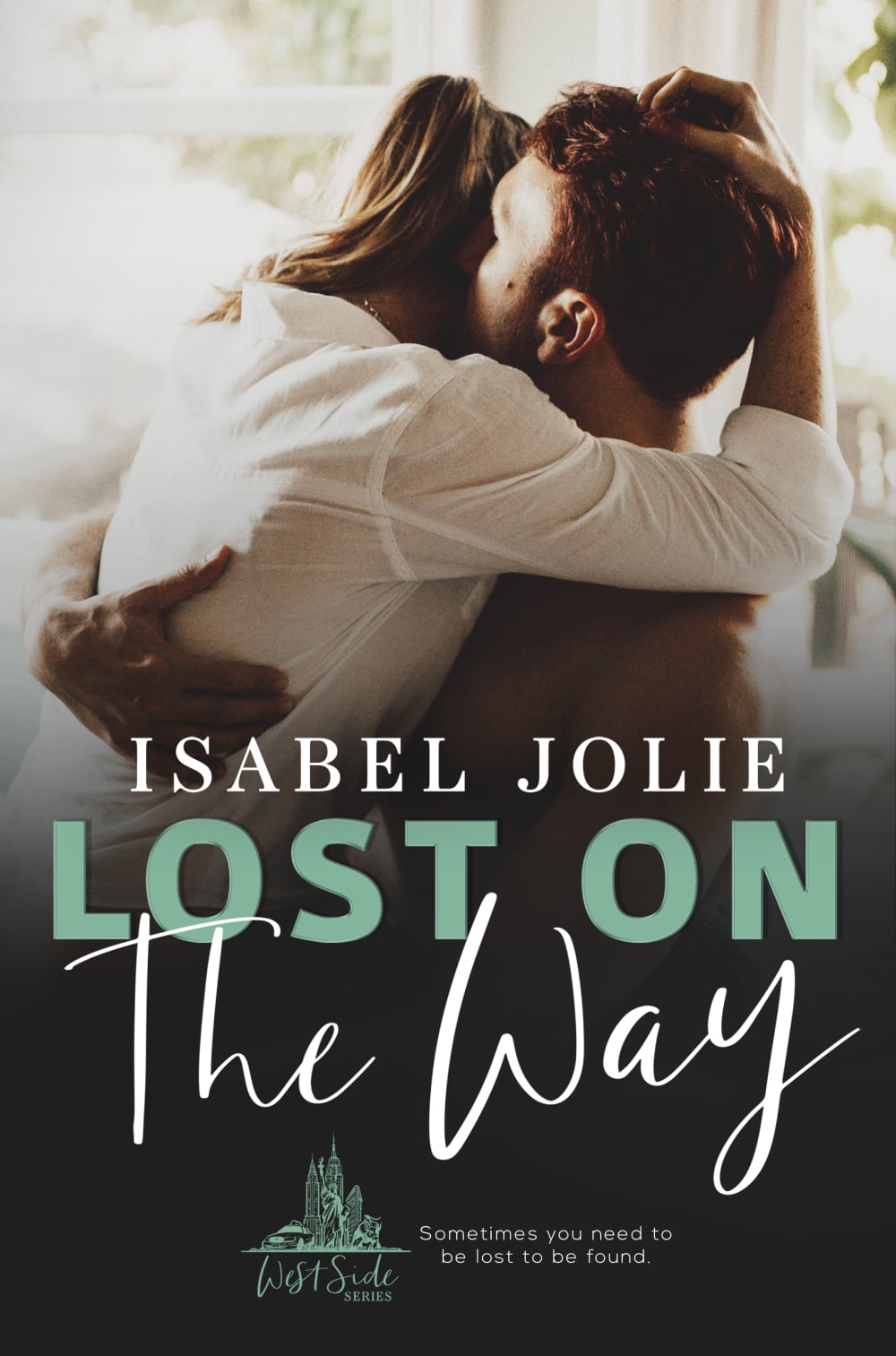
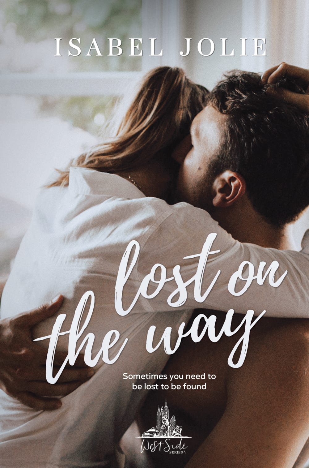
Which book cover do you like the best?
Age range
Education level
Gender identity
Literary preference
Options
Personal income range
Racial or ethnic identity
42 Responses to Option A
I prefer the colors more in this book cover as it’s more aesthetically pleasing and appealing.
I LOVE THE BLUE GREEN COLOR ON THIS OPTION. IT MAKES THE WORDING STAND OUT ON THE PAGE
using different colors make the design more stylish and looks better.the picture in A is good size while the one for B is too-big
I prefer option A. I like that the photo is smaller and that the fonts and color of text is different colors. I do like that the authors name is at the top of option B.
A looks more like a whole and complete presentation; the colors are nice, the fonts are nice and the overall art design works well for me. While B looks a bit rushed or something.
The bold green text looks good and the image isn't as close up. B looks too close.
I think the title in this option is easier to read. I think the title being more visible would be the way to market the book.
Picture for A is centered, the titles and text are symmetrical on the bottom, and I guess you're drawn to the intimacy of the couple in choice A better than Choice B. Choice B pic makes me feel like I'm spying on them, which is uncomfortable.
I like that the picture is further away in Option A. It helps me see more of what is going on. I also like the block letters of some of the title in Option A.
The green text in choice a provides nice contrast and is much easier to read.
I choose Option A because the cover page is attractive and I like it very much, the quality was good and the clarity was good and interesting, when comparing with Option B it is more likely to view and it is more appealing to me, so I choose accordingly.
Option A stands out more, it’s easier to read the title, and the green color is nice.
The placement of the author's name on A is too big. It looks like a movie poster with the actress' name rather than an author's name.
I like the title to be in one general area.
B looks like the lost on way which makes no sense. I like A much better. The photo is really nice, too.
Love the style of the font, and the colors. The placement is catchy and draws a reader in. .I love the author name prominently displayed as such. I want to read this book!
I prefer A because in that option the picture is the focus on the first part of the cover so it catches my attention. In option B the authors name at the top of the cover is distracting and takes away from the focus of the image. I think it flows better when you can look at the image at the top and then look down at the bottom to see all of the written details.
I think its easier to process the information on A. I like that the color and font changes up a little.
Its colorful and the font displays well on the book cover.
I like choice a because it is less zoomed in.
I thought with option A the set up of the image for the book cover was placed well and I liked the color & positioning of the title and author. I also thought that the book cover looked less cluttered and classy.
I like the font style and color on option A, it makes it really easy to read, especially for a person that can’t see well. The picture in the background looks better because it’s a little bit further and you can actual focus on all the elements of the cover not just the couple.
I find the option A book cover design better from the Two designs. The colors are sharp and more attractive. It looks better and it appeals the most to me. I love the arrangement and use of colors. I would rather choose it as the front of book design over the other option. The background image is so reflective of the theme. It gives me so much interest in reading.
Option A book cover looks attractive. Option A book cover looks best than Option B. The font attracts me a lot and so I chose the option.
Even though the cover pictures are the same, Choice A is more eyecatching with the green and white coloured font. Similarly, I prefer the differing font styles of "LOST ON" and "The Way". In addition, the black faded part at the bottom of the cover makes it clearer to see the title and looks more professionally filtered.
The shading of A makes it better. It represents the content in a more mysterious way, while giving a bit of romantics in the way the image is presented.
Color contrast and less cursive makes it easier to read and more eyecatching
I dont really have a strong preference. A is a little more eye appealing and catchy because of the color combo
Option A book cover is more interesting with its different letter fonts and colors, and the picture is smaller.
i liked a best because it is less zoomed in i feel like you get more of the idea that way
i don't care to see a shirtless man on my book cover. This one is covered up well by the shadow and title.
The cover is darker and more mysterious. The author and title stand out with the mixed font and added color. This is the book that would catch attention because the photo of the two people embracing is not overwritten by the author's name and book title.
I prefer choice A for many reasons. I like the bottom half of the book being dark so that the title contrasts. It looks better than having font laid on top of a picture like in choice B which is so 90s web. I prefer the couples picture in choice A, the framing is better, the clarity and the overall aesthetic look of the picture is more attractive than choice B. in choice B you can see blemishes on the guys arm, and that mole is super gross.
I like the contrast of option A. The darker bottom made the title and subtitle stand out. I also liked that the words of the title were different colors as it put emphasis on lost.
The coloring on the wording is more eye catching. The author's name directly above the title also makes the cover look less cluttered.
For some reason, having the black at the bottom makes this book seem more literary and less like a everyday romance.
Prefer the way A Looks I like the different color used for the font
Option A is a better cover to me because the text does not interfere with the jacket art.
I chose Option A because of the lighting of the cover and the contrasting Font color for the book title. It makes the images clearer and the book title stand out.
The blue letters pop out more making me pay more attention to it.
I like the image more zoomed out, you can see more in the picture and the couple’s surroundings.
this one is way easier to read
58 Responses to Option B
I like B because it remine me of how the person is in love.
For a romance novel, the close-up of the couple in B is fitting. I think of romance, relationships, closeness. The title typography is better as one solid color. The white does not get washed out.
They're both good but I like the font better in B
I like the B option to choose..because it is surprisingly beautiful and the style of the writing is so awesome ... the design of the book cover looks like a professional ... the effect of the book cover being so beautiful ... it motivates me a lot to buy this book cover. .. So my initial preference is option B
I prefer the title to be separate from the author so everything is more clear and easier to read. I also prefer the font and color of my choice.
A's weird font contrast makes it look realy cheap. I like how B's author name is separated from the title. The green isn't a good choice either.
I like the font on choice B and I don't like the 2 different fonts for the title on choice A. I think that the author's name looks better up at the top, away from the book title. I like how the couple is cropped closer in choice B too.
I like B because I think having the authors name at the top and the title at the bottom looks more balanced and attractive as a cover.
I love the script it makes me think of love letters and romance
I like this cover better. It's laid out cleaner.
i chose option B because I feel like the up close image is more appealing and more intimate. I also fell that the script used makes it more appealing and looks like it is more sophisticated.
Option b looks more romantic with the writing style
The swirly light font makes this a much more feminine font color. The blocky font that appears in A feels a little aggressive for a romance novel
I prefer option B because option A looks way to cluttered. Option B is simplistic and not too distracting.
I chose B because I liked how the image of the couple was more close up, and I liked the font that they used better than the one that they used in A.
I like both actually. They both look great! (Especially compared to some of the other covers I've seen through Pickfu). But since I have to choose, I'll go with B.
This cover is more aesthetically appealing to me.
I chose Option B because the font and display of the title is very appealing - I like the way the title is all in one font, as opposed to Option A. I also like colors on Option A - the browns and white. I do not like the green font in Option A. The book in Option A is much more visually appealing and entices me to want to read this book!
I like the brush lettering on the title in option b. I also like that the text on option B is all the same color. I think it makes the color look neater and the light text stands out.
I like the author name and the book title to be separated.
I liked B because it feels like the text was laid out better. In option A, everything was in the same location and also there were different font styles, whereas B is more consistent on font styles. I like the author's name on the top and the book title on the book as I feel like it balances the design out. Plus I like the larger image too, rather than the fade to black that option A had.
Better design for love and I prefer it
I like the style and white color font better than the greenish blue in the other option. Its looks classier.
I chose B for a few different reasons. For one I don't like the green text used in A. It's an off-putting shade to me and it doesn't do anything to add to the image. Secondly, I prefer the way B is organized, with the author's name at the top, the title of the book in the center, then the tagline for the story, then the publishing house at the bottom. Finally, I prefer the font of the title --it looks more romantic to me-- and I prefer the look of the entire image as the background (as opposed to the black used as the bottom portion of Option A). All in all, B is the much better option of the two.
the big large print and picture drew me to it like here i am
The font on B is more consistent, and looks fitting for a romance genre type book, which is what this appears to be. In A, the title is also formatted such that the reading of it appears choppy, and in B the title flows together nicely due to the design.
I like the way that the photo is cropped, it looks more exciting than the one that is not cropped. The author's name looks better at the top and by itself. On version A, it almost looks like it could be part of the title.
The added green color, and three different font styles of Option A are too distracting and conflicting - Option B is much more attractive design.
i choose the B option because i find the book cover more appealing and of better quality.
I like that in B the lost on the way is in cursive and white.
The author of the book should always be on the top front cover. And this book cover is more legible and easier to understand overall. Text is clearer, meaning it is larger and the placement is in a good position to be legible.
B has more of a grip to it. It's more exciting with its fonts and the way the type is spread out.
I like how the image is cropped on this cover. The white font of the title looks nice. The tagline font is bigger and easier to read.
I like the title all in the same font and seeming to spread over the models on the cover. Seems more emotional.
I like the font and script style of the title
The second one just stands out more to me.
The image in B is lighter and a little softer looking. The title stands out nicely on the background. I prefer the couple being more close up on the book
Keeping the font the same makes it easier to read.
The font is more in line with a romance novel. It's pretty and more enticing. A is kind of boring and blocky. I got the impression from B of it being more of a non-fiction type of book.
B has a more clean look
I prefer option B because the layout looks better to me.
I think the white and the close up makes the cover look more cohesive
I think this cover looks a little less erotic than the other one. It looks a little more romantic rather than having it look steamy.
This layout is better at distinguishing the author name from the title. The other cover makes me think the name is in the title as a character.
I picked B because I like the lettering being all the same style.
I like the font of B much better not only because it is prettier, but because it is easier to read. I like the title and description.
I chose option B just because I like it better. I like how the author's name is up at the top separate from the title. I don't like in A how there are four different fonts right on top of teach other (author, two for title, and then the one line description). I also like how there is the one line description in B under the title that is way more noticeable than in A.
I could honestly go with either choice of these book covers. I think looking at the choices, I do like the authors name at the top of the book which is why i went with choice B. I do like the colors of choice A and wouldn't mind that cover either.
the font makes more sense and ti is easier to read
I like the bigger image with writer's name on top with white texts.
Option A really emphasizes the words " lost on " which makes reading the title confusing
I think B just reads and flows better. With the green text that’s like all you read first and it doesn’t make sense. It’s also so cluttered with it all in one spot.
The closer picture looks better. I prefer the Font on Choice B. You can read the "Sometimes you need..." better in Choice A.
I like the cover much better where the authors name is at the top and then under part of the image is the title of the book. I think it looks weird having the authors name jam packed with the title of the book.
I prefer B. I think the different colors and fonts in A make the book feel disjointed.
I think that image B looks more typical of a modern romance novel for the couple to be zoomed in. Also the font looks better in my opinion.
i like that the two people in the ad are closer up and i like the boldness of the tagline. It draws my attention and would make me find out more about the ad.
Being closer to the couple in the image makes the emotions in it more immediate.
Explore who answered your poll
Analyze your results with demographic reports.
Demographics
Sorry, AI highlights are currently only available for polls created after February 28th.
We're working hard to bring AI to more polls, please check back soon.

