Poll results
Save to favorites
Add this poll to your saved list for easy reference.
What book cover do you prefer for this fictional, humorous novel, and why?
Option D won this Ranked poll with a final tally of 25 votes after 4 rounds of votes counting.
In a Ranked poll, respondents rank every option in order of preference. For example, when you test 6 options, each respondent orders their choices from first to sixth place.
PickFu requires a majority to win a Ranked poll. A majority winner differs from a plurality winner. A majority winner earns over 50% of the votes, whereas a plurality winner earns the most votes, regardless of winning percentage.
If an option does not earn a majority of votes, PickFu eliminates the option with the lowest number of votes. The votes from the eliminated option are reassigned based on each respondent’s next choice. This process continues in rounds until a majority winner emerges.
Scores reflect the percentage of total votes an option receives during the vote counting and indicate the relative preference of the respondents. If there is no majority winner, look to the scores to see how the options fared relative to one another.
| Option | Round 1 | Round 2 | Round 3 | Round 4 |
|---|---|---|---|---|
| C | 28% 14 votes | 28% 14 votes | 34% 17 votes +3 | 50% 25 votes +8 |
| D | 28% 14 votes | 30% 15 votes +1 | 34% 17 votes +2 | 50% 25 votes +8 |
| E | 22% 11 votes | 22% 11 votes | 32% 16 votes +5 | Eliminated 16 votes reassigned |
| A | 16% 8 votes | 20% 10 votes +2 | Eliminated 10 votes reassigned | |
| B | 6% 3 votes | Eliminated 3 votes reassigned |
Age range
Favorite book genres
Gender identity
Options
Preferred book format
Reading frequency
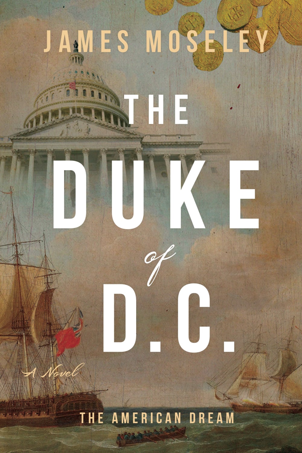
8 Responses to Option A
I like the image on the cover of option A, so that is the one I would choose.
I love the ominous White House and the foregrounding of the boats. It sets the scene for a very interesting story.
I like the subject and artstyle of my top choice. I find it appealing and interesting.
Option A I think it fits with the description and fits with it very well and not only does it fit with it, but it is very visually appealing
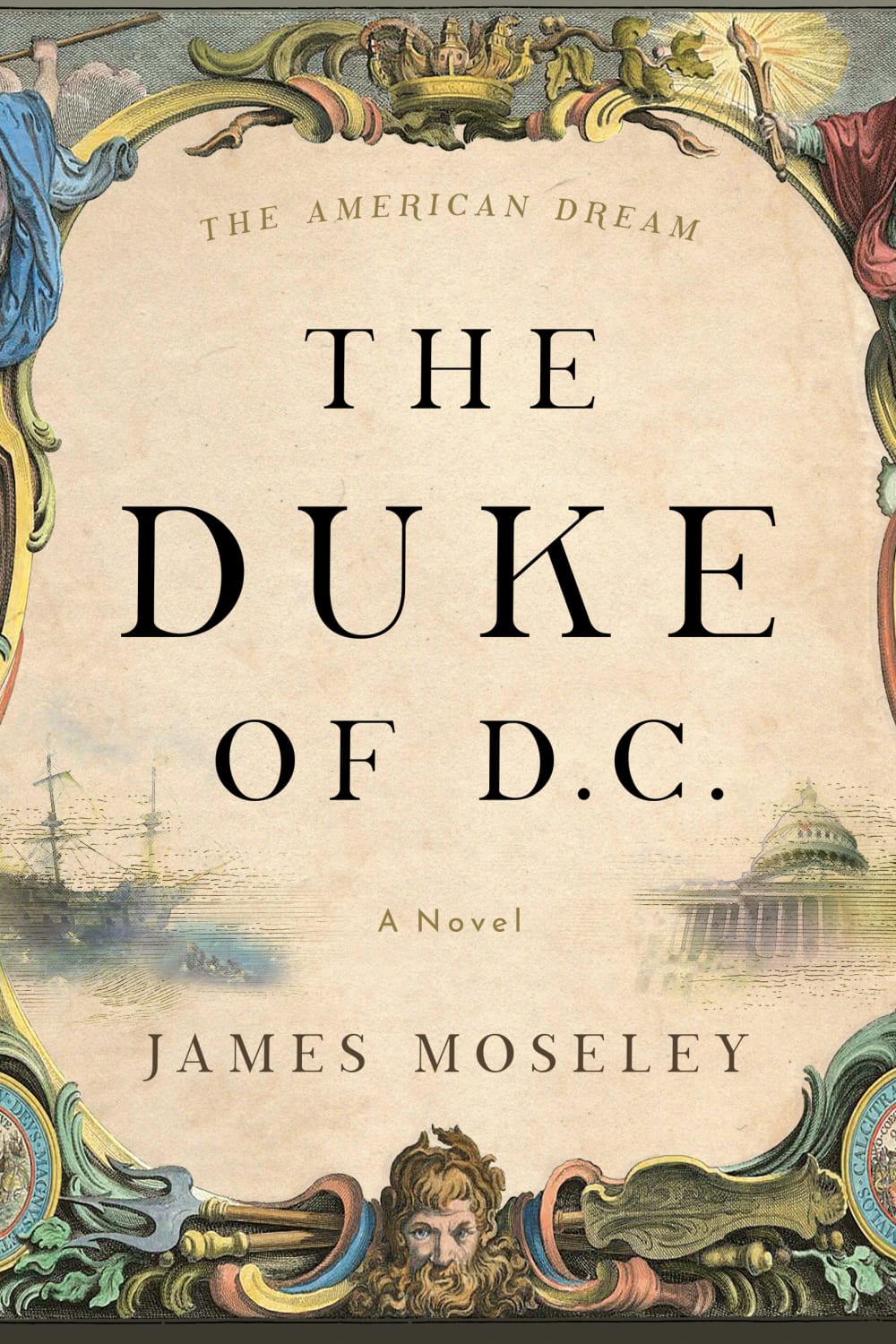
I like the drawn capital building on the cover. Secondly I like the face of a person on the cover. Option D and C lack the warmth of the other covers.
I really like the 'classic' appearance of A and B, preferring the former due to the added contrast in the fonts. E is fine, though a bit plain, while I do not really like the focus on the monument in D and C.
Larger text is attention getting and I'm intrigued by the ships illustration
A has a great balance and flow to the design. C and D are a little too falicky for me, plus the monument is a bit disruptive in the design.
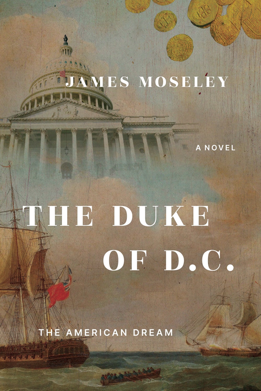
3 Responses to Option B
B and a caught my attention first.
I chose B firs because I liked the historical context of the cover. I chose D next because I preferred the author's name being at the bottom rather than the top. I thought the font on A was much too large and E's graphics didn't really intrigue me into wanting to open the book to read what the book is about.
I like the images in the background of B and A. They seem to match the theme most of an American historical humorous novel. I like the placement of text better on B, more visually appealing. I think D and C seem too serious and plain.
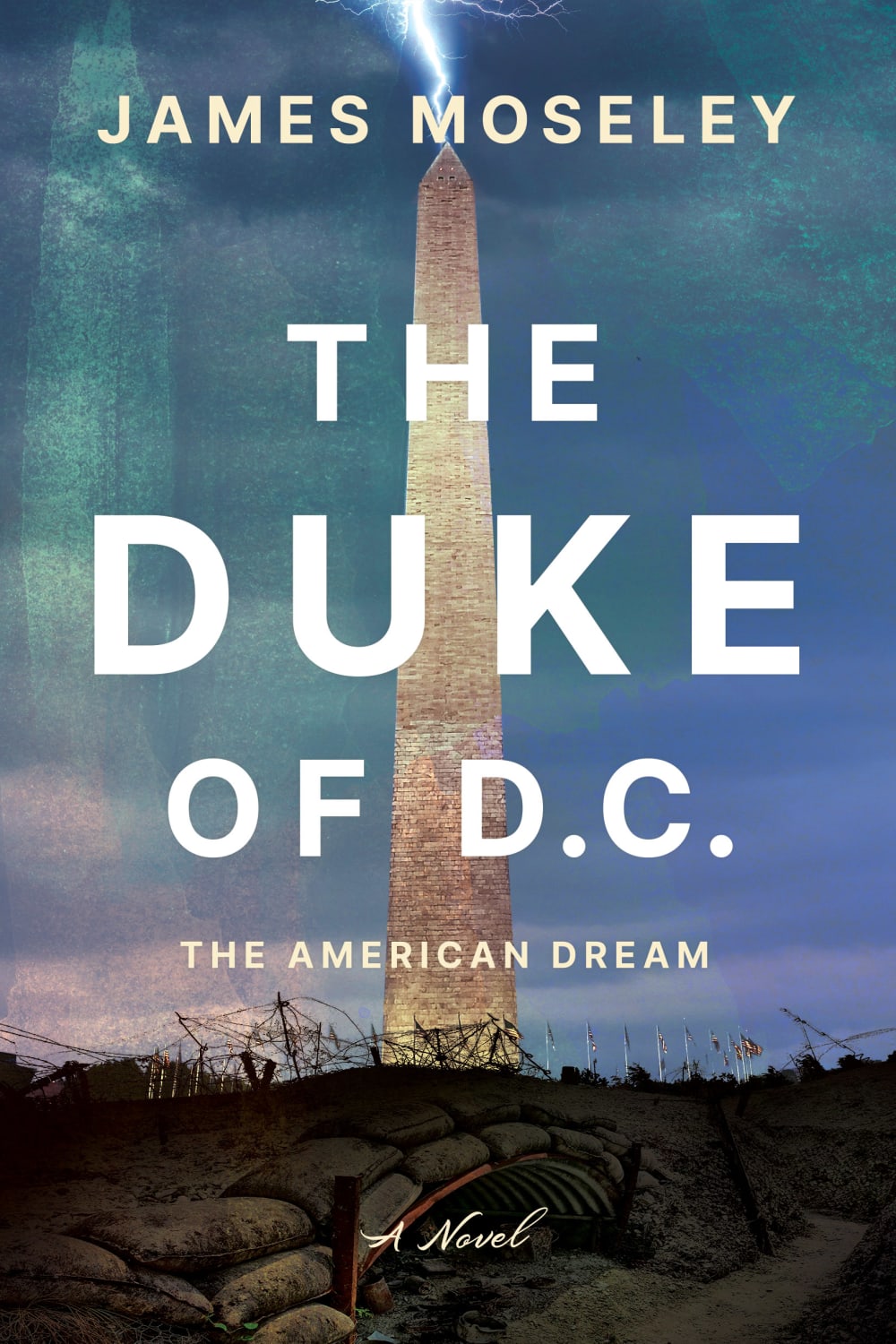
14 Responses to Option C
I like the imagery of lightning striking the Washington Monument, it's fantastical and evocative.
I like the view of the darker colors, especially the blue that is featured on this cover.
I like the options that have the Washington Monument. It is really iconic and looks good with the blue sky in the back. I like the font on C better so it would be my first choice.
I prefer Option C because I like the combination of the colors, font and image the best. It is the most visually appealing to me.
The blue covers featuring the Washington Monument are much more dynamic. That's appropriate, given the synopsis of the book. The more old fashioned covers make it seem like this is a period romance, and isn't really the vibe of what's going on with this book.
I thought option C, looked the best in terms of a cover. I also liked the font style. Option D and A, looked nice. Option B's text placement didn't look as good as option A. Option E's cover, looked the least appealing.
C and D stand out the most, the others are pretty weak and not too involving.
I prefer option C, because I like the design and photo of the Washington Monument. I also like the font on the title better than on option D. Option A is ok, but not as attractive as the first two options. Option B is similar, but I don't like the font as well. Option E is very bland. Not very attractive.
Options C and D have the best looking covers and look the nicest.
I think the monument in the background makes the most sense as a sort of "phallic" symbol tying into the humor.
I would prefer Option C. This book cover gives attractive look with its design and best suitable for this fictional and humorous novel.
Option C had nice imagery and scenery, and the font and text layout was very professionally done.
"C" is the one that seems to peak my interest the most. It is straight forward and the author has a prominent placement.
C looks the best and most enticing to me- The layout and images make it look interesting and would make me want to pick it up.
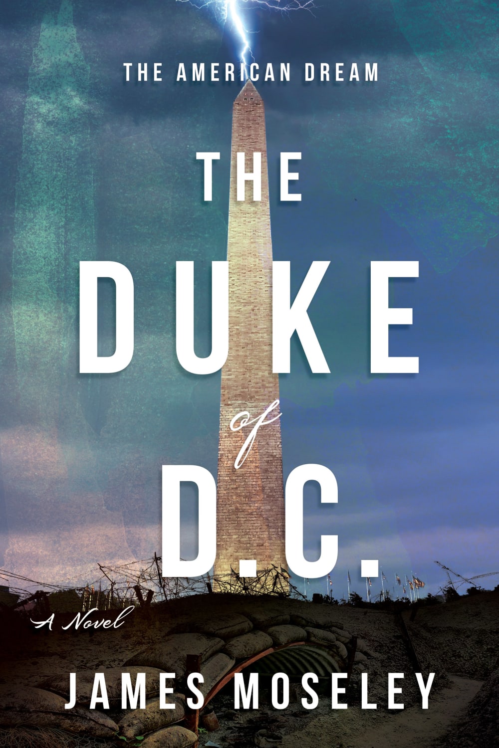
14 Responses to Option D
well none of these covers give a humorous feel but the monument is the most interesting part of these covers.
The blue cover is more eye catching to me so I like D and C the most and then I like that the title spans the entire Washington monument in D. I think that looks better
I like option D, the lightning on the washington monument and the font choice looks the most intriguing from this set.
I think the Washington Monument is more recognizable to people than the US Capitol. I think more people associate Washington, D.C. with the Washington Monument.
I would choose choices D, C and A first because the books covers are much pleasing and the image of the house at the background makes the book covers more visually pleasing as compared to the other choices.
The image of the Washington Monument and the font/text wrapping is much preferable to the others.
the manly imagery on the picture will appeal to any person that would find this storyline appealing as well. The softer colors would be off-putting and threatening to them.
These cover designs have solid illustrations and I'm finding the darkest color schemes more favorable. I think the traditional elements are suitable as well as the font size that is large enough to be seen at a distance.
The lightning makes this seem more exciting.
I prefer the covers in options D and C the best because they seem more original.
I think the Washington Monument is more iconic and more appropriate for the content of the book, so option D is the best, then C, then A and B with the white house.
My first instinct was to chose Option A; however, after I looked it over, it made me confused thinking the author was the duke. I like the artwork in Option A with the ships, coins, and the capital building rather than the one with the lightening striking the national monument. I do however prefer the blue colors in Option D that make the cover really pop and stand out. Ideally, I would prefer to get rid of the monument and coastline, and replace that with the graphics used with the ships. Have the lightening bolt strike the capital instead. In other words the cover with the ships is ideal but it is too washed out. The order of the text labels needs to be: The American Dream, The Duke of D.C., a Novel by, James Moseley. Any other order is rather confusing to me.
I like the lightening bolt in the image.
I prefer option D. I like the mysterious look of it. I makes me think it's a good story.
11 Responses to Option E
E because I really like the cover, it feels much better and looks well done.
I prefer the designs of my top choices for the stated theme of the novel.
I like the visual artwork of choice E. Its appealing and attractive.
I love that this looks historical and "old," which makes me feel like I am able to travel through time when I read the book
I don't need the font to be too bold. I like the E and B backgrounds because it gives me a better sense that this is a historical piece, but C and D are modern.
I liked the layout and design of E the most, aside from that "The American Dream" should be underneath the title, not at the top (I liked C because this was the case). D was kind of awkward looking, A was too bland and did you even try with B? I hate the font and layout.
The art on E is such a cool style and something I'd proudly display on my bookshelf.
I like the cover art of E a lot, and think it goes well with the premise of the book
I think that option E seems the most mysterious and does not give away possible key elements from or about the story.
E - This cover is the most unique and fitting. I like the art style which really gives it a historical vibe. A and B I much prefer the history art style as opposed to C/D's use of the Washington Monument. It's not as visually appealing or attention grabbing.
E has the more fun looking cover and since the book is humorous it's the best fitting.
Explore who answered your poll
Analyze your results with demographic reports.

