Poll results
Save to favorites
Add this poll to your saved list for easy reference.
Please examine the designs of the following three book covers. We ask you to rank these covers from the one you like most to the one you like least. We're primarily interested in knowing which cover appeals to you more, and why?
Option C won this Ranked poll with a final tally of 69 votes after 1 round of vote counting.
In a Ranked poll, respondents rank every option in order of preference. For example, when you test 6 options, each respondent orders their choices from first to sixth place.
PickFu requires a majority to win a Ranked poll. A majority winner differs from a plurality winner. A majority winner earns over 50% of the votes, whereas a plurality winner earns the most votes, regardless of winning percentage.
If an option does not earn a majority of votes, PickFu eliminates the option with the lowest number of votes. The votes from the eliminated option are reassigned based on each respondent’s next choice. This process continues in rounds until a majority winner emerges.
Scores reflect the percentage of total votes an option receives during the vote counting and indicate the relative preference of the respondents. If there is no majority winner, look to the scores to see how the options fared relative to one another.
| Option | Round 1 |
|---|---|
| C | 69% 69 votes |
| A | 18% 18 votes |
| B | 13% 13 votes |
18 Responses to Option A
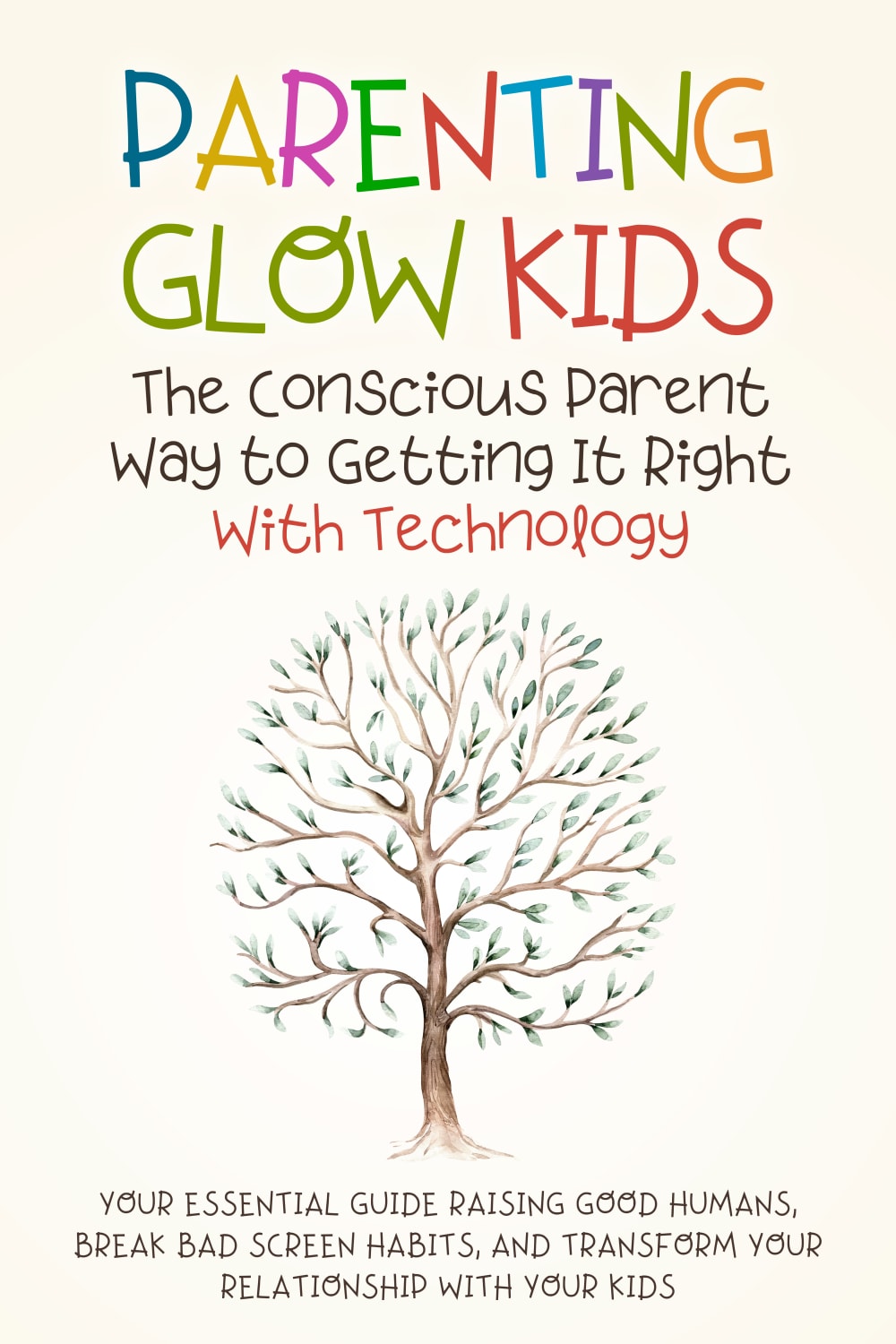
I understand my last choice, but the colors and image are just a bit too much for the book. I prefer the more simple and basic design and look of my top 2 choices.
I like the simple tree and it gets the point across. I also like the colors of the "glow" cover.
I am most drawn to option A because of it's simple but colorful design. I am next drawn to Option C because of its calm base color but color accent colors and large font. I am least drawn to Option C because while it is bright and colorful the cover makes me think this is less of a serious text and more of a cookie cutter self-help book.
In my opinion, Option A is more appealing because it has a minimal design and is colorful. The simplicity makes it look modern and sophisticated, while the vibrant colors catch the eye and create an inviting appearance.
I like the cover of option A because the hand writing looks something like a kid would do.
C is too dark for a kids book, i like the colors and style of option A
A appeals to me the most. The graphics make sense, are appealing, and have color tones that I like best. B is next. C is last.
I like "A" most, the tree with a lot of sprouts looks like telling that it's the beginning of new parenting for my kid's brighter future.
Option A jumps right out at you because of the clever contrast of font with the background of the book. It appears as a kid-related book from first glance without having to wonder what it's content is. Option B conveys a good image with the message it is trying to convey, making it clear the contents of the book. Option B is a bit more hard to tell at first sight what the subject matter could be without reading the smaller details.
I loved the cover design of option A, its cover design color combinations, its features layout and the way it is presented in a cool and calming color combination, everything is so soothing to the eyes. I feel that option C is too brightly colored and multicolored for the purpose for which the book is written.
I will say choice A first because it has the simplest design with the words easy to read through and the color choices of the book cover more clear as compared to choices B and C
I like Option A as my first choice. Its light and attractive with good graphics and a easy but effective style. Option B is also quite nice, sunny and with charm. Option C is my least favorite as i find it too dark and the graphics are odd and very down beat.
i like the one in option A the most because it looks concise and written by an experienced individual
I think the colors in choice a makes me feel comfortable and willing to listen and lean more
I chose in the order the cover makes it look like aQuality information
I would choose "A" because children are the book of life. I think this cover is more interesting.
I prefer the option with the lighter background covers. The cover with the black background should be avoided ... it suggest something sinister.
I think this topic should be taken with caution so a cover like this would be more inviting vs C. C looks like it would be making parents look bad.
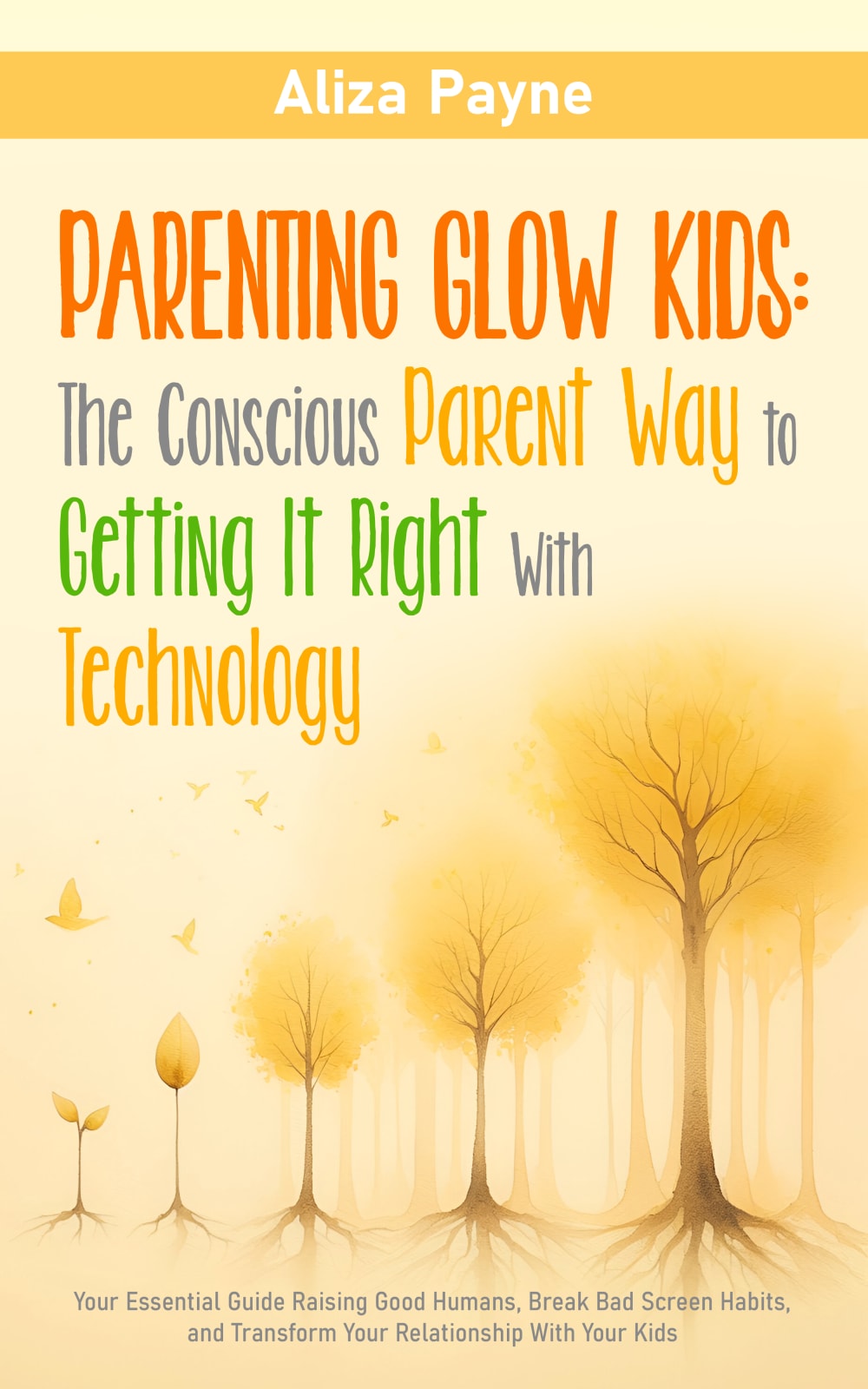
13 Responses to Option B
Option C is a bit too cartoony so I crossed that out first. I think B is more adult of a book cover so I like it. C is alright but a too self help sounding
I think B looks like the nicest book cover and also just feels like a book you can stick on your book shelf
I liked that B featured a more warm and inviting yellow glow as this matched "glow kids" as a title more.
I personally find as an adult with sentimental thoughts that I like options B and A the best. I like these two because of their beautiful artwork and their tree designs on the cover. I like that it is an illusion to roots I think it fits well with the title and theme of the book. I think option C better fit with a younger crowd or is better fit for a teenager cover for a different topic.
Option B - it’s easy to read the title on this cover. The art is inviting and intriguing.
I like the trees and the font of option B. I would like A more but I don't like the font. and option 3 looks too AI generated.
Option B is the book cover of my choice because of how bright and sunshiny it looks. This book is about parenting Glow Kids and the yellow color is a perfect reflection of that idea. The color matches the book title as far as ideas go, it is the most natural color to use for this type of subject matter. The other two options are too basic and more common looking
I really like the imagery of a growing tree, it's a great image to have in mind!
B is the easiest to read and looks more for adults, A looks like its more for children, C gives the appearance thats its for lgbt community.
I like option b the best because I like how it has the different trees in different stages of growing. I like option a next because I also like how it has the tree on it. I put option c last because I think the cover has kind of a negative connotation to it
I like the growing trees in B. It's subtle yet powerful.
I like the more abstract nature of B, and that it suggests both glowing and growing.
I love the nature scene and trees with B and then A. C is too overstimulating for me.
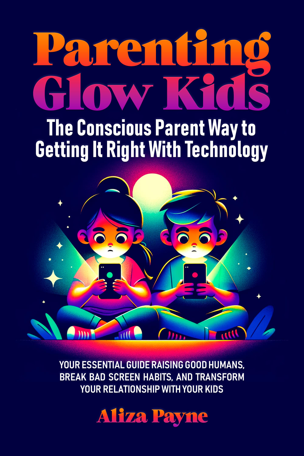
69 Responses to Option C
I found the glow in the dark image to be utterly appropriate given the title. It has a great appeal to it.
The cover is cool. It really is the most appealing with the kid and colors
I think the cover of Option C is very relevant to today's culture and will connect with people.
I really like the illustration because of all the wild colors
Option C book cover looks colorful, motivating, helpful, informative, has great design and visually more appealing than the other ones. I am more likely to buy option C book.
From a purely aesthetical standpoint my 1st pick is Opt C. It has the best color contrast meaning it will stand out, the orange and purple glow on the font set against the darker deep blue/purple makes it much more attractive and easier to spot. My 2nd pick would be Opt B for a similar reason as before in that it stands out more, if you do choose this as the cover the font would be better all in one stand out color like black or dark blue because the base color and theme is lighter so it's a reverse of the 1st pick. Finally Opt A, this isn't a bad book cover it's just not as vibrant as the other two. When you're trying to get a consumers attention you want something that has a quick contrast in colors, if it blends in too well then it's going to be easier to pass and less likely to catch the eyes or attention.
C is colorful, contextual, clever and eye catching. B is descriptive and insightful. A is simple and not memorable.
I prefer option C I like the cover the colors and everything about it. It is very appealing to me especially since it looks like the kids are glowing. Option A is my 2nd choice as I like the tree on there as growing and learning is associated with the tree image. Option B was not appealing to me at all, the colors were nice but it did not grab my attention.
C has very nice color and picture for the cover. A has a pleasant picture of the tree but not as catchy as C. B is kind of plan and non inspired.
the black and neon design fit better with the "Glow Kids" aspect. it is more eye catching than the other two options as theses are kinda flat, boring and do not catch attention like the black and neon aspects
C really hits what parents see. Fits into the title as well
I prefer Option C because the meaning of "glow" is clear from the design. I like the aesthetics of Option A more, but the metaphor is unclear.
I like the colors of this cover. I feel it helps make it stand out. Also given the title I like that this one is the most relatable to the subject.
My first choice best reveals the topic of the book and my second choice is more interesting than the last choice.
I think C seems very relevant to the topic and the colors are nice and eye catching.
C is the easy choice for me. First, the dark cover with the bright, bold colors is much more eye-catching than the other 2 covers. Second, there ar etwo kids on their phones front and center, which is relatable and perfectly appropriate for the content of the book.
I like C because it has the glow aspect on the cover
I like Option C better with the text is printed and doesn't look like a kid wrote it
Option C makes the most sense with the image of the kids using technology
I chose C because I like the design of the two children engrossed in their devices. This is a nice visual cue of what this book is about, and the colors are very vibrant. I chose B next because I like the way the tree grows big and strong on the cover. I chose A last because it shows a withered tree and the rainbow lettering of the title makes it look childish.
The cover I like shows an example of bad screen habits that should be broke, and the colors and imagery presented in the cover is likely to get more attention.
This cover fits the title the best and also is more colorful and stands out more.
I prefer option C. It is a very cute cover and it is also relatable.
Out of three book cover, I would definitely choose option C because it is appealing to me, interesting, eye catching.
I like the 'glowing colors' used in the design. It goes very well with the title and description of the book. The words and illustrations seem to glow. Option B does not interest me at all. The colors used aren't very appealing and I do not understand the meaning of the trees.
It's a book about kids and technology, and we only see that technology in Option C.
C just got my attention the best and I like it has kids on it. A and B are pretty similar in my eyes but I slightly prefer A
I feel like it is most relevant to the title to illustrate the children as glowing.
The designs and covers featured in Options C and A make the book seem more interesting and higher quality as compared to Option B. I think the colors used in Option C make it stand out a bit more, which is why I ranked it higher than A.
I like C because I like the dark background with the bright colored images and bright font. It stands out over the other two.
I like option C as the image is more modern and realistic than the other options. I think it would help make parenting more relatable.
I chose option C first because I feel that the cover best fits the topic of the book.
Option C' is my preference because its vibrant colors and engaging illustration immediately capture attention, effectively conveying the book's focus on parenting in the digital age.
Choice C makes use of a nice color palette. The colors go together very well. It is attractive the way it uses cartoonish kids on the cover. It makes it appealing to all parents. I chose B next. It also uses a nice color palette. The symbolism of trees growing looks really good. I chose A last because compared to the other two, it reads more clinical.
Option C was my preferred choice because I liked the way the "glow" was reflected in the cover in the images of the kids. It made it more interesting and intriguing. Option A was my second choice as I thought it was a fine cover that could build on the raising portion as in raising a tree. Option B wasn't very pretty and it was actually a little scary looking to me.
I think C is the most fitting and engaging. B i think has a good design as well but C i think stands out the most to me. A i think could be for many issues
option C is the most appealing because of the bright colors
Option C is my first choice because I like the colorfulness of the cover page and also I like the design of the cover page along with the images of the small babies.
The bright colors make the book stand out and the picture is relevant to the title. B and A are kind of white noise.
The dark background (C) is the easiest to see and has good artwork on the cover. (B) has too much yellow and is difficult to see. (A) is confusing as to what the book is about
This one matches the title the best.
I love option C. The design is balanced, love the picture of the kids with the phones lighting up their faces and the mesmerized look on their faces, and the colors on this cover are fantastic. Not sure how trees fit in with the other two, but I do like the colors in the title on A, just not the rest of it, and I don't like B at all.
I ranked Option C first because it's an appealing cover. It jumps out at me because it has a dark background. I like how the kids are on the cover using cellphones. It makes sense because kids do that now. I believe that's an issue parents deal with so it's realistic. The color will appeal to anyone who likes covers that stand out. Option B is a good cover too. It has a metaphoric vibe to it. I like how the author has the trees represent the evolution of children growing up. Each tree represents children at different stages in life. I felt that was creative. Option A is nice, but it doesn't feature that much. I think the design needs more work to make it more appealing.
I really like the image on C, it explains the title with just the image. You don't have to read more of the cover to see what its for.
Option C - The book cover in glowing vibrant colors goes hand-in-hand with the title of the book "Parenting Glow Kids." The book cover produces a strong impact in our minds with the kids staring at the screens indicating a serious impending social, emotional, and behavioral incompetence in the upcoming generation. The book cover sounds as an alarm to the parents. Option B - The book cover looks impressive; the transformation of plant into a tree demonstrates how the relation between parents and children should grow. Option A - The book cover looks good with the letters in beautiful colors, but fails to influence our senses.
I'm most interested in the cover of Choice C the color scheme is the best and it is the most aesthetically appealing relative to the other options.
C is much more engaging with the design. The art style and color theme really grabs attention
THE BRIGHTER AND COLORFUL IT IS TE MORE ATTRACTIVE IT IS
to me its about which cover would my kids like and i think we'd agree that c is the best cover
this is definitely the more attractive one because it is full of vibrant colors that truly grab my attention
Honestly, only C would attract me to buy the book. It gives context to the concept of "glow kids". I also like the colors and the image of the kids with devices since it makes it clear that this goes beyond old school parenting books. C and B look old school and while they're not bad, they don't say much to me.
I really like option C. It gets the message of the book across very well visually!! It's also very eye-catching and attractive. I think the picture of the kids combined with the color scheme honestly makes me feel the importance of this book, like I can see what technology is doing to kids looking at it.
I like that the artwork on the cover is directly related to the title in that electronics are portrayed being used by children. The color scheme is attractive too.
C shows the kids on the phone reitrating the screen time plus the coloring of the book with the dark background and the light "glow" really draws your eye to it . B isnt bad but doesn't really portray anything to help what the book may be about , the font looks a bit fun but doesn't draw your eye to the book and i would probably pass it by on the book self . A i find this one honestly to look almost like a childrens book that my kids may read and i would completely over look it due to the graphic and font used .
C directly discusses the issue of the book, without reading the title
I like the richer and brighter colors. The last one is boring and plain.
I think C has a more "shocking" cover, showing what kids these days are actually doing. I also like B, because it shows what kids these days should be doing, which is going outside and exploring nature.
I would opt for choice B. I love visual appeal where the dark background with glowing neon illustration of children using technology is very eye-catching and modern. It gives vibrant and dynamic feel which attracts me.
I like Option C more than the other two. i think Option C has a great level of detail and it captures my attention the most out of the three.
The option A seems to be most interesting. This is clear and intrigue the customers. The cover page is super cute and interesting. The option A seem cool too due to the color scheme. The art is visually represent the genre of the book. The option B is okay too but not too interesting
Option C is my favorite. The image of children on their phones is perfect for the topic. The colors are also very appealing.
i love the little ones on option c, the symbolism with the title of the book is perfect and eye catching, option A i like the tree and the cover is easy to read, option c, i like the growing tree concept
The bright purple and blue colors used in my top choice are exciting and energetic, which is appealing for sure!
Option "A": This is the more visually compelling visual which also reinforces the title and meets the mental expectations of the content.
C is my first choice because if kids glow then there's something evil about them and this cover reflects that. They've been infused with cancer causing microwaves and their brains have been taken over by Ahriman. They are being cooked and one can see that in the dark cover. C is my second choice because it represents fall with it's fall color. A fall that has been microwaved. So much evil. And A is my last choice. It is trying to say a new spring is coming. Where? With AI taking over human bodies that are not going to survive being microwaved?
The cover in Option C definitely does the best job of standing out and grabbing my attention due to the very appealing color contrast between the bright text and dark background, as well as the image of the two children on their phones. Additionally, I like the balance of text/images on this cover - it's organized in appearance with the centered title, then the image, and then more centered text at the bottom. Definitely a great cover choice!
The images first of all is more colorful and stands out. It grabs your attention more so than the white covers.
I prefer option C. The black cover looks like it would be more fun because of the color and then the bright colors of the characters
This shows me more what the book is about I like this one the best
Explore who answered your poll
Analyze your results with demographic reports.

