Poll results
Save to favorites
Add this poll to your saved list for easy reference.
If you saw these three covers on Amazon, which would attract your attention first, and second?


Option B won this Ranked poll with a final tally of 26 votes after 2 rounds of votes counting.
In a Ranked poll, respondents rank every option in order of preference. For example, when you test 6 options, each respondent orders their choices from first to sixth place.
PickFu requires a majority to win a Ranked poll. A majority winner differs from a plurality winner. A majority winner earns over 50% of the votes, whereas a plurality winner earns the most votes, regardless of winning percentage.
If an option does not earn a majority of votes, PickFu eliminates the option with the lowest number of votes. The votes from the eliminated option are reassigned based on each respondent’s next choice. This process continues in rounds until a majority winner emerges.
Scores reflect the percentage of total votes an option receives during the vote counting and indicate the relative preference of the respondents. If there is no majority winner, look to the scores to see how the options fared relative to one another.
| Option | Round 1 | Round 2 |
|---|---|---|
| B | 48% 24 votes | 52% 26 votes +2 |
| C | 40% 20 votes | 48% 24 votes +4 |
| A | 12% 6 votes | Eliminated 6 votes reassigned |
6 Responses to Option A
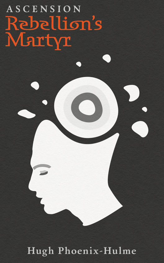
Option A has a very simple design, but its naturally the most appealing because of that. Its not overpowering, but the light colors are still very eye catching.
A is the most evocative. B has better colors than C.
It seems the most modern and smooth; the others look too sci-fi for me
i think the graphic nature of the imagery on this cover is very bold, intense, and eye catching
A is the coolest because it looks like an old school “classic” novel cover. Nothing flashy or kitschy.
The interesting illustrations and images that are unusual get me the most exciting and catch my eye rather effectively. Something different is usually unexpected.
24 Responses to Option B
I picked the most attractive images.
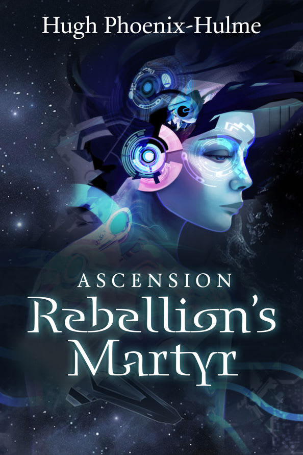
I love the colors and the detail of the character, plus the title is easily readable.
I picked B and C as my top choices as the colors make it look very mysteruious.
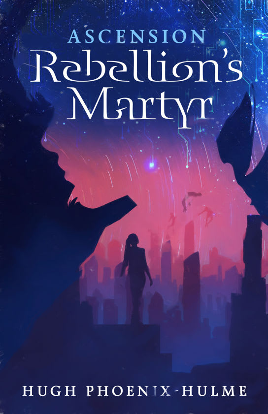
Option B has that technological/artificial intelligence theme to it, futuristic and forward looking. Option C has the night sky of hope for better days ahead.
I prefer Option B first because the image of the female character makes me want to learn more about the story and who that character is. I prefer Option C second because the background image of the city makes me want to gather more info about what that city is about and who are the characters that live there.
I like the colors and the woman’s face in Choice B. I thought it was the most beautiful artistically and the one I found most interesting. The woman’s face jumps out first. The colors in C would attract me too, but its a distant second.
I can see the chaos going on in the person's head in my first choice. I am intrigued by this cover and I want to know exactly what is causing the chaos. The busy appearance of the cover is interesting to me and it makes me curious to want to learn more about what the book is about
I like B the best because it is the most detailed. C has a good color mixture, but is too not detailed enough. A is too simple and plain for me.
The woman's face in B is most compelling. The color combos of B & C are most attracting to the book
This will attract my attention first. The image is bold and memorable. The cover is colorful.
I like the droid, Mona Lisa Overdrive look of the replicant in Option B, which is much more enticing than the b/w Option A.
The picture on B gets my attention and makes me take a closer look, it looks futuristic and interesting, so it would be the first to get my attention, next would be the pretty colors on choice C, and the silhouette is just beautiful, option A looks a little plain.
The face and the coloring caught my attention right away. I would chose this one. I think it is nice looking. My second choice is not too bad either. I like the pink background the best about that one. Thank you.
I like option B the best because the blue design stands out the most to me.
i ranked the images according to how the graphics were designed and how color they look.
THE PICTURE OF THE YOUNG LADY IS VERY REVEALING AND INTERESTING. PLUS IT IS VERY ATTRACTIVE AND THE COLORS ARE ATTENTION GETTING. C IS A FAR DISTANT SECOND PLACE BUT THE COLORS ARE NICE AND ACTIVE.
B - I love the picture. C - 2nd choice. A - the picture looked too weird for my taste.
This has a sci-fi look to it, and would catch my interest.
B would certainly catch my attention first. I think it is aesthetically appealing and would also make me wonder what kind of genre this book is. I also like C, as the cover is also beautifully done with pleasing colors.
I like the image of option B. It looks to be very transcendental. It makes me feel the book is going to be about something very deep. Option C brings to mind the traveler who is looking to the stars. It makes me feel the book is about a voyage. The last option does not appeal to me as it does not appear to be leading to anything. It almost appears the character will be schizophrenic.
B has a really passionate display of artwork and design
Options B and C, in that order, attracted my attention due to overall design impact being compelling.
option B and option C are attractive and most eye catching in my opinion
B's face is clear, and it makes me feel like it's more relatable as a character. The decorations are standard-fare sci-fi, simply done and tasteful. C's art looks like a mix of fantasy and sci-fi. IT's a little more abstract, but still attractive. A is too simple, it looks like a self-help book or a post-modern sociology textbook.
20 Responses to Option C
I would pick option "C'. The cover looks unique and appealing.
Between option C and option B. Good futuristic design. A lot of fun and very imaginative as a whole. Think that option C is a little better but I'd buy either one of the title covers there.
I like the brighter colors on these covers. I don't like the black cover at all.
If I were looking at books on Amazon, cover C would best capture my attention because the color scheme works well and the graphics tell a great story and create a mysterious tone that grabs my interest. Cover A is the second most enticing because I'm not in love with the sci-fi motif on the cover, but the cover is much more tasteful than cover A, as I don't like the strange silhouette on cover A.
the colors in C makes it look really attractive
I like option C the most it has a unique design that
I prefer the colorful book covers to the black and white one, and of those two I like the pink and blues of C a little more than the darker cover that B has. By comparison, A looks a little dull to me.
The lady on the cover in C looks about ready to "ascend" from the place she is in, so I feel this is the best cover. A is also a pretty good cover, with the brain or whatever breaking free of its constraints.
The colors are the first thing I notice and what draws me into C. They are so varied and beautiful compared to the other two.
I really like the one I voted one but don't care at all for the other two.
I like this cover and would pick this one because it matches the title of the novel. You can see people “ascending” with one person watching, making you think this person will be the savior of all people.
Th pink and purple sunset theme really stands out..to me anyway. I like it the best. The less colorful background w the stars is pretty interesting too, but not as attention-attracting as the sunset theme. The plain black/white them, though, is boring.
The person in front of a city is the most intriguing. The face in front of stars is a close second. Option A looks like someone's brain being pulled out.
I love C. It has a splash of more color, which helps to telegraph the title and bring depth.
I like Option C the most of these, since I find that having contrasting colors naturally draws my attention to the cover, which is critical in getting me to click on the link. Option B is decent at this as well, thought not quite as good as Option C. Option A is arguably the weirdest, but not necessarily in a good way as I really have no idea about what's going on, but not in a way that makes me want to find out.
This was a hard choice, but C stood out to me the most and is the most pleasing to look at. B was a very close second, but I do not feel draws my interest as much as C. A is a little too plain compared to C and B.
All of the options are visually appealing and interesting, but C and A are a little bit more intriguing and better designed as compared to B.
C is my first choice for this cover. Just having the figure out and the face outline add a bit of mystery to the cover and makes me think this might be a real page turner. B is my second choice. This cover is also interesting. It makes me wonder if this person is part machine and part human and might make for an interesting story. A is my least favorite cover because I just don't find that image appealing. This would not draw my attention and make me want to read this book. It actually looks like it might be a medical or a science book.
I really like the image in book c. The colors and scene stand out the most and I like how it shows space and earth. I like b better than A because it’s has a more interesting colorful design and I like how the stars are above the head in B.
I chose C first because I like the colors on the cover. The graphic are good ,too. B was my second choice because the graphic of the girl is outstanding and the colors on this cover are nice. Choice A probably would not capture my attention.
Explore who answered your poll
Analyze your results with demographic reports.
Demographics
Sorry, AI highlights are currently only available for polls created after February 28th.
We're working hard to bring AI to more polls, please check back soon.

