Poll results
Save to favorites
Add this poll to your saved list for easy reference.
Based on these covers, which book would you buy if you wanted a novel (fiction) about a serial killer murdering players on a professional baseball team?
Option E won this Ranked poll with a final tally of 33 votes after 5 rounds of votes counting.
In a Ranked poll, respondents rank every option in order of preference. For example, when you test 6 options, each respondent orders their choices from first to sixth place.
PickFu requires a majority to win a Ranked poll. A majority winner differs from a plurality winner. A majority winner earns over 50% of the votes, whereas a plurality winner earns the most votes, regardless of winning percentage.
If an option does not earn a majority of votes, PickFu eliminates the option with the lowest number of votes. The votes from the eliminated option are reassigned based on each respondent’s next choice. This process continues in rounds until a majority winner emerges.
Scores reflect the percentage of total votes an option receives during the vote counting and indicate the relative preference of the respondents. If there is no majority winner, look to the scores to see how the options fared relative to one another.
| Option | Round 1 | Round 2 | Round 3 | Round 4 | Round 5 |
|---|---|---|---|---|---|
| E | 26% 13 votes | 28% 14 votes +1 | 28% 14 votes | 38% 19 votes +5 | 66% 33 votes +14 |
| F | 24% 12 votes | 24% 12 votes | 30% 15 votes +3 | 32% 16 votes +1 | 34% 17 votes +1 |
| B | 20% 10 votes | 20% 10 votes | 22% 11 votes +1 | 30% 15 votes +4 | Eliminated 15 votes reassigned |
| D | 16% 8 votes | 20% 10 votes +2 | 20% 10 votes | Eliminated 10 votes reassigned | |
| A | 8% 4 votes | 8% 4 votes | Eliminated 4 votes reassigned | ||
| C | 6% 3 votes | Eliminated 3 votes reassigned |
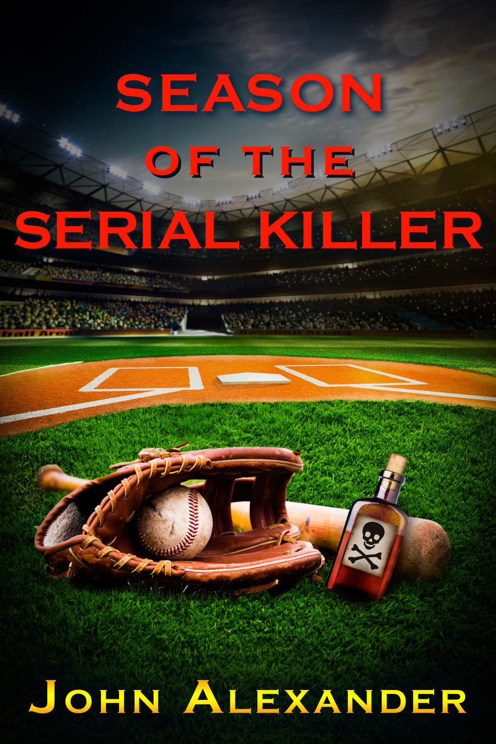
4 Responses to Option A
A and F are the best because of the red font. I also like B how the font is using 2 different colors and sizes. D just looks like a standard book font. C and E are interchangeable because they are just alright. They don't really scream to reach out and buy either one.
I like the color, positioning and fonts used for my top choice. I find it more appealing to me.
I selected the books that I found to be the most visually appealing, eye catching and aesthetically pleasing.
The font in F and E is too large. A stands out because of the red font.
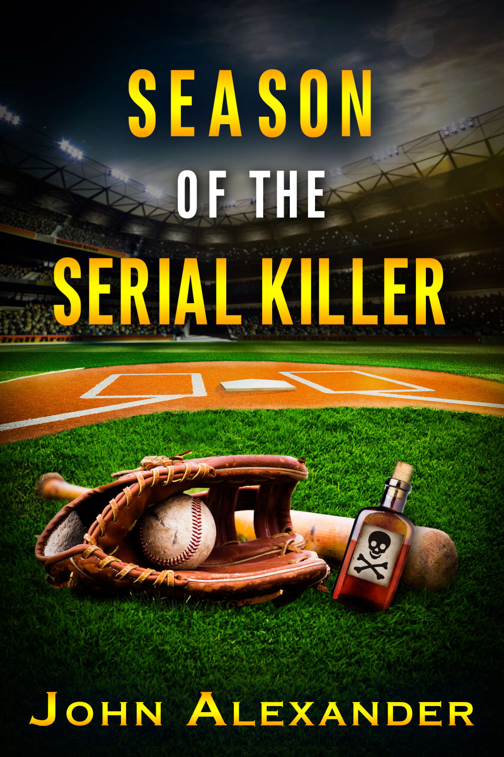
10 Responses to Option B
I like the yellow color of the writing better. It sticks out more off the background. I like B as the best because the white font in the middle. I like how it separates the lines. I like C second because it looks better being smaller because I like the baseball field in the background. D is smaller than E so it would be third
The yellow is vivid and makes the field stand out. Also, I like the font.
I am really the yellow text with the smaller white letters as it grabs my attention first compared to the other choices
I loved the font of option B, and I think it wasn't too large that it detracted away from the picture of the baseball field and the drink/glove. Everything about it would make me pull for it. Option C also has smaller writing and so does D, it was a tough choice between those three. I hated the last two, i thought the red color was too trashy, it made me think of a sex book rather than a mystery book.
I chose option B because using a white font along side the gold pops much much better.
The yellow titles are appealing and suitable for the book cover. I like the larger font versions and those that are appealing to the majority of potential readers by keeping the word level at a minimal level.
I prefer option B because it looks and seems more engaging and interesting to me. Option C, E, and D look quite enticing to me too. Option A and F feel the least intriguing to me!
I like the larger letters...but the poison bottle looks funny...like it is an alcohol bottle and they are calling MLB players drunks. The grittiness of the graphics I enjoy though.
Some of these look amateurish from a font type perspective. I picked B because I like how the type is in gold and white. It gives more texture.
These options were all very similar, and there weren't any that I had a strong preference for or against. Having said that, I did like the yellow/gold font better than the red font because it felt a little more professional - like a book with a known author/publisher that I might see on social media. I also liked the larger fonts better because the title stood out more.
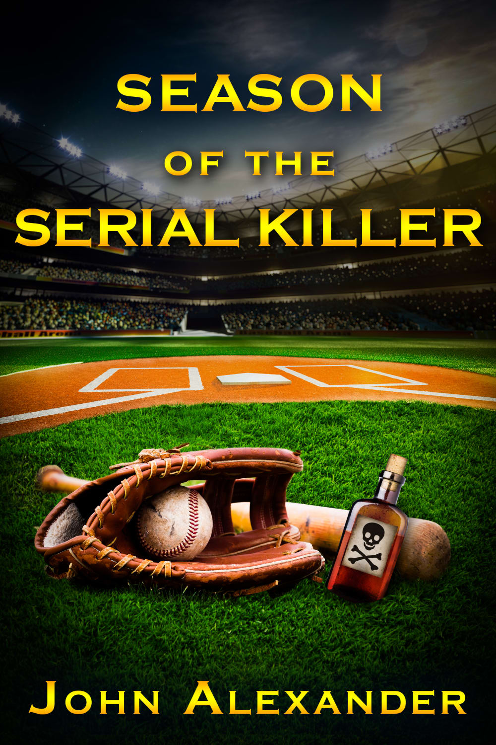
3 Responses to Option C
i like the fonts of my first options as well as color scheme the yellow contrasts the background much better than red
I ranked my choices based on my preference for the color/font/arrangement of the title.
The font color and size are most appealing in option C as it looks balanced
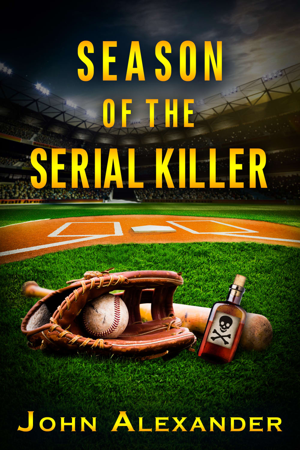
8 Responses to Option D
I like that D has the most in depth and personalized message.
D has a stronger and more intriguing style. The gold color stands out and looks more pleasant to me. I prefer this font style and size as well.
I like D because I like the color of the font and the font itself the best. The yellow is the perfect contrast with the dark ballfield behind it. I like the red font somewhat but not as much as D. B I don't care for because having the words "of the" in white looks out of place and odd.
I am not a fan of the red text at all. Of the golden texts, these are my favorite.
This version looks very balanced. I like the yellow text because it looks a little more mature and not as edgy as the blood red text. Easier to take seriously that way. Really great plot for a novel!
I like Options D & C the most. The title in yellow with a normal font size looks to be the most appealing design. The picture tells the story, there is no reason for large, blaring titles in red. I also quite like Option B. The little part of the title in white is effective and eye catching. The remaining options are perfectly fine but not as compelling with some options being way over the top.
I chose D first because like all the lettering in yellow best. I chose C next as it looks to be so similar to D I can’t tell the difference. I chose A next because I don’t like the red lettering as much as the yellow but I do like the smaller print as it fits the cover better. I chose E next because as I like the large letters less than the smaller but I do like all the lettering to be in yellow as it is more uniform. I chose F next because I prefer the smaller letters better and out of the larger letters I prefer them to be yellow. I chose B last because it has the big lettering I do not like and the color red which I do not prefer
The yellow font matching the author’s name looks most appealing and eye catching
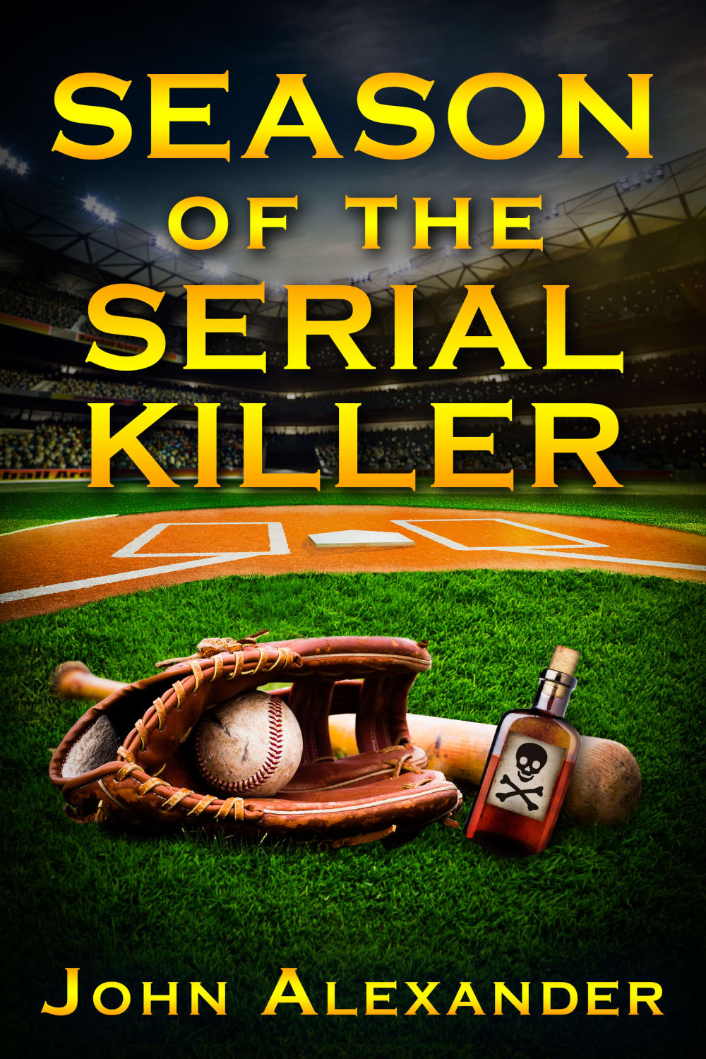
13 Responses to Option E
I like the cover and the text it stands out
I picked the images that most match what I would expect with a book subject such as this one.
To be honest I didn’t like any of them because they look a bit forced, but if I had to pick, I liked the yellow font in contrast with the black background compared to the red.
I based my opinion on the size of the lettering, the larger bolder colors and letters were very attention grabbing
E best uses the available space and emphasizes the dark sky. The same is true for B, just a litle less so. F is third because I like the coloring a little less. D is the next to use the space as appropriately. And A's color makes it stand out a bit better than C.
The yellow is much better than red. And larger fonts draw the readers eyes.
I like the big bold yellow letters that draw me in to the story and what the book is
I don't like the titles that have a really bold and red font, I think it's better to just let the words speak for themselves instead of using colors
Options E,D,B and F are the best options, the font and the color scheme make the cover stand out and the title look great.
I preferred the golden font because it stood out more. It needed to be larger too because it created emphasis that this book is a powerful mystery and horror story.
I prefer the color scheme and size of the lettering on the cover of option E. It is eye-catching and appealing.
I like Option E the most because the gold font and sizing really matches the green grass and frames the book very well. Option D is good too but I would prefer the font to be larger for the title. Option C I ranked third because I liked the color but the way it is arranged on page makes it look cluttered. Option B is okay but I don't like the white "of the" in the middle of the title as its jarring. A is not good in my opinion because the red clashes, and F is even worse because the red clashes and fills up even more of the cover.
E, because the title is large and easy to read. F because the title is large, but the red makes it a little harder to see. D and B look the same to me. C, because the yellow makes the title stand out more. And A because the red lettering makes the title stand out less.
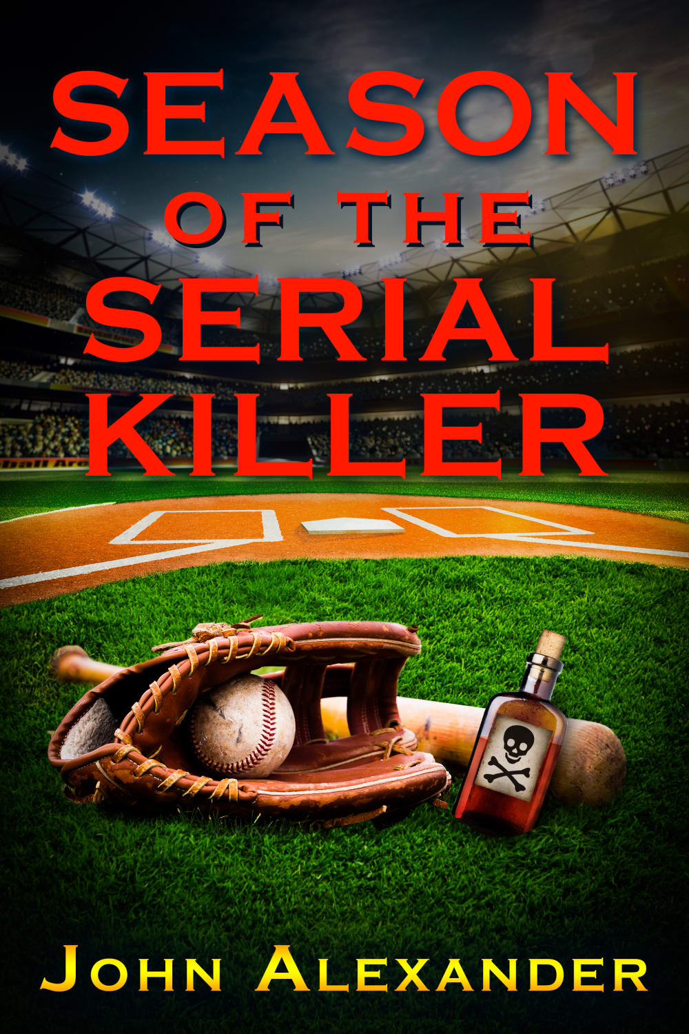
12 Responses to Option F
I like option F the best, I think the red title really stands out and I love how it's so big. I think the red is a great color for the book title, it's very fitting. I think the yellow on the other colors don't really look right, in option B, there is a couple words that are white and I think that is out of place.
Option F is the most eye catching, and visually appealing. The color sequence transitions and blends together well. Overall it looks similar to the current books on the market, from a visual aspect.
I think the red text stands out much more than the orange-yellow text. I choose the bigger text (font size) first and went down in rankings as it got smaller. I did not like the text where the "of the" was white at all.
seems most appealing and ominous and makes me want to find out more which stands out to me as a good thing
Killer implies blood, so I like the red letters. The larger font is an attention grabber so my first and second choices use the largest font, even though the second choice is yellow letters. There is no doubt that the focus is on murder during the baseball season. My third choice does not have the next largest font, but it is in red, so it is more chilling. My next choices are the yellow letters with the next largest font. I don't think anyone looking at the cover would need to ask me what the book is about. The last option is my least favorite because of the color changes of the letters.
I much prefer the 1st 2 with the red writing and I like the larger writing too I also am not a big fan of the ones that change color with the other wording. Although I like the red I wish it had a little bit more of a gradient maybe red with black or black or black edges but a little bit more texture and depth to the lettering kind of like you do with some of the yellow ones
I thought F's presentation of the text was the most relevant/appropriate: the red color signifies blood/murder which is appropriate; the large size is displayed prominently and is eye-catching. The other choices I made all correspond to what I just described: I chose the others based on how prominent on the page the text was, as well as the positioning of said text on the page.
I prefer the red text. The darker colors make it more ominous and interesting.
I like the red text best. Fits the theme better. Then I like the all gold better than the gold and white mix. And I like the big letters better than the small ones
Big and bold lettering in red.The lettering of red goes well with the title since blood is redVery fittingThe lay out of the cover is excellent and eye catching
I prefer choice F because the red larger letters make it easier to read and to see.
I made my choices this way because I felt that the red text was a lot better for a book about a serial killer. I also felt that the text should not be too big or small.
Explore who answered your poll
Analyze your results with demographic reports.
Demographics
Sorry, AI highlights are currently only available for polls created after February 28th.
We're working hard to bring AI to more polls, please check back soon.

