Poll results
Save to favorites
Add this poll to your saved list for easy reference.
Based on the image, which product would you rather buy?

Option B won this Ranked poll with a final tally of 30 votes after 4 rounds of votes counting.
In a Ranked poll, respondents rank every option in order of preference. For example, when you test 6 options, each respondent orders their choices from first to sixth place.
PickFu requires a majority to win a Ranked poll. A majority winner differs from a plurality winner. A majority winner earns over 50% of the votes, whereas a plurality winner earns the most votes, regardless of winning percentage.
If an option does not earn a majority of votes, PickFu eliminates the option with the lowest number of votes. The votes from the eliminated option are reassigned based on each respondent’s next choice. This process continues in rounds until a majority winner emerges.
Scores reflect the percentage of total votes an option receives during the vote counting and indicate the relative preference of the respondents. If there is no majority winner, look to the scores to see how the options fared relative to one another.
| Option | Round 1 | Round 2 | Round 3 | Round 4 |
|---|---|---|---|---|
| B | 34% 17 votes | 40% 20 votes +3 | 42% 21 votes +1 | 60% 30 votes +9 |
| E | 24% 12 votes | 28% 14 votes +2 | 36% 18 votes +4 | 40% 20 votes +2 |
| C | 14% 7 votes | 16% 8 votes +1 | 22% 11 votes +3 | Eliminated 11 votes reassigned |
| A | 16% 8 votes | 16% 8 votes | Eliminated 8 votes reassigned | |
| D | 12% 6 votes | Eliminated 6 votes reassigned |
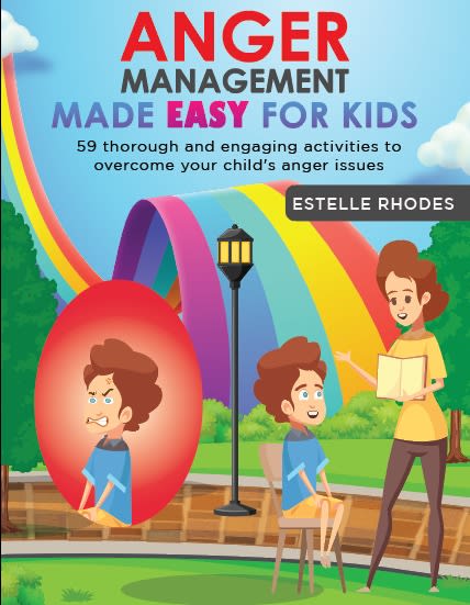
8 Responses to Option A
i would buy the product in option A because it looks the most effective for someone with anger problems
Option A makes the most sense for what the product is for. C is okay too, but I think the imagery shows how this book is suppose to help. D,B and E feel a bit strange and don't really fit with the idea of what the book is for.
I chose this selection for my responses because, the advertisement has more details, and it expresses the picture onto the activity workbook phenomenally.
I like this one it seems to have a more welcome to understand this
i liked option A the best b/c it illustrated a young boy being mad, i have 2 sons, so it fits. i liked option E next b/c the workbook looked like a board game which my youngest son can relate to. i picked option B next b/c again, i have sons. i picked option D next only b/c option C has a girl on the cover and that's the one i can relate to least
My top 2 choices do the best job conveying a realistic image of what anger in a child would look like
I would purchase options A, C & E. I like the vivid colors, they make the books stand out from the rest. The designs are more kid friendly as well.
They all interest me and I chose A as I like the photo with the child and mother. It relates to many single women. Then D and E which is interesting and caught my eye followed by B and C last.
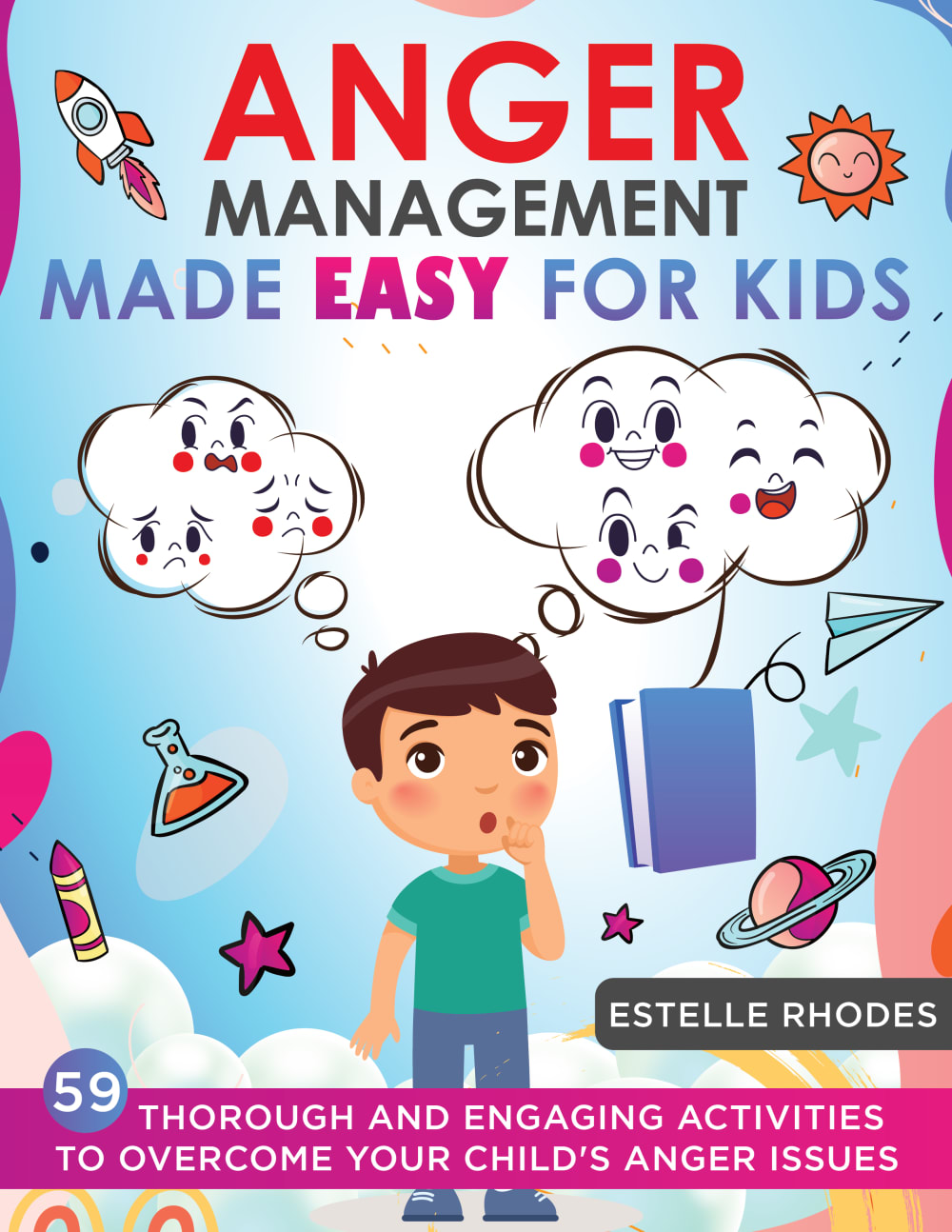
17 Responses to Option B
I like that B has a much more inclusive design and feels like a warm user interface that is strongly entertaining and enlightening.
A little hard to explain my choice here. I wanted to pick a cover that was the most palatable, or inviting. Does that make sense? And no meant as a slight, either. This is one of those challenging topics. So I wanted to pick the cover that seemed the least... threatening isn't the right word... Anyway, I wanted to try and pick a cover that a kid would accept as non-threatening.
B by a mile because in my opinion, it's the only one that shows a social story.
B is a good cover without the pride rainbows all over it.
I'm not so keen and a bit turned off by the pictures of the kids with angry faces. This subject needs to be approached more gently with kids.
The design in option B speaks more volume on the subject. The color usage even makes it more appealing.
i chose option b as the one i would buy because using pictures of friendly ghosts would put the children at ease
I really like my first pick because of both the number of activities and because it shows the child has to make a choice instead of pretending like all the bad stuff goes away.
My absolute favorite is Option B image because it`s very clear and descriptive and also very positive and cheerful, i.e. very appropriate for a child even though dealing with anger and negative feelings. My second best is Option D. Other options follow in the mentioned order.
Option "B": A sympathetic figure of a child confused by their feelings is the more apt and appropriate cover image making clear the cause and potential resolution to some of the issues that a parent can use and thus be wiliing to buy.
I love the color and the explantion of what is found in the book. I think it would be most helpful for a child's anger issues. Society needs this today.
The image of the kid really trying to understand his anger is a good predictor of what might be in the book.
These are cute covers, and this is SUCH an important topic I have to commend the authors of this book. I think that anger management for children is vital to solving the mental and emotional health problems plaguing America, and the world as a whole for that matter. I prefer the covers here B & A & C because the show vibrant characters in a family setting, and I think that would be more interesting and easier to relate to for the children that are the target audience for this book!
Option B is great here. Love the look there. This is an excellent feel and think that will be great for managing anger issues based on the cover. Option D is nice to show the kid's mind there. Good activities to help with the choices they make. Option E is not bad with the path there like a game. Seems cool with that there. Not as big a fan of options C and A. They seem to be a bit complex for a young person to understand the bubbles.
I like option B the best because I like the little though bubbles showing the bad and good emotions that the child is thinking about.
B is fun, engaging, and draws in my attention
It described the story line.
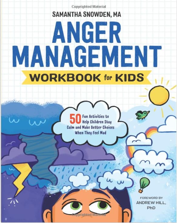
7 Responses to Option C
I like Options C and A equally, what with the rainbow and the promise of being happy again, as well as the two images of the child, one a happy self with a parent.
I most prefer option C personally just going off of the illustration. This illustration gives me the most vivid imagery and also allows me to start to think about what the book may entail.
I like c and b the best. Showing the before and after and with more activities gives a better chance to find ones that work.
The two images in C and A are eye-catching and friendly, but C is funnier.
I prefer C, i think because I have a daughter and the cover reminds me of her kinda.
C an A have a positive message on the covers and don't intimidate like D and B do. E just doesn't fit in and is too complicated.
I like option C the best. I like that they include the parent in the picture on the cover. It is a team effort to help our kids.
6 Responses to Option D
Definitely D, the cover represents better a kids emotions and how they see. It is definitely more appealing for a kid
Option D would be the product I would buy because the fact that it's a workbook rather than simply a self help type book, which I feel would help kids work through their issue and reflect on their behavior as they complete each exercise, so this option would be more comprehensive than the others.
I like both where there's a clear contrast of choices, and where it is colorful and upbeat, without too many words or images that it looks cluttered or confusing. Although I would like to see placed at the bottom instead on one of my two favorite choices the statement at the bottom that caught my attention on the least favorite image, which was appealing to me, the part that reads "Engaging Activities to Overcome Your Child's Anger Issues" - that part of it jumped out at me, although I don't like the word "thorough" - maybe "Easy and Engaging..."
Option D appeals to me because of the range of emotions shown on the book cover. I like Option E because it focuses on the activities to help children focus their emotions. Option C and Option A are very similar and I chose Option C over Option A simply because I like the font at the top better. I enjoy the switch of emotions from the characters on both covers. Option B unfortunately comes across as a bit creepy and off-putting, even though I can understand what the cover is going for. I just feel that the other covers handle it better.
I really like the ones where I can see the workbook language very clearly. I think that makes it a better book than if it was just straight up reading. Kids like to do workbooks
I really like the first one the most, the others look pretty good as well
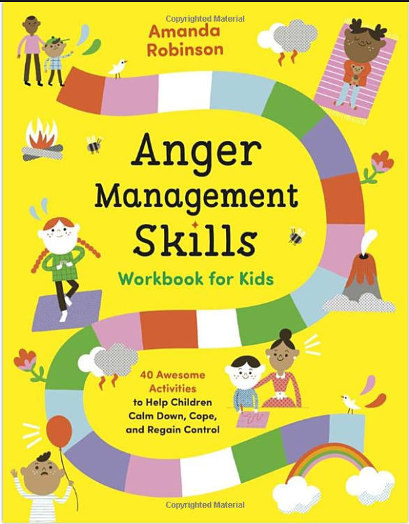
12 Responses to Option E
I like that option E looks like the game candyland, I think that it would resonate with kids and they would want to learn from this type of book.
Option E's cover looks more like a game than teaching so that is appealing. Option B and E encourage children to think things through. The angry faces in Options A and C do not appeal to me at all.
I chose option E because it was a better looking cover to me and description of the book.
I felt that my top two choices were the least judgements covers and looked more inclusive and helpful.
I like E because I like how it says skills and I like how the cover looks like a board game with a start and finish. I think the others look okay but E stands out for me.
Option E is the best because the book cover is illustrated nice and simple
Option E had the most eye-catching color; the yellow was bright and cheerful, while the cover implied that anger management is a series of steps and that there can be progression towards improvement. Option C was colorful and the artwork was cute and expressive. Option A had great colors, too, and the art style was friendly. Option B wasn't bad; it just lacked the eye-catching colors of the previous options (more colors would make improve this book cover). Option D seemed more like a "what to do on a rainy day" book and didn't imply that it was for anger management based upon the artwork (only the title).
I like E because it shows that it is a path with individual steps, which I thing would resonate with kids. Next is B then C which are pretty close. I don't like the options that show rage so they are last.
I really like the look of my first choice. It gives the impression of a path to success with this process. It is visually the most appealing to me and would catch my eye.
I like the look of this workbook the best. It looks like the Candyland game which would give it an extra element of appeal to me personally.
E has the best cover, it's yellow color is appealing and looks cheerful. C has the second best cover with the dad and an image of a happy and angry girl (I chose this one because I have a daughter and relate to this more). A is my third best for the same reasons as Cc except it has a boy on the cover, I like the angry and happy face with the presense of a parent. D has the second to last best artwork but not my favorite as it seems the child is confused rather than quetioning and my last choide is D because it looks too negative the way the child is staring up at rainy clouds and thunder.
I chose E because I like this look best. I like the path and like the colors of it. It looks good to me.
Explore who answered your poll
Analyze your results with demographic reports.
Demographics
Sorry, AI highlights are currently only available for polls created after February 28th.
We're working hard to bring AI to more polls, please check back soon.

