Poll results
Save to favorites
Add this poll to your saved list for easy reference.
Based on the cover, which book would you rather buy?
Age range
Education level
Gender identity
Mystery and crime book reader
Options
Personal income range
Political affiliation
Racial or ethnic identity
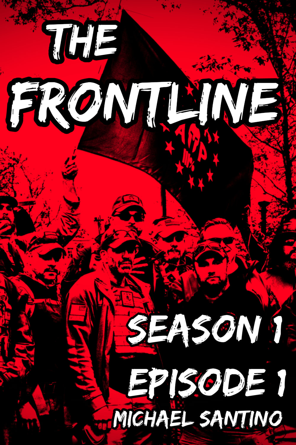
25 Responses to Option A
makes it look like an animated version or based in a comic so it seems more interesting
Red is the most appealing and catchy so A
A has a strong and impactful design that is enchanting and enthralling to me.
I think this cover makes the book look a little more action packed, dramatic, and intense so I would prefer that one.
The red and black is more eye catching and stimulating for me, so I'd pick that one.
I'm not a fan of either one that much and the same thing I am not a fan of, the bright red cover is the thing that could be eye catching to people. That is the reason I selected A instead of B as B is in black and white and isn't intriguing in general.
I think A is the better cover, by far. The red wash on the cover is very visceral, and makes the white typography pop. Also, I like the photo used of the III%er militia as it is very relevant to current-day culture wars and events.
I chose panel A. I think the red background just grabs you. I like the artwork and I would want to learn more about this book.
This cover has an inflammatory feel and look to it. The font needs to be changed, but other than that this is an good cover.
I like A because of the color and soldier graphic. It tells me this a story/series about the front line in the military. I'm not sure what the symbols mean on the flag. I also wonder why isn't the 5 star sticker on A.
I think this one draws more attention and I like the artwork and not try like it all in red but I like it more than black and grey.
There appears to be more action on the cover of A which gives the idea of what the books is about.
A is a dynamic cover that evokes a lot of emotion with both its imagery and the red color chosen for it. I would definitely get it over B.
I think A is more captivating. The dark red contrasting against the black is really bold and interesting. B is too dull, only the episode number stands out, which shouldn't be what stands out.
I like title A the best. I like the photo of the soldiers and comrades. I really think it really drives home the primmest of the book
A is dramatic and engaging.
This cover with the red and black makes you think something bad is about to happen or at least there is a dark element in the book.
A seems more eventful
A is more eye catching (and alarming)!
I don't like the black and white background. It looks tacky to me. I prefer this artwork because it has a modern look to it.
A is more attention grabbing. B doesn't seem 'front line' to me. It seems peaceful and tranquil like a farm or something. Not that interesting.
It would make me wonder what is going on with these guys. Are the evil? Are they trying to help others? What's going on in this book?
red looks scarier and more interesting
I would buy option A because the cover looks more absorbing and interesting. Option B doesn't look quite as fascinating to me.
The red and Black colors makes it more intense. Also like seeing the characters.
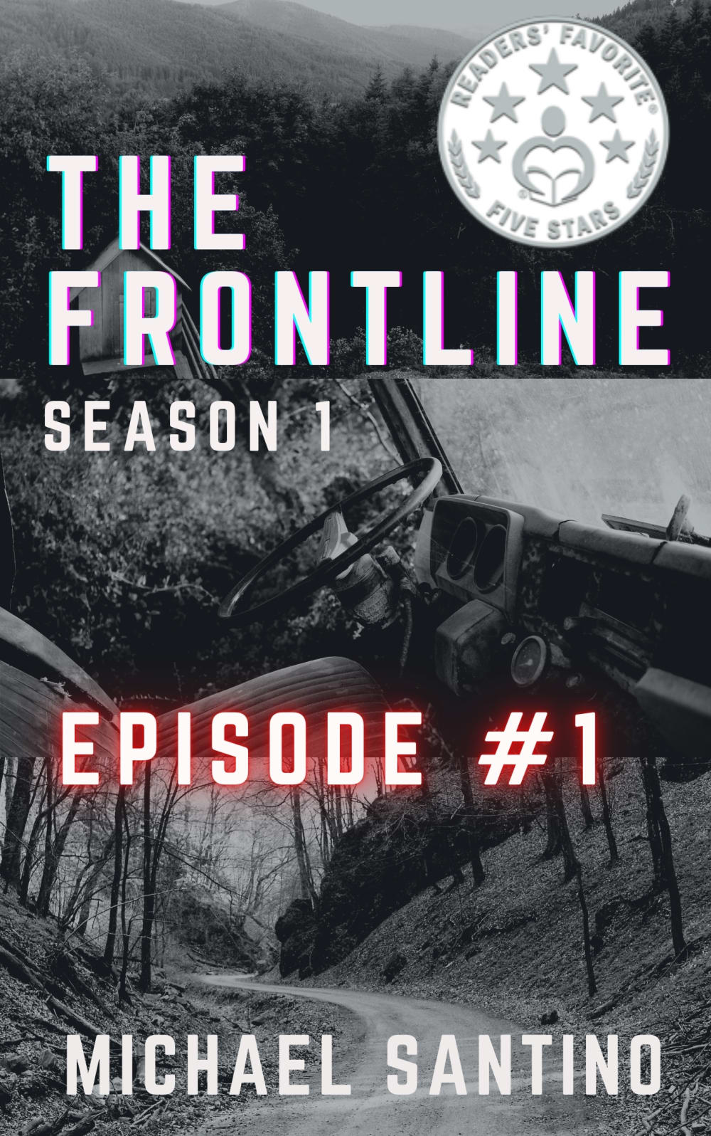
25 Responses to Option B
the black and white photo one is easier to read i think
The other one looks kinda like a militia or something and I don’t know what the book is about
B looks like a military war book, A looks more like a militia
I like B because the image of the vehicle and the road get my attention first and I also like that it says "reader's favorite five stars". The black and red image on A doesn't really get my attention or look like it would be a book I'd enjoy.
B looks a lot more professional. Having the "Reader's Favorite" Award on the cover is intriguing and makes me think it's worth a purchase.
The black and white isn't as overwhelming compared to the red in Option A.
The other cover looks like a cheesy comic book
choice B has a more modern style of book title compared to the other choice
I like B best because I am not wild about all the red in the other one.
The reader's choice badge makes it seem like it's a better choice and more well liked to interest me more in reading it as well.
I think the cover of option B is more mysterious than the cover of option A
The other picture reminds me of a far right hate group.
I prefer the color scheme of B. It’s sharp and looks nice
Choice B looks professional and the award makes it sound worthy enough to read. The other cover looks very basic and homemade in a bad way, the font choice is bad.
I like Option B. I like black & white version.
I don't enjoy militant or military type stories all of the time, so the other cover would turn me off. The option I chose would intrigue me.
The other but cover is way too red and it looks like it's a book about communists
This cover makes the book appear to have more historical value which sounds more interesting.
I like the simple black and white look in this one. It feels nice and mysterious and full of possibilities.
I like the overall visual and the font is so much more professional and better overall.
the photo on A looks like a group of white supremacists, which is the last thing I'd pick up
I choose option B because it looks less radical and angry.
The best design element of option b is the road and the seal is informative where it makes me think the book is a fan favorite
I like the subtle red title of the episode, it doesn't feel over saturated, and it overall makes me interested in the story and plot of the book. I find the gray image makes it more interesting to me.
I like B. The other choice is too bright and hurts my eyes.
Explore who answered your poll
Analyze your results with demographic reports.
Demographics
Sorry, AI highlights are currently only available for polls created after February 28th.
We're working hard to bring AI to more polls, please check back soon.

