Poll results
Save to favorites
Add this poll to your saved list for easy reference.
Based on the cover, which book would you rather buy?


Age range
Education level
Gender identity
Mystery and crime book reader
Options
Personal income range
Political affiliation
Racial or ethnic identity
17 Responses to Option A
the background picture used in the other option makes no sense
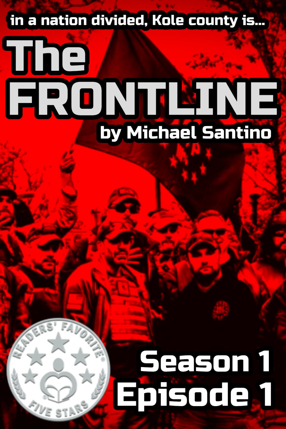
A has people in it, and it looks like they're ready for action. B looks nice, but it doesn't convey any action.
I like A because the red and black gets my attention first and looks intriguing to me. I like that Readers Favorite Five Stars stands out more too.
A has a bright display with a well encompassing layout.
The red color of A is a lot more appealing
A is more intriguing/scary
I chose the cover in panel A. I really love how the red cover jumps right out at me.
I think Option A would get a consumers attention better with the images displayed and the color of the cover. Option B is too gray and nondescript.
A is bright, eye catching, and intriguing.
I think the colour in this attract much more attention but I think maybe use the red to highlight something rather than everything. For example may be some of the guys in colour With still having red background.
I like title A the best. I like the picture on the cover of the soldiers.
I thought option A was more interesting because including the people on the cover made it seem more intimidating overall.
This cover would make me more curious as to what is going on. Who are these people? Are they good? Are they trouble? I would want to know what's going on.
More provocative look. Sometimes that detracts from a book but given the subject matter it seems appropriate. However, I would eliminate the "readers' favorite" badge. It has no citation. (according to who) It seems self serving and questionable
I like Option A for the cover of this book. The picture of the people goes well with the title of the book. It gives me an idea of what to expect when I read this book. The cover in Option B gives me no idea what this book is about. I can't understand how the pictures relate to the title in this image.
The Red, White and Black colors are striking. Seeing the soldiers/fighters and readers' favorite makes the book very appealing.
I choose A first as the main title is much more quickly to the point and attention grabbing and not as "cluttered" as the B choice.
33 Responses to Option B
B has a more interesting cover. I don't like the red in A at all and would pass up the book even if I was interested.
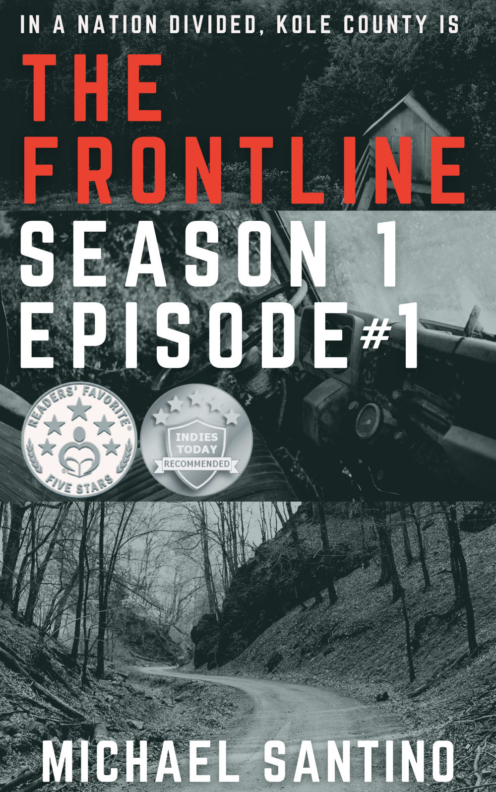
The cover in Option B is easier to read and the road suggests adventure and a tale to be told - much prefer Option B!
I prefer the black and white cover. I think it is more appealing than the red/black cover
Option B looks professional. It is as good as any book cover I have seen. Option A looks very amateur. The font is dated and the strong red color is a turn off.
This black and white color with the font for the subtitle at top looks better and a little more professional and serious to me.
Both covers are interesting. I think I like B better because it isn't bright red. Somehow A looks like a puddle of fresh blood. Not my favorite thing to look at.
This cover gives a sense of dividedness. The other cover gives you the idea of a group united. I think showing the two different photos together on the front gives more a sense of the turmoil.
I picked B mostly because A looked too threatening and violent to me. (A) totally turned me off. Where as B is quite and lets you look at the details on the cover.
I like the colors better in A, but too hard to make out what the graphic is. B is good
I picked option B because of the colors scheme. It has enough color to make it pop but isn't overboard like option A.
B is a good layout iwth a good picture i think. it seems like the county sounds like its very rural so this makes sense to me
B is more kind on the eyes. A gives me a headache looking at it.
Option A is too red for my taste, it makes it hard to focus on the words.
I like the background better because of the scenery
i like the dark cover of option B the red of the other cover is not good
I like the black and white cover. It seems more classy, and the fonts are more serious, the type of book you would see on the shelves of a bookstore. A's font and glaring red cover isn't attractive, and I'd be less inclined to pick up the book.
I chose B because there is too much red in A. The red detracts from the title. I prefer the way that B uses red in the title, which makes it stand out from the rest of the cover. I also like that the season and episode are listed directly under the title, making that information easy to find.
the photo and color scheme of A completely turns me off. The red is too aggressive, and the men in the photo are not people I want to be around. I'm fine reading a book about them, but I don't want them on the cover
I prefer Option B as my first choice. There is something a little sinister and mysterious about the winding road on the cover. I also like the no color look, it makes it seem serious and detailed.
I hate the color red
A is too bright and hard to read. B is bold, but readable. The subject is interesting.
The other cover looks like it contains a bunch of white supremacists.
I like the look of B with the title featured. I don't like the bright red of the other choice, it hurts to look at it.
I chose option B based on the cover photo because option A with the red seems like it could be violent and had a lot of people in it, There is less going on in option B and it leave it more open to the imagination. With the photo showing a winding road it alludes to the author taking you on a journey with the character and seems like it would be more enjoyable.
I prefer the calmer photo on B. I like the deserted road photo. I don't care for the red tint on A. That would probably turn me away at first glance. Plus the fact that Book B shows two awards/recommended circles would make it seem like a more interesting/popular book.
The cover doesn't really give much of the story away, makes you wonder what is down the road and draws you in. Cover A reminds me of Jan 6th and not something I want to read fiction about
I picked B because the red headline really stands out surrounded by the gray area
B looks more professional.
A looks like something you'd see on the dvd cover of a horror movie. It's far too scary.
B because it reminds me more of a horror story and with the black and white cover and I want to find out what is on the other side of that road.
The red cover turns me off for some reason.
Less of an eye sore, the other one is just ugly.
I think the red is too bold. I also like that it has the extra badge for the Indies today. I am not sure what the pictures are supposed to represent, but I like the black and white a lot better. However, I may prefer the other picture because it seems to imply what the book is about better.
Explore who answered your poll
Analyze your results with demographic reports.
Demographics
Sorry, AI highlights are currently only available for polls created after February 28th.
We're working hard to bring AI to more polls, please check back soon.

