Poll results
Save to favorites
Add this poll to your saved list for easy reference.
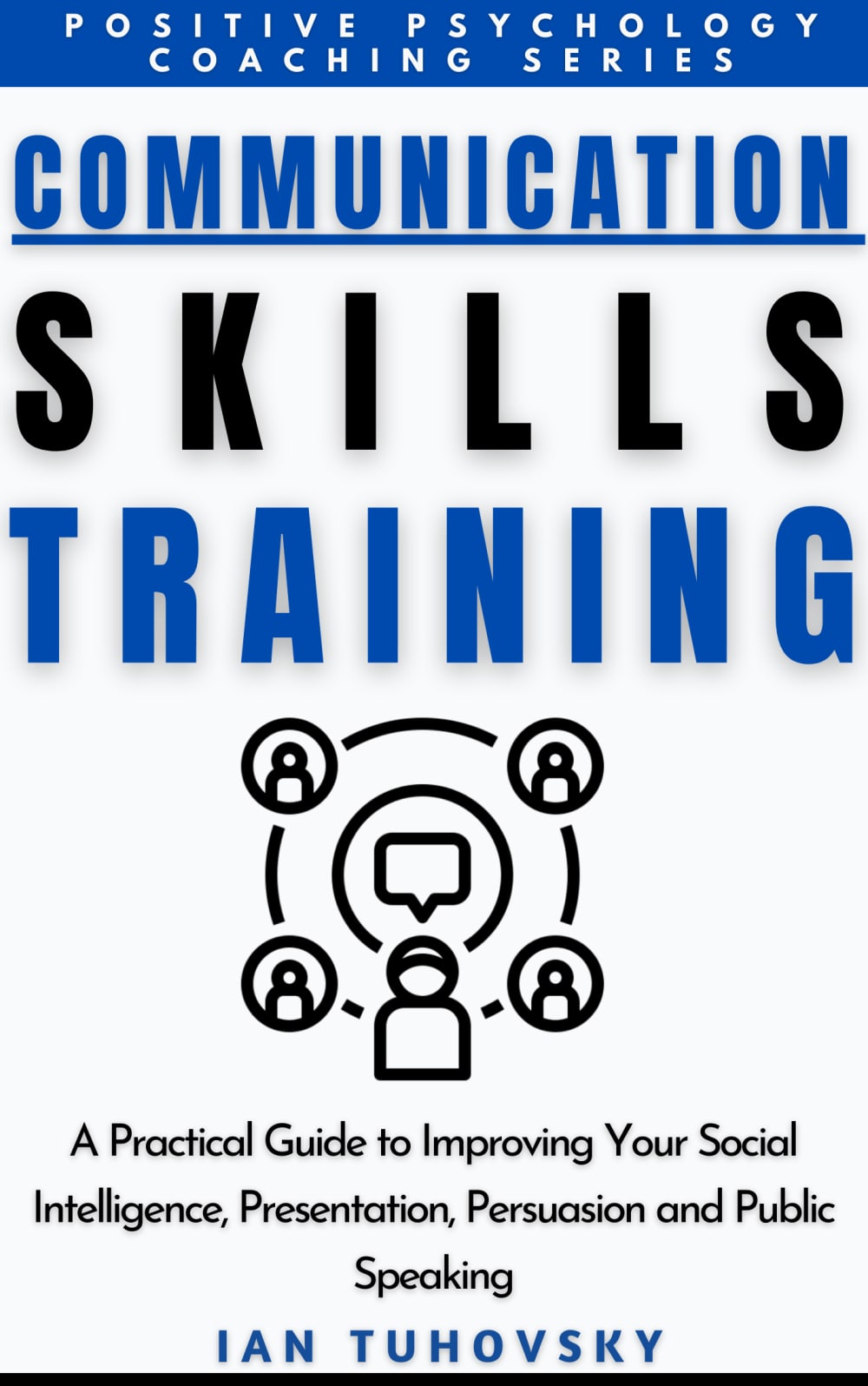
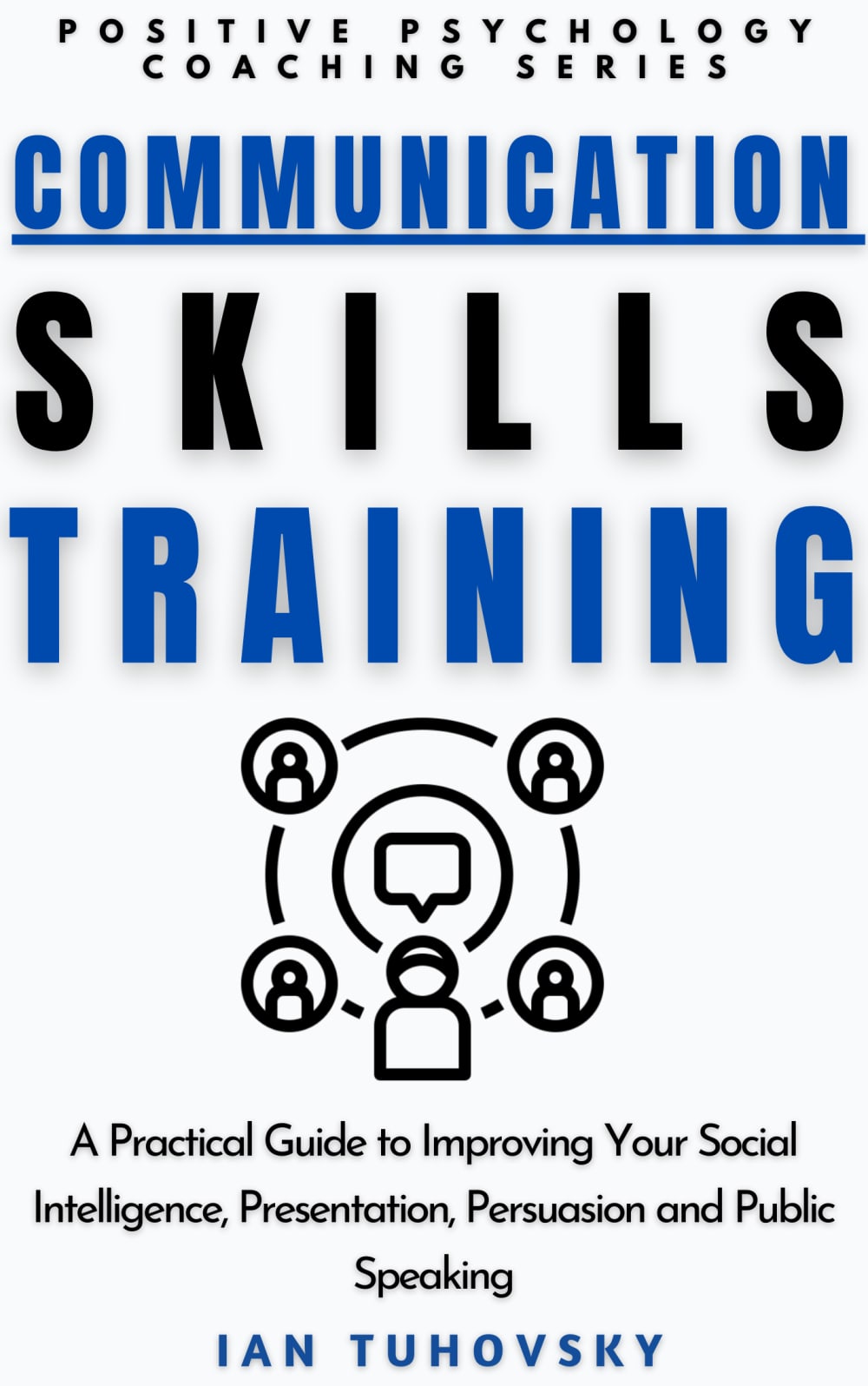
1) Which composition of the book cover do you like more? Stripes or no stripes? 2) Which would grab your attention and entice you to buy the book? 3) Would you change anything else in the cover of your choice?
Age range
Education level
Gender identity
Household income range
Options
Personal income range
Racial or ethnic identity
Self-help book reader
37 Responses to Option A
The stripe on the top gives it a bit more character. I like option A.
I think the highlight and the line at the bottom makes it more interesting.
I chose option A because the blue bar on the top captures my attention more than the plain white background in option B. The black bar on the bottom of choice A adds more depth and creativity to the cover and I'm more likely to look at it and read it.
I like the stripes at the top a whole lot. I like the splash of color that it gives the book with all that white. This one would grab my attention more. No, I like choice A a lot.
I like the stripes because it breaks the book into sections that make it easier for the eye to read. I don't have any other improvements to add.
The blue colors that are used for the top of the book help it stand out here
I like all the extra fancy stuff. The extra black lines that bring the eyes to focus on certain sections was a nice touch.
I will say immediately - I don't like either option here, there is something missing in both, that being said, stripes grab more attention.
I like the stripes because gives "definition to the cover", not just a plain white background that makes the book looks boring. I would buy this option and the suggestion that I have is change the speech bubble (or he circle around it) line the same blue or another color
I choose A. i don't like the black stripe at the bottom. I do like the blue stripe at the top. I like the blue background with white letters better at the very top.
The only thing I would change is the white background to another color. But I do not know what color would look best.
i like the book cover in option a and i like the black lines that are part of the book. i feel like it stands out more and seperates more of the words on the book and it is easier to read and it stands out more.
I like the blue box with reverse type on top with the underlined type at the bottom of the cover. It is more compelling.
I prefer option A because the design/lines seem more pronounced and eye-catching. It looks more neatly broken up into sections, and it conveys the message better. If I could suggest one thing, perhaps add a little tiny bit of red somewhere. It would provide a nice contrast and make the book even more attention-grabbing.
Choice A is presented better by being underlined and boxed
I like the blue strip across the top. Draws the eye, adds more interest. Bold is better. B just blends in.
I prefer choice A because I prefer the bold blue stripe.
If I were to choose a cover I would choose A. A stands out more to me. I really like the stripe at the bottom. I think that's what I stands out to me more and it's why I like it so much. I also like the working in the top in white with a blue background. I think it sticks out more. A makes me want to buy it honestly. And honestly there isn't anything I want to change about it. I think it's fine the way it is.
I chose A because I like the look of the blue bar at the top. It grabbed my eye and got my attention.
Definitely stripes. The cover seems barren without them and more boring.
1. I like the stripes better. I feel like it breaks up the wording and whiteness, which is a little plain in Option B. It also grabs my attention slightly more.2. Same as rationale for answer #1.3. No changes. It looks professional and nicely done.
I like option A. The stripes look appealing to me. Makes the book look more highlighted
I love the stripes used in Option A. It helps define the books edges, and is more formal in appearance. I would definitely want to pick this book up. If there was anything I would change, I would bring the "SKILLS" letters closer together just a tad (not much). That way is easier on the eye and doesn't look like: S K I L L S. A quick glance, and "KILL" is all I recall in mind without processing what I'm reading. I hope that makes sense.
I prefer the option A with the stripe as it is more eye catching and makes me more likely to buy it. I would go with a stark white, as this one is a little muddy.
I think a blue bar at the top attracted more attention.
i chose option a because with the blue heading as well as black on the white background it really makes the cover pop
I like this option because it is condensed in a way that makes it look a little more professional.
I prefer option A because the dark blue background with the white lettering drew my attention right away and I also like the underlining of the speaker name which makes it look more important. Some suggestions would be to make the large lettering of Skill Training a little more compatible with each other by being more medium in size because it seem less professional with the two large lettering together.
Option A is my preferred choice because the sub head at the too stands out more and shown in th blue box instead of the plain white background.
I prefer the cover with stripes shown in option A because for me it makes the cover more aesthetic compared to option B.
I like that the blue background breaks up the front text.
I prefer stripes. They more clearly delineate the different sections of the book cover. I would make the word "Communication" at least as large and bold as the rest of the words on the cover.
I like the bold color at the top of my first choice. It gets my attention and looks more professional.
I like the blue banner at the top. Very nice.
The stripes help to catch attention of the whole cover and the underlined text. Try to get ‘Speaking” on the same line as the other text.
I like this one because of the stripes and that it is more appealing.
The stripes seem to give it a sense of stability and I think that is helpful. I might consider dropping the bottom stripe and leaving the top one.
8 Responses to Option B
I thought the strip of navy blue at the top of the cover on A looked too heavy.
I prefer this style because it's a little cleaner and more efficient which helps me focus on the text.
No stripes is definitely better than with stripes. As a result, option B is much stronger than option A. It looks cleaner and more direct. I don't think it needs any changing if this is the design you're going with. It looks decent.
I think this option is more appealing.
! No stripes. Stripes make the book look cheap and outdated.2. Option B because it looks more modern3. No
I like the more simplified version of B. i think it conveys the idea of what it is to be used for without being overly flashy. I wouldn't change anything about B.
I dislike the black underline under the author name so I chose option B
The blue border in the other version looks a bit unprofessional and doesn't look as nice as the one I chose.
Explore who answered your poll
Analyze your results with demographic reports.
Demographics
Sorry, AI highlights are currently only available for polls created after February 28th.
We're working hard to bring AI to more polls, please check back soon.

